
HCD, UX & UI
When it comes to designing a website, or an app, there are certain aspects that you as a designer need to keep in mind. It’s not as simple as making a pretty design that looks good and feels good to use for you as a user, but it should be a good design for the end-users to use with a design that is comfortable for them to look at. This is why hCD(human-centered design), UX (User Experience Design) as well as, UI (User Interface Design) are important.
- User Interface Design
- Human-Centered Design & User Experience Design
UI
User Interface
What is “User Interface”?
The User Interface is the visual experience when the human users interact with a computer, website, or application. It is to allow the user to control the product efficiently and effortlessly. The UI should make the interaction between the user and the product easy and intuitive, requiring minimal effort for the user to receive the maximum desired outcome of the experience using the product.
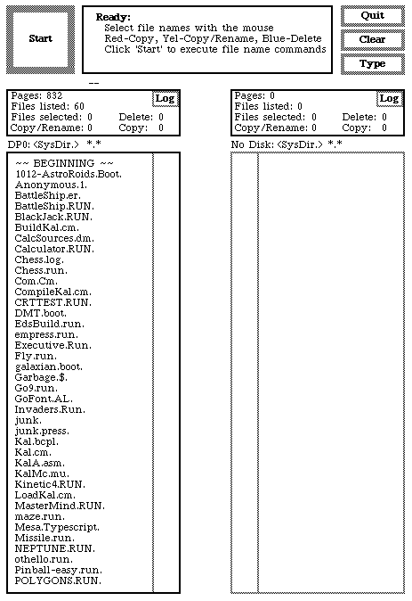 The first GUI (Graphical User Interface) was first introduced in 1973, in the Xerox PARC. It wasn’t a product meant for personal use, rather for universities for research purposes. In 1981, the Xerox 8010 Star was created, being the first workstation to have a GUI throughout with applications.
This inspired future developers to create a GUI, like the Apple Lisa Workstation. With the rise of the GUI and more people starting to use workstations, more apps were created, we had to work graphic icons into the applications to make the users understand them better. This is where skeuomorphism began to rise.
![]() Skeuomorphism is a term used in graphical UI design to describe interface objects, such as icons or applications, that mimic their real-world counterparts, such as the bin tool in your computer.
Skeuomorphism is a term used in graphical UI design to describe interface objects, such as icons or applications, that mimic their real-world counterparts, such as the bin tool in your computer.
Susan Kare, aka the woman that gave macintosh a smile. Created icons for the Macintosh computer that was released in 1984. These icons were groundbreaking and you can still see them in computers until this day, such as the computer disk to save files, which is used until today.
Skeuomorphism


Skeuomorphism is an important part of the development of the UI and UX we see today, icons to help us understand what the apps would do, making the experience better and easier. By using imagery of everyday occurrences to apps that would be much like that. A perfect example of this is the earlier iPhone OS that many are familiar with. The recording application would show and be a functional microphone in your app, when you spoke it would tell on a little indicator that it did in fact pick up sound. Reminding the user that it’s in fact recording their voice. The buttons on the UI of the iPhone would mimic buttons so that users would understand that it served the same purpose as a real-life button, it would also give off an indication when pressed like a button would do non digitally, it would sound like a button and vibrate. The type function mimicked a real-life keyboard as well, vibrating when touched and making a sound that sounded like a keyboard
Since many users were new to the touch function back then, it helped people relate to real-life items much like what the apps were.
The future of UI
Recently we’ve begun to have devices we can interact with without a GUI, but with voice or gestures. Like Alexa or a newer generation of a car where you can wave in front of the screen to change music. Which brings us the question, what will a UI be like in the future? There are some experiments with UI’s like augmented reality, that appeared in google glass for example, but we’re not yet there to involve it with our environment.

We do however have the technology to change our environment on our phones via our cameras. There are several AR apps and tools that either help us or entertain us, giving us a lot of potential with what we’ve created so far.
Throughout the past decennium, our UI has improved and changed. From a 3D look that would mimic everyday items to us being more comfortable being digitalized. The designs have become flatter as well as looked less like their real-life counterparts, we became used to the UI, giving us a chance to develop further and see what was possible.
HCD & UX
Human-centered design
&
User Experience
What is Human-Centered Design and User Experience?
In short, User Experience is quite self-explanatory, it’s how a user interacts with your product and the impact of the interaction. User Experience, on the other hand, is more of a value to Human-Centered Design.
Human-Centered Design, is the design process and the focus of the end-user, a human. To understand the end-user as well as making a product that they would understand as to be easy to use. The product doesn’t always have to be digital though, it can be an object for example, like a door.
This is a great video as an example, explaining the importance of HCD.
Human-Centered Design is to also understand the end-user, how they work and if this would satisfy them and not cause confusion when they’re using the product.
Focus on the people
A great design does not come from nowhere, to be able to create a good, if not great HCD and UX, you need to understand the end-user.
There are several steps in the process to create a product, and you have to start with the most basic question: Who will be using this product?
Having a general idea of who your end-user will make it easier to understand what elements would be necessary to add to your product and how to build it. You would also have to get a general idea of what your focus group would be like, would they consider using it? Research and interviews would give you a better perspective as well as a more understanding approach to your product, what to add and remove to satisfy them. It’s a journey to solve and find the right problem.
Think of everything as a system, just because one part of your product might be great, doesn’t necessarily mean that you’ll have a good overall user experience. Every piece of the puzzle matters to make the image whole. For example, if you were to make an app, that requires an account, you sign up at first, the whole process has a nice and smooth flow and everything is close to perfect with an easy-to-understand process, but when using the product, the app. It’s hard to navigate, it doesn’t make sense except for the front page of the app after signing up which is what you wanted your user to use. Humans are curious by nature and will explore your product, to learn and see what it has to offer, which is why we have to think of the big picture, to satisfy them.
The best response you can get on your product is from the users themselves, which is why you should always test your solution on them. The feedback given from your users will be much more useful than your own opinion to reach the best result since you’re designing and solving the problem for them rather than yourself since you are not the user. This is why you should always validate your design decisions.
What are Design Systems?
Design systems, simplified, are a general theme for a company on their websites or apps, a documented catalog of components and styles, used within a product. It’s everything from colors, animation, font type, the layout to content and behavior.
An advantage to a design system is used to help speed processing up as well as improve without changing the apps/websites in their entirety. It helps the workflow in many different ways, the developers in that sense do not have to focus on the visual design, rather the workflow and the logic. It brings consistency which is important for a brand.
Design patterns
Design patterns are reusable components that are used to solve common usability problems. When we look at websites we can see several similar elements and tools being used, as well as where the elements are placed. This is for the user to have an easier time using the app and/or website, as well as understanding the product more.
If we look at a few websites we can see similar elements used to facilitate the end-user.


By having a brief look at these three different websites, one being a social media platform; Facebook, One being a video platform; Youtube, and one is a news outlet; Aftonbladet, A Swedish website. We can see similar elements to help the user to navigate easier, no matter if they’re new to the website or not.
These three websites have several elements in common to help you understand what’s happening as well to understand what’s going on.
Common Design Patterns that are being used from just looking at the websites
- A navigation bar with a search function
- The navigation bar has the company logo on it, for the user to understand what website they’re on.
- When have selected, selecting or hovered over a button it gives off an indication, showing a different color, showing you where you are on the website with a clear and understanding language and graphical response.
- A menu that is on 2 out of 3 of these websites, on the very left side of the screen, right below the navigation bar, except on the news website.
- Input prompt, telling you to search using the search bar.
- Vivid colors to show notifications or, as it’s being portrayed on the news outlet, to “new” news.
These are just a few design patterns you can see from just looking at these print screens provided in this post, and there is much more behind the scenes, such as settings, for you to customize the website to your liking, your own account page, where you can edit your profile if the website lets you have one. There are countless of these that websites use to make it easier to understand for the user, no matter if they’re new to the website or not.
Accessibility
When designing a website it’s important to make it accessible for the end-user. Using components that are obvious at what they’re for and a good consistent website can come a long way. If you have a button for example you should make it clear that it’s a button, it should give an indication and a response when it’s being used like a button does. Otherwise, it wouldn’t be a great button.
By adding highlights with either vivid colours or a colour that would pop more than the general colour of the website, helps the user to know what’s happening as well as what’s being selected, an extra detail for an icon, like an empty basket would be empty if you were to do online shopping and when you have a product in your basket if would indicate that you having something placed in it, like an icon saying ‘1’.
Several elements help users visually rather than with just text, which makes websites more accessible. When something goes wrong or doesn’t add up when the input is wrong, for example, You need to write your new password in twice, and the second time it’s being typed in, it’s not the same. The text bar, where it was being written needs to indicate that it’s not matching.
If the website were to say: “Error” and not indicate what would be wrong, it would be very confusing for the user. By adding colours, around the area, what would be wrong as well as a status message below it, it would indicate that just that part would be wrong, to make it easier for the user to understand.
Tasks during today’s class

We were asked to recreate a card based on our favourite musician or group using Google’s Material Design. I chose to work with Kraftwerk and their song Radioactivity which is one of my favourite tracks of all time. Kraftwerk is a very retro music group, dating back from the ’60s.
I chose to use a very vivid yellow which was used on their vinyl disc when it was released. I also chose to work with a font, that felt on par with their music, which is electronica.
I made the icons myself, with pixels to match the font.
Thank you for reading.