Introduction
For my final year studying animation at Ulster University, I decided I would direct my efforts toward 2D animation as it was the area of the industry which I am hoping to have a career in in the future. Whilst I had been studying and learning how to model and animate in 3D using various different software, I felt I would be more within my comfort zone creating an animation by hand drawing. To allow myself to have full creative freedom I decided I would work by myself for my final project, because it would allow me to involve myself in the various stages of production and gain greater insight into them, as well as giving me full control in terms of the artistic direction and setting of the animation. Working within a team to create an animation would certainly take a considerable amount of the work load off my back, however in group work there are often disagreements and compromises made to accommodate the groups majority vote. By working by myself on this project, I felt it allowed me to work on something that appealed more to myself, which would help motivate me throughout the time working on the project.
Idea’s & Inspiration
For my project I wanted to go with a medieval/fantasy setting with a castle in a rural area. I’m a huge fan of games such as Zelda, Dark Souls, Sekiro, Elden Ring and Skyrim so I wanted to try and create an animation which took inspiration from them. However, unlike most of those games I wanted to settle on a more light hearted approach to the story, as I felt it would allow the animation to appear to a wider audience. I had a rough idea for the plot at the beginning which consisted of my character making his way towards a castle or other form of medieval building, facing various obstacles and enemies before facing a boss-like enemy at the end of the animation.
In terms of art style I wanted the animation to be more comedic as opposed to the dark, gothic setting which the games in the Dark Souls series portray, so I began looking toward television shows like Adventure time and Rick and Morty. Both of those programs have a very simplistic art style to them which make them more accessible due to their minimalism. Both the humour and stylistic choices of both these programs allow them to stand out when compared to other programs in the same genre, which is what I was aiming to achieve with my animation.
I began researching various different characters, from those games I had previously mentioned, to give me some ideas on character designs.


I felt my sources for inspiration contrasted well with one and other. The bright, warm colours from animated shows like Adventure Time and Rick & Morty would allow the more detailed aesthetic of the Dark Souls character designs to stand out.
I also looked through Youtube for clips from various different TV shows and animation channels to be able to get a better idea of how the composition and motion of the animation would be. I have allows been a big of anime and how that genre is able to use still shots to create compelling visuals using still shot. They are able to capture the attention of the viewer despite not flooding the viewer with high framerate animations which can be rather jarring at times. By using this framerate style of animation it would also lighten the work load for myself, which I knew was important because in previous projects I had been too optimistic with what I was capable of achieving within the time frames. So with this animation I tried to be realistic with what was achievable, also asking our lecturers for feedback with any ideas I had and if they were attainable. I also was very fond of the concept of rotoscope animation, where you take a live action sequence such as fight or other actions, and using the movement of real life actors as a skeletal frame to base the action of my characters around. By doing this I felt the movements and actions of the characters in my animation would be more life like and believable. I thought this technique would come in very handy because although I feel I’ve improved my animation skills during my time on the course, I hadn’t really sat down and stuck with 2D animation since our first year on the course, and I wanted my final animation to be a big improvement on the rugged and janky visuals of my animations back then.
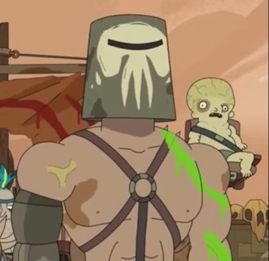
I had a rough idea for what I wanted for a story however before creating a story board I decided to narrow down my choices so that I would be able to come up with the final plot of my animation. I wanted the basis of the story to be focused around “,don’t judge a book by its cover,” and that appearances can often be deceiving. To capture this idea I wanted the protagonist to come across as clumsy yet efficient. I knew I wanted to have my character facing different enemies and getting the best of them each time so I decided to use the time in-between fight scenes to make the character seem playful and humorous. I ended up coming up with the idea of having a character with an oversized “bucket like” helmet, similar to the one from “Rick & Morty”, which would affect his balance when walking so his head would wobble side to side whenever he was moving to make him look unsteady. I also knew that when it came to the final boss fight, I wanted it to be comedically anti climactic in some form, in order to make the protagonist seem unrivalled.
Character Design
Character design is important because a well design character should be able to capture the audience’s attention. They should be able to communicate through their appearance, expressions and body language. A characters design should also replicate the genre and theme of the story, it can show a characters background or show their role with in the story.
Protaganist
Before going to work on the story board for my animation I began working on the design for my protagonist. I really liked the design concept for characters such as Master Shifu from “Kung Fu Panda” and Rocket from “Guardians of the Galaxy”.


I felt that both characters had similar design choices as the ones I was going for so I wanted to make my character a racoon/rodent like creature, which would later be revealed during the animation during the final boss fight.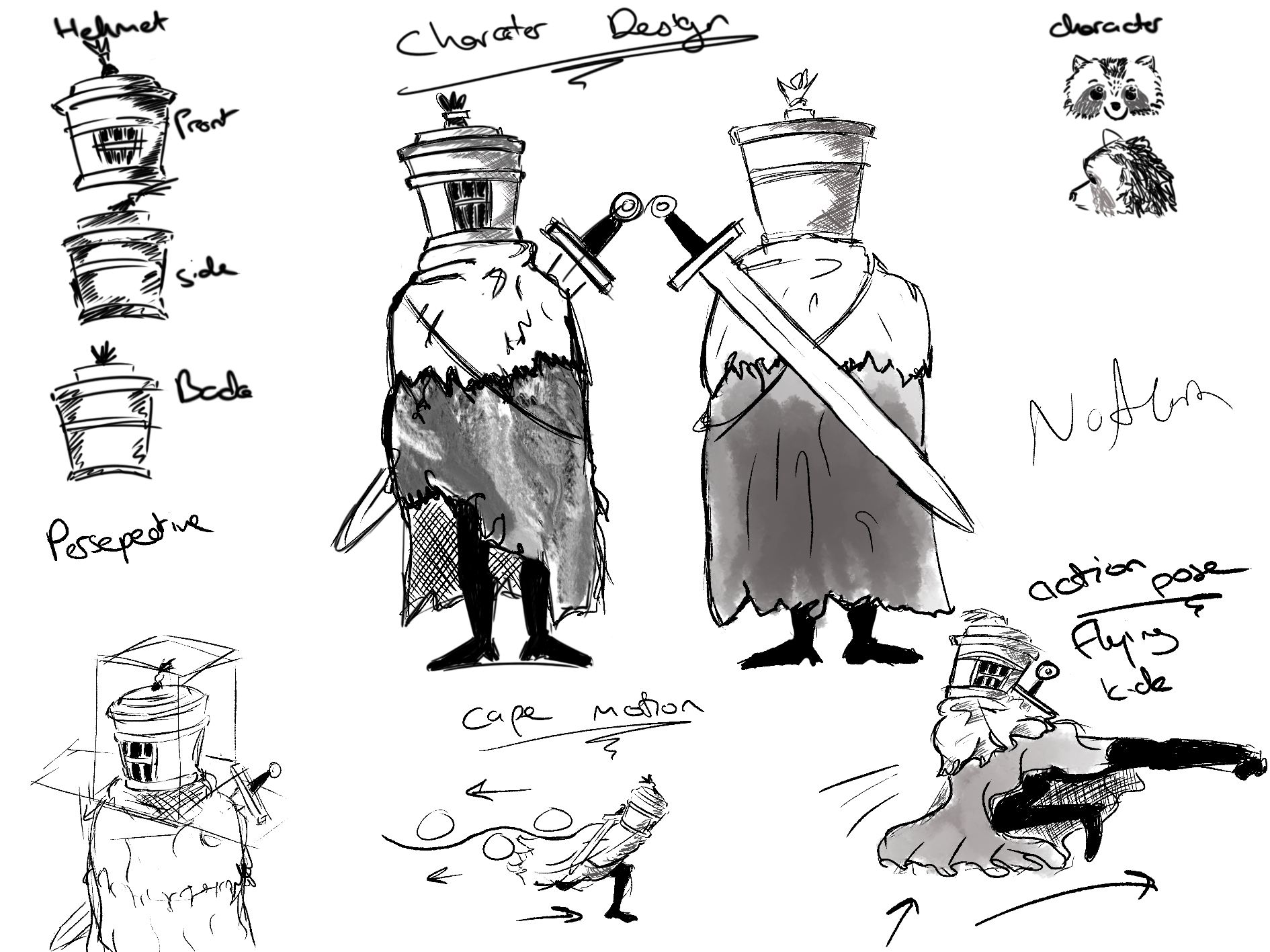
I was fond of the idea of having the character wear a large rugged cloak as it would cover the majority of his body, giving as little as possible about the characters identity before the reveal at the final fight of the animation. The cloak covering the body would also allow me to draw more complex fight scenes during the animation as I wouldn’t need to worry too much about the anatomy of the character, mostly having to focus on just the legs during the walk and run cycles. However despite the characters arms being hidden beneath the cloak, I would instead have to focus on the movement and weight transfer of the helmet shifting from side to side when he was moving, as well as the rag which was on top of the bucket which would also sway during movement. Like the two other characters in which I drew inspiration from, my protagonist would move a normal human would, standing on two legs to give a humanoid demeanour. I knew the cape would be rather difficult to animate however when I spoke to my lecturers they shown me how to correctly display the motion of the cape (as displayed above). The bucket helmet itself was designed to be identical from most angles apart from the front where the visor is, I designed it like this so that I would often be able to reuse the helmet motion from previous frames in the animation to save time on certain scenes.
Boss
I wanted the boss in the animation to be large in appearance in comparison to the protagonist in order to make him appear more intimidating. He would also be seated on a throne during his scenes which made him a lot easier to design as I he would only be in one position in these frames. This character was where I took the most inspiration from the “Dark Souls” games as I wanted his look to be more demeaning to the audience.
I used references such as these to come up with some designs:
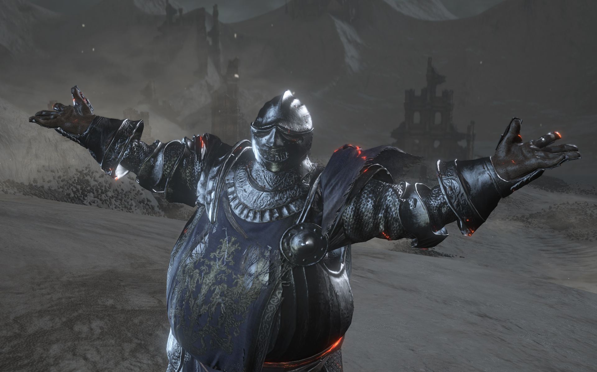


Eventually I settled on a design where the antagonist would wear a coat with a cape draped over his shoulders and the arms of the throne in which he sits. The cape would line his collar with a borg/fur like material and he would be wearing a large helmet like the protagonist of the animation.

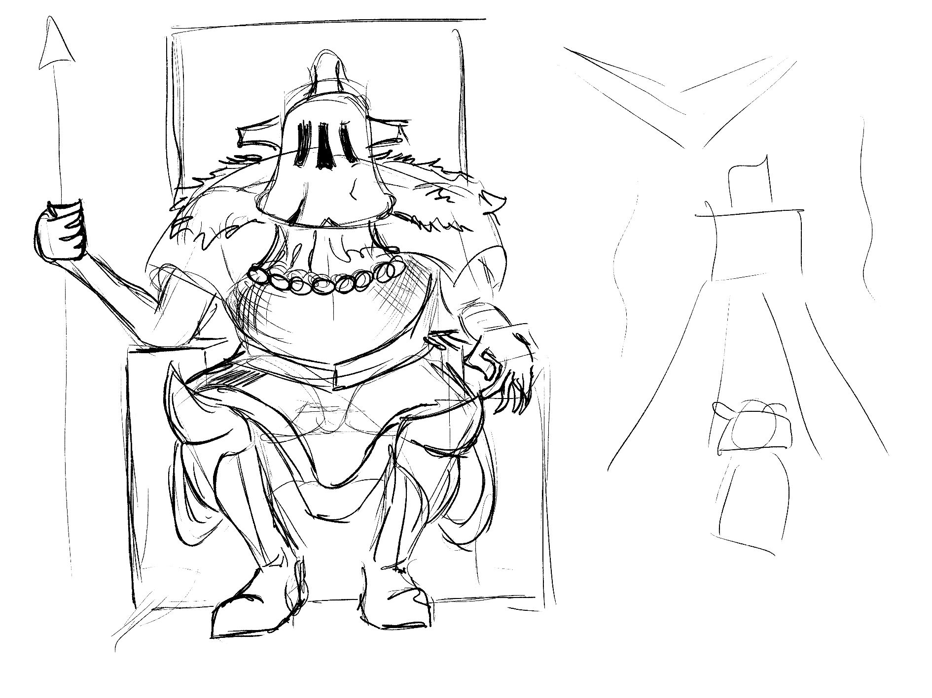
The final design which was used in the animation resulted in being more of a combination of all the above designs. I combined the helmet designs, giving his helmet a bell like shape with horns on either side. The fur collared cape remained constant through the designs as I felt it fitted really well with his aristocratic appearance. I wanted the antagonist to appear swole and bulky in his physique so that the main character would look out matched during their fight scene together. I went with the more simplistic spear like design for his weapon as during the fight scene there would be a projectile that would be launched from the end of the spear.
Enemies
I also designed some enemies that the character would be able to face in the middle of the animation before facing the main boss, I didn’t want to spent too much time designing these characters so i made them look very simplistic. there design consisted of a large overweight human like body, with large domed heads.

This design would be incredibly easy to work with because the upper body basically consisted of three circles to create the head, chest and belly. Around the neck I added rolls to make them look more bulky and they were also not given clothes to allow me to focus mainly on the anatomy and positioning of the enemies during their scenes. For the head and face of these characters I tried to give them an appearance similar to an ogre and troll, with up turned noses like pigs. The eyes I kept simple and straight forward as these would be the only characters showing any facial expression up until the face reveal of the protagonist during the final fight.
Storyboard
Storyboards are a great way for an animator to get a clear visualisation of how a scene will be set up. They are able to show movement, camera angles and composition allowing for a better understanding of a scenes overall flow and pacing. They also allow you to explore different creative options without having to fully dedicate yourself to a scene. When working with a team they can be a great way to pitch a concept as they make it easier to communicate the artistic direction of a project.
Before creating my animatic I drew up a storyboard to give me a better idea of the direction the animation would be going before I started my work. I decided for a title for the animation which in turn resulted in the name of my protagonist, the title being “Nomad the Nameless Knight” and the character going by the name of Nomad, meaning, “a member of a people that has no fixed home but wanders from place to place.” I felt that the name suited the character and the story as there is no hint as to where he is from only his destination, which in this case is the castle and location of the animation. The animation would begin with a cliff view of the setting. The character would then walk along the cliff facer before travelling up a path towards the gates of the castle. When “Nomad” had passed through the gates he would jump over the balcony landing effortlessly with a cloud of smoke either side of him before walking down a corridor where he would face multiple traps and then a fight between him and three of the enemies that I had previously mentioned. After that he would then burst through the double doors leading into the cathedral where the boss would be present. Nomad would then lunge forward towards the boss for the animation to end as a cliff hanger, however, after some feedback from my lecturers and other class members, I decided against the cliff hanger ending and to instead have a short fight sequence between the two characters.

Here are some videos I used during my research for storyboarding:
Animatic
Animatics allow for the storyboard stage of animation to come to life and for creators to see how the scene would look in a rough animated form before investing a significant amount of time on it. They allow you to test concepts and work on improving existing ideas, as well as making sure the vision of an animation remains consistent. They are an incredibly important aspect of the pre production phase of animation as they can help identify potential issues which may appear during the early stages of development. When working for an animation studio, animatics can help estimate the budget for a project and they save time during the later stages of production as you have a reference you are able to use.
The animatic is also one of the most important aspects to take into account when creating an animation, as it acts as your guide rope to help show you what you need to draw and where you need to draw it. The animatic also helped me design the backgrounds because as well as drawing the characters and their key action poses, I drew a loose outline of the background and the positioning of different objects in the environment. This helped me prevent any overlapping of drawings and the backgrounds when creating the final animation. I also spent a bit more time working on the animatic making sure it was detailed with lots of frames, this would later relieve me from some of the stress of having to draw some of the frames in the final draft. I made my animatic more of a less detailed draft of the animation so that I would more or less just need to trace over the animatic, add detail and occasional fill in for some of the gaps between frames.
Here is my animatic:
As you can see from the animatic, I added a fight scene when Nomad enters the cathedral. During this scene Nomad and the antagonist, now called “Lord of the Bell” (due to his bell shaped helmet) will exchange some dialogue before “Lord of the Bell” will raise his staff and launch a projectile towards “Nomad”. He will then deflect it using a knife/sword and the projectile will change its course upwards and back towards the chandelier above “Lord of the Bell”, were it will then fall on top of him and defeat him. I agree with the my lecturers and I think this was the right decision, as the previous ending felt a bit bare and would leave the viewer a bit confused as it just sort of ends.
For the fight scenes during the animation I took inspiration from various different sources, such as; clips I took of myself at home, choregraphed fight clips off various youtube channels and scenes from anime such as Samurai Champloo and Afro Samurai. I was able to get some of the clips downloaded, here I cut various snippets of the clips up and stuck them together intertwined with each other to try and create one fluid fight scene.
Here are links to the clips I used to help during my animation:
Backgrounds
Backgrounds are really important when it comes to bringing your animation to life, they establish location of the scene whilst supporting the story by displaying the mood and tone of the environment. Narrative details can often be hidden in backgrounds to provide extra depth to the story. It is also important for the animation to remain visually consistent as this will allow the area around the character to transfer seamlessly and keep the animation flowing steadily.
Another incredibly important aspect of background is they establish the scale of an area. They allow for the size and distance between objects to be conveyed with in a scene. Backgrounds also affect how characters will interact with their surroundings, they can be used to create obstacles which characters can interact with making the animation seem more believable.
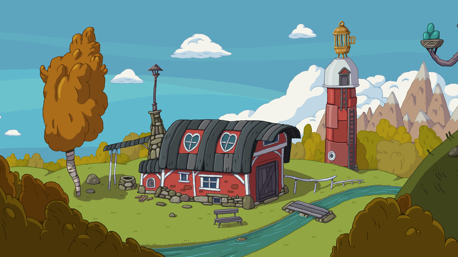
The animatic came in incredibly useful during this part of the project as it acted as a guide to tell me what needed to be drawn and how it needed to be composed. When designing the backgrounds I looked at shows like Adventure Time to help with colour schemes because I was really fond of the warm tones that were used and how they affected the overall aesthetic. Adventure time also has a lot of baron settings which are rich with detail, despite there simplistic appearance. I felt my animation would really benefit from this kind of artistic style so I tried to replicate it with the setting of my own animation.
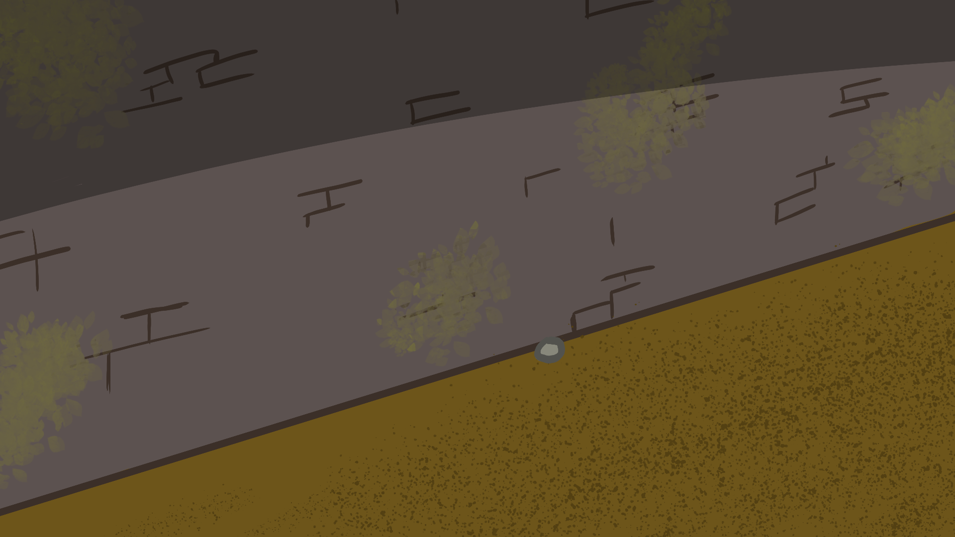
Here is a screen shot which I had taken from my animatic, it gives a rough outline of the mountains in the background. This gives me an idea of where I would need to draw the castle, mountains and the cliff edge, so that it all looks believable when it comes to the final animation draft.

Here is an example of an Adventure time background which I used to help with the colour scheme of my own background:

Here is an example of me using on of my animatic screenshots to help me draw out my final draft for this particular background.

When it came to drawing up the backgrounds for scenes such as inside the cathedral, I decided to use a real life cathedral photo instead.

Here you can see I used a photo of St. Patricks Cathedral in New York City as my reference for drawing up the interior of the cathedral in my animation. I really liked the perspective of the photo so I wanted it to be present in my own animation as I believe it adds depth to the image.

When it came to the fight scene in the tunnel, I didn’t think it would make sense to draw out multiple different backgrounds, as I thought it would be a waste of effort and my time would be better spent on the animating process. To combat this I used to two different images on multiple occasions, by flipping them however it was able to make the perspective of the scene make sense.
Here is an example:


This made the process so much quicker as I didn’t need to spend time drawing up another two backgrounds which would have been practically identical anyway.
By the time I had finished drawing up all the different backgrounds I had twenty different backgrounds, which were all used in the various scenes of my animation. Being able to trace over the background used in my animatic clips was incredibly useful during this process because I would have needed to go through the animation and back to design the background itself constantly to make sure that it would be able to fit within the scene properly.

This was by far the least stressful part of the animation as most of these images were just static shots that didn’t require any animation.
When researching backgrounds I also came across a few useful videos on Youtube which came in very useful during the background design process:
Animation
For my animation I decided to use Toon Boom Harmony 17 as it is a very popular software used within the industry. I had never used this software to animate before so admittedly I was nervous using the software for my final major project. However, I found it really accessible and I was able to to get to work on my project relatively quickly.
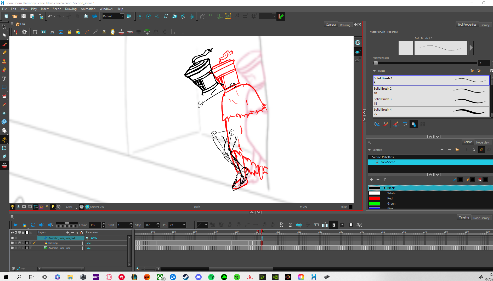
I began animating my first scene by tracing over my animatic, which I had imported into toon boom. I then changed the opacity of the layer that the animatic was on to allow myself to see the drawing I was working on. As I used a lot of video references when I was creating my animatic it made it so much easier to work on. I found when I was tracing over my animatic that I was cleaning up the drawings rather than drawing from fresh. Some scenes were easier to animate over than others because of my animatic being more detailed in some scenes. I felt I had to show more attention to the physics of the cloak and rag on top of the helmet of the main character, rather than the positioning of the helmet. Due to this I would often copy the frames over from a run or walk cycle and scaling them differently in order to save time as I really wanted to have a complete animation by the end. I found the helmet of my character quite difficult to draw at times because of the amount of circles, and cylindrical shapes it involves. When drawing it from a different perspective I often ran into trouble trying to make the line work look clean.
Here is an example of my working over my animatic:
Part of the issue I found with having used a rotoscope technique for my animatic was that the framerate didn’t always seem consistent throughout the animation. I found myself going back to those scenes in particular and having to remove frames in order to try and keep a steady flow during the animation because some scenes looked cleaner than others. Having said that my favourite scene to animate was the fight between “Nomad” and the three guards that were waiting at the double doors down the tunnel. The movement in the scene was very complex so I wanted to spend extra time trying to make it look good as it involved some of the most difficult movements I have ever had to animate, especially the side flip over one of the guards.
I found it much easier drawing my “Nomad” from behind as I could cover his feet with the bottom of the cloak and I could use the swaying head movement and tilting of shoulders to show the characters movement and the fact that his arms were underneath the cloak for the majority of the animation also took a lot of the stress off from keeping the animation looking clean.
One of the tools in Toon Boom which I found really useful was the ability to have background shots pan and zoom in and out. This helped showing the scale and positioning of characters greatly and it saved me a lot of time as I was worried I would need to change the scale of the backgrounds frame by frame in order to try and get this effect.
The most difficult part of the animation by far was the final fight scene between “Nomad” and “Lord of the Bell” because this was wear the protagonist removes his helmet. Up until this point my characters face was covered so I didn’t have to worry about showing facial expressions, rather I could show his expression and emotion through posture and body language. I particularly found the snout difficult to draw when the character was moving from a side angle to face forward, as the dimensions became a bit more complicated. Also drawing the dashed lines to try and separate the different shades of the fur proved to be tedious also as they would need to be lined up in the same part of the the characters head when he was moving. During this part of the animation I tried to have most of the scenes only showing his head to allow myself to solely focus on that rather than over complicate the frames.
During the final fight scene I also realised I had forgot to make one of the backgrounds for a certain shot when both characters were talking to each other. This was relatively annoying because I had to backtrack and create a background for that scene, and when you have already progressed so late in to the project it can be rather frustrating.
Here are some videos which I found really useful during my time using Toon Boom:
Overview
Overall I really enjoyed my time spent on this project, I felt had challenged myself despite 2D animation being my preferred form, we had not animated in 2D since first year. This meant I found myself going back to look through previous lesson material and watching youtube videos to remind myself of techniques I had already been taught. I also surprisingly enjoyed working on the project by myself, it gave me a lot of creative freedom to do what I wanted with the animation and work towards the direction I wanted it to go in. I would have liked to have been able to spend time filling in colour to make the animation more complete but I just ended up running out of time towards the end. From the beginning of the year when we were given our project brief I knew I didn’t want to have dialogue as audio and I had set my mind more towards the animation being more like a music video, but like the colour I just ran out of time when it came the point were I could do either of those things. I really liked using Toon Boom and I found it really accessible so I would like to use it more in the future for personal projects.
If I were to go back and repeat this project I would have liked to have spent more time on the final animation part itself, I feel I spent too much time drawing up backgrounds and in turn I didn’t leave myself enough time to concentrate on working in Toon Boom. I think I was too optimistic with the amount of different environments I had featured in this animation and I would have produced a better animation if it was on a smaller scale.
Despite getting frustrated at times, I am glad I challenged myself to work on this project alone. By working alone you gain a better insight into the importance of each department in an animation team and how they all must work together to create a finished project.