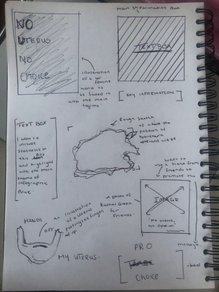
When presented with the task of creating an infographic surrounding the population world meter, i immediately thought of my making my in a more political direction. I knew I wanted to choose Abortion as I feel it is a very relevant Topic at the moment with everything going on Northern Ireland and outside countries as well. I started with creating a sketch of what I could do for the infographic as it isn’t perfect but helped gage where I could put the information, images and illustrations.
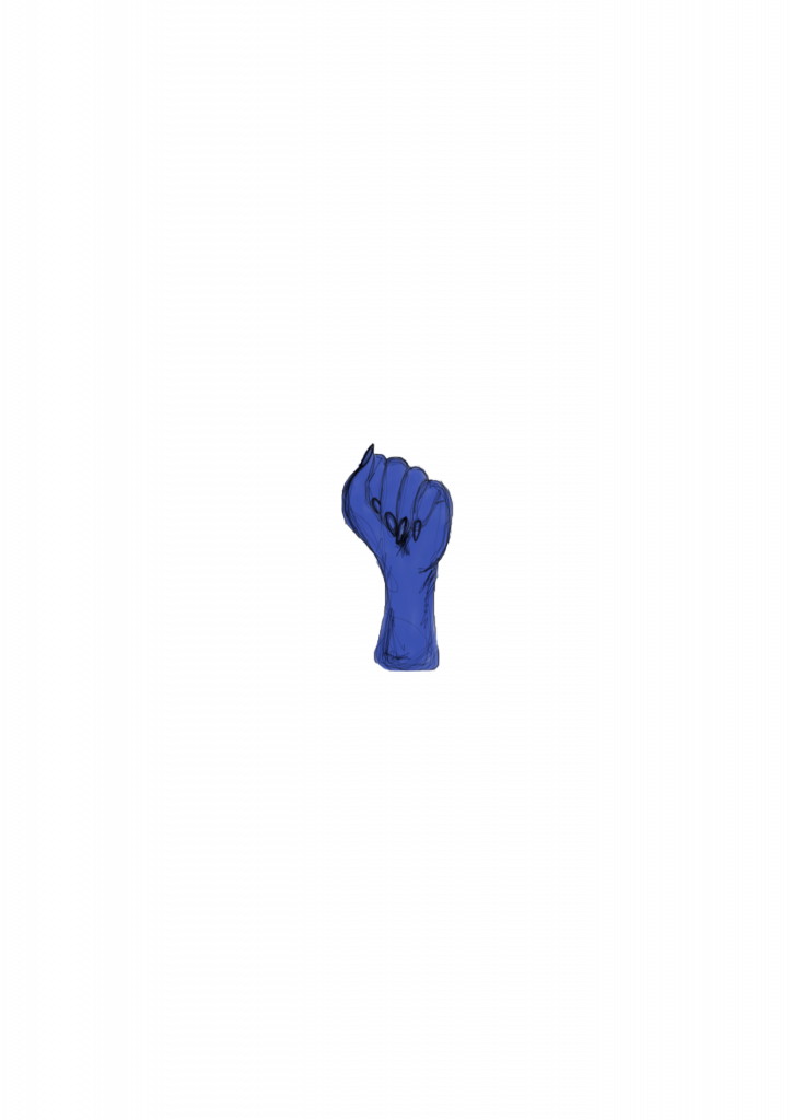
With this, is added to created some illustrations and decided on what my colour pallete would be for my Infographic.
These where some ideas of what I wanted to include in my Infographic and with this I then decided on an Analogous colour scheme with the colour blue. This was my outcome


