For our first influences class we explored the use of graphic marks within an urban environment, how these marks, often signs have added meaning to our spaces, additionally how architecture cannot act alone and requires signage in order connect and communicate with people in an urban environment. Another aspect of this project was discovering how signage has a tone of voice just from looking at it, although everyone will interpret signs differently it is safe to say that some signs we may perceive as: Friendly/unfriendly, welcoming/unwelcoming, fun/serious. Additionally, we learned how we can identify cultural indicators, the purpose of a building, the age or history and perhaps services provided by looking at a signs content and design.
For our first task we were asked to go out into our surrounding urban areas and capture images of 8 key areas:
- Shop signs/commercial signs
- Wayfinding signs
- Ad-hoc signs, posters, stickers etc.
- Street signs
- Regulatory signs
- Directional signs
- Architectonic (Architectural) signs
- Graffiti, tags, murals
We were asked to then explain what these signs were made of, the purpose and if the message is well portrayed.
I really enjoyed this task, living in Belfast there were a lot of signs and inspiration for this, it taught me how to really take a deeper look at my surroundings, and to have a critical eye when looking at signs that could have been improved. It made me realise how much we depend on signage to dictate our pathways, inform, and encourage us, and lastly how design is key to an effective sign.
Shop Sign – Fuzz Vintage
The purpose of this sign would be to inform customers this is the name and building for their store, simply saying ‘Fuzz Vintage’. This seems to be printed onto a plastic board, I really love this sign and think it is incredibly vibey, it looks like a place that would be fun due to the fuzzy lettering and the lovely psychedelic swirl in the background.

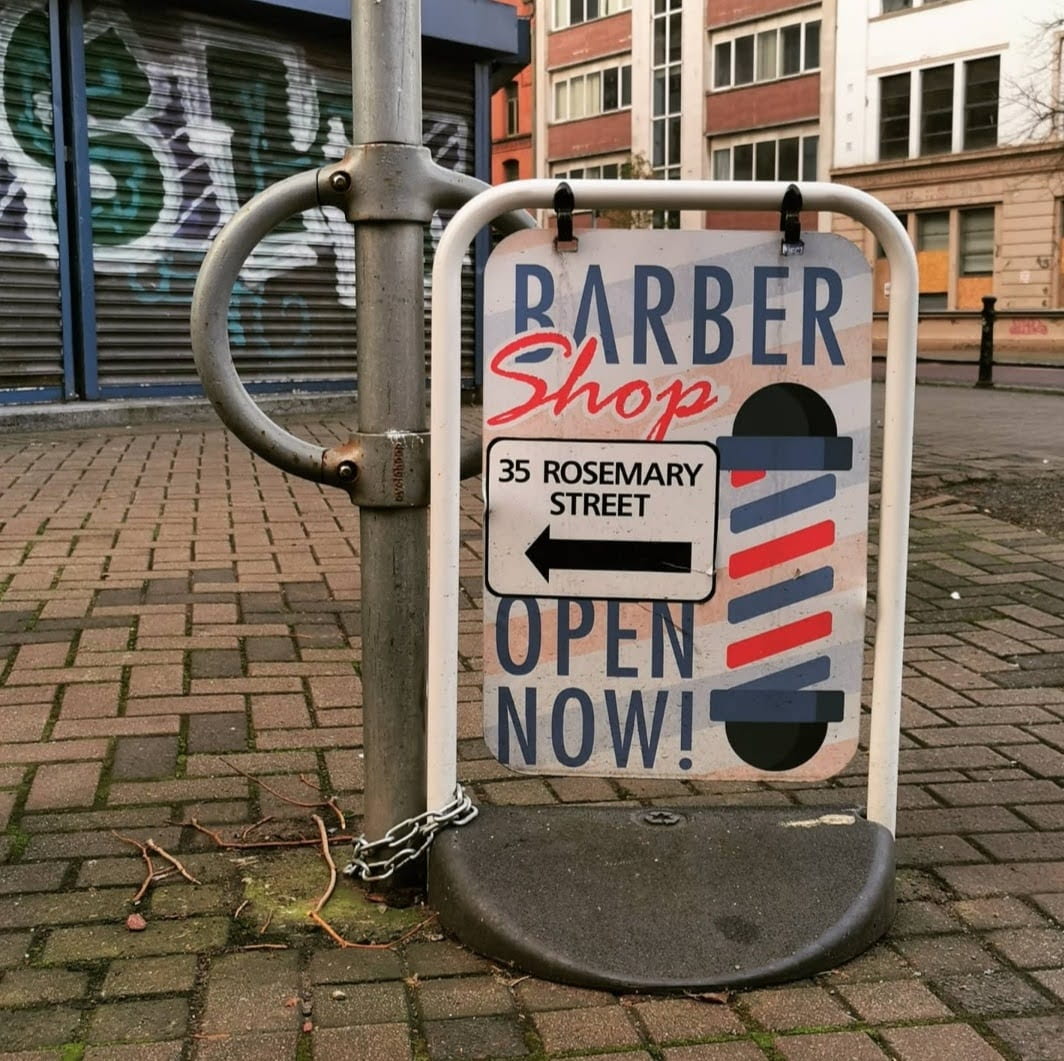
Directional – Barber Shop
Purpose is to direct customers towards their business and made from metal with a sticker sheet stuck onto it including the address of their shop however it does not include a personal logo or name of their barber shop. I don’t think this sign is really anything special, it does its purpose of telling people where they need to go and is comforting having that well known ‘Barbers Pole’ however I think it would have a lot more of a personalised touch.
Ad-Hoc – Hench Gym
Purpose is to advertise their gym, printed onto a plastic sheet and displayed on a metal frame. I don’t like this sign at all and I don’t think it displays a clear message, all it has to offer is a slogan which didn’t make a lot of sense to me while walking by as well as their email which is small and hidden in the bottom right corner. The colours are quite attention grabbing however I feel there is too much text which overwhelms the reader.

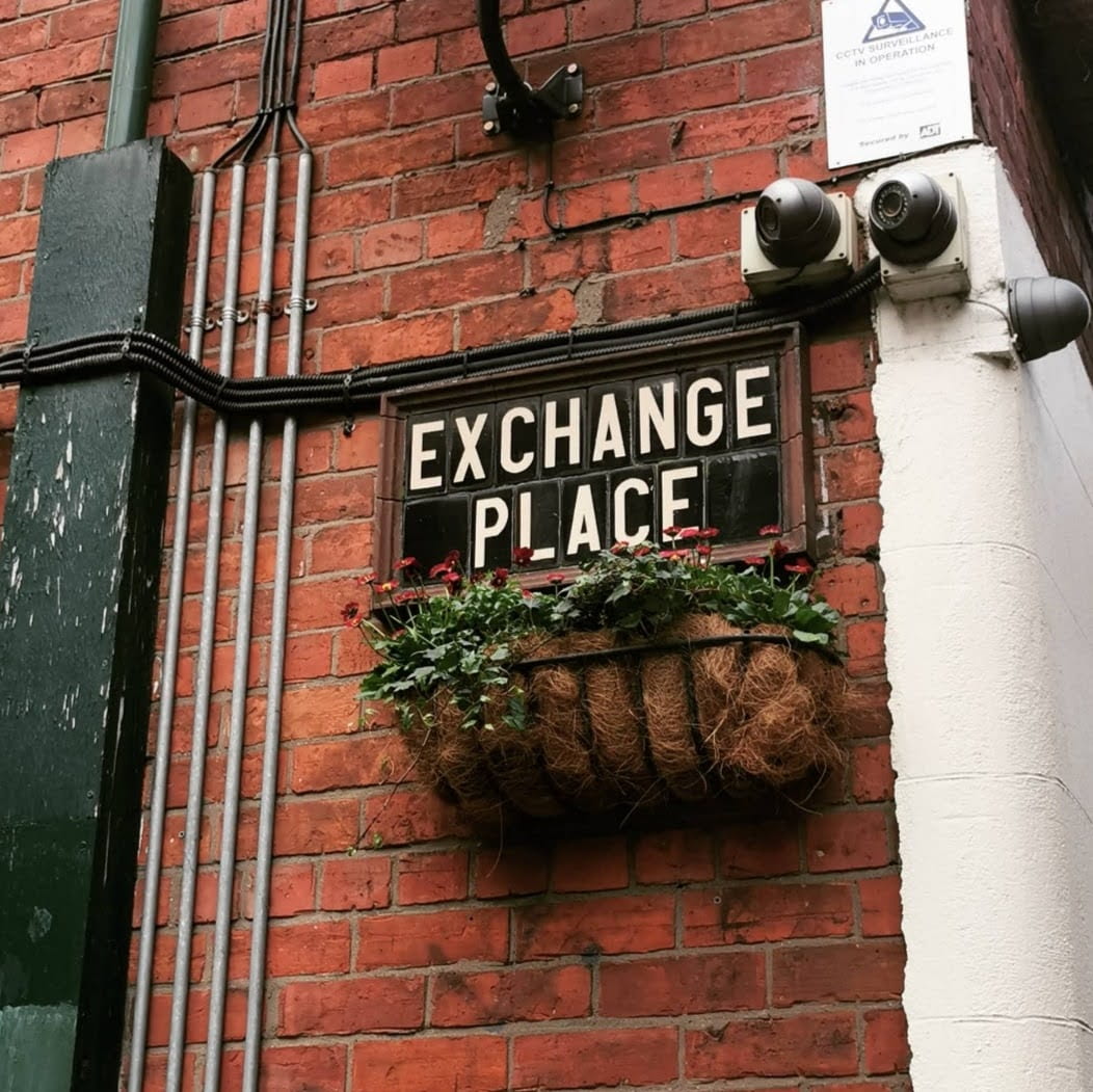
Street Sign – Exchange Place
This sign simply serves to display information, it is made from tiling along with a wooden frame which indicates it and the street would be quite old. This sign is really quaint and blends in well with its area.
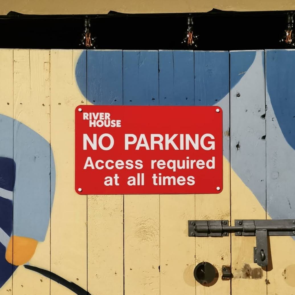
Regulatory – No Parking
An effective sign printed onto plastic board and mounted onto a wooden door, the background is a bright red accompanied by a simple sans-serif white font, it grabs the attention due to its vibrancy along with the use of all caps for the ‘NO PARKING’ – which gives it a very authoritative tone.
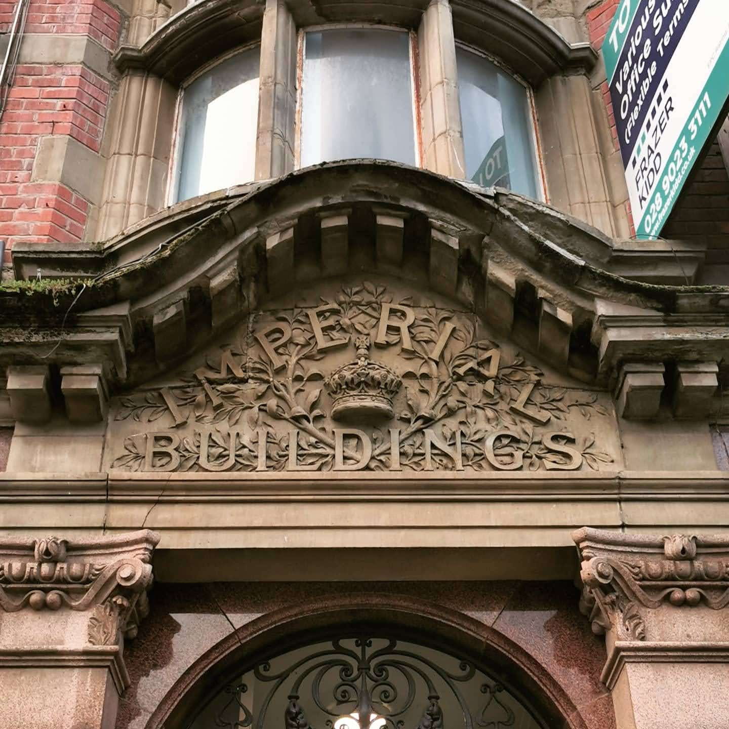
Architectonic – Imperial Buildings
A lot of elements make this a very regal looking sign, it is quite large displayed in stone above the doorway, along with a lot of baroque style detailing around the very decorative lettering.
Graffiti – Show Some Love
A very simple spray-painted yellow stencil including the words ‘Show Some Love’, this is actually a charity organisation within belfast which uses art to raise funds for homelessness. just looking at the graffiti it has a very simple tag line which reminds me instantly of their cause, short and sweet.

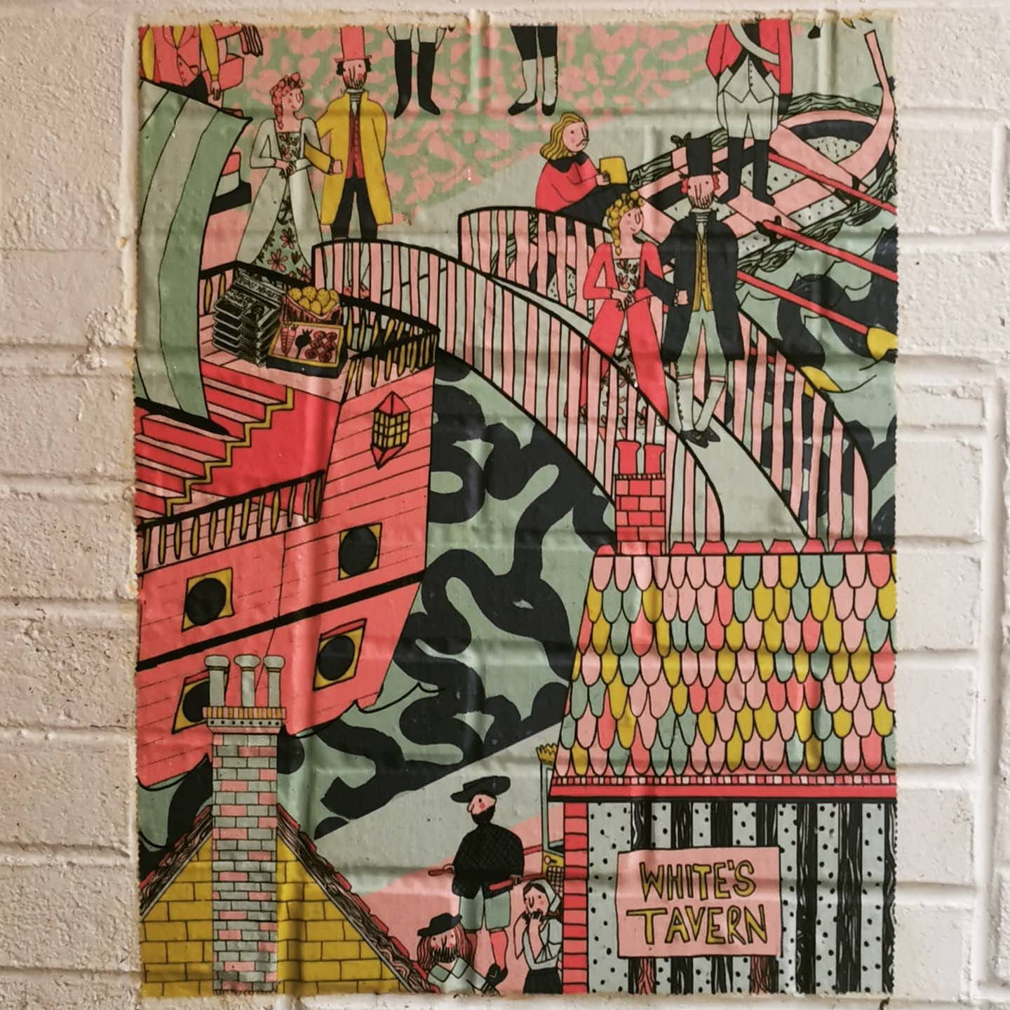
Mural – Whites Tavern
A very lovely illustrative mural painted with acrylics, it sets the tone for the type of bar it is, it gives a bustling and friendly kind of tone with the pastel colours along with the many friendly little characters which can be spotted within it. I like how it has the bar name displayed at the bottom however I feel it could have been made slightly bigger as I didn’t realise what the mural was for until I looked a lot closer.