During these weeks our group realised that the enemy animations had not been created yet, the group member who was assigned to these was no longer able to do them and the lead animator was very busy with the main chapter animations, so I decided to do the enemy animations, I was able to get two of them completed-


the first one is a purple skeleton figure who’s main attack is slashing, this enemy is one of the most powerful common enemy types the player can come across, so I tried to make it look menacing, the design was created by Jamie in our group.I animated this in Procreate and I tried to add in a smear frame to make his swipe look more fast and powerful, it was also fun to animate his chains moving with his arms going up and down like that, the arm movement is meant to be saying “come at me” as this enemy wouldn’t be afraid of a fight.

 this enemy is a bit different, it is instead blue and has a more nervous squirmy animation,this animation is meant to show that this type of enemy is more hesitant to attack the player and therefore probably does less damage, this enemy has a ranged attack in which it screams at the player and shoots some sort of beam form it’s mouth, it’s kind of like the enemy is nervous so it vomits up its attack.
We had decided early on in our development that the enemies where only going to be animated at one angle as it would be so time consuming to animate them at 4 angles like the main character ‘Red’. I also sadly was unable to get the last enemy finished as I was doing these very late in the project due to unforeseen circumstances.
and lastly I finished the death animation I had created, I wanted to make it a little dramatic so she’s falls to the ground, then does a dizzy motion like she’s trying to stop herself from falling, then with her last bit of strength is trying to hold herself up, but eventually falls to the ground and succumbs to her injuries-
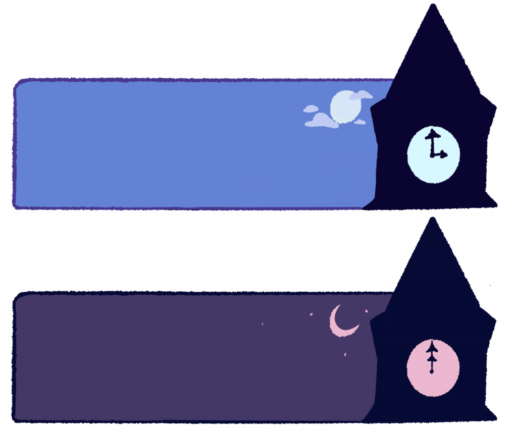
 Finalised text boxes-
these are the final rendered text boxes I finished to be used in our game, the tutors had advised me to change the colours of the text boxes to fit in more with the style of the game so I tired to colour correct the original designs and make them slightly bigger so that their was more room for text-