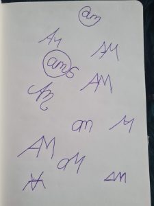
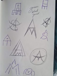
For beginning my personal brand project, the first thing I did was sketch out logo ideas which was a little difficult because my letter choices were A,M,S so that didn’t really connect well without a lot of manipulating. After playing around for a while I decided to try pick out a font so that I could use it, however noticed I couldn’t find a good font that had both letters a and m to curve inwards so I ended up having to do it myself with shapes.

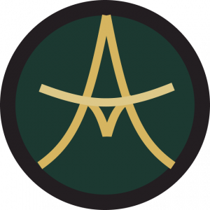
And after picking my colour theme I end up with 2 versions one with and without a gradient, however i decided to go with the one with the gradient as it adds a little something more.

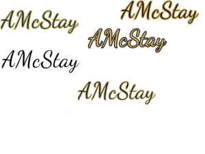
Whilst working on this I also was picking out a font that could work. I wanted something curvy to match my logo, however I wanted it to be still eligible so I didn’t want it too cursive or in italics.

These are some of the options I tried but they all had some problems and it was hard to get good ones as I wanted the a, m and s capitalized which caused some clashing between the A and M however I decided that the font I use would be ‘dancing script’ as it could be easily read and had slight curves. I also played with the colours and added a similar gradient to the wordmark as the logo to make sure the matched.