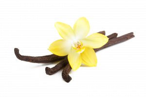

For my logo design, I thought the best shape to work with was the letter ‘V’ as its shape can be easily in interpreted from a triangle and it gave me the most to work with. I also played with the idea of a flower as the brand is Vanilla so I wanted to try combine the two ideas and did several sketches exploring the idea, as well as trying other ideas such as ice cream.

From here I tried looking for a font to use in both my logo and wordmark and explored several ideas. What I was mainly looking for was symmetrical strokes and preferably bent outwards at the top as I thought it would be good to try make the ‘V’ resemble the stems of the vanilla flower. I initially went through adobes font choices to find something.

I had found a few options I had liked and had messed with letter spacing etc. however I couldn’t find the file that I had done experimenting on. Luckily I had made an another file of a narrowed done option however I wasn’t please with any of the fonts enough to use them. So I went to figma to see the options there as well as work on my logo design. After narrowing down which sketch I liked I began making it digitally with helped in trying to decide a font to use.

This was the first draft of a logo and possible font, however I wasn’t certain about the design as I couldn’t make up my mind if the flower was too much as I had then begin to think more about my simplicity values and I didn’t think this iteration worked for it. After receiving feedback about my concern, we looked at my sketches again to find something that represented simplicity better. This also meant find a new font to use that also was more simple.

After writing down a list of potential fonts on figma, I decided on ‘ABeeZee’ as it was very simple and had symmetrical lines so it ticked the boxes of what I needed. I also manipulated the ‘V’ to resemble the stems of the vanilla flower and also it ties in with the logo. The logo consists of 5 manipulated ‘V’s joint together to form a flower. At first I tried to replicate the actual vanilla flower with the bottom petals being separated more, however this didn’t look good so I opted to make the angles all even. I also liked this idea better as it could be animated to form the logo or wordmark easily.
