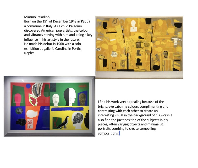
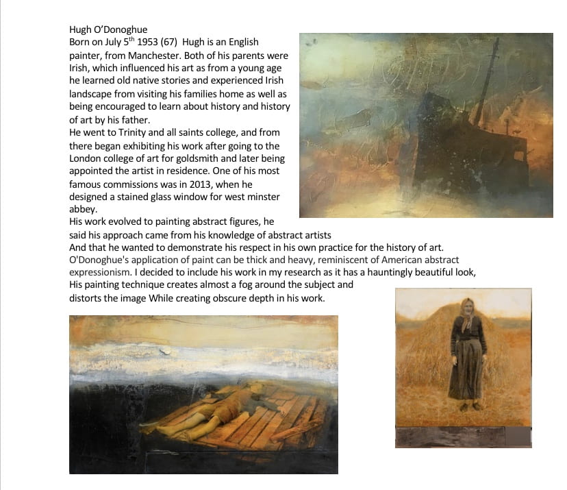
Exhibition Catalogue Updated_compressed

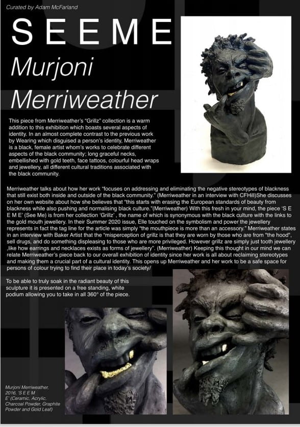

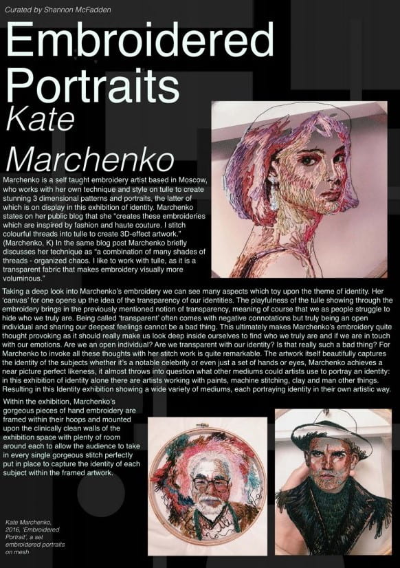
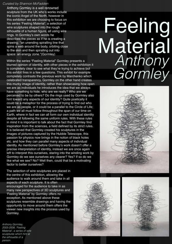

Exhibition Catalogue Updated_compressed
One of the main aspects of my final piece dresses, was the patterned fabric I created to make them from, many of which are printed on using natural and lino-printing techniques. A big inspiration for my work even from GCSE, is William Morris, a pioneer of textile art, most well known for his pattern work, which can still be found in modern homes today. I have been inspired by his work because of the classical or vintage aesthetic, but also the subject matter of his work being mainly nature or small animals amongst intricate designs, which despite the use of fantastic colours still portrays the look of the wilderness.

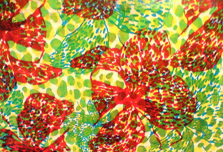
Another artist I found influential when creating my patterned work was Claire Burchell, a textile artist. I found her work fascinating as the colour schemes are vibrant and in contrast to one another, making for a striking composition, as colour has always been an integral part of my creative process. I found this reminiscent of some of the work I had already completed in textiles earlier in the year, and wanted to try incorporate more of her style into my work this semester.
communication is defined as the imparting or exchanging of information by speaking, writing, or using some other medium.
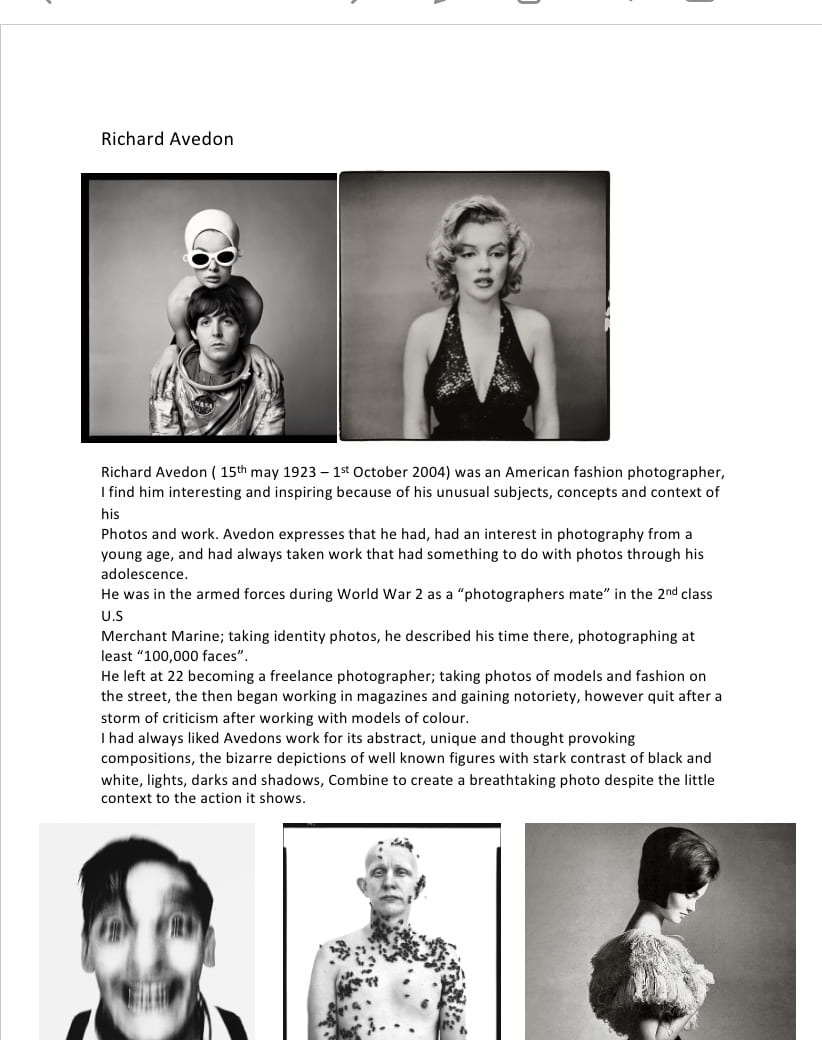
communication through logo design is extremely important to the prosperity of the company or business. In the fashion industry it is imperative that the logo can be easily identified, as this will help consumers associate it with the product. For example ‘Louis Vuitton’ is a widely known designer brand, which has had such success with their logo; a simple monogram and a flower motif, they have incorporated it into a pattern which is commonly printed on many of their items. The colour used on the logo, is primarily black and the typography is sleek and almost modern despite being created in the 1890s, this is done to give a sense of elegance and innovation, as it can withstand any changing style and still remain timeless.
Louis Vuitton Logo | Design, History and Evolution (famouslogos.net)
![]()
I decided to try to create a logo for an online second-hand clothing store I run with my sister, its called Nihilistic Clothing, its current logo is a simple block lettering of the name in black and green, however I want a more creative style.

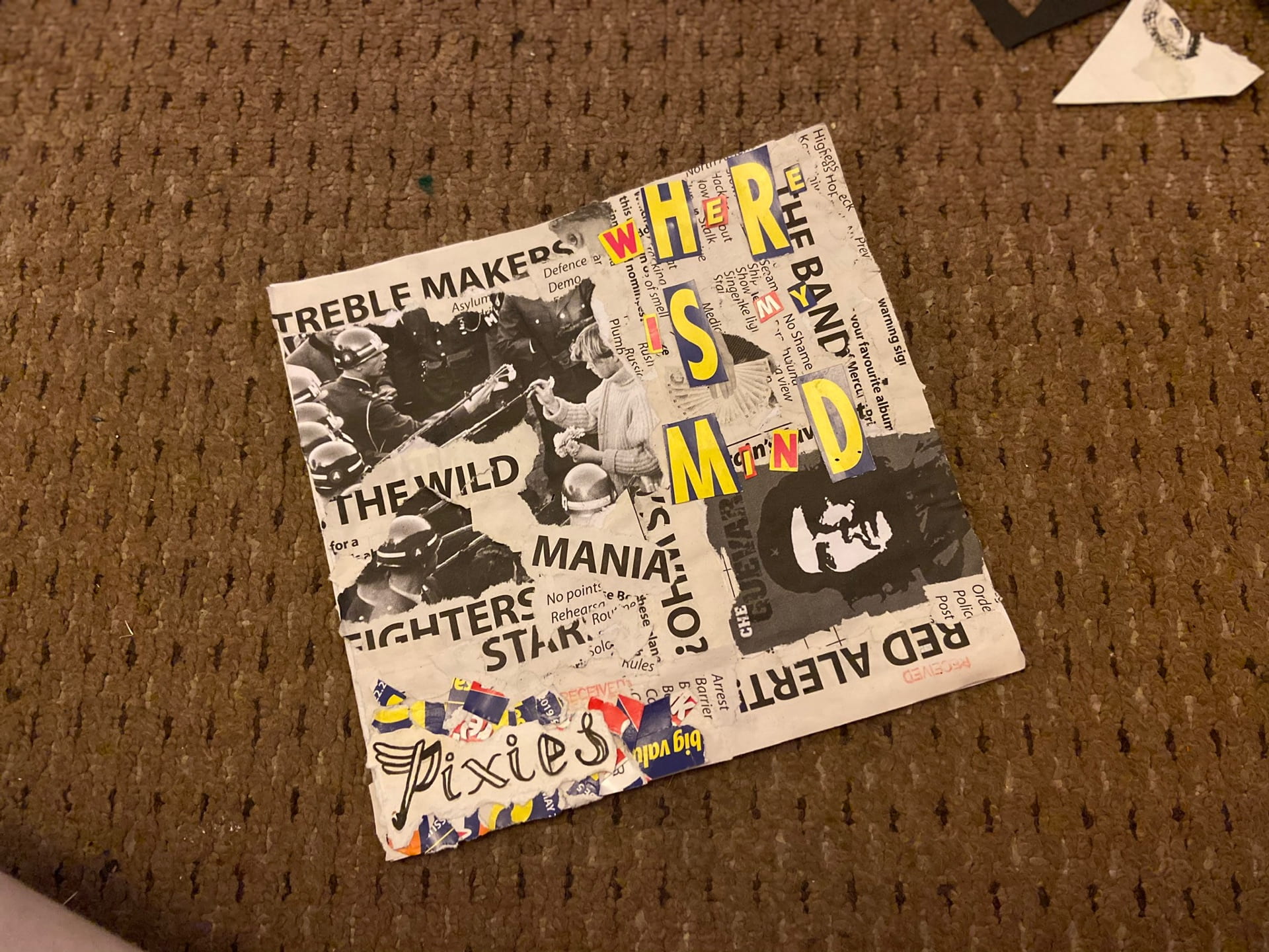


I began my album cover with thinking about how I wanted to present it. I decided I wanted to go with the ripped up homemade style that other punk artists have utilised in the past. I found a word search book that worked perfect for my idea, I wanted it to look like ripped up newspaper articles and the titles of the word searches were mostly relevant to the situations I was trying to create. For instance I found titles such as “Britain’s favourite”, “red alert” “shady business” and others that made it seem like they might have been from articles about the band.

I then started to print old influential photos that I thought might be relevant, for example a group of punk rockers in a pub in the 70s is on the back of the cover.
i then cut out some letters from the cover of the word search and created a ‘random font’ style title for the song “where is my mind” by the Pixies.
after that I created some paintings of the logo, band title and album name for the front and back of the cover in the same colour scheme as the ransom font at the front.
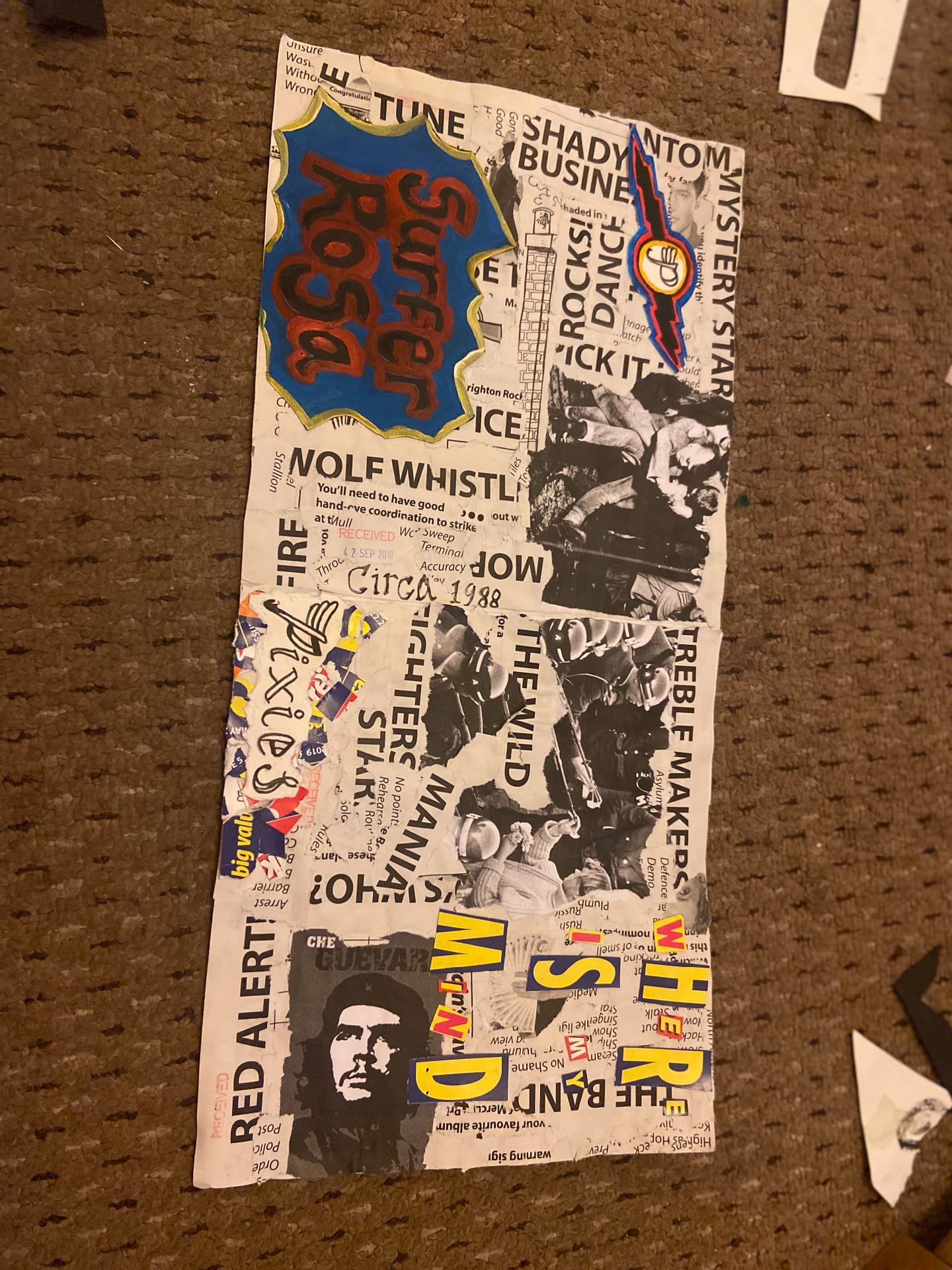
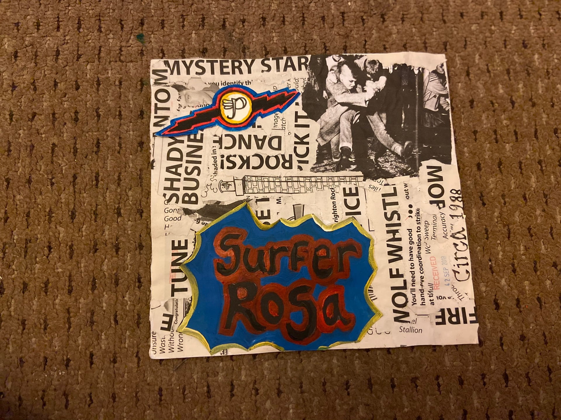
i am happy with the outcome of my work I think it works well as a album cover and I finished up with the creation I wanted in the beginning.

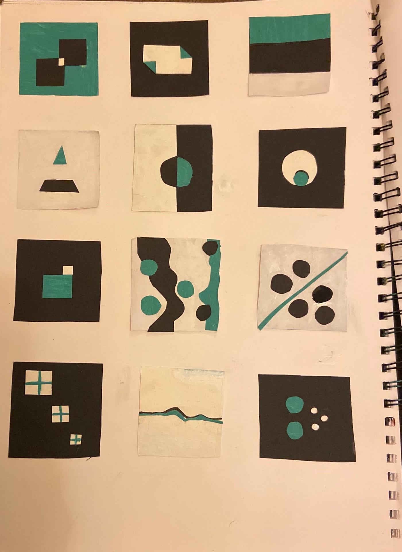
Our first task for Illustration was to create drawings relative to 26 words for example: Ratio, Scale, Align.
we were asked first to create 10 sketches of the first 10 words, I chose the colour scheme of clack white and turquoise.
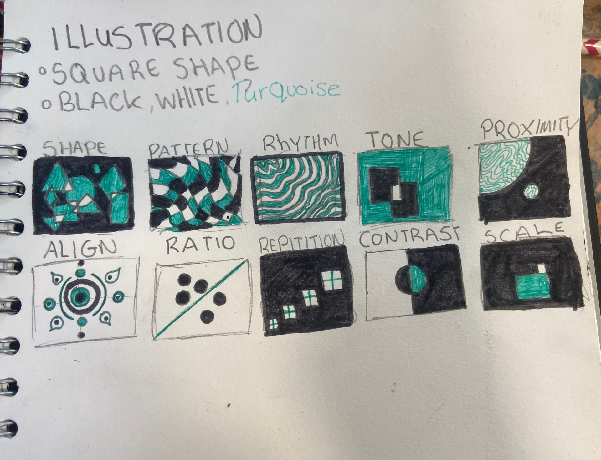
I decided that I would continue sketching the rest of the icons, however there were a few that I could not think of.
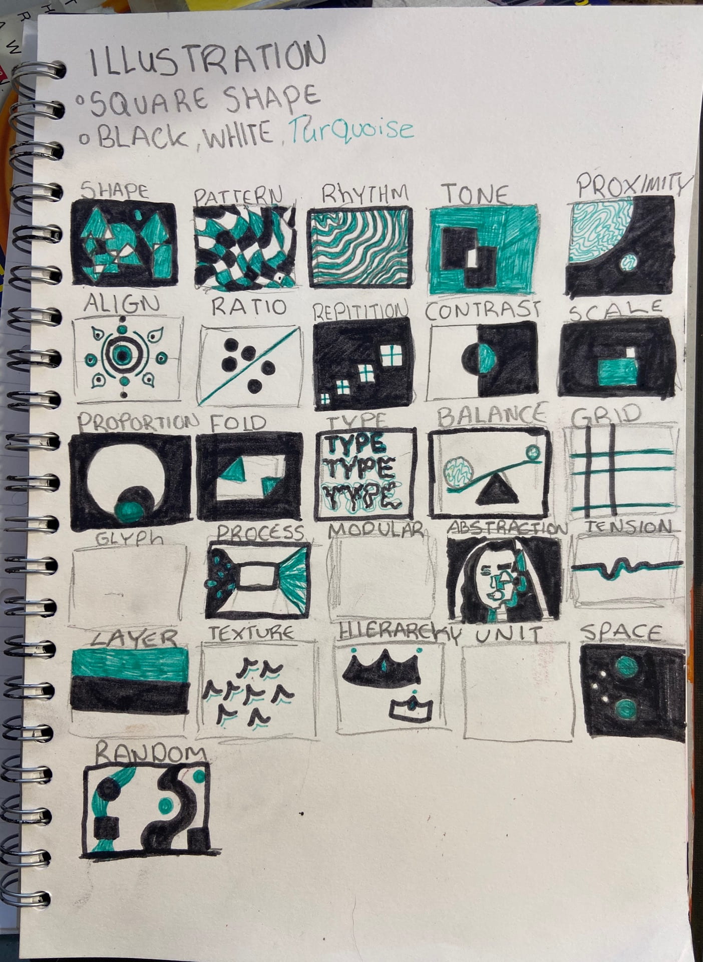
I was unable to create virtual Versions of my illustrations as I did not have access to a laptop or computer, instead I created a series of 24 paintings in the same colour scheme as my previous quick sketches.
I am happy with my outcome and through to my process of creating them I decided to incorporate a colour scheme into my work in the future as I think it ties the work together and gives it a nicer overall look. The project also changed my perception of what illustration was.
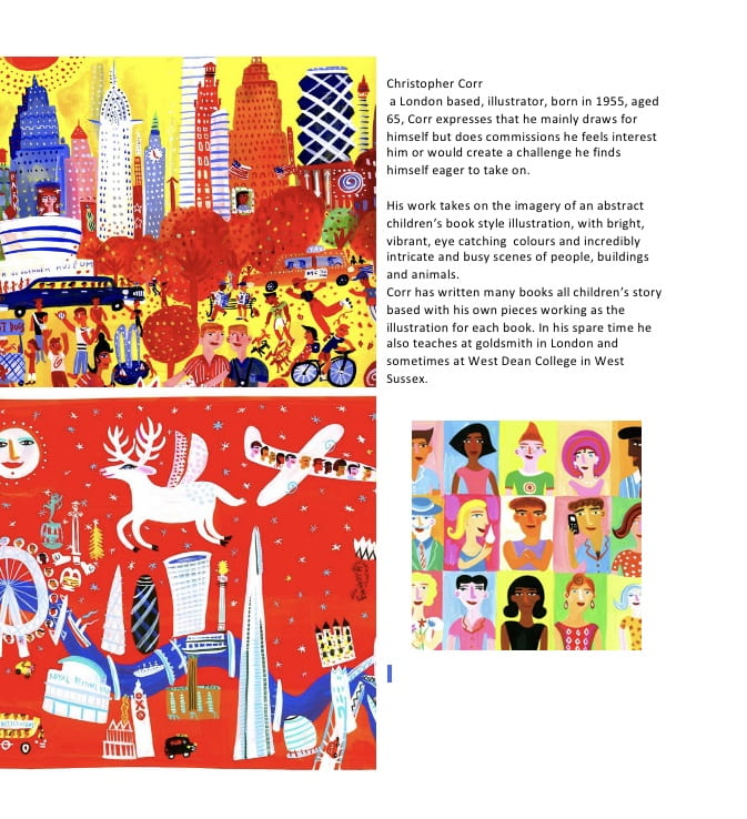
to investigate illustration as a career and a course I did some research into illustrators

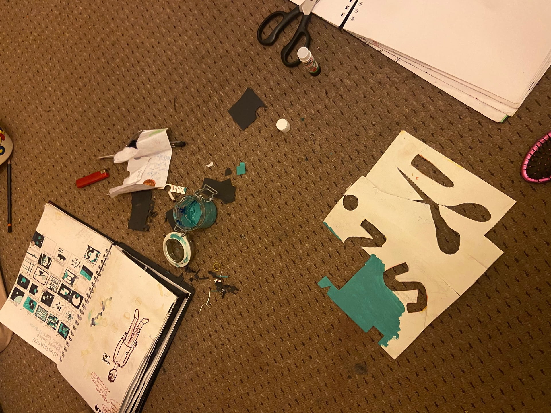
we also had to create a number of cutout, paper versions of our illustrations. I continued my colour scheme and used scraps of old, recycled paper to reduce my waste in my work.
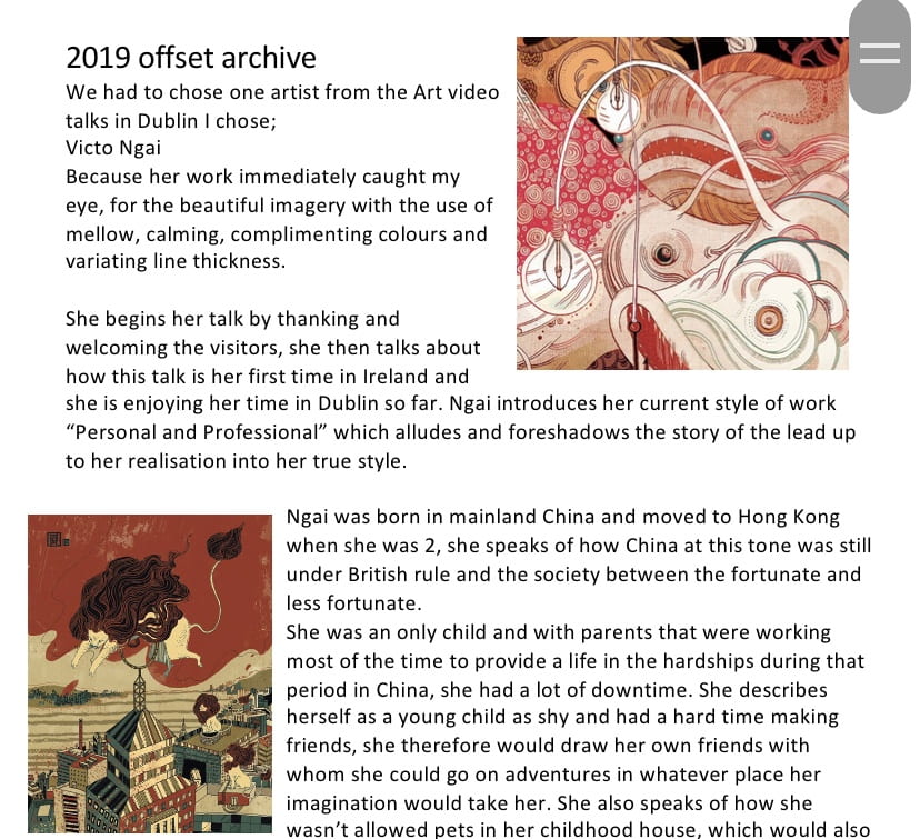
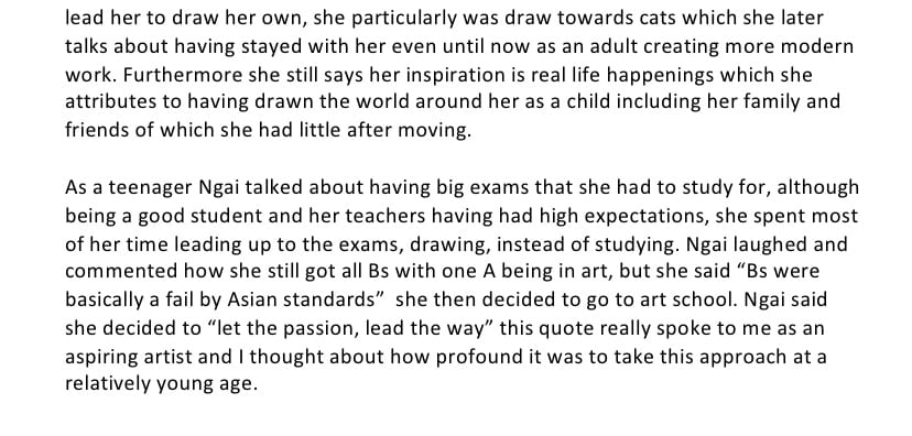
I also watched the offset archive video talks in Dublin in 2019 , I chose illustrator ‘Victo Ngai’.
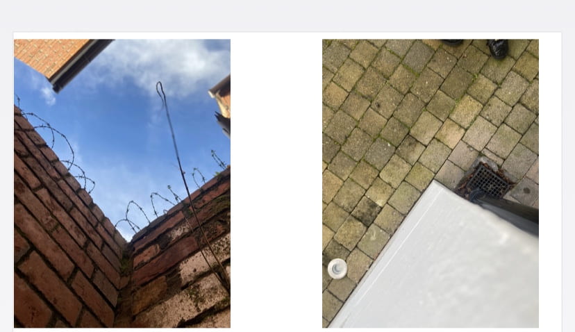
We were assigned to create a series of photographs that relate to each other, while also creating an interesting and unique composition.
we were also asked to conduct some research into a photographer that we find inspiring, I chose Richard Avedon


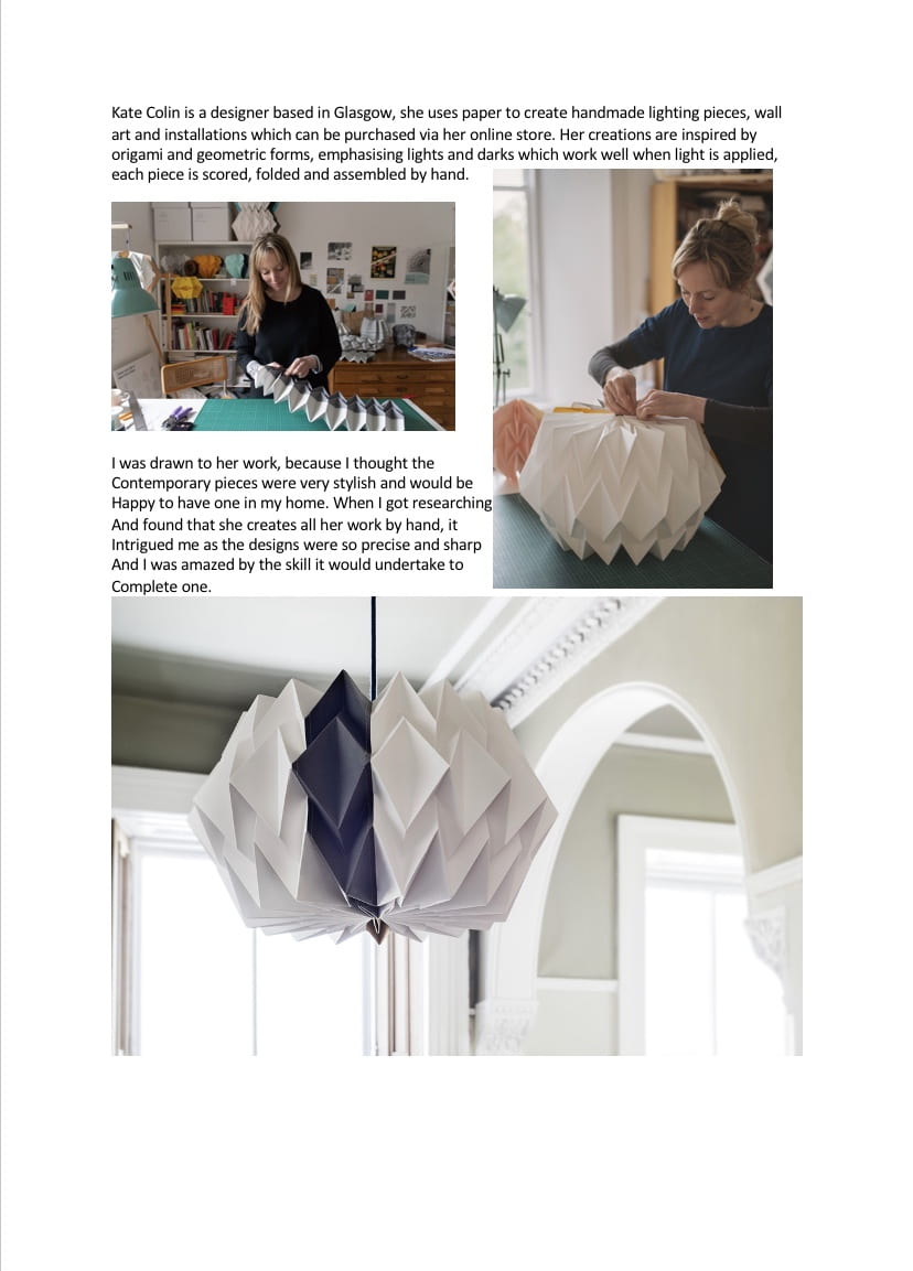
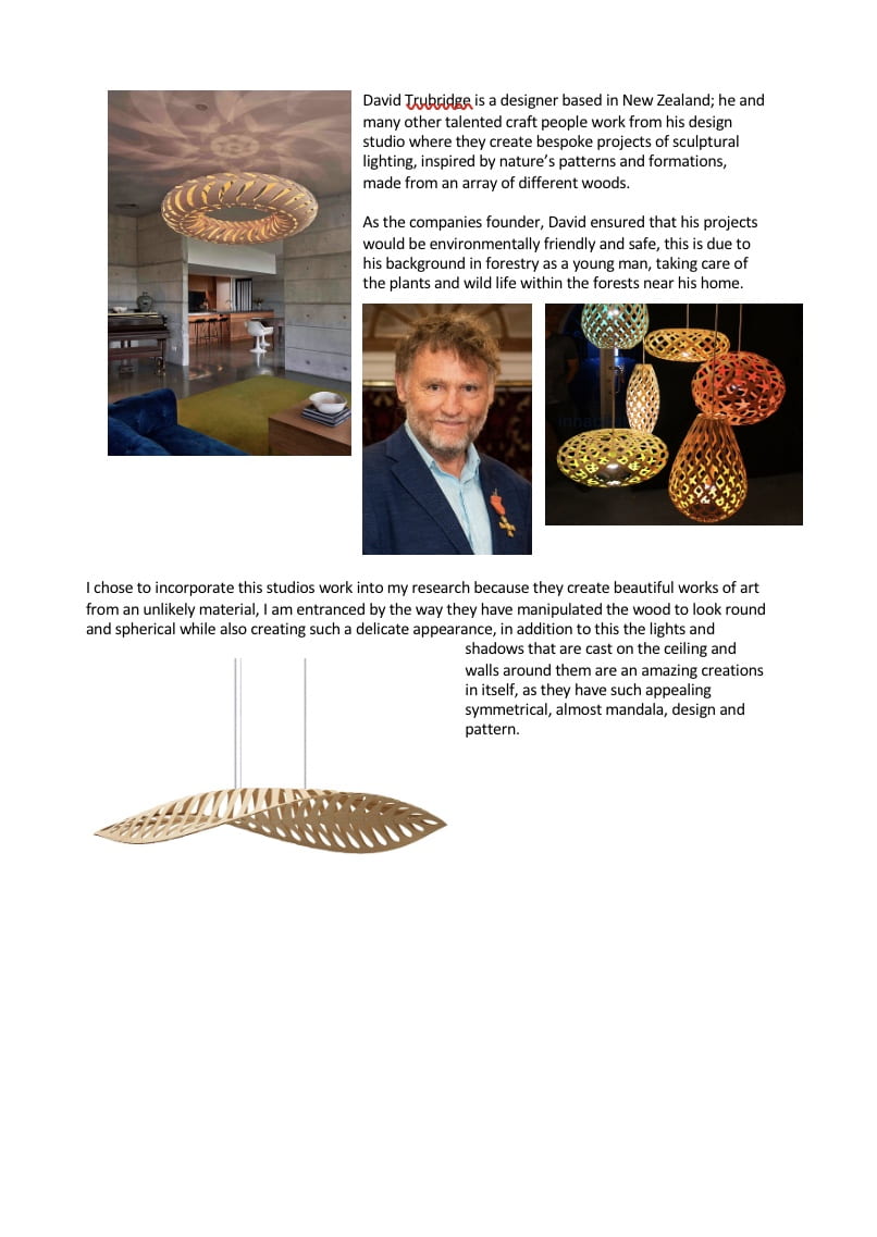
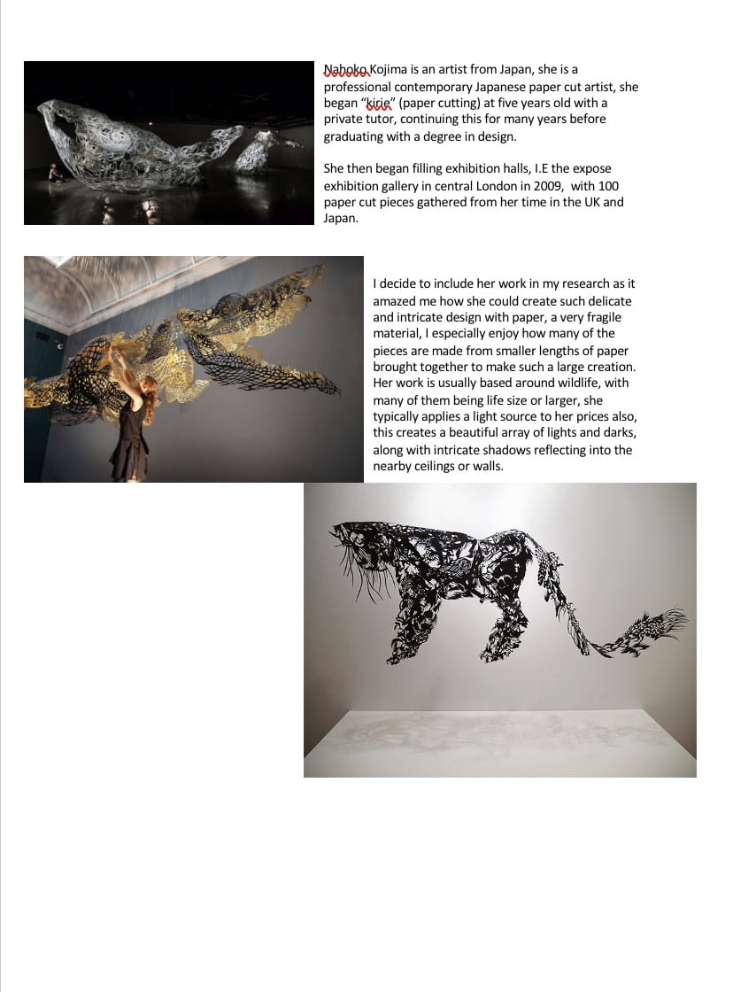
Since we were working with paper To make lamp shades by folding and cutting it last week, we needed to do some research to back up our findings and work.