Pierre Bonnard
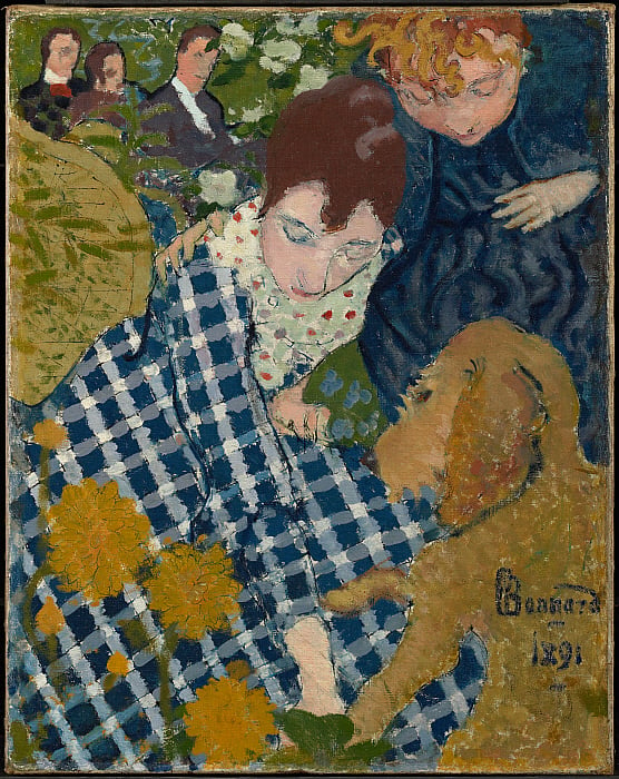
Pierre Bonnard was a French painter, printmaker and illustrator born in October 1867. He was one of the founding members of an avant-garde group of Post-Impressionist painters named Les Nabis. His artwork really interested me as the way he paints and uses different techniques to create art result in very abstract pieces. One piece of art that caught my eye was ‘Women with a Dog’. This was painted in 1891 and it is oil and ink on canvas. The painting depicts Bonnard’s sister and cousin playing with their family dog.
Something I found interesting about this painting was the viewpoint of the painting as it appears to be from a bird’s eye view with very simplified versions of who he is painting. The technique when painting the dog piques my interest most as although the children look like they are sitting down and 3D, the dog appears to be 2D. the different views of the figures allow for a very abstract, decorative form of art.
Another aspect of this painting that I like is the decorative features such as the picnic blanket, what appears to be a basket and the flowers. They appear to be very layered and textured as well as his use of scraping into the paint to create outlines around the objects. These decorative features are techniques that were explored by Les Nabis.
Max Beckmann

German painter Max Beckmann was born in 1884 and is an interesting artist as despite being classed as an expressionist artist, he did not stick with the typical aspects that came with that style of art.
His artwork appealed to me as it is something I have never seen much of. His techniques and style allow for each piece pf artwork to be completely different. A piece of art that intrigued me was ‘The Night’. This was painted using oil on canvas. The painting was painted in 1918-1919 and it appears to show men cramped into a small space which takes up the whole painting, so it is unknown what the small space is, yet despite seeing this initially, the meaning within the painting gets darker.
The most interesting aspect of this painting is the story that is being told through the characters used, combined with the use of colour and form to create this chaotic scene. On the left, we see a man who appears to be hanged by what is described as an intruder. His use of shape shows an interesting depiction of this space that they are in as despite them being in a cramped place, the angles that Beckmann has positioned this man in give a sense of discomfort.
Another thing that is good to look at is the style adapted by Beckmann, which was heavily associated with Fauvism. This technique allows for the painting to spear flat and to get away from accurate representation of space. For example, we see a woman tied up at what appears to be the forefront of the painting, yet she is tied to the back entrance, which allows the painting to have no depth as a forefront image is supposed to be towards the back. I think it was very clever as it allows the story to be seen equally through all the people and does not force the audience to go searching for meaning yet it is right in front of their eyes.
Peter Doig
Peter Doig is a painter from Scotland who is considered “one of the most renowned living figurative painters”. His artwork is very abstract and the techniques he uses to create his art are interesting in how he depicts both the landscapes as well as the figures within them.
The image I have chosen to look at is ‘Two Trees’, an oil painting made in 2017. The inspiration for this piece comes from the landscape that Doig looked onto when living in Trinidad, the Caribbean as a child, where he also returned to in the early 2000s to live. This image has been painted in a way that allows both the background scene as well as the people and the trees to all appear very flat and 2D, yet all on the same level as though they are all at the front. I think thus style of flat, zero depth paintings are captivating as it allows you to appreciate everything in the painting rather than things being disguised due to the perception that they must be at the back. Something I find very strange about this painting is his depiction of local people compared to the visitor. The characters are depicted with a tone of menace as though they are local and locality which is reflected through the colours typically worn by locals as well as their dark completion, yet there’s a contrast in the figure carrying the a video camera, reflecting the migration of people to the Caribbean, more specifically, Doig’s migration and how the local people have been so accustomed to foreigners being there they too adapt the tourist persona of capturing everything about the country.
Gillian Ayres
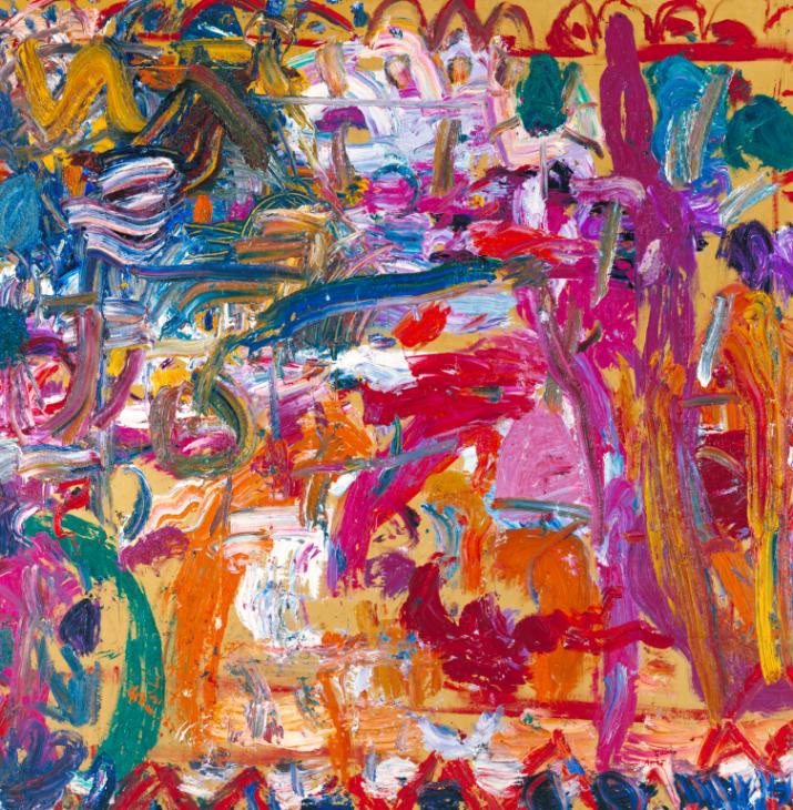
Painter and printmaker Gillian Ayres, born in 1930, was best known for her abstract paintings and prints that use vibrant colours and interesting shapes to create the desired outcome.
Being the first woman ever to open and run an art department, her artwork reflects the true meaning of abstract; “using colour and shapes to create an effect rather than attempting to represent real like accurately.”
I have chosen to look at the oil painting ‘Antony and Cleopatra’, which was painted in 1982. Looking at this painting, it is clear there is no clear direction or structure to portray a message. However, I feel like this style perfectly fits the title of the painting as it is taken from Shakespeare’s tragedy ’Anthony and Cleopatra’. This play contains many elements of different genres of plays, for example, it can be looked at as a romance, history, comedy or even a problem play. This mix of genres to portray one singular thing give a sense of chaos as though there is so much going on in one piece of art, which is seen within the painting. The painting expresses many different colours, shapes, and techniques such as applying the paint thickly, making blocks of colour or just lines, as well as the overlapping and layering of paint. Overall, this painting and abstract style perfectly depicts the chaos of the story which she is maybe trying to portray.
Richard Diebenkorn

Richard Diebenkorn, born in 1922 was a painter and printmaker. His artwork is mostly associated with abstract expressionism as well as the Bay Area Figurative Movement, which was an art movement that “abandoned working in the prevailing style of abstract expressionism”.
Something very appealing about his works of art are the simplicity of them. While only using simple block colours and straight edge lines, he creates paintings that perfectly reflect the setting he is trying to create. When looking at his painting named ‘cityscape #1’ in 1963, he used layers of oil paint to achieve the scene. The way he creates the buildings to the left of the painting, he uses block colours with undertones of warm colours that give the appeal that the cityscape is warm and in a sunny place. He also portrays this by using different shades of the same colour to create the shadows, as though the sun is coming from behind the buildings, casting a light on the road and the grass to the right.
The colours used all come from a limited pallet that are extremely helpful in portraying the image. Although the image is made up of shapes to portray the buildings and fields, it is the colours that allow you to recognise it as a city scape image. Something that is seen often in his paintings as there are many simpler version of landscapes that are just simplified into blocks of colour and overall are effective in creating an abstract piece of art.
Anselm Kiefer

German Painter Anselm Kiefer is an artist who has an interesting way of creating art; by incorporating clay, ash, straw etc into his art. His artwork is used to address taboo subjects and revisit historical moments in time that he addresses in his work, for example, themes from Nazi rule are often reflected in his artwork. The symbolism in is artwork is shown through abstract techniques and the inclusion of other materials to show his message.
The painting I will be looking at is one named ‘Varus’, painted in 1976. The subject matter of this painting is based around the battle in Teutoburg Forest. Within this battle, Hermann and the German people battled the romans, under the command of Varus. The romans were defeated, and Varus died a humiliating death after watching all his soldiers die. Within this painting, Kiefer wanted to honour the Germans that created national identity while also showing the death of the romans.
To do so, Kiefer layered the paint and then went back and scraped away the paint, carving the names of all the fighters into the painting. Within the trees, you see names of the German soldiers’ names, the placement of these is very clever as they are placed at the top of the painting, to symbolise the fact that the people who followed Hermann were lifted higher and displayed in a somewhat ‘hall of fame’ to show ow Kiefer felt about the Germans.
The use of colour is also vey helpful within the paining as he has a limited colour pallet, using greys, blue, browns and greens to depict the forest (all very cool tones to give an eery feeling about the forest). Yet, contrasting with these shades, he also uses a red that is splattered on the ground of the forest as well as smeared across the trees. This contrasting colour is used to symbolise the lost lives of the romans and even the Germans that died also. Overall creating a particularly good message through his technique and different uses art.
Willem De Kooning
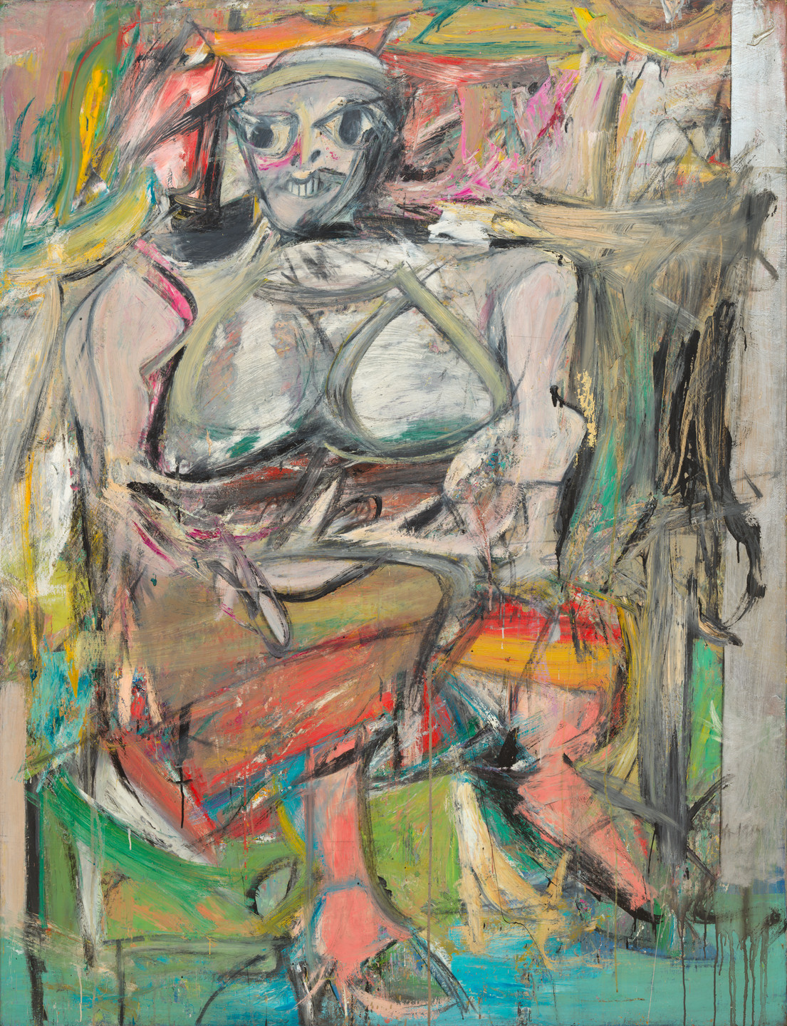
Willem De Kooning was an abstract expressionist painter. He was born in 1904 in Rotterdam but moved to the US and became an American citizen in 1962. His abstract art came in the years after WWII and he became part of an artist group that was known as the New York School, they usually got their inspiration from surrealism.
I picked a painting of his that caught my eye the most. The painting named ‘Woman’ that was painted between 1950-52, shows a very abstract, distorted image of a woman. Using oil paint to create this, he described that “flesh is the reason oil paint was invented”, showing that the image he was painting was meant for the paint and allowed the paint to depict this woman in any way it chose. Bringing in the techniques he used and how he focused on the negative space within the image to single out the woman in the centre.
The time is key to note when analysing this piece of art. The simplicity of the artwork does not reflect the length it took him to complete it. This period when he was painting this involved a lot of repainting. He continually revisited this painting and created many studies of it on top of each other, where he eventually arrived at the outcome. This makes the painting a lot more complex as the undertones and layering of colours show that this image is supposed to be distorted and abstract due to the journey it took him to achieve the result. Overall, I think the painting and style is effective as it shows a woman that can be seen as beautiful de to him allowing the paint to work the simplicity of a woman body, or it can been seen as offensive as many people have judged it as “misogynistic” as it objectifies the women and portrays her in a seemingly ugly way, due to its lack of realism.

