CW2 coursework

I have emailed a word document copy of this to Howard as i was having trouble linking it here.

My Essay

Paul Cezanne was a painter born in Southern France in 1839 who created numerous paintings on the same place “Montagne Sainte-Victoire”, which is a mountain range in southern France. This mountain range became the subject matter of around thirty of Cezanne’s paintings, showing the interest the painter had in this specific place.

Paul Cézanne, Mount Sainte-Victoire with a Large Pine - The Courtauld Institute of Art

1Paul Cezanne, 1887, ‘Montagne Sainte-Victoire with large pine’, 67cm x 92cm, oil on canvas

Firstly, looking at the definition of the word ‘place’, it is defined in the Oxford Dictionary as “a particular position, point, or area in space; a location.” This automatically allows me to identify that Cezanne’s sole purpose of his many paintings were to show the beauty of the mountain range in whatever style he decided to pant it as his paintings did not include a deeper meaning to the term place, but rather were used to just show the beauty of them. Looking more specifically at the 1887 piece named “Montagne Sainte-Victoire with Large Pine” it looks at the scenery from an interesting viewpoint: using a large tree and its branches to frame the mountain and create a picturesque scene that includes techniques that complement each other.

When looking at the painting, the simplicity of the shapes used by Cezanne were highly effective. When painting with oil on canvas, the layering of colours allows for things to be built up and expressed differently. In this piece of artwork, the artist uses soft blues to build up the sky.  He wrote that the colour “blue created atmosphere”[1], which shows how he wanted the calmness and peaceful atmosphere of the landscape to be picked up, due to the paleness of the blue that allows for a softer look and more relaxed painting. He then goes on to use a light grey as well as peachy tones built up on top of it to create the mountains. I find this interesting as it does not only simplify a mountain into just colour and shape, but also allows for it to be the focus of the painting due to them working in coherence with the other colours in the painting as the more saturated yellow and blue that surrounds it, only make the mountain stand out more. Again, in relation to his use of colour, the yellow he used to depict the fields and stretch of land between him, and the mountain is used to reflect “the play of light”[2] as these colours are associated with the sunshine and warm climate of the southern regions of France. This further brings in the term place as he has taken into consideration the climate of the place he is in when creating his artwork.

An extremely effective aspect of this painting is his use of line, seen in the painting as a large tree that frames the mountain range in the distance. On first look at this painting, the tree appears to be overlooked as your focus immediately goes to the picturesque mountain range in the distance. However, the tree goes unnoticed as it is the tree that allows your focus to go to the mountains. His use of placement in terms of where he is standing to paint this, show that the objects in the painting all work together as one, to allow the outcome.  This is effective when using the word place as even the placement of the artist himself, allows for it to tie together perfectly.

clouds

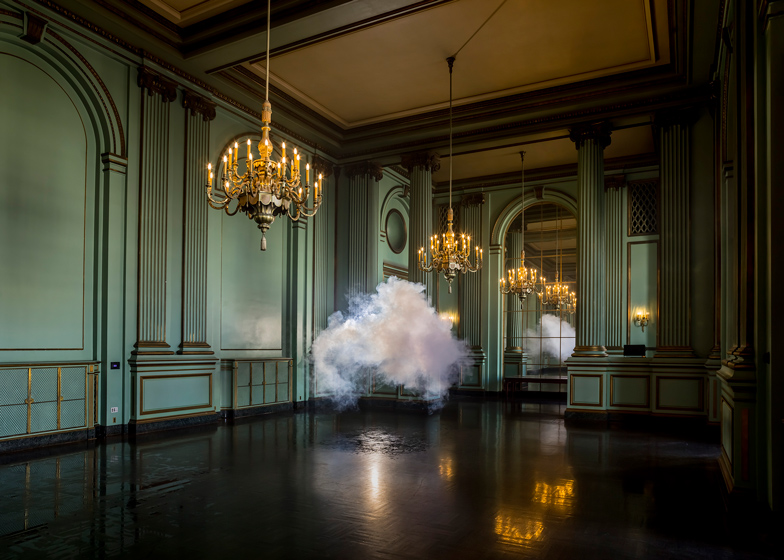
2Berndnaut Smilde, 2013, ‘Nimbus Green Room’, photograph

Another piece of art that shows the word ‘place’ but in a completely unique way is the photography piece by Berndnaut Smilde. Smilde is a visual artist born in the Netherlands in 1978. His work is made up of photographs, sculptures and installations and the piece of work I will be looking at is called “Nimbus Green Room”. This artwork did not initially strike me as one that suits the word ‘place’, however, when looking into everything that went into putting the piece of art together, you are showed how much he had to consider the place and even alter the place to assure his artwork could be captured.

Firstly, the art of making the clouds within the room are completely dependent on the atmosphere around them. Smilde must create the perfect place and conditions to be able to create the indoor cloud. Working with a smoke machine and water vapour, he creates the place he wants the cloud positioned by wetting the area where the cloud should be fully formed and placing a light behind it to get a dramatic affect. The cloud then remains there for a few seconds before evaporating, giving Berndnaut Smilde time to capture photographs.

Something I find interesting is how he has described his artwork as “cotemporary sculptures that consist of almost nothing”[1]. Artistically, this is an interesting way of looking at what he is taking photos of and how important it is to place. Despite him needing the perfect place to create the perfect conditions, it is the place surrounding the cloud that is really being taken. The traditional style of the ‘nimbus green room’ is what makes the photograph interesting as the cloud is there for only a moment in time, yet the room brings character and contrast to the cloud.

This form of artwork, creating something that has contrasting elements is intriguing to me. The fluffy, uncontrollable cloud shows a sense of freeness, as the artist cannot manipulate the shape of the cloud while it is in the air. However, the place is manipulated for the cloud to be present and contrasts it with its rich colours and straight edge lines throughout the room, showing that not only the cloud is considered art, but also the place the cloud is in as without it, the image would not have the dramatic outcome and sense of ambiguity, while also the cloud would not exist without the place.

I think it is all captured perfectly by using still images as it is a fleeting moment in time that will remain still in a photograph and overall shows an interesting, creative way of using a place to create art.


[1] Direct Quotation from Storytellers Summit in 2019. Smilde give a talk on the art of making clouds- sourced from Youtube.

[1] Quotation from The Courtauld Institute of Art, “Paul Cézanne, Mount Sainte-Victoire with a Large Pine, 12 July 2019.

[2] Quotation from The Courtauld Institute of Art, “Paul Cézanne, Mount Sainte-Victoire with a Large Pine, 12 July 2019.


References

“The Art of Making Indoor Clouds | Berndnaut Smilde | Storytellers Summit 2019.” YouTube, 7 May 2019

https://www.youtube.com/watch?v=bat_yMCcMCU&t=304s


“Berndnaut Smilde – Ronchini Gallery Artist.” Ronchini, 8 Apr. 2021.

https://www.ronchinigallery.com/artists/berndnaut-smilde/


Kate Andrews, 2 August 2013, “Clouds.” Dezeen, 6 May 2015

https://www.dezeen.com/2013/08/02/nimbus-green-room-by-berndnaut-smilde/


“Mont Sainte-Victoire (Cézanne).” Wikipedia, Wikimedia Foundation, 22 Feb.

https://en.wikipedia.org/wiki/Mont_Sainte-Victoire_(C%C3%A9zanne)0


“Mont Sainte-Victoire with Large Pine.” Wikipedia, Wikimedia Foundation, 24 Feb. 2021.

https://en.wikipedia.org/wiki/Mont_Sainte-Victoire_with_Large_Pine


“Paul Cézanne, Mount Sainte-Victoire with a Large Pine.” The Courtauld Institute of Art, 12 July 2019.

https://courtauld.ac.uk/gallery/collection/impressionism-post-impressionism/paul-cezanne-mount-sainte-victoire-with-a-large-pine

Aoife’s essay

“When a particular space is invested with cultural and social meanings and personal experiences, it becomes a place.” (Tuan, Yi Fu. 1977). Upon searching for a theme to use for our coursework piece, my group decided on the theme ‘Place’. This term is very interesting to look at as it is sometimes hard to define. However, as stated above, place can be a space given meaning and value. I wish to discuss Vincent Van Gogh’s “The Bedroom”, 1888 and Can Togay’s “Shoes on the Danube Bank”, 2005 in relation to this theme and the ideas associated.

In 1888, Van Gogh[1] painted “The Bedroom” a few months after moving into what he refers to as “The Yellow House”, in Arles, France. The painting is self-descriptive, an oil study of the bedroom he occupied in this house when he moved from Paris. Van Gogh considered this one of his best works, writing in a letter to his brother Theo Van Gogh, “When I saw my canvases again after my illness, what seemed to me the best was the bedroom.” A lot of what is known about this painting has been due to the letters Vincent Van Gogh had sent to his brother or to other friends. The painting itself portrays a place to the artist and in turn to the viewer. This space had been very personal to Van Gogh; he himself decorated the rooms and painted pieces to display on the walls for decoration. In social respects, the piece is very intimate, a close encounter with the artist’s bedroom is not something typically seen and perhaps gives us a closer look into Van Gogh’s life.

The painting has actually become discoloured over the years and in fact looks quite different to how it originally did. Again from a letter to his brother we learn that the walls were a pale violet, the doors lilac and the floor red. Van Gogh praised himself on the colours of this room and the painting and said, “looking at the painting should rest the mind, or rather, the imagination”, in the same letter to his brother Theo Van Gogh, Arles, Tuesday 16th October 1888. Giving off a very humble and homely feeling for the ambiance of the piece. The artist liked to work with using complimentary colours and colours that contrast against each other within his pieces. With the original colours of this painting, we would have seen the colours clashing and fighting for dominance but altogether being harmonious and balanced due to the abundance of complimentary colours.

This painting appears to be very successful in terms of creating a sense of place as the viewer is immersed into the artists life in a sense and due to the context we have been given, we understand it is a home, rather than just a room. The fact that this painting is so personal exudes a welcoming and friendly atmosphere which means the painting will work well in almost any capacity to create this sense of place.

The sculpture “The Shoes on the Danube Bank” is a chilling remembrance of events from World War II in Budapest, Hungary. It was erected on the 16th April 2005 by film director Can Togay[2] with sculptor Gyula Pauer[3]. This sculpture has very important cultural and social meaning attached and consists of 60 pairs of iron shoes, appropriate to the 1940s styles in many sizes and styles. These shoes are used to represent the 20,000 Jews who were brutally shot into the Danube River by the Arrow Cross party between 1944 and 1945. These killers often would force their victims to step out of their shoes before shooting them on the bank of the river, as shoes were a very valuable possession during the Second World War. During this time, the River Danube became known as “The Jewish Cemetary” (Reeves, T.Zane. 2011).

This sculpture very clearly portrays a place, not only as a setting, but also as a moment in time. A very thought-provoking and emotionally distressing portrayal of the bitter, cold-blooded events in Hungary 1944-45, the showcase forces onlookers to see what has happened in the past, not to forget and to see some of the crimes that had been committed against the Jewish people during Hitler’s authority in the Second World War.

The use of a metal like iron was a choice made by the artist most likely so that the installation would serve a constant reminder to that which had happened. Iron being a highly corrosive metal will turn green and rust in the rain, meaning that these shoes will become more and more worn-looking over time. This effect paired withy how the artist clearly used an arrangement of different shoes from children’s to men’s and women’s forces spectators to appreciate how this tragedy happened to anyone as long as they were Jewish. We are encouraged to see how the world was such a different place for such a large group of people. This installation is very successful in showcasing place, and we are unable to help but know what the meaning behind it is.

In conclusion, I believe that both works I have discussed, Van Gogh’s “The Bedroom” and Togay’s “The Shoes on the Danube Bank” are extremely successful at showing their audience a sense of “Place” and even the place that they represent. I believe that in both pieces, the viewer is submersed into the work as is the artists intention.

[1] Dutch artist born in Groot-Zundert on March 30th 1853, he died July 29th 1890, supposedly from a self-inflicted gunshot wound in Auvers-sur-Oise.

[2] Can Togay János (Budapest, August 27, 1955 – ) is a Hungarian film director, screenwriter, actor, poet, producer, cultural manager and cultural diplomate.

[3] Gyula Pauer was born on February 28, 1941 in Budapest, Hungary. He was an actor and production designer.  He died on October 8, 2012 in Budapest.

The Bedroom - Vincent van Gogh - Van Gogh Museum

Vincent Van Gogh, 1888, The Bedroom, oil on canvas, 72.4cm x 91.3cm

Shoes on the Danube Bank - Wikipedia

Can Togay, 2005, Shoes on the Danube Bank, iron

Bibliography

Atlas Obscura (2021) Shoes on the Danube Promenade. Available at: HTTPS://www.atlasobscura.com/places/shoes-on-the-Danube-promenade  (Accessed 03-05-2021)

Britannica, The Editors of the Encyclopaedia. (26 Mar. 2021) “Vincent Van Gogh”. Available at: HTTPS://www.Brittannica.com/biography/Vincent-van-Gogh  (Accessed 03-05-2021)

IMDB (2021) Gyula Pauer. Available at: HTTPS://www.imdb.com/name/nm0666718/  (Accessed 04-05-2021)

Reeves, T. Zane, Ph.D. (2011) Shoes Along the Danube: Based on a True Story. Durham: Strategic Book Group. p.190

Sheryl Silver Ochayon/ Yad Vashem (2021) “The Shoes on the Danube Promenade- Commemoration of the Tragedy”. Available at:   HTTPS://www.yadvashem.org/articles/general/shoes-on-the-Danube-promenade.html  (Accessed 04-05-2021)

Transmediale (2021) Can Togay János. Available at:  HTTPS://transmediale.de/content/can-togay-j-nos  (Accessed 04-05-2021)

Van Gogh Museum (2021) The Bedroom. Available at: Https://www.vangoghmuseum.nl/en/collection/s0047V1962 (Accessed 26-04-2021)

Van Gogh Museum (2021) Bedroom in the Yellow House. Available at:  HTTPS://ontrafel.vangogh.nl/en/story/36/bedroom-in-the-yellow-house (Accessed 26-04-2021)

Van Gogh Gallery (2021) Vincent Van Gogh Biography. Available at: HTTPS://www.vangoghgallery.com/misc/biography.html (Accessed 26-04-2021)

Van Gogh Museum (2021) ‘The colour has to do the job here’. Available at: HTTPS:///ontrafel.vangogh.nl/en/story/37/the-colour-has-to-do-the-job-here/ (Accessed 26-04-2021)

Dearbhla’s Essay

The 2006 sculpture ‘Cloud Gate’ which was created in by an Indian born British sculpture artist, Anish Kapoor, is situated in Millennium Park in Chicago. It is a bean shaped, mirror sculpture which is made up of 168 stainless steel plates that are welded together and placed on the ground. The shiny, polished surface of the sculpture gives the viewer ‘a new way to think about the non-objective object.’[1]  In relation to the theme ‘place’ that we have chosen, Kapoor has made it possible for the sculpture to reflect and distort Chicago’s skyline and play with light which changes as the sun and clouds pass by over time. Millennium Park was specifically chosen by Kapoor to display ‘the bean’ because of its beautiful cityscapes which attracted photographers and tourists from all over the world. Kapoor’s sculpture, built in Lurie Park, initially brought life to the plans of Millennium Park which had been delayed for years and promised it a successful future. Edward Hopper’s oil on canvas ‘Nighthawks’ 1942 captures a group on individuals, possible four strangers, in a diner in New York City at night. There is a strong emphasis on the damaging impact of living in a lonely, urban city as Hopper once said, “Unconsciously, probably, I was painting the loneliness of a large city.” [2] The composition of this painting is unique as it allows the viewer to see the individuals from both a front and face on view to see that no one is communicating regardless of their physical closeness. Unlike Hopper’s painting, the onlookers of ‘Cloud Gate’ view can change depending on their position in front of the large, mirrored surface. Kapoor was largely influenced by the texture of liquid mercury and how it reflects light.[3] He has famously said ‘I am interested in sculpture that manipulates the viewer into a specific relation with both space and time.’[4] The sculpture can appear bright and beautiful in daylight or dull and dreary in late evenings, so it is also massively influenced by the place it is situated in. In contrast to ‘Cloud Gate,’ Hopper has used dull, gloomy lighting and shadows that have captured an overwhelming sense of loneliness and human vulnerability which demonstrates the harsh reality that although there is a place of physical closeness, there can be a lack of psychological comfort from one another. The painting ‘Nighthawks’ clearly stresses and highlights that human interaction and our inability to connect has entered society in 1940’s, a long time before the introduction of technology and smartphones which many argue to be at fault for a lack of connection in today’s world. However, Kapoor’s artwork relies on the viewer’s involvement, otherwise the sculpture loses its story. This is shown on the underside of the bean sculpture is the Omphalos which the Greeks describe as ‘the centre of the world’ and it is sacred and traditionally dedicated to a god.[5] This artwork ultimately becomes celebratory in how it creates a ceremonial place for tourists. It can therefore be said that Kapoor’s artwork demonstrates the opposite of Hopper’s ‘Nighthawks’ in how people can be brought together emotionally in places through shared experiences. Hopper was inspired by the, the 1940’s, after the Pearl Harbour Attack and the growing paranoia and anxiety among the people of New York, in case there was a second attack. Unlike Kapoor’s ‘Cloud Gate’ Hopper used a real-life diner in Greenwich Village which sits on a crossroads in reference once again to the crisis of existing physical proximity and the lack of emotional connection in urban cities.

Personally, I would agree that Kapoor’s ‘Cloud Gate’ sculpture is successful, mainly because it is not only beautiful to look at, but he mainly entices his target audience to consider their surroundings and how they see themselves in life. In many ways his sculpture reflects the beauty of the place it is situated within, but it also gets the onlooker involved in some way which is extremely clever and makes it that bit more special as artwork. It is interesting how it becomes a metaphor and acts as a ‘magic bean’ that transforms a place of reality into a new world that in many ways excites onlookers. I would also agree that Hopper’s painting ‘Nighthawks’ is very successful because of how accurately he displays that places can directly influence our experiences of loneliness, particularly urban cities. It is admirable how this painting also gives people an idea of the mental suffering and devastating impact of world war two in America which is crucial in helping new generations try to understand history. The image has no doubt a timeless, universal quality but also raises various questions and invites the viewer to create their own imaginative narrative of what is happening. It is noticeable how similar Hopper’s style is to Van Gogh’s painting ‘Café at Night’ which could VERY well have sparked some inspiration. I believe that credit is due certainly and this is evident as it is one of the most iconic paintings in the history of American Art. After evaluation, the artwork that I would say is most successful in relation of the theme ‘place’ is Kapoor’s ‘Cloud Gate’ because the sculpture would otherwise not have worked if it had been placed in the wrong location and Hopper’s ‘Nighthawks’ is focused more on the raw emotion of loneliness.


[1] Heidi Reitmaier, 2007, Anish Kapoor, In Conversation with Heidi Reitmaier {accessed 27th April} {online} http://anishkapoor.com/177/in-conversation-with-heidi-reitmaier

[2] Edward Hopper, 2021, Nighthawks 1942 by Edward Hopper {accessed on 27th April 2021} {online] https://www.edwardhopper.net/nighthawks.jsp ‘It is Hopper’s most famous work and is one of the most recognizable paintings in American art. The red-haired woman was modelled by the artist’s wife, Jo. Hopper’s biographer, Gail Levin, speculates that Hopper may have been inspired by Café Terrace at Night by Vincent van Gogh, which was showing at a gallery in New York in January 1942.’

[3] Sneha Dewani, 2020, Cloud Gate: A Fun Interactive Sculpture, The Arch Insider {accessed 25th April} {online} https://theclare.com/chicago-bean-history-inside-story-behind-cloud-gate/

[4] Heidi Reitmaier, 2007, Anish Kapoor, In Conversation with Heidi Reitmaier {accessed 27th April} {online} http://anishkapoor.com/177/in-conversation-with-heidi-reitmaier


[5] Richard Storer-Adam, 2021, Cloud Gate – a polished stainless steel sculpture inspired by a drop of mercury taking centre stage in the city {accessed on 27th April} {online} https://www.doublestonesteel.com/blog/art-and-sculpture/cloud-gate-a-polished-stainless-steel-sculpture-inspired-by-a-drop-of-mercury-taking-centre-stage-in-the-city/

Nighthawks | The Art Institute of Chicago

Edward Hooper, 1942, Nighthawks, 84cm x 152cm

Cloud Gate - a polished stainless steel sculpture inspired by a drop of mercury taking centre stage in the city

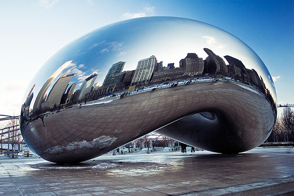
Anish Kapoor 2006 Cloud Gate stainless steel 33ft x 42ft x 66ft

Bibliography

Anon., 2021. Choose Chicago. [Online]
Available at: https://www.choosechicago.com/articles/tours-and-attractions/the-bean-chicago/
[Accessed 23rd April 2021].

Artic Insititute Chicago, 2021. Artic Institute Chicago. [Online]
Available at: https://www.artic.edu/artworks/11628/nighthawks
[Accessed 24th April 2021].

Artsper Magazine, 2021. Artsper Magazine. [Online]
Available at: https://blog.artsper.com/en/a-closer-look/artwork-analysis-nighthawks-by-edward-hopper/
[Accessed 24th April 2021].

Chevrier, J., 2018. The Conversation. [Online]
Available at: https://theconversation.com/anish-kapoors-cloud-gate-playing-with-light-and-returning-to-earth-our-finite-world-102272
[Accessed April 23rd 2021].

Choose Chicago, 2021. Choose Chicago. [Online]
Available at: https://www.choosechicago.com/articles/tours-and-attractions/the-bean-chicago/
[Accessed 24th April 2021].

Curtis, S., 2020. Artistic Fuel. [Online]
Available at: https://www.artisticfuel.com/sculptiure/cloud-gate-chicagos-famed-silver-legume-sculpture/
[Accessed 24th April 2021].

Hopper, E., 2004. Edward Hopper. In: H. Liesbrock, ed. Masterpaintings . Munchen, Germany: Schirmer/Mosel Verlag Gmbh, p. 120.

Hopper, E., 2021. Edward Hopper. [Online]
Available at: https://www.edwardhopper.net/nighthawks.jsp
[Accessed 24th April 2021].

Kapoor, A., 2008. Anish Kapoor. In: N. Baume, ed. Past, Present, Future. Cambridge: Mit Press, p. 143.

Kapoor, A., 2021. Anish Kapoor. [Online]
Available at: http://anishkapoor.com/210/cloud-gate
[Accessed 23rd April 2021].

Martinique, E., 2018. WideWalls. [Online]
Available at: https://www.widewalls.ch/magazine/edward-hopper-nighthawks-painting
[Accessed 24th April 2021].

Mastropieri, K., 2020. The Culture Trip. [Online]
Available at: hhtps://theculturetrip.com/north-america/usa/Illinois/articles/brief-history-of-the-chicago-bean/
[Accessed 24th April 2021].

Overstock Art, 2021. Overstock Art. [Online]
Available at: https://www.overstockart.com/painting/night-hawks-1942
[Accessed April 27th 2021].

Raz-Russo, M., 2021. Britannica. [Online]
Available at: https://www.britannica.com/biography/Anish-Kapoor
[Accessed April 24th 2021].

Storer-Adam, R., 2021. Double Stone Steel. [Online]
Available at: https://www.doublestonesteel.com/blog/art-and-sculpture/cloud-gate-a-polished-stainless-steel-sculpture-inspired-by-a-drop-of-mercury-taking-centre-stage-in-the-city/
[Accessed 27th April 2021].

The Clare, 2021. The Clare. [Online]
Available at: https://theclare.com/chicago-bean-histpryinside-story-behind-cloud-gate/
[Accessed 24th April 2021].

Tucker, J., 2012. Sartle. [Online]
Available at: https://www.sartle.com/artwork/cloud-gate-anish-kapoor
[Accessed 23rd April 2021].

Zapella, C., 2014. Khan Academy. [Online]
Available at: https://www.khanacademy.org/humanities/art-1010/american-art-to-wwii/social-realism/a/hopper-nighthawks
[Accessed 24th April 2021].


Practical work

This image is an image of my display showing all the work I have completed over the past 7 weeks

To start the seven weeks we were asked to make six collages

I then created two additional collages further into the course. For the second one I created a collage, cut it up and rearranged it before painting it.

I then created charcoal drawings based off the fist six collages.

I then created some black and white paintings using acrylic

From these, I made some very colourful acrylic paintings

I then decided to move onto oil for the rest of my paintings


I really enjoyed working on these as it allowed me to experiment with different styles of creating art


AAD012 artist research

Pierre Bonnard

Women with a Dog

Pierre Bonnard was a French painter, printmaker and illustrator born in October 1867. He was one of the founding members of an avant-garde group of Post-Impressionist painters named Les Nabis. His artwork really interested me as the way he paints and uses different techniques to create art result in very abstract pieces. One piece of art that caught my eye was ‘Women with a Dog’. This was painted in 1891 and it is oil and ink on canvas. The painting depicts Bonnard’s sister and cousin playing with their family dog.

Something I found interesting about this painting was the viewpoint of the painting as it appears to be from a bird’s eye view with very simplified versions of who he is painting. The technique when painting the dog piques my interest most as although the children look like they are sitting down and 3D, the dog appears to be 2D. the different views of the figures allow for a very abstract, decorative form of art.

Another aspect of this painting that I like is the decorative features such as the picnic blanket, what appears to be a basket and the flowers. They appear to be very layered and textured as well as his use of scraping into the paint to create outlines around the objects. These decorative features are techniques that were explored by Les Nabis.


Max Beckmann

Max Beckmann, 1918-19, The Night (Die Nacht), oil on canvas, 133 x 154 cm, Kunstsammlung Nordrhein-Westfalen, Düsseldorf.jpg

German painter Max Beckmann was born in 1884 and is an interesting artist as despite being classed as an expressionist artist, he did not stick with the typical aspects that came with that style of art.

His artwork appealed to me as it is something I have never seen much of. His techniques and style allow for each piece pf artwork to be completely different. A piece of art that intrigued me was ‘The Night’. This was painted using oil on canvas. The painting was painted in 1918-1919 and it appears to show men cramped into a small space which takes up the whole painting, so it is unknown what the small space is, yet despite seeing this initially, the meaning within the painting gets darker.

The most interesting aspect of this painting is the story that is being told through the characters used, combined with the use of colour and form to create this chaotic scene. On the left, we see a man who appears to be hanged by what is described as an intruder. His use of shape shows an interesting depiction of this space that they are in as despite them being in a cramped place, the angles that Beckmann has positioned this man in give a sense of discomfort.

Another thing that is good to look at is the style adapted by Beckmann, which was heavily associated with Fauvism. This technique allows for the painting to spear flat and to get away from accurate representation of space. For example, we see a woman tied up at what appears to be the forefront of the painting, yet she is tied to the back entrance, which allows the painting to have no depth as a forefront image is supposed to be towards the back. I think it was very clever as it allows the story to be seen equally through all the people and does not force the audience to go searching for meaning yet it is right in front of their eyes.


Peter Doig

Peter Doig | Two Trees | The Metropolitan Museum of Art

Peter Doig is a painter from Scotland who is considered “one of the most renowned living figurative painters”.  His artwork is very abstract and the techniques he uses to create his art are interesting in how he depicts both the landscapes as well as the figures within them.

The image I have chosen to look at is ‘Two Trees’, an oil painting made in 2017. The inspiration for this piece comes from the landscape that Doig looked onto when living in Trinidad, the Caribbean as a child, where he also returned to in the early 2000s to live. This image has been painted in a way that allows both the background scene as well as the people and the trees to all appear very flat and 2D, yet all on the same level as though they are all at the front. I think thus style of flat, zero depth paintings are captivating as it allows you to appreciate everything in the painting rather than things being disguised due to the perception that they must be at the back. Something I find very strange about this painting is his depiction of local people compared to the visitor. The characters are depicted with a tone of menace as though they are local and locality which is reflected through the colours typically worn by locals as well as their dark completion, yet there’s a contrast in the figure carrying the a video camera, reflecting the migration of people to the Caribbean, more specifically, Doig’s migration and how the local people have been so accustomed to foreigners being there they too adapt the tourist persona of capturing everything about the country.


Gillian Ayres

Painter and printmaker Gillian Ayres, born in 1930, was best known for her abstract paintings and prints that use vibrant colours and interesting shapes to create the desired outcome.

Being the first woman ever to open and run an art department, her artwork reflects the true meaning of abstract; “using colour and shapes to create an effect rather than attempting to represent real like accurately.”

I have chosen to look at the oil painting ‘Antony and Cleopatra’, which was painted in 1982. Looking at this painting, it is clear there is no clear direction or structure to portray a message. However, I feel like this style perfectly fits the title of the painting as it is taken from Shakespeare’s tragedy ’Anthony and Cleopatra’. This play contains many elements of different genres of plays, for example, it can be looked at as a romance, history, comedy or even a problem play. This mix of genres to portray one singular thing give a sense of chaos as though there is so much going on in one piece of art, which is seen within the painting. The painting expresses many different colours, shapes, and techniques such as applying the paint thickly, making blocks of colour or just lines, as well as the overlapping and layering of paint. Overall, this painting and abstract style perfectly depicts the chaos of the story which she is maybe trying to portray.


Richard Diebenkorn

Richard Diebenkorn Brought California Light to Abstract Expressionism - Artsy

Richard Diebenkorn, born in 1922 was a painter and printmaker. His artwork is mostly associated with abstract expressionism as well as the Bay Area Figurative Movement, which was an art movement that “abandoned working in the prevailing style of abstract expressionism”.

Something very appealing about his works of art are the simplicity of them. While only using simple block colours and straight edge lines, he creates paintings that perfectly reflect the setting he is trying to create. When looking at his painting named ‘cityscape #1’ in 1963, he used layers of oil paint to achieve the scene. The way he creates the buildings to the left of the painting, he uses block colours with undertones of warm colours that give the appeal that the cityscape is warm and in a sunny place. He also portrays this by using different shades of the same colour to create the shadows, as though the sun is coming from behind the buildings, casting a light on the road and the grass to the right.

The colours used all come from a limited pallet that are extremely helpful in portraying the image. Although the image is made up of shapes to portray the buildings and fields, it is the colours that allow you to recognise it as a city scape image. Something that is seen often in his paintings as there are many simpler version of landscapes that are just simplified into blocks of colour and overall are effective in creating an abstract piece of art.


Anselm Kiefer

ok-varus

German Painter Anselm Kiefer is an artist who has an interesting way of creating art; by incorporating clay, ash, straw etc into his art. His artwork is used to address taboo subjects and revisit historical moments in time that he addresses in his work, for example, themes from Nazi rule are often reflected in his artwork. The symbolism in is artwork is shown through abstract techniques and the inclusion of other materials to show his message.

The painting I will be looking at is one named ‘Varus’, painted in 1976. The subject matter of this painting is based around the battle in Teutoburg Forest. Within this battle, Hermann and the German people battled the romans, under the command of Varus. The romans were defeated, and Varus died a humiliating death after watching all his soldiers die. Within this painting, Kiefer wanted to honour the Germans that created national identity while also showing the death of the romans.

To do so, Kiefer layered the paint and then went back and scraped away the paint, carving the names of all the fighters into the painting. Within the trees, you see names of the German soldiers’ names, the placement of these is very clever as they are placed at the top of the painting, to symbolise the fact that the people who followed Hermann were lifted higher and displayed in a somewhat ‘hall of fame’ to show ow Kiefer felt about the Germans.

The use of colour is also vey helpful within the paining as he has a limited colour pallet, using greys, blue, browns and greens to depict the forest (all very cool tones to give an eery feeling about the forest). Yet, contrasting with these shades, he also uses a red that is splattered on the ground of the forest as well as smeared across the trees. This contrasting colour is used to symbolise the lost lives of the romans and even the Germans that died also. Overall creating a particularly good message through his technique and different uses art.

Willem De Kooning

Willem de Kooning. Woman I. 1950–52 | MoMA

Willem De Kooning was an abstract expressionist painter. He was born in 1904 in Rotterdam but moved to the US and became an American citizen in 1962. His abstract art came in the years after WWII and he became part of an artist group that was known as the New York School, they usually got their inspiration from surrealism.

I picked a painting of his that caught my eye the most. The painting named ‘Woman’ that was painted between 1950-52, shows a very abstract, distorted image of a woman. Using oil paint to create this, he described that “flesh is the reason oil paint was invented”, showing that the image he was painting was meant for the paint and allowed the paint to depict this woman in any way it chose. Bringing in the techniques he used and how he focused on the negative space within the image to single out the woman in the centre.

The time is key to note when analysing this piece of art. The simplicity of the artwork does not reflect the length it took him to complete it. This period when he was painting this involved a lot of repainting. He continually revisited this painting and created many studies of it on top of each other, where he eventually arrived at the outcome. This makes the painting a lot more complex as the undertones and layering of colours show that this image is supposed to be distorted and abstract due to the journey it took him to achieve the result. Overall, I think the painting and style is effective as it shows a woman that can be seen as beautiful de to him allowing the paint to work the simplicity of a woman body, or it can been seen as offensive as many people have judged it as “misogynistic” as it objectifies the women and portrays her in a seemingly ugly way, due to its lack of realism.

Audience

Bob Ross was a painter who’s artwork was used as a way to fully engage with his audience, which is how he became widely known due to his presence online.

His main forte of artwork was landscapes and he paints using oil paint using a wet-on-wet painting technique). Looking at the painting I have included, I think his technique of painting is really nice and he shows a perfect image at the end of every painting.

However, it is not his technique that is the basis for his engagement with the audience, it is the way in which he teaches painting that allows the audience to be engaged with his artwork right to through the end. For example, I have included the video where he teaches how to paint this image, giving step by step instructions, yet the audience do not know what the landscape will be until their painting is complete. Overall I think this is an extremely smart and creative way to include the audience and get a reaction from them, which is what he done perfectly as he is someone who is well known throughout the world.

Collaboration

Andy Warhol and Jean-Michel Basquiat first met in 1982 when Basquiat was a young, unpopular street artist and Warhol, who felt like he needed something new to be introduced into his work. Their collaboration and friendship benefitted them both as Basquiat was seeking recognition and fame, where Warhol wanted a new, different energy in his work that he had never seen before.

Out of many of their collaborations, I chose one that outlined the difference between their styles. The name of the painting is named ‘paramount’ and includes both freehand painting, introduced by Basquiat, as well as printing which was the main medium used by Warhol.

Within this art, the use of block colours within the printed style ‘paramount’ signs as well as and the greens yellows that are used to compliment the other solid colours in the logo.
The image was made in 1985, and includes an interesting way of collaboration as their styles are so different. Warhol’s simplistic art heavily contrast’s, yet compliments basquiat’s messy, doodle like paintings all over the image.

Their collaboration allowed for Basquiat to get the recognition he needed yet also allowed Warhol to explore move techniques as he introduced wee hand painting into his work.

Aesthetic

The term aesthetic is defined as objects, or in this case, artwork “concerned with beauty or the appreciation of beauty.

With this knowledge, I picked an artist who’s artwork is completely based on portraying the beauty in the landscapes that surround her. Joyce Hicks creates paintings using oil (and in some cases watercolour) that bring life to the landscapes she paints using different colours to what are actually in the photograph.

For example, in this painting I chose, she paints a barn using pale/ pastel colours to reflect the calmness, beauty and brightness of the landscape, showing full appreciation of the beauty just by using colour as it is a big contrast to how the landscape actually looks.

The way in which she has painted this painting also helps towards her aesthetic. By having most of her paintings in this same style it shows that how she likes to appreciate the beauty of the world surrounding her as she manipulates how the landscape actually looks and shows a more beautiful picture of the alternative view of the landscape.

Overall her aesthetic shows how Hicks chooses to interpret the landscapes that she paints and how she views the softness of beauty.

AAD011 Coursework

week 1: sustainability

‘Evanescent Encounter’, 2010, Jave Yoshimoto, Gauche. 

Jave Yoshimoto created images of destruction using gauche. Using his art to create a message, he created a series named ‘Disaster’ that addresses environmental destruction. 

The definition of the name tells a lot about the painting. The definition of Evanescent (“soon passing out of sight” “quickly fading or disappearing”), shows that the artist was alluding to the fact that the earth is disappearing due to the treatment of humans.

Published in 2010 there was no information on where it was displayed  until a website named artworksforchange.com featured it in an online exhibition in 2020 to promote sustainability. 

The artwork impresses me with the block colours. Showing an oil spill of a brown colour contrasting the bright yellow of the sand, the contrast of these colours show the beauty of the earth, compared to the oil that is being polluted into our oceans and causing a lot of destruction to our planet.

week 2: Identity 

‘Hermaphrodite’, 1963, Allen Jones, Oil on canvas.

Allen Jones’ painting shows blurred lines within gender identity. Using art to create a message, it highlights a nuanced aspect of gender, suggesting there are aspects of the male and female in everyone.

The name of the painting; ‘Hermaphrodite’ (“an organism that possesses both male and female reproductive organs”), shows the theme of combined or blurred genders.  

This artwork was published in 1963 and displayed in the Walker Art Gallery. Jones’ art is always subject to discussion as he creates artwork on controversial topics. 

The image captures my eye as what you initially view is a messy blurred image, yet it actually shows aspects of the two genders. Also, the way he uses a bold black colour to separate the genders while they are also intertwined, suggests the blurring in between them both, they are not two separate things yet more of one thing with characteristics of both. Overall showing identity reimagined as one thing. 

week 3: innovation/ provocation

Les Demoiselles d’Avignon’, 1907, Pablo Picasso, oil. 

Creating a brand new style of art, Picasso’s style of painting uses the term innovation in a new way. In 1907/08, Picasso created cubism. Using oil paint, Picasso created a painting named “Les Demoiselles d’Avignon” in the style of cubism; making the style of the painting innovative rather then the painting itself.

The painting was created in 1907 yet there was an issue when Picasso showed it to other artists as there was a sense of provocation when the artwork was seen. It sparked talks as the painting depicts prostitutes in sexual postures, simplified to a 2D painting made of geometrical shapes. Which was interesting as the innovative way of creating this painting in the style of cubism, created a lot of talk amongst people which resulted in the painting not being exhibited until 1916. 

When looking at the way he uses these geometrical shapes to create the people within the painting, it shows how important this new style of art would become as it portrays people in a completely new way that no artist had done before. The fact that the translation and simplified version of naked women, outlines how controversial it was as even though people weren’t looking at the real naked features of a woman, they still thought the painting was risky. Which obviously was reflected through Picasso as he chose not to exhibit it until 1916.

week 4: communication 

Volkswagen logo, 1937.

Volkswagen is a car company that was founded in 1937. Originating  in Germany, it was named “Volkswagen” which translates to ‘people’s car’. 

Originally, the company was under the control of German Nazi party, controlled by Adolf Hitler as he used it as a way of propaganda. During the Second World War, Hitler introduced the idea of an affordable, car that Germans would be able to buy. This was used as a way of persuading the citizens to like the Nazi party and follow their control. 

The original logo incorporated the swastika, however, when the company was bought by America, they tried their best to distance the logo from the Nazi party. After many years, they struggled to sell the car due to the ties from the nazi’s and it was bought back by Germany, where they developed it to what it is today. 

The colours in the current logo are used to show class, excellence and reliability through the colour blue and charm, nobility and purity through the white. 

Creating my own logo

for this I decided to create my own florist company. I wanted to create something that was very bright and colourful. When deciding this, I decided that the hippie time period was what I wanted my logo to look like. A long with this, the name “flower power” is something that is associated most with hippies which give me most of my inspiration for the colour scheme and way I wanted my logo to look.

week 5: gender 

‘We Can Do It’ / ‘Rosie the Riveter’, 1943, J. Howard Miller, unknown paint.

J. Howard Miller’s painting uses the image of a woman to portray a message to the world. Miller created this painting for the company “Westinghouse Electric” during the Second World War (1943) with the aim to boost female worker morale. 

This artwork shows a woman as the main focus, rather than creating a sexualised image of a woman, Miller’s aim was to show the powerful, strong women that these companies needed them to work for.  The focus of this painting is the stance the woman is in, showing off her muscles and portraying a more “masculine” image. This allows for the painting to uplift the women as it was more of a cry for help to get more women into the factories and show them that they are strong, rather than creating a more sexualised image of a women which was usually more common in art. 

The term gender comes in as it is not only portraying a more masculine version of a woman, but it is also a painting with the target audience of plainly women.

week 6: place 

‘The Legend of Giants’, 2013, Natalia Rak, spray paint and acrylic.

‘The Legend of Giants’ is a mural by Natalia Rak, painted in 2013. Painted as part of the ‘Folk on the street festival’, Natalia painted a mural based solely on the place where it was based. 

For this painting, Rak took into consideration the location of this painting being in Bialystok, Poland where there was a tale of giants that used to roam in that area. It was explained that the giants would copy human behaviour and take care of nature. With this knowledge, she painted a large painting of a girl (giant) caring for a tree that is actually growing in front of the mural. This doesn’t only take into considering the location, but looks at the place of the mural and what surrounds it, for example, the tree that she uses to complete her artwork

(word count: 1,078 not including subtitles, 1101 including subtitles)

Bibliography

Artuk.org Hermaphrodite Allen Jones
https://artuk.org/discover/artworks/hermaphrodite-98229

Artworksforchange.org Jave Yoshimoto portfolio
https://www.artworksforchange.org/portfolio/jave-yoshimoto-1/

Behance.net The Legend Of Giants
https://www.behance.net/gallery/11332311/The-legend-of-giants

Javeyoshimoto.com
https://www.javeyoshimoto.com

Moms.org Pablo Picasso Les Demoiselles d’Avignon
https://www.moma.org/collection/works/79766

Pablopicasso.com  Les Demoiselles d’Avignon
https://www.pablopicasso.org/avignon.jsp

Tate.org.uk Allen Jones
https://www.tate.org.uk/art/artworks/jones-man-woman-t01059

Thisiscolossal.com Natalia Rak

https://www.thisiscolossal.com/2013/09/natalia-rak/

Wikipedia.org cubism
https://en.wikipedia.org/wiki/Cubism

Wikipedia.org Volkswagen
https://en.wikipedia.org/wiki/Volkswagen

Wikipedia.org We Can Do It

https://en.wikipedia.org/wiki/We_Can_Do_It!


Place

Natalia Rak

‘The Legend of Giants’ is a painted mural by Natalia Rak, painted in 2013. Painted as part of the ‘Folk on the street festival’, Natalia painted a mural based solely on the place where it was based. 

For this painting, Rak took into consideration the location of this painting being in Bialystok, Poland where there was a tale of giants that used to roam in that area. It was explained that the giants would copy human behaviour and take care of nature. With this knowledge, she painted a large painting of a girl (giant) caring for a tree that is actually growing in front of the mural. This doesn’t only take into considering the location, but looks at the place of the mural and what surrounds it, for example, the tree that she uses to complete her artwork. 


Gender

J. Howard Miller

In a painting by J. Howard Miller, he uses the image of a woman to portray a message to the world. Looking at the painting I have chosen, Miller created this for the company “Westinghouse Electric” during the Second World War (1943) with the aim to boost female worker morale. 

This artwork shows a woman as the main focus, rather than creating a sexualised image of a woman, Miller’s aim was to show the powerful, strong women that these companies needed them to work for.  The focus of this painting is the stance the woman is in, showing off her muscles and portraying a more “masculine” image. This allows for the painting to uplift the women as it was more of a cry for help to get more women into the factories and show them that they are strong, rather than creating a more sexualised image of a women which was usually more common in art. 

Overall, I think this painting was extremely smart in how it was produced, it was used for one purpose and done exactly that, making more employment for women during the war and boosting the level of work of all the women who were already employed. The term gender comes in as it is not only portraying a more masculine version of a woman, but it is also a painting with the target audience of plainly women. I really like the use of the women portraying a masculine stance and the fact that she is identified as a women plainly through her head scarf and makeup, overall showing how they thought of the women when needing their help.  

Communication

Volkswagen

Volkswagen is a car company that was founded in 1937. It originates from Germany and was originally known as “Gesellchaft Zur Vorberwitung des Deutschen Volkswagen mbH” which was then renamed “Volkswagen” which translates to ‘people’s car’. 

Originally, the company was under the control of German Nazi party, which was under control of Adolf Hitler as he used it as a way of propaganda. During the Second World War, Hitler introduced the idea of an affordable, reliable car that Germans would be able to buy. This was used as a way of persuading the citizens to like the Nazi party and follow their control. The car that was used in this time was the Volkswagen Beetle. 

When researching the car, I learned that the original logo incorporated the swastika, however due to obvious reasons, when the company was bought by America, they tried their best to distance the logo from the Nazi party. Although after many years, they struggled to sell the car due to the ties from the Second World War and it was bought back by Germany, where they developed it to what it is today. 

The colours in the current logo are used to show class, excellence and reliability through the colour blue and charm, nobility and purity through the white. 

Creating my own logo


for this I decided to create my own florist company. Usually when looking at florists in my town, they are all very traditional and not ever eye catching, therefore I wanted to create something that was very bright and colourful. When deciding this, I decided that the hippie time period and vibe was what I wanted my logo to look like. A long with this, the name “flower power” is something that is associated most with hippies which give me most of my inspiration for the colour scheme and way I wanted my logo to look.