IXD101 – Project 01 – Wax On, Wax Off
For our first proper project for Interaction design fundamentals, we were tasked to create a series of three 3×3 grids and within each create a dynamic, visually interesting design by only one visual element e.g., Point, Line, and Plane. While also choosing a given list of words and tailoring it to our understanding of it e.g. Reflect, Multiply and Proximity. The point of this project is to help build fundamental skills needed for interaction and graphic design. It allows us to use make use of our creative muscles in a way that will benefit us in the future.
- Wax On, Wax Off.
The first half of this project we were told to only design with only points (dots and circles) and chose from these lists of words and use our understanding to generate a design. Also, for the two parts of this project we were told to split the 3×3 grids into groups on three with the only using a certain number of points. At first using two, then three and lastly five, this was probably to draw more creativity out of us, as we would genuinely need to think of ways to present these limited number of points in an exciting and new way, steering clear of any obvious interpretations of how to position these points. we were given the task of using the words in question were:
- Reflect
- Multiply
- Disperse
- Proximity
- Scale
- Dominance
In terms of research the first thing I did was research any kind of design that makes great use of circular shapes and see if I can apply that to one of the boxes contained within the three grids. At first, I simply typed in “Circular Designs” into google images and skimmed across what came up in the results. While there were some very effective designs being displayed, most of theme were circular shaped than making use of a circular shape to create a pattern or background. Which was what I was looking for, I thought would be easier to imagine the designs as backgrounds for website or app, it would make it easier to just think about the design instead, how functional it would be at grabbing someone’s attention like a logo. So, I then went in more specially and typed in “Circle Patterns”, and that was much more effective at bringing up what I wanted. Most of the results were vector designs that people purchased or downloaded to use for their own designs. But I just wanted to find inspiration from them, and I certainly did, as many designs were able to find unique approaches to utilising the shape of a circle. There were some examples which used an overlay effect and turned down the opacity to create a sort of layered lens effect, while other designs resembled ladybirds spots or polka dots. Here were a few examples:
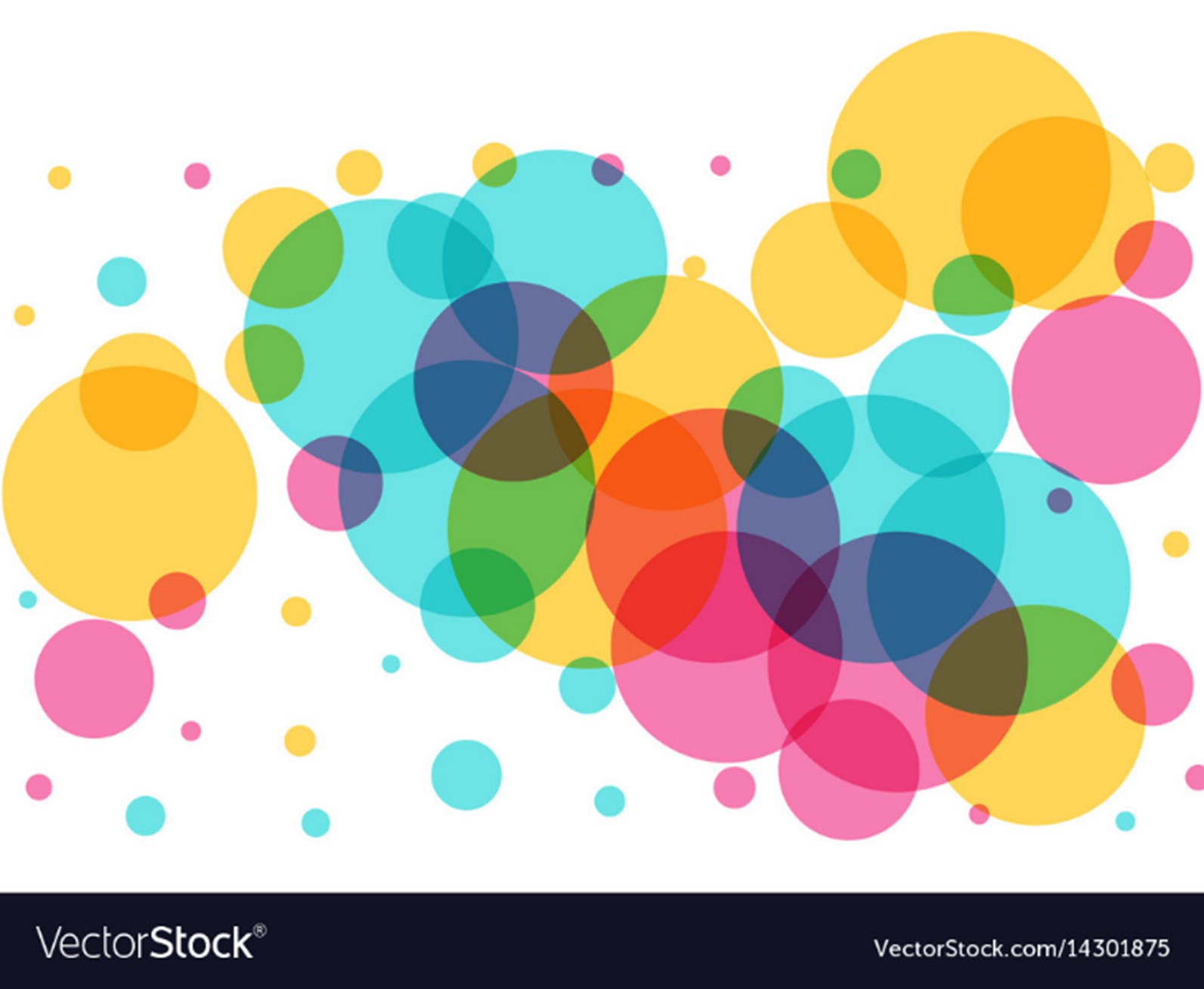

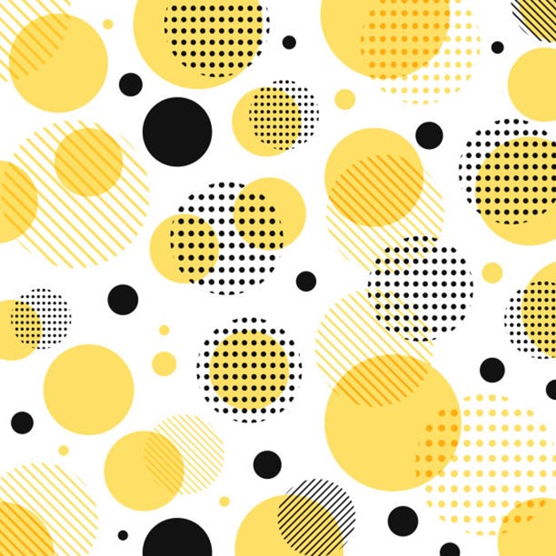

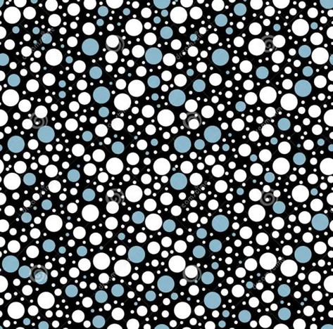
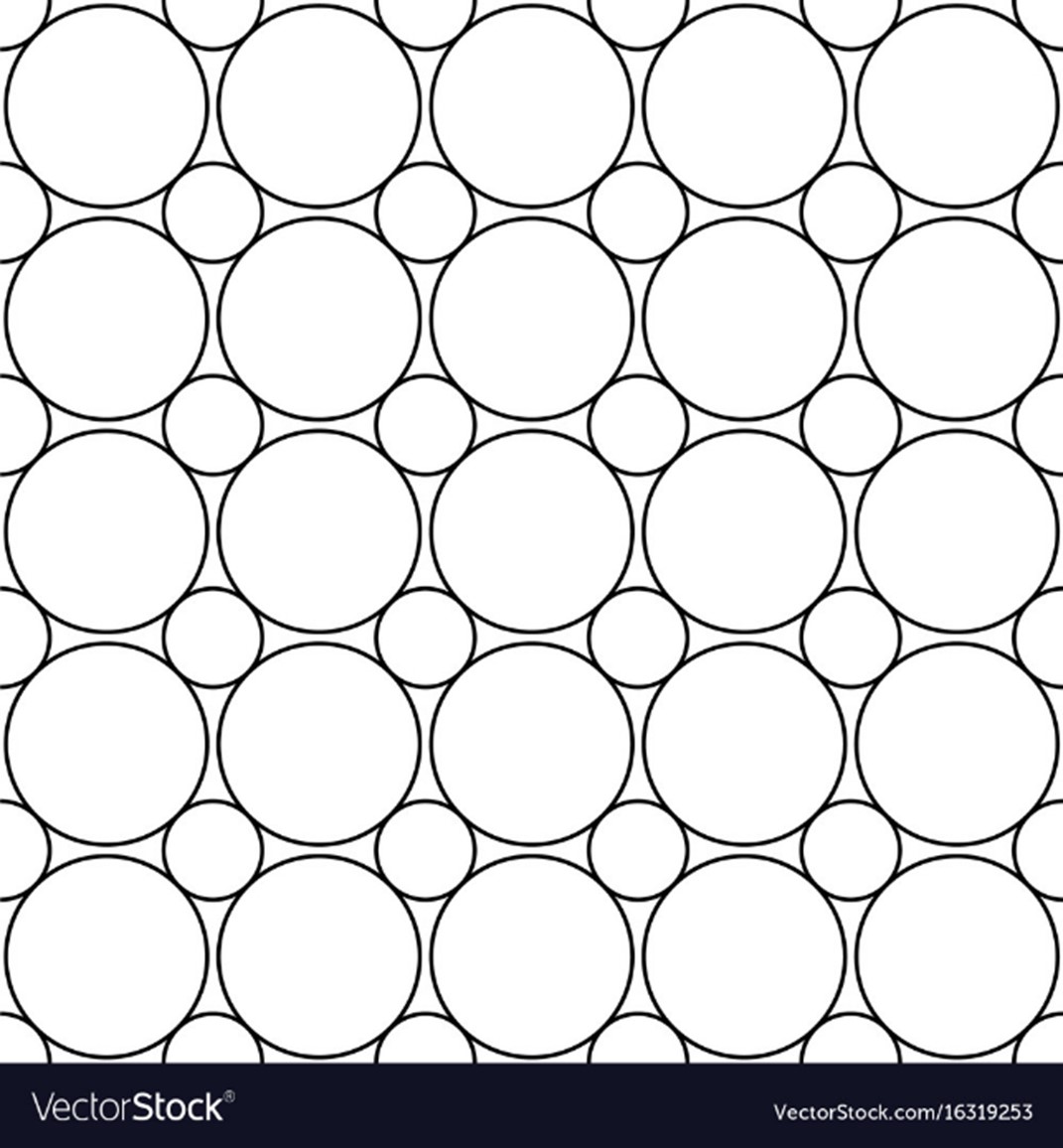
All these designs came from vector websites, who provide potential designers with quality vector designers, without having to go to the trouble of making it themselves. A good lot of the designs came from vector stock, as seen at some of the bottom sections of the designs. They have an extremely wide plethora or designs for clients to choose from, but obviously due to the nature of this project, that wasn’t of any interest to me. While researching I seemed to gravitate towards more abstract designs, mainly since I was going to be designing with a limited number of circles to utilizing, so therefore I was trying to find designs that found other ways to make their piece interesting without just using a multitude of circles in some sort of pattern. Instead playing with the composition or the opacity of the circles, which I found to be much more beneficial.
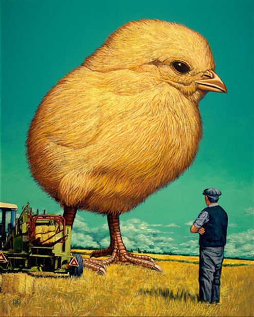
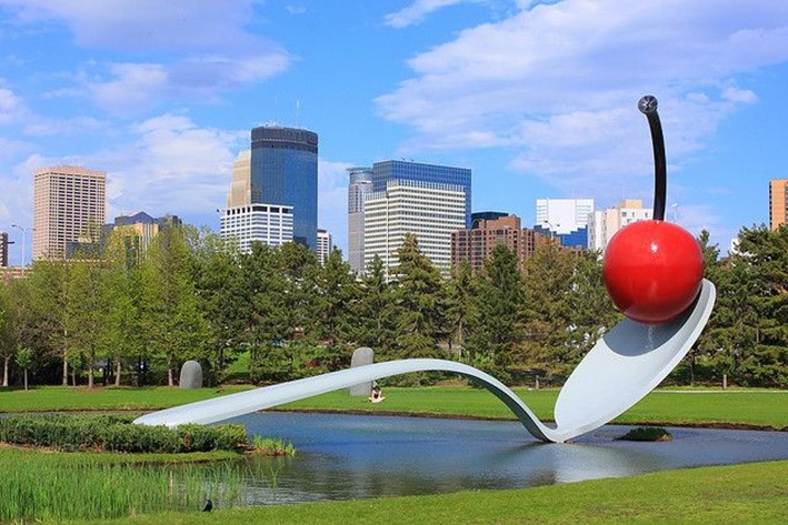
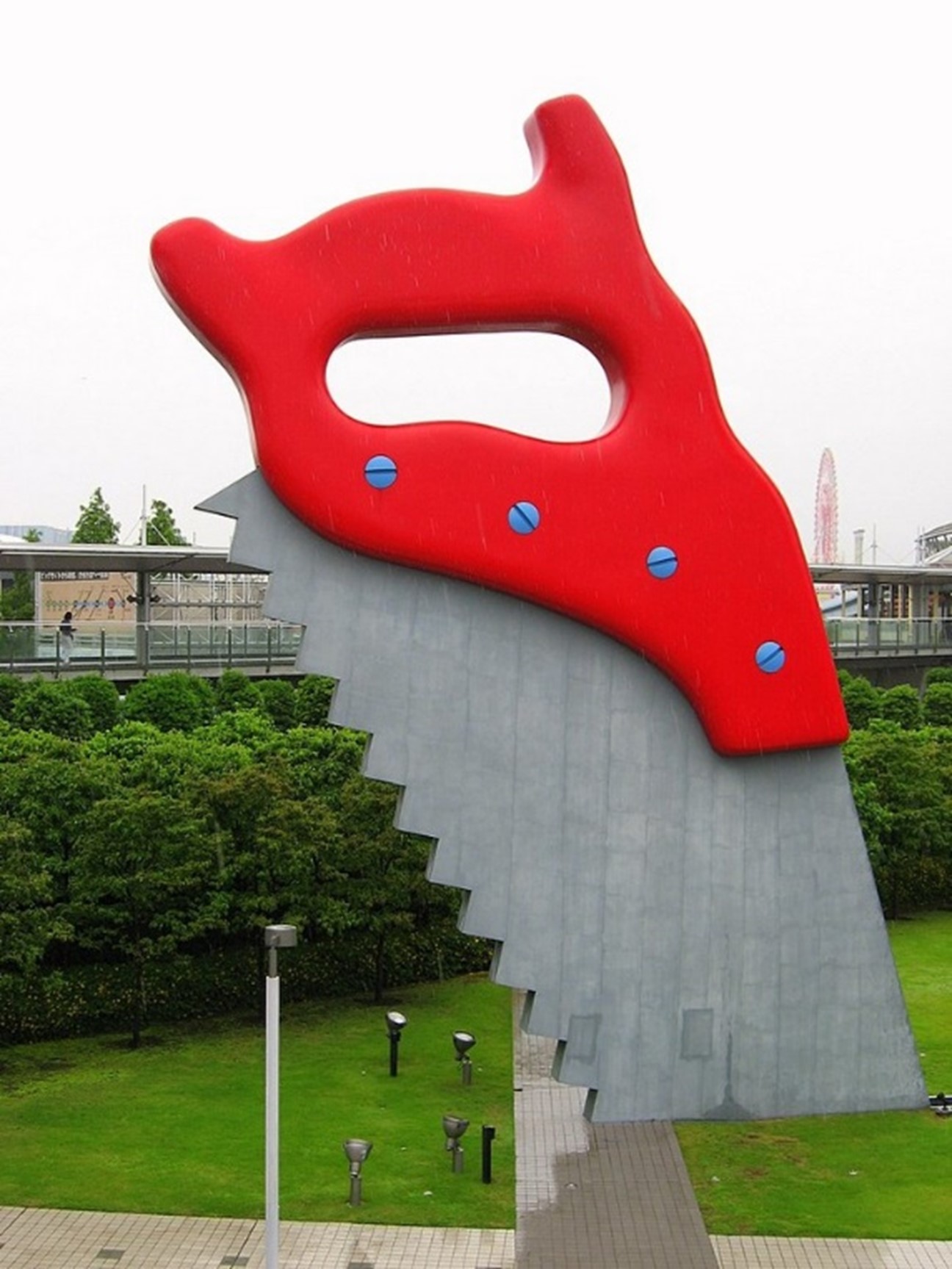
From the list of words given to us, I chose: Scale, Reflect and Multiply, as I felt these were the best choices for me to generate designs from. With scale I could easily play with the sizing of the circles and utilize them to form dynamic composition. I chose to reflect as I knew that it would be this would make me think of ways to create a reflective effect with the circles which would allow me to come up with at least some creative designs. Lastly, I chose multiply, due to the concept and definition of the word itself, being rather like the word, ‘reflect’. With scale, while researching I found that when scale is used in art, it’s evoked by artists making use of a contrast in size. Like this rather odd painting, by painter, Jeff Jordan. Where the humongous size of the chick is emphasised by the small size of both the farmer and the tractor. It makes for a more impactful piece when you want something to come off as big, and you use smaller sized visual ques to convey this to the viewer. The chick probably wouldn’t seem so big if the farmer and tractor weren’t there to be used as visual reference, to show just how big the chick is. Scale also gets used widely in architecture, where a lot of architects and sculptors use typically smaller sized objects and blow them up to massive scales to make something totally different. Like the giant eyeball sculpture by Chicago-based artist Tony Tasset, or the Spoonbridge and Cherry, designed by Claes Oldenburg and Coosje van Bruggen. With oddity of these blown-up objects and being placed in public, adding to the sculpture’s effectiveness.

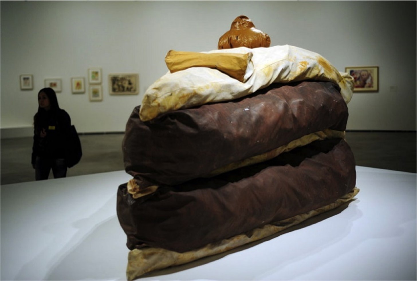
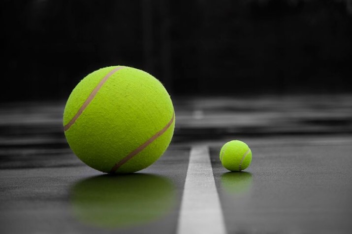
There many other instances of scale and proportions I used for inspiration, here were one of the these.
After the research I did, I moved onto sketching some vague ideas I had in mind for the scale grid, and how to go about dealing with the 2,3- and 5-point restriction when trying to come up with decent designs. I think my use of the circles is ok, nothing especially clever, but did try to make them as visually interesting as I saw fit. I found that taking an abstract approach to this project, was the best way to go about designing for these simple visual elements of point, line, and plane.
Scale
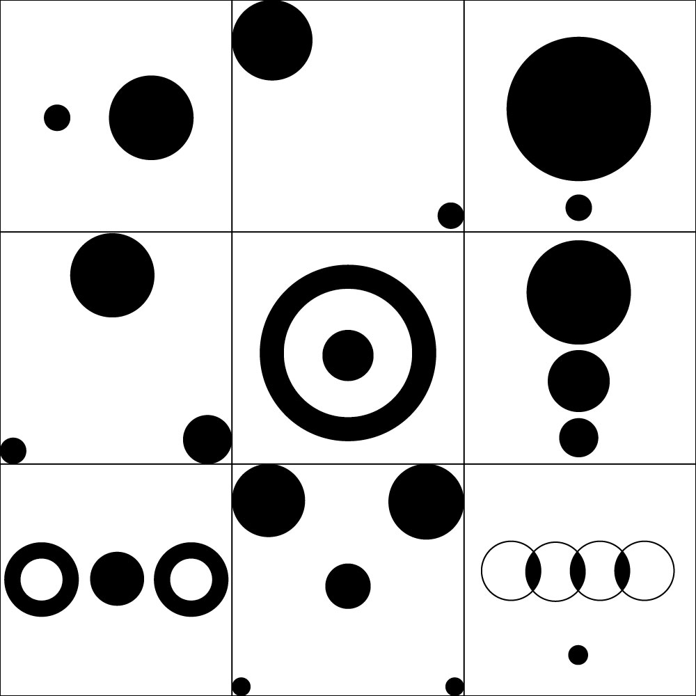
I find each of these designs to be fine, nothing particularly interesting, but nothing extremely boring either. The design in the bottom right corner is one of the more visually interesting, as I unintentionally made it resemble the Audi logo, with the overlapping of four rings to create a type of chain effect. I coloured each section where the circles overlap and meet, in black, to match with the tiny circle at the bottom the design. I mainly did the so the smaller black circle didn’t feel so out of place within the design. I also enjoyed the designs I did for the centre block and the bottom left block, as I made use of changing the circles colours and putting smaller circles on top of bigger ones to create more depth within these designs. I thought it worked out very well and some of the better designs in terms of the scale grid.
For the reflect grid I researched art was made with a reflective visual in mind, any art where it depicted a reflective effect taking place within
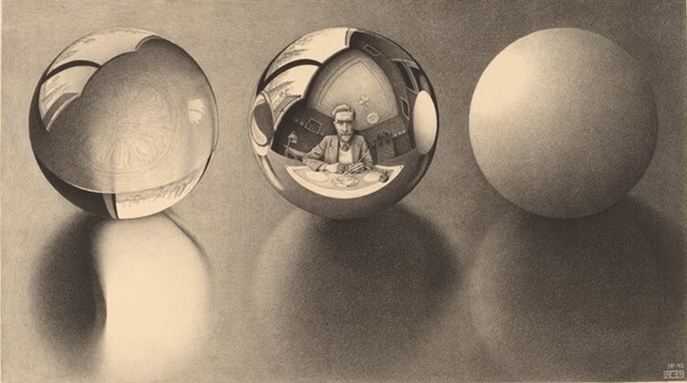 the piece. One of note was this piece done by Dutch artist M.C. Escher, where he used spheres to act as self-reflective mirrors. One piece that found was called ‘Three Spheres II’, Here, the central sphere that reflects Escher at work is flanked by one, at left, filled with water, and at right, by another opaque sphere. All three spheres are reflected in the polished surface on which they rest. The spheres at right and left are reflected in the centre sphere. Finally, the entire composition is seen as the drawing on the paper reflected in the central sphere. I obviously was interested in it due to it utilizing circular objects in it’s design.
Reflect
When I started the Reflect themed grid, I was getting a little bit more into the stride of designing with a restricted number of points. After designing, and looking at them now, I used different shades to add more visual flare, rather than have all the circles be the same dull shade of black. The use of different shades probably came from me trying to make the light shaded circles look like reflection or shadows of the black circle depicted in a lot of my designs. The top and middle row’s centres were the most influenced by M.C. Escher. The two black points, both seem like they’re sitting on a reflective surface, which depicts the lighter shaded points, which makes a more active and alive design. Overall, I would say I’m much more pleased with the reflect grid, compared to the scale designs, they’re much more interesting and I feel I found a way to make them like that using different shades.
With Multiply I tried finding ways to make it not look like the reflect grid, because as mentioned before, the two words have similar visual connotations. So, I tried making a conscious effort to avoid the two grids being too similar looking. However, when I tried to find examples of where the concept of multiple was the focal concept, it proved to be very difficult to find as most results displayed looked too much like my reflect grid of using the same shape repeatedly. But I came across a digital piece called ‘Multiple Targets’ by Anastasiya Malakhova, which depicted multiple circles, obviously supposed to symbolise targets, filling up the entire page. Which gave me the idea to for a type of doppelganger, multiple copies approach to designing the circles.
Multiply

I find that the multiply grid seems to be a merger of the approaches I had to the previous two grids. Layering was big theme throughout this grid as I used my understanding of the word ‘multiply’ to use the shape and form of each circle to try and make my own shape. I also played the opacity again, as layering shapes with lower opacity would allow me to create a more shapes and designs within the layers of the circles. I especially liked the centre design of the bottom row, as the use of circle outlines made for a nice design look like a symbol or insignia. I think this grid showcased how my design skills were starting to progress from doing this project, as this grid took a lot less longer than the first two. These are also my favourite designs I’ve made, when it came using only points and 2,3, and 5 points to be used for each row.
- Paint the house
The visual we were instructed to use for the second part of this projects was, lines. The words we were given to choose from in terms of a theme were:
- Rhythm
- Frequency
- Symmetry, and asymmetry
I found this part of the project to admittedly be a lot more fun and interesting than the first, as I feel you can do a lot more with lines than you can circles so therefore, I could be more flexible with what to create.
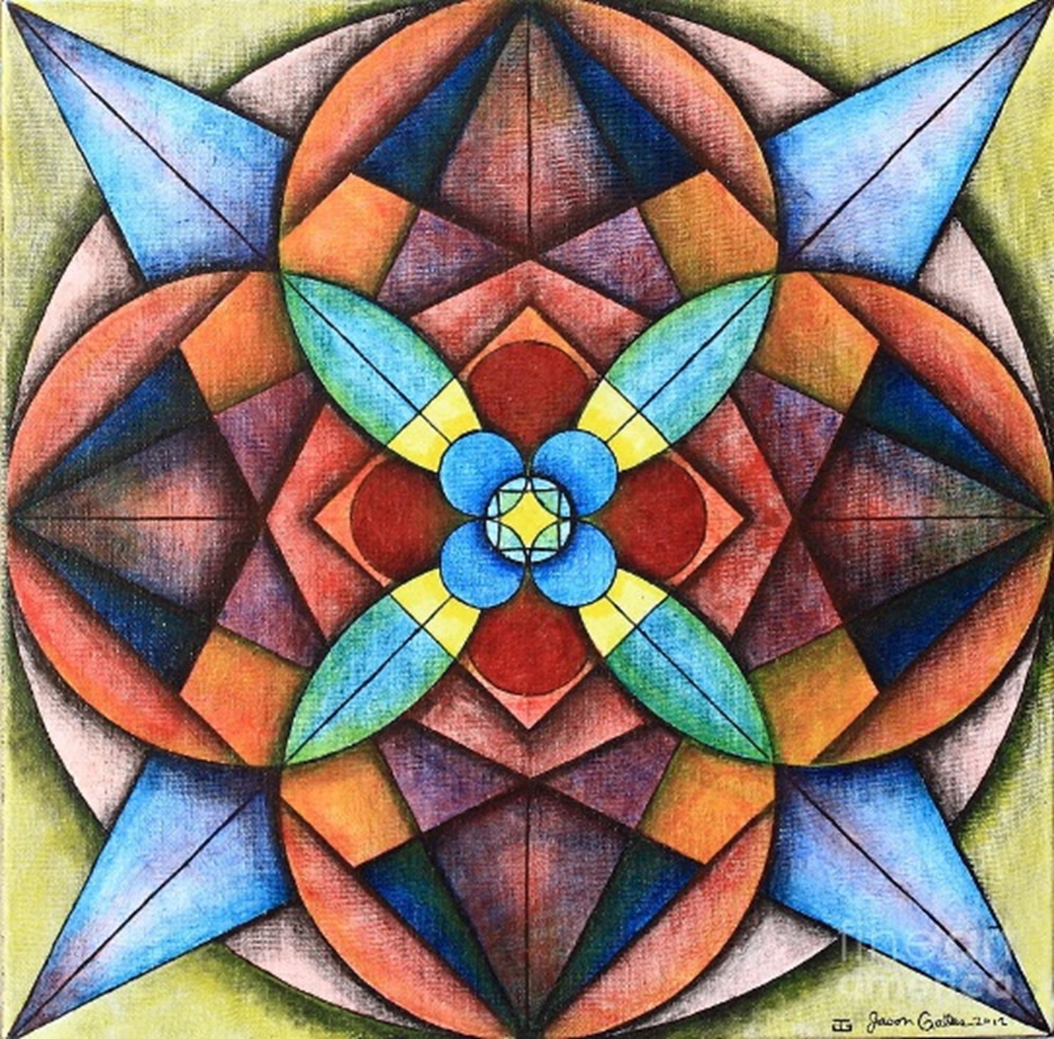
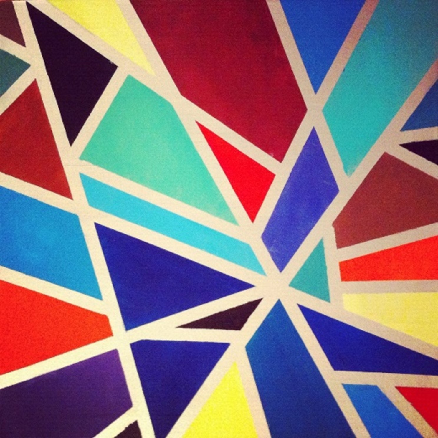
I first designed for symmetry, and asymmetry, as I felt this would be the easiest to design for, and thus a good way to ease me into the part of the project dealing with lines. Researching symmetry, I found that geometric shapes was more what I was looking for as most art depicting

geometric shapes uses lines in one way or another. So that was able to form the basis of my approach to symmetry and asymmetry. There was one painting done by artist Jason Galles, where he made use of geometric shapes to create a symmetrical design. The artist makes create use of lines and squared to help build structure to the piece. which presents a lot of instances where I can use this as inspiration for my own piece. how the artist seems to have incorporated shapes within shapes is a design decision that find to particularly clever and would be good to apply to my own design piece for the grid. Here were other symmetry and asymmetry pieces that I found to be very effective:

Symmetry, and Asymmetry
For the symmetry and asymmetry grid, I tried to make blocks have symmetry and asymmetry. I don’t think I don’t think that’s what happened however, as I was more invested in coming up with good designs than having equal amounts of symmetry and asymmetry. What I found most frustrating when designing for this grid was the restrictions on how many lines I could use, so therefore I had to compromise on some decent design ideas I had in mind. In terms if geometric shapes, I think the two blocks with the ‘x’ in the left and the centre block on the bottom row of the grid, were the most influenced by geometric shapes used in art. I also liked the use of the lines depicted in some of the blocks. I do think however, that these designs are rather plain looking compared to the last two grid designs I did for the points.
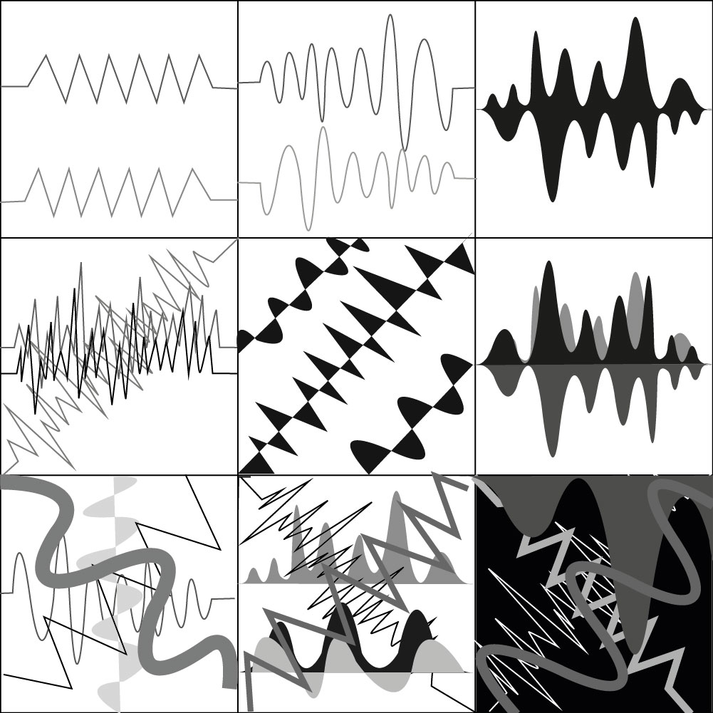
With the frequency grid, the visuals came to mind easily as the association of lines and frequency, immediately made me think of utility frequency and the horizontal lines that are used to show the frequency of volume. So, this is what I primarily researched on the internet, I didn’t research any artist for this re theme as I already had a pretty good idea on what frequency lines look like so there for, I just mainly looked at images for visual reference. There were a few images that seemed to compile a plethora of different variation to line frequencies, so this is what I primarily used as inspiration.


Frequency
These were some of my favourite designs I had made so far, I once again used different shades, as I didn’t in the first line grid designs, but seeing as how well that worked out the last time with the points, I though it be would best to try different shades again. The left and right blocks hold both of my favourite designs, as they seem to be the most harmonious and are well balanced. Originally, I did really like the design I did in the bottom right-hand corner, but after looking at it now, its just far too messy and chaotic, it lacks ant structure is just crazy looking. Overall, I would say that I’m quite pleased with these designs, mainly because frequency lines simply look visually interesting to me, but I do think I did deliver some decent designs, due to my own creative decisions.
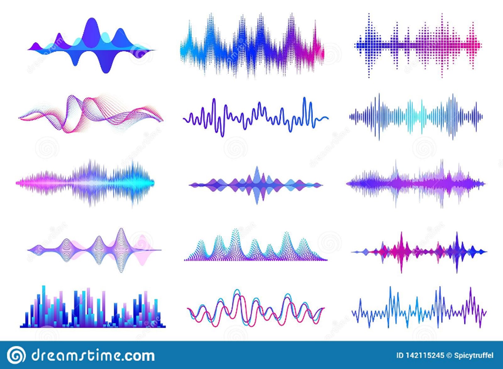
With the rhythm grid, I once again just looked up images of what rhythm loos like when depicted visually by artists. Unfortunately, most of the images that came from searching rhythm visuals, brought up many similar images to frequency due to both words being closely tied to music. To try and remedy this I searched for sound wave visuals, as this perhaps would bring different results. I eventually found a solution to my problem of trying to keep away from frequency lines, with sound waves I found them being represented by not only frequency lines but also a type of bar chart format. So there for this is the position I approached design for this grid. I selected a few specific designs to draw inspiration:


Rhythm

Rhythm was particularly hard to design for as stated previously, it was blending in with frequency quite a lot which meant I couldn’t get a good understanding of what visuals are associated with the term ‘Rhythm’. Therefore, I had to improvise to some degree to use my own understanding of rhythm, and what images come to mind. I added dominance into the mix to try and help with designing a more dynamic composition for people to look at. All being said I do like a good lot of the designs I generated from this, like the entirety of the bottom row as well as the centre block in the middle. In terms of adding dominance into the design I tried to do this with not only size, but also colour. The change in colour helped to save the designs from looking too similar and the same. The colour is where I decided to show dominance between light and dark colours, which resulted in a an abstract, pop art type of style, which personally found to be pleasing to look at.
- Paint the House
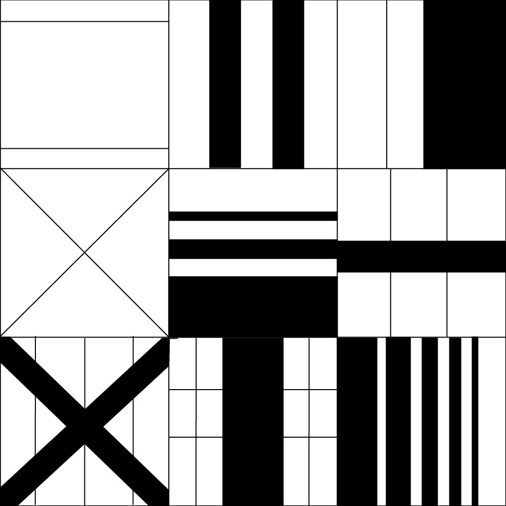
For this last part of the project, we were tasked to create, once again, three sets of 3×3 grids and divide them into five planes. For research, I looked at pieces I had come across on previous research which would be perfect for each dividing a grid into planes. The artwork in question was from Piet Mondrian, a Dutch painter, known for being one the biggest pioneers for 20th century abstract art. The artwork itself, wasn’t one piece but a series of grid-based paintings, Neoplasticism, splitting his canvas onto a series of rectangles and squares, meticulously choosing which would be the best to colour and provide a better perspective and meaning to the viewer. Viewing his work, gave me a better sense of direction as beforehand, I was having trouble making sense of an otherwise vague task:
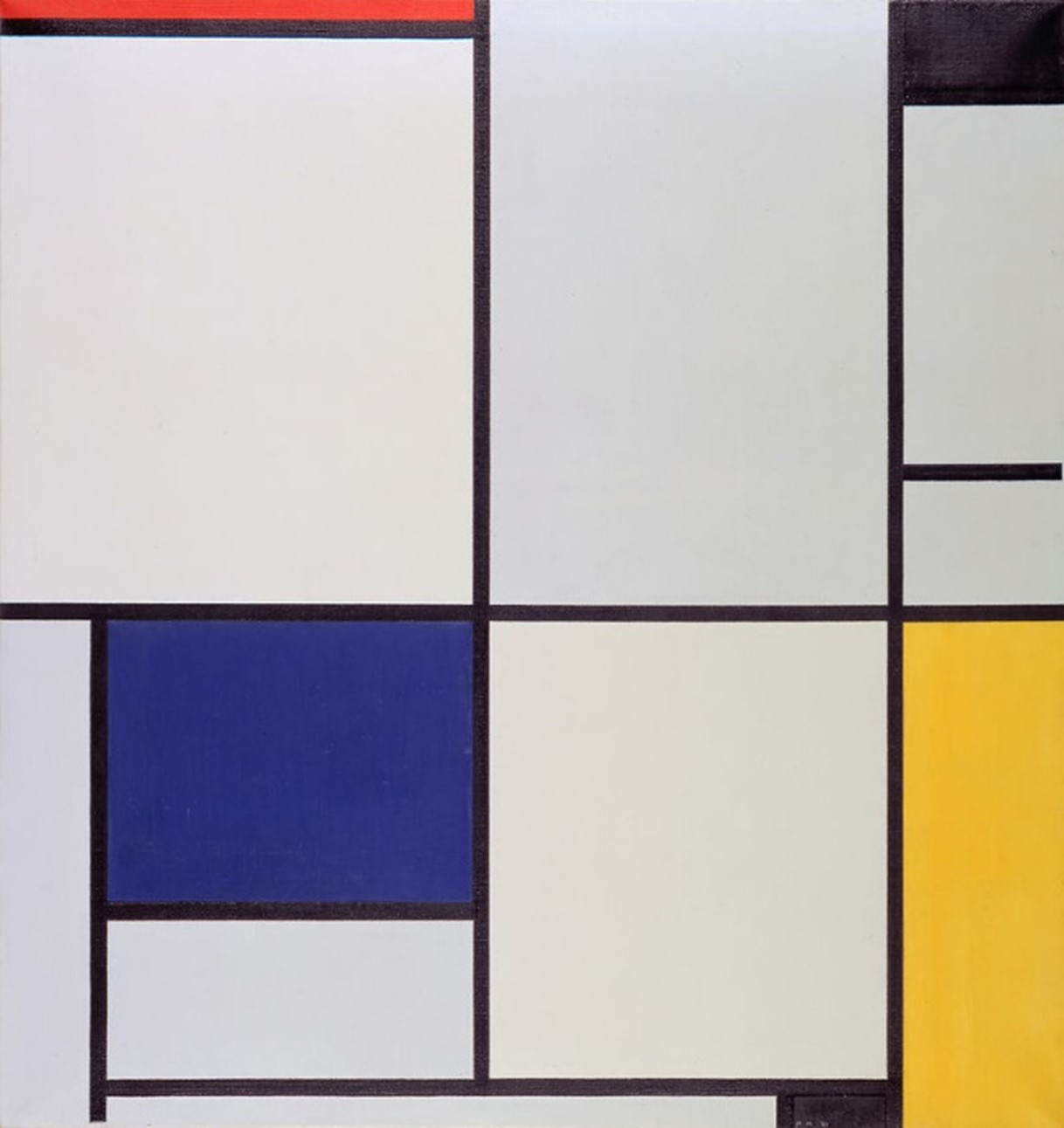
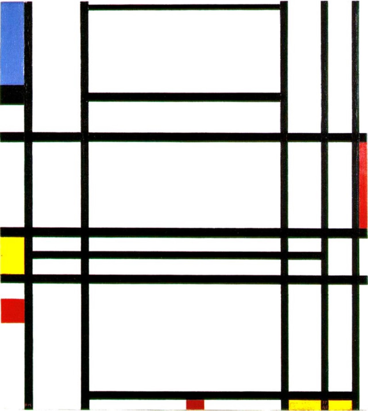
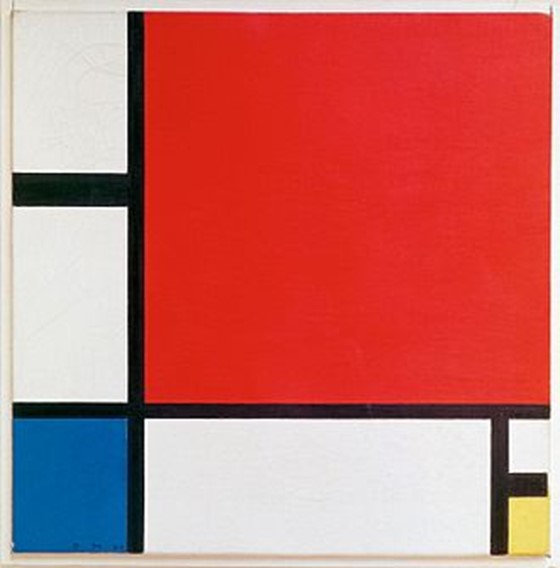
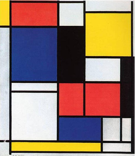
Plane


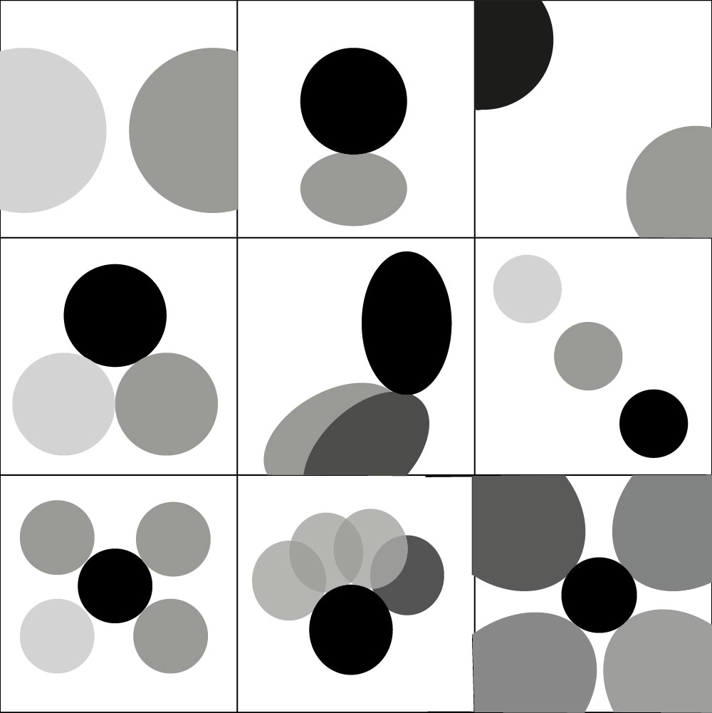
I’m mostly pleased with the outcome of theses designs, however I don’t think I achieved what was asked of me, given my lack of understanding. When it came to planes and what that word means in design. So, I could be freer with the designs I decided to do both symmetrical and asymmetrical designs. But forgot that I could only divide each block within the grid five times. I miss interrupted planes to mean five blocks or rectangles in each block, though this was not actually what were supposed to do. That’s why the theming looks rather inconsistent across the three grids. Within the grid on the right-hand side, is where I was most inspired by Mondrian. This is probably the most creative I got with the design on the planes, and I find a good lot of them to be well designed, particularly the design on the far right of the middle for in Figure 1. In Figure 2 is where I began to understand what was being asked of us, the designs for this grid are much tidier in comparison to Figure 1, also this is the grid where I used the most symmetry, as we were only allowed to split the block into five planes, so I thought asymmetry would keep the designs from looking too boring. Figure three is the first grid I designed for and is probably the one design where my warped understanding of the project is most present. As I kept the 2,3, and 5 plane formats of the previous two tasks, and therefore only three of the designs split their block into five planes. Despite that, this is the grid I chose to add tone to, therefore I do think this adds to making the designs much more interesting to look at. Especially the bottom row of designs, which seems to be where I had the most fun with colouring each plane in a different tone.
Overall, I would say that this design was very effective in helping the rest of my class and I develop the fundamental skills needed for interaction design. It helped get my creative juices flowing and as I am progressing through the project, I saw improvement in the time it took me to come up with a design for one of the grids. Which is great for me as it can take me hours to come up with a final design that I am happy with.
Bibliography
https://artclasscurator.com/proportion-and-scale-artwork-examples/
https://en.wikipedia.org/wiki/Piet_Mondrian
https://fineartamerica.com/featured/geometric-symmetry-jason-galles.html
https://fineartamerica.com/featured/multiple-targets-anastasiya-malakhova.html
https://pixels.com/featured/geometric-symmetry-2-jason-galles.html
https://www.artranked.com/topic/Geometric+Art
https://www.nga.gov/features/slideshows/mc-escher-life-and-work.html#slide_4