But first a theory…
This is going to be really embarrassing if Kyle has mentioned this in class and I wasn’t listening but during my research into style guides and design systems, I came across Brad Frosts Atomic Design Methodolgy.
‘this methodology is called Atomic Design because it’s very idea is founded in that of Chemistry, and the study of the composition of matter. The universe is made up of a fixed set of ‘atomic elements’ – known to many of us as the periodic table of elements. These elements are the building blocks of everything around us…
There are five distinct stages of the Atomic Design methodology, with the first three modelled after their equivalents in the Chemistry world. Each stage builds on the previous, acting as an aggregate of items from the preceding stages.
- Atoms
- Molecules
- Organisms
- Templates
- Pages ‘
Now we were given an elements project. This methodology is based on the periodic table. coincidence? Is this how Kyle came up with the task? Have I cracked a code? Do I get a prize?
Nevertheless, I applied this method to my own product and in the process discovered how to avoid noodle soup :


Noodle Soup
(example of ‘noodle soup’)
Noodle soup is an unofficial term when using prototyping software that references the vast amount of interaction ‘noodles’ that are a result of frame linking. I avoided this by creating interactive UI components that I reused across my full product. I followed these exact steps in this Figma blog and created reusable, time saving buttons. I created a new compnanent of certain versions for slight changes ( all componanents on my atoms page above).

Process
initially I began creating button interactions outside their frames and linking them to each frame ( causing dreaded noodle soup ) and i got frustrated experimenting with interaction options.Imagine I did this for 50+ frames each with multiple buttons on each. But I didn’t because I created componanents. It took me hours to create each and grasp a solid understanding of interactions, but it paid off.

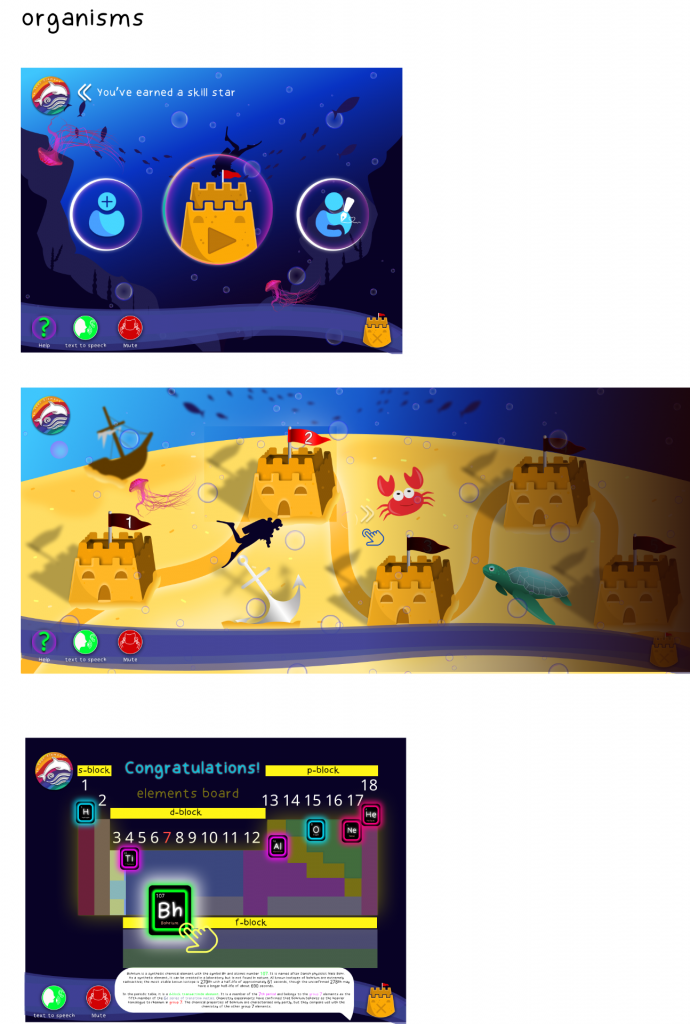
I revisited each ‘level’ and considered flaws in the user journey. I completely removed the top menu and transformed the visual clutter into a single expanding button, when pressed. Instead of having ‘lives’ (stars), the stars now acted as progress tokens for reaching extensive progression on the map ( every 5 levels). Even though I have hover states on an iPad prototype I found this the least complicated way to showcase a double interaction once pressed.
I followed this tutorial and applied it to my own loading page animation. Originally I went for a recognisable sand clock icon as a loading cue, but then I realised although recognisable to an older audience it might not mean much to a younger generation. So I extended the visual style of the branding into my own loading animation. I wanted to keep the loading screen as minimal as possible in comparison to the rest of the product to achieve the visual pause. I am so happy with the way this turned out in the prototype.


Note: Naming layers is a necessity for smart animate to work correctly.
If I look at my previous iteration in comparison to the finished prototype, I can see how small changes greatly influence the user journey. Content is more legible. I have removed unnecessary visual distractions and repositioned content in order of a usable hierarchy.

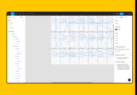
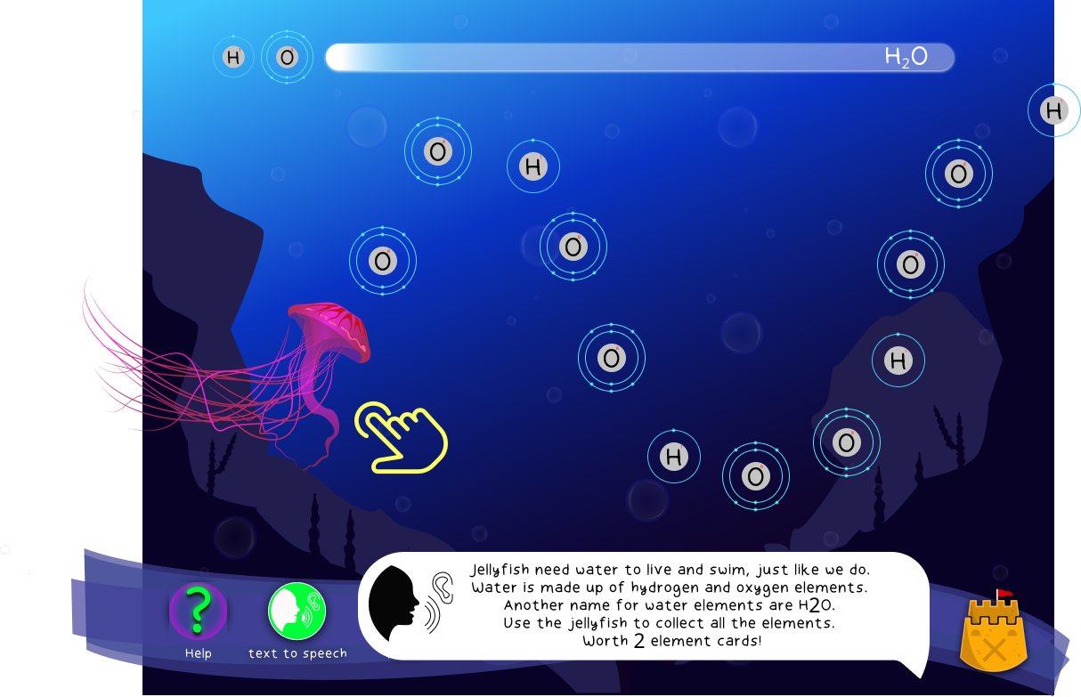
I added a simple darkened opacity layer over the full map view, to prevent errors when navigating the map. Predicting that the user will get confused with multiple and similar images, this opacity layer prevents frustration and keeps aligned to the user journey.
the previous iteration had the h20 progress bar along the bottom and the logo header/stars along the top. I have removed the visual clutter and repositioned the content so that the information needed to use the design was visible when needed. It informs the user easily of the current system status.
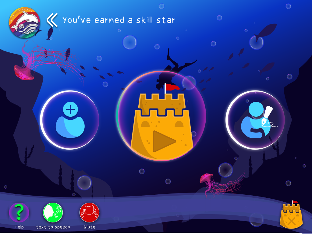
This highlights the removal of the header menu in favour of a clickable rollout menu. This small change removed clutter form the design but is still completely functional ( checking star progress).
As I couldn’t embed audio in the prototype this text box reflects how the text to speech/help function would relay information to the user and how that might sound.

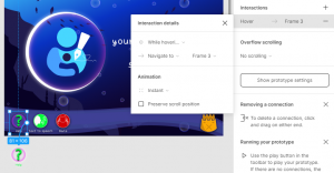
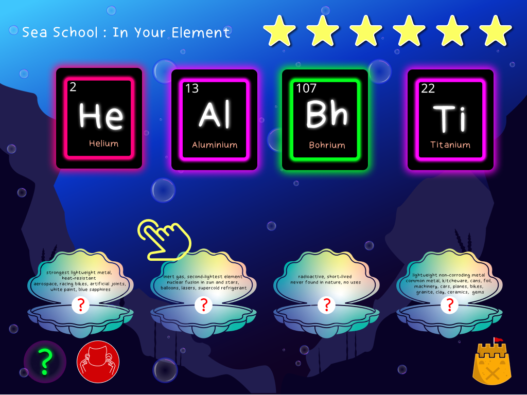
The periodic table is the reward system. Encouraging messages along the user journey motivate the child.

although subtle, when the help button is pressed, gentle hints like the bubbles showcased below will guide the user on what to do next – accompanied by verbal instructions if needed.

#5: Error prevention
Good error messages are important, but the best designs carefully prevent problems from occurring in the first place. Either eliminate error-prone conditions or check for them and present users with a confirmation option before they commit to the action.
Instead of using language like ‘you’ve failed’ positive reinforcement is used to spur on the user, whilst the universal use of the red glow is applied to make the user aware there is an error.

The ‘advanced’ elements board shows how the content changed to suit the user and their learning requirements. This user requires a deeper understanding of the periodic table therefore more information is required. The aesthetic still appeals to a younger whilst offering a more academic approach.


The Finale
This is where all my research paid off. I don’t think I have ever put as much time and effort into a project from research to micro-interactions. I didn’t get time to user test as I previously discussed in my blog, however, whilst isolating I got one person to quickly navigate through it. I instructed them only to ‘play the game’ to see how they approached it. Even though it was not my target audience, one is better than none. It was mostly a positive experience although a few issues came along in the user journey. There were a few tasks along the way that took a little longer than expected and could be revised in terms of design. Overall I am pleased with the concept and prototype.
Have a go at ‘Sea School: In Your Element’

My Figma File
Usability testing briefly applied ( not the most controlled setting)