Lo-fi to Hi-fi
Below are my initial ‘level’ concepts derived from a set of assets.


![]()
![]()

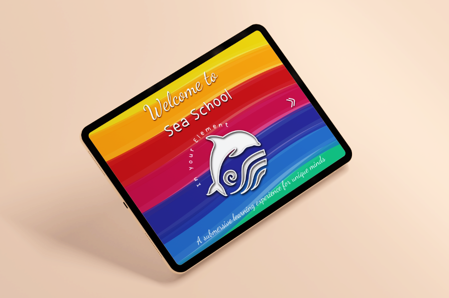
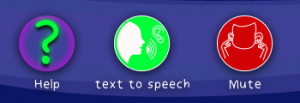
To incorporate aspects of the branding throughout I created UI’s, some familiar, some unique. The mute icon is completely unique, but not an unfamiliar action associated with autism. This icon depicting a gesture covering the ears was not assumed. I talked to parents and have been in the presence of children experiencing sound overload, as well as conducting online research. This is always a risk creating new icons that are unfamiliar but I am creating for a unique audience, however, I won’t know if these will be successfully recognised until the product reaches the user testing process. Above I have reflected on how the intro landing screen might look before the onboarding process ( questionnaire that determines the needs of the user ) vs how it would look complete. This preempts any pain points in the user straight away, as opposed to if the user were to continue their journey with content not applicable to their needs.


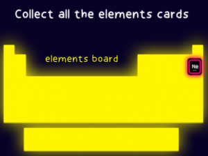
Inspired by neon signs and spelling, this is how the preliminary level that introduces the user to the interface as well as a progression onto level 2 of ‘ Sea School’. The touch icon acts as an instructional visual cue. I introduced a star system to reflect ‘lives’ that might diminish with unsuccessful completion of the task. However, feedback suggested this concept is negative and associations of losing or ‘dying’ is not beneficial to the users’ goals/journey. I will rethink this in further interactions. This level enabled me to come up with a relevant reward system in the form of ‘element cards’ as a token to be collected on an elements board. Collection has always been a popular game motivation. Angry birds you collect birds, hats etc, Pokemon has pokemon collections and so on. I feel this is a relevant approach for the user than a non-relevant point/numerical reward system.

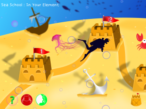
The map divides the content into user-friendly, manageable sections. Just as Youtube and Spotify organise their content into smaller but expandable sections. I have managed in the form of sandcastles. Not a sentence I thought I’d ever write. The map will be a draggable screen so the user isn’t overloaded with visuals all at once. I might need to rethink if they will instinctively know to drag or should there be a visual cue.

Not forgetting the VR aspect, which I was sure I couldn’t replicate in the short space of time that I had and something that was outside my skill set. I questioned this aspect because of the headset required and the audience I was catering for but there is no reason why it couldn’t be an optional feature for the prototype. To create the prototype of virtual reality I uploaded the map into a 360/panoramic viewer. I wish I could write about how it was a more intricate, skillful process but you can do the same here at renderstuff.com and google panaroma. It’s by no means a seamless view but pretty fantastic nonetheless, especially for prototyping purposes and it would avoid costly development if pitching an idea.
task: h20
Jellyfish need water to live and swim, just like we do. Water is made up of hydrogen and oxygen
elements. Another name for water elements is H2O. Use the jellyfish to collect all the elements. Worth 2 element tokens. This is the first visual introduction to the scientific structure of elements, the user can be aware of advanced content within a fun setting.

task : Aluminium
Complete the puzzle to find out what element often litters the seafloor. I created the puzzle pieces by using puzzle piece vectors as clipping masks for an image. This drop and drag task is simple, again with a hand icon gesturing what to do instead of text. Although the text to speech instructions are always available for accessibility. The exit icon will always be readily available in the form of a sandcastle icon, which is familiar through the home map.

Task : Helium, Nitrogen, Oxygen.
Your scuba tank is running low.
Inside your tank is oxygen to breathe as well as helium and Nitrogen.
quickly collect the elements before they float away.
I am not sure about how clear this task is I might reconsider it.

This section shows how the game would have adapted should a child be on a different level on the spectrum. Aspergers come with their own unique qualities, these children are often highly intelligent and even though social skills might be different, reading/education skills are excellent. Although not every child will be the same, the quiz will adapt the game to the users reading level, learning style and be
‘aware’ of triggers.
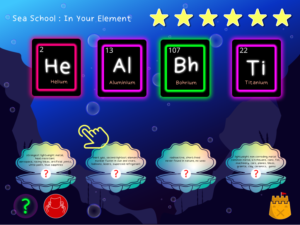
Task: Helium, Aluminium, Bohrium, Titanium. Match the element to its definition.
This introduces the child to a higher difficulty of content in accordance with their abilities provided in the questionnaire. More detail is available in terms of educational content.
Feedback suggested the text is too small here. Even though I was really unsure about my project so far because I hadn’t got to the prototyping stage and I was comparing my progress to that of others in my class, I received great feedback. I worked really hard on this project and it was the boost I needed. Interactions in Figma baffled me but I had never sed Figma/Webflow up until a few months ago and now I had created a whole website and game visual. My tutor provided me with a few helpful tutorials on interactions ( below ). He also suggested I created a user flow for the product so far, I probably should have already done this, as even though the feedback was good there was just a lot of content to digest in one go. If the user flow was to continually flow from one game to the next, it became mentally overstimulating. It needed a break/visual pause. The user flow helped me introduce a loading screen between stages.
https://www.adobe.com/products/xd/learn/prototype/interactions/prototype-with-drag-gestures.html
https://www.youtube.com/watch?v=II_iz5gN3lY


Usability Testing

This book is pretty self-explanatory and reiterates a lot from Neilsons’ heuristics. It takes us through what we all think or feels when we come across a new app or site and is a great read for any designer. If a user has to think excessively about how to use or navigate through a product they will simply go elsewhere. The brain tends to take the path of least resistance an easy journey will feel more natural, resulting in a good user experience.
Jakob Neilson discusses the study of eye tracking to better understand how users interact with a design. There are many other articles on this, Sarah Richards discusses this in her book Content Design. Studies of eye-tracking give great insight as to why a certain design works as opposed to others. For example, if we look at how we extract language when reading – left to right- it makes sense to position text into design in this way to aid the ease of legibility. Typography, the speed of reading, and the shape of words all play into the usability of a design. The length of a line of text can mean the difference between user’s staying or leaving. People have a lot happening in their lives so it’s important that our designs not be part of their problems.
We can avoid designs being a problem by usability testing. User testing does exactly what it says on the tin. A user (usually a group/various groups) is shown a sketch, wireframe, or prototype and instructed to complete a task to see how they interact with it, whether successfully or unsuccessfully. truthfully there is no unsuccessful way. The user may use a product in a way the designer never considered and from these results/recordings, a design can be adjusted/redesigned/rolled out according to results. Ideally, five users at different stages of the design is a good starting point but 1 is better than none. It is important to find testers similar to your target audience, especially if that audience has specific needs.
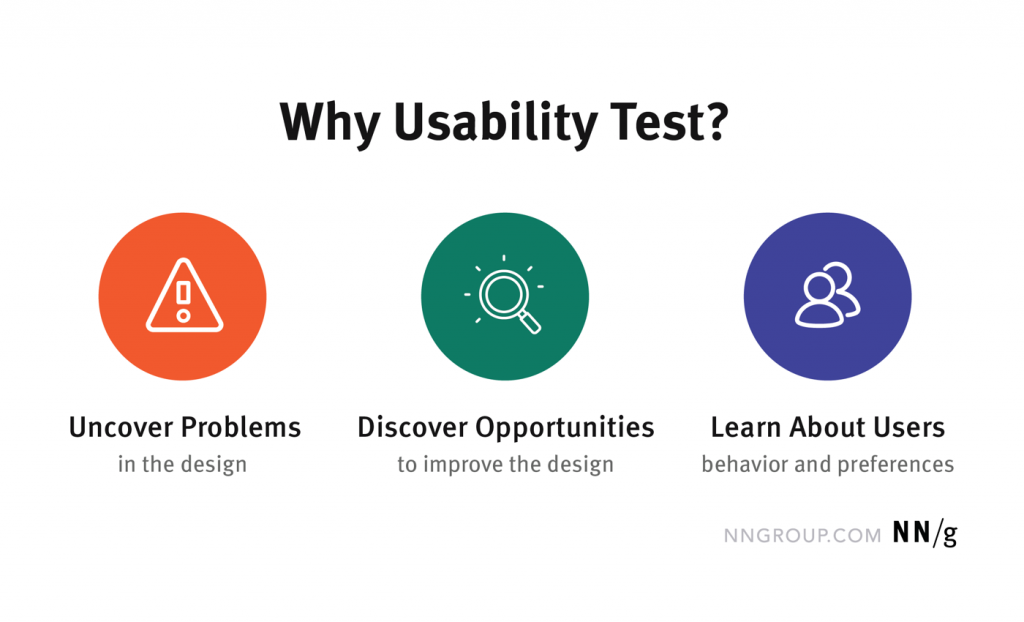
Neilson Norman Group states we use usability testing below.
A test would ideally be set up by recording a participant completing a task, with the designer (facilitator) and an observer being present. The observer may act as a third eye as well as spot something the facilitator may miss when busy asking questions and recording data. The participant needs to be made feel at ease and they can even be tested with a similar product to see if there are any pain points or insights within competitors that may inform your own design choices.
Test type 1: Think Aloud protocol: ask participants to voice what they are doing out loud while they are doing it and record. In my elements project this may be difficult in some cases as some participants would be non-verbal or have restricted social skills but to impossible.
Test type 2: Standard Usability Test: The facilitator asks the participant to perform a task (without influencing their decisions or actions) and records it. It is to be recorded meticulously via note-taking, timing, and/or video/voice recording. The efficiency of data recording ideally calls for a witness or observer to aid the facilitator. For this task sheets and questions will need to be created beforehand as well as setting up and testing the required equipment. The facilitator needs to ensure the test is the same for all participants for fair results. This type of testing is a very controlled method and the more efficient but also the most time-consuming, as well as requiring practice.
Writing test scenarios such as :
1. step back and make sense of the initial screen (think out loud)
2. Find the contact information on this website
3. Find a specific deal/offer.
Usability testing is measured by the efficiency of task completed, time, the effectiveness of the task being done, satisfaction, and frustrations – if any. There is a System Usability Scale of 10 questions (outlined below) that was originally created by John Brooke that was able to determine usable and unusable systems. The scoring system can be somewhat tricky and a score above 68 is considered average to good.

How I would usability test
Ideally, I would have a few children on various ends of the spectrum as well as children not on the spectrum. This would provide a fair and overall insight into usability. Two cameras would be set up with me as a facilitator and the parents as an observer. I would instruct the children to carry out tasks ( by visual cue card instructions where relevant – in instances of non-verbal users ) such as
– locate the home screen, exit the screen, mute the game, search for help within the game, complete a challenge.
Without any influence I would time the tasks being carried out and whether done so successfully. I would record any deviations from predicted user flows and in turn adjust the design to findings if necessary. The user testing would uncover any unforeseen pain points as well as any unique user flow patterns/behaviors.