Week 5: Storyboards, Anticipation and Staging

For week 5 we focused on creating a a flour sack jump animation, this was the bases to teach us the fundamentals of storyboarding, anticipation and staging.

The first image that came to my head when I thought of doing the jump was a ballet ‘hop’, and not just one or them but two. A jump leading into a jump! I felt I would would have good live reference to pull from and it would be more interesting than the standard two legged hop you see in most student animation excercises.

I started by researching different types of ballet jumps. The hop I originally had in mind is called a sauté and while it is a movement that requires undeniable skill for a human to perform correctly, it isn’t quite as interesting for a flour sack. I eventually settled on combining a temps levé (a hop from one foot to the same foot) and a jeté (a jump or leap from one foot to the other).

I used the video below as reference:

From this I produced these storyboards:
They weren’t terrible, they showed obvious anticipation for the jump and the staging was clear. I however quickly feel out of love with them. I had attempted to combine different jump poses together into something that felt and moved unatural. The beauty with ballet poses also comes quite heavily from the positions of the arms, something which was hindered by the flour sack’s tiny exuses for appendages. Again I had to think about the constrains of the form I was working with and how best to utilise them. I remember earlier Sarah had compared the flour sack to a weird floppy ball and I decided to focus less on using human poses for the flour sack and think more cartoony and expressive with the flour sack.

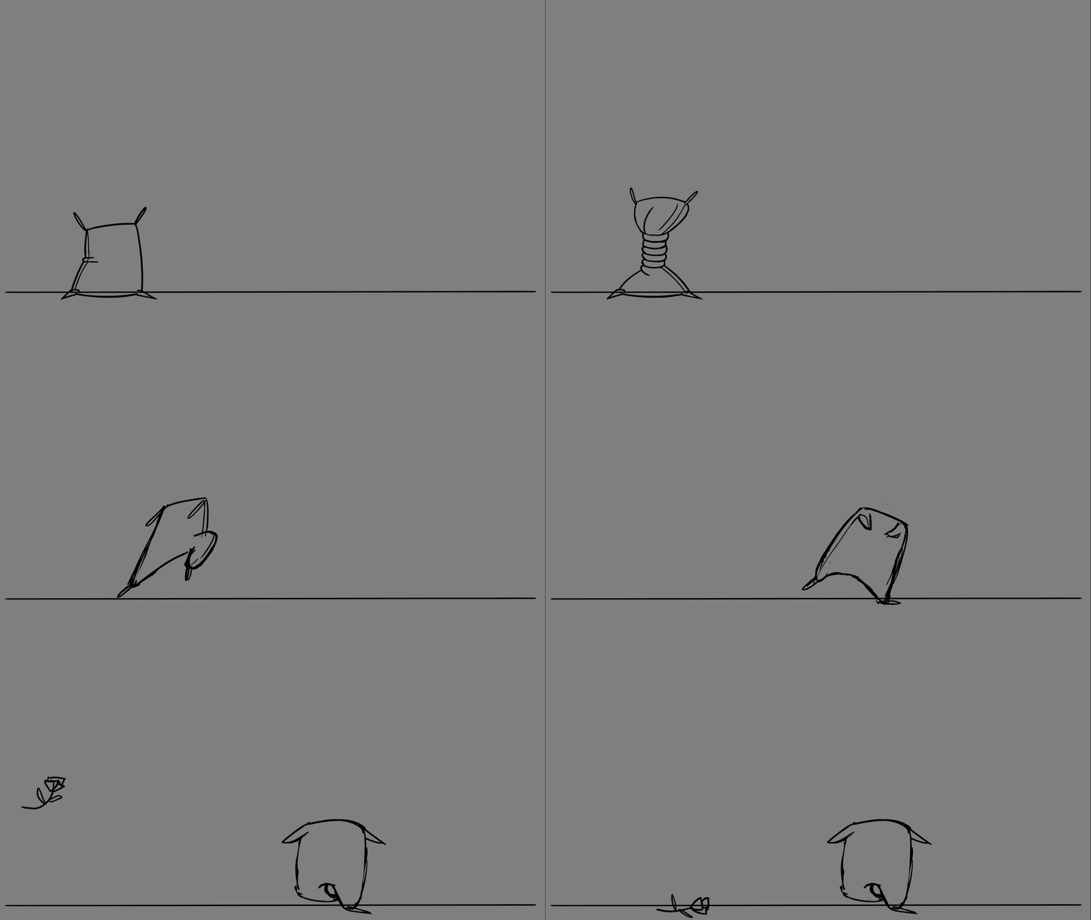
I resolved to cut the animation back down to one jump and have the flour sack wind up like a spring as my anticipation and then release into a faux ballet leap.

I was a lot happier with this newer version, it was cleaner and more straight forward. When in doubt remember to K.I.S.S. Keep. It. Simple, stupid.
My feedback from Sarah was positive and she suggested I add another frame in the story board after the jump just to make it a little clearer what action he was doing.

With my new storyboard finalised I took it into Toon Boom and started animating.
 

The staging I felt was strong and the anticipation translated well into animation. I showed it to Sarah who gave me this feedback:


She suggested a ‘ta-da’ pose to give a nicer finish to the jump and pointed out that the rose dropping in overlapped with the sack animation so she suggested I withhold the rose toss for a few more frames. With this feedback I returned to my animation.

With the timing improved I started to refine the animation begining with the sack twist.

I struggled to find good animated reference for a twist animation. I was able to find this image from Nickolodean’s Spongebob Squarepants (1999) which gave me enough of an idea on where to start with the twist.

Spongebob’s form, while cartoony and stretchy didn’t quite match what I was trying to go for with the flour sack. After foolishly attemtping to act out the twist myself I eventually was able to use my hat of all things to give me a reference on how the flour sack, especially his bottom half should contort.

From here it was just about thinking of the mass and form of the sack. More loops made him taller and his mass on the top becomes smaller as his body contorts. I also played around with his momentum, slowing down his twist at the top and then unraveling quickly into the spin.


The next stage was to animate the twist. My first port of call for reference was Taz from Looney Tunes.

The newer versions of the spins appeared to be smear animations with the facial features and arms being smeared at the start of the spin until they devolve into smeared lines of colour.

This approach gives a stronger fluid spin and would have been my preferred approach but due to the lack of colour palette and facial features in the sack it would be impossible to produce a coherent smear.

The older taz spins were more based around numerous swift lines coalescing into a twister with identifying features like Taz’s eyes and legs appearing on random frames during the spin.

I briefly attempted this approach but once again the constraints of the sack hindered how much I was able to achieve artistically, without any readable features like eyes or limbs it was an incohesive mess. In the end I was only going to be able to utilise the swift line approach for the flour sack.

With the spin sorted the only part left was to clean up the lines and timing of the actual jump itself. I added a few frames to the top of the leap to help with the staging of the jump and slowed down the pacing of the descent to help with readability.

In conclusion I’m content with how this animation turned out. I’m proud of the twist before the jump, especially the slow down at the top of the twist but the rest of the animation is just fine, although the squash at the end of the jump could probably do with being more extreme. The animation’s not necessarily bad by any means but simply uninspiring and conventional. Of course this critique is however something of a conundrum, by trying to experiment and create something unique earlier I created a weaker animation with my first storyboard, it was only when I stripped it back to it’s fundamentals that I was actually able to create something of quality.


Week 4: Secondary Actions

With week 4 I came in with a clear plan of what I intended to do. Improve that walk animation.

As I had mentioned before, I became intrigued with the 1940’s rubber hose style animation seen in early Disney and Max Fleischer cartoon’s after adding the squash and stretch to my walk cycle.
I wanted to steer into this style and embrace it. I started looking at classic animations like Disney’s Steamboat Willie (1928) and Max Fleischer’s Bimbo’s Initiation (1931).

https://www.youtube.com/watch?v=48Ka0xvim3c&ab_channel=GoonCartoons

In these earlier animations the characters are fluid and seemingly without much bone structure (hence the rubber hose name). As animation was still a fledging art form everything is drawn in it’s most basic shapes, heads and bodies are sphere’s and the limbs are simply cylinders. This won’t be too hard to replicate and actually works for my benfit since I’m still learning the basics and don’t want to create a character too complex.

Bimbo’s Initiation offers a great look at an example of a walk cycle but it doesn’t encomporate the arms and feels very bespoke to the charcter of Bimbo and has a more nonchalant feel than I’m looking for in my own animation.

I decided to look at more modern references. Studio MDHR’s 2017 video game ‘Cuphead’ is heavily influenced by 1940’s animation, so much so that it even features traditional hand drawn animation for all the animation in the game. I was able to track down references from Jake Clark and Tina Nawrocki, animators who worked on Cuphead. Below is an example of Clark’s work.

And Nawrocki’s work can be seen below.

There’s a partciluar bounciness and ‘gloopiness’ to the animation in Cuphead that I really like. Plus I just love those odd timey cartoon gloves. Once I had enough reference I started editing my walk cycle, begining with the hands. I took the stiff bent arm and redrew it in the rubber hose style and matched it up better with the squash on the body. I was happy with the original timing on 3’s so I kept it in the newer version.

I didn’t really like how this turned out. I felt it looked too stiff and contained. The elbow jinters weirdly at the top of the back swing and the arm swing looks more like a single drawing that’s simply being rotated at the shoulder and tweened. I realised I needed more of an arc and exaggeration in the swing, the arm needs to extend and swing back further. In William’s Animator’s Survival Kit he stresses the importance of arcs in helping to make an animation appear more alive. So I went back to the arm and loosened the elbow.

It looks a lot more lively now. Exaggerating the back swing has made the return look a lot more snappy but I feel that suits the style.

The left arm was easy as I just had to redraw the arm in the new style. I however encountered the same issue I had before with the bent elbow looking too stiff so I extended the left elbow on the back swing too but found now the arm just looked out of place and no matter how much I played around with it I just couldn’t get it to ‘feel’ right. I decided to shelve the left arm for now and move onto adding additional seconday animations by adding a top hat.

With the hat I used the squash and stretch on the body as my guide for timing and then offset the hat by a few frames so it didn’t distract from the head and body.
I had also finally managed to work out the kink with the left arm and was able to extend it behind him to create and nicer arc and loosen up some more of the stiffness.
Thirdly I added another secondary animation addition in the form of a smoking pipe. I wasn’t sure how to exactly animate the smoke. I was aware that along with fire, smoke is one of the hardest things to animate in 2D animation. Lucky I knew I could steer into my 1940’s influence and create a cartoony smoke puff that wasn’t as confined by real world physics. Steamboat Willie offered me the clearest reference for smoke puffs.

The final smoke cloud looked horrendous. The timing wasn’t quite right and it looked like something cooked up by the clip art team at Microsoft. It looked horrible and moved horrible. I decided to scrap it since smoke was more SFX based than my walk animtion needed to be, and I already had enough secondary animation going on. The pipe animation itself however was a success with a nice bounciness to it.

In conclusion: I liked this animation when I first finished it but now looking back I think it’s a little bit of a mess. There’s a bit too much going on I feel. The squash and stretch is probably too much, especially in the head, which detracts from the hat. Having a steadier head would have made the hat all the more bouncy and alive. I decided to leave the legs as they were in the original, after talking to Sarah she felt they suited the style and that changing them could lead to massive timing issues with the rest of the body. In hindisght I probably should started fixing the walk with the legs first. There’s a slight clip near the bottom of the arm swing where I didn’t erase enough of the leg’s lines behind the hand but I’m not too worried about it since the animation is only meant to be rough anyway.

As I became less stressed with my full time work I was able to sit down and actually go through the Animator’s Survival Guide properly. In it William’s mentions a trick of breaking the elbow on the swing so it looks more natural and fluid.


I think in future endevours I’ll try this trick to hopefully breathe some more life into my work.

In the end some parts of the walk cycle are too exggrated like the squash and stretch in the head and body while other parts, like the arms need more. I’m willing to write this animation off as done since I’ve learned the fundamentals of what I need but if I had time in the future it would be nice to go back and just polish it off a little more.


Week 3: Basic Walk Animation

I cannot animate.
Did I mention that before? I feel it bears repeating.

Anyway, week 3 was the first week that I was actually able to attend the class. We were tasked with animating a walk cycle in either 2D or 3D. I’d done a walk animation before back in 2014 in 3D, I was actually able to find a copy.

It’s stiff, awkward and lacks a lot of weight. There’s a slight bob in the head but it isn’t offset enough and could actually do with a lot more exaggeration to help ‘liven’ up the animation.
Wanting to experiment and remembering how unpleasant my 3D animation turned out I decided to try my hand at 2D animation in Toon Boom.
Before I started I went through the Toon Boom guide for using X-Sheets, a tool for helping to plan your animation before you begin it. I originally was going to animate on 3’s but Sarah wisely suggested I start on 2’s and then just add my additional frames once I had all the poses correct.

Truth be told though with such a straight forward animation I didn’t really end up using it much. What I paid attention to the most was Dermot O’ Connor’s (2010) tutorial for a walk cycle.

This was of great help to me, since while I can’t animate, I can copy drawings.  Which is all I had to do. I didn’t concern myself at the start with arcs or the timing I simply copied the drawings. I knew that once I got half way all I’d have to do is simply flip or copy the previous frames to finish the rest of the walk.  Once I was done I played it back on the 2’s…


I spent the whole day on this speedy mess and afterwards I was convinced I’d never come back to 2D animation. However later when I changed the timing from 2’s to 3’s I could see that I actually had the start of a functioning walk cycle with a contact, recoil, passing and high point. It was stiff and largely lifeless but it was a start. As I had learned with the bouncing ball I decided to add some squash and stretch to the body and head to try and make him a little more appealing. Squash on the impact and stretch on the pass.
It gives the character a hyper cartoony feel reminiscent of early 1930’s rubber hose animations which I actually quite like.

Conclusion: I think I’m gonna steer into the 1930’s style for the secondary animations next week. The animation as of now, isn’t really that great, there’s a lot of clipping, the shoulders aren’t synced properly to the body and the top of the head blinks out for a frame but it’s got a good foundation to build something better on.

Week 2: Flour Sack

Didn’t get a chance this week to attend the class or do the work so I actually ended up working on this assignment after my week 3 and week 4 walk animation. Which worked out if my favour I think.

The brief for this week was to animate a flour sack changing from one expression/mood to another. By now I’d had a better understanding of 2D animation since I actually came to this in week 5 and I wasn’t as rushed so I was able to prep well in advance.

I started by gathering reference of flour sack poses. Most of what I found online was done by other animation students which irked me as I was more interested in seeing how professtional animators had handled the flour sack. The only clear examples I was able to find came from the The Illsuion of Life by Frank Thomas and Ollie Johnston:

These examples were almost as bad as the student examples I found online. Still unstatisfied I remembered that the Magic Carpet from Aladdin was basically a flour sack and through the animation archive site Living Lines Library I was able to find character designs and expression sheets for the carpet.

Still not entirely happy with what I’d found I accepted that I just wasn’t going to be able to emote with a sack as well as I would with a person. With this in mind I began to look more favourbly at the earlier examples I’d found by animation students and used them as reference for my own poses. Below are a selection of some of the references:

Below are then my own attempts at expressing the flour sack:

I found the flour sack a rather unpleasant experience since it was so hard to properly emote, in fact most of the reference for poses I found also contained a description just what the emotion was meant to be, which to me just demonstarted how difficult it was to read the flour sack’s emotions and how much it was open to interpretation. Many of the drawings for the flour sack’s emotions, in my opinion simply do not work. It was only though animation that you’re able to actually wrangle some clear expression from it.

Which brough onto my next stage, animating.

I decided an animation of the flour sack taking a deep sigh then slumping over in dispear would have the clearest emotional change.  As with any good pratice I took a video of myself going through the motions for reference.

From this I got the base key poses.

  • Neutral.
  • Inhale.
  • Exhale.
  • Slump over.

Next I went into Toon Boom and started with the keyposes.

Feeling it what I had was too bland I exaggerated the inhale.

Still feeling like it was too flat I pushed the inhale even further. Shifting his weight from the bottom to the top of his body to help sell the pose.

Once I was happier with the inhale I began focusing on the timing of the animation.

The timing on everything felt weird to me and I wasn’t quite sure what the issue was. William Blair mentions in The Animator’s Survival Guide that a happy action moves fast while a sad actions moves slower so I deicded to slow the sacks slump foward and see if that helped.

Even after I still felt the animation looked weird to me. While I was working in the office I asked my c0-worker Alec for some feedback and he suggested:

  • Hold the breath for longer.
  • Add his shoulders dropping before the exhale.
  • Add an extra larger pose at the top of the inhale to help sell the action.
  • Deflate quicker.
  • Drop to the floor at the end.

With his feedback I began adding the changes.

I felt you couldn’t really get the slump in his “shoulders” so I held the pose for longer and added a few extra frames into the exhale so his stomach inflated again slower. I also drooped the horizontal line on the inertior cross with the shoulders to try sell that feeling of sadness.

I still just wasn’t feeling those shoulders so I held the inhale at the top for longer and gave more time for the shoulders to slump down. I also removed the absolutley hideous “sad face” I’d made with the interior cross. I still felt everything moved weirdly and I just couldn’t put my finger on what was going wrong. But after talking to Sarah she was able to point out that the issue was my timing was too evenly spaced. So I held the inhale at the top for even longer and sped up his head slumping over in sadness.

This made a massive difference and instantly fixed the weirdness I had kept seeing in the animation. Once this was done the only thing left was to add the drop to the floor.

The final drop was definately needed it adds so much more life to the animation and helps get a little more movement in there to make it less stiff. I was careful to maintain a nice arc in the drop and used the top knots as my guide when I was planning the animation. I also added a slight tilt in the head as anticipation just before he falls over.

In conclusion: There’s a definate improvement from where I started and it’s not a completely terrible attempt. There’s some parts I’m happy with but there’s a lot of areas for improvement. Looking back at it the staging needs to be improved, it starts into the inhale too fast. Holding the neutral pose at the start for longer I think would make it look better. I like the slow deflate after the inhale but there’s something slightly off in his head slumping down, it’s almost as if the movement feels unatural. I think it might move to fast from the deflate into the head slump. Holding that neutral pose in between for longer would fix it or maybe a pose where his head is slightly drooped before it completely tilts down.
The fall turned out better than expected and was probably the saving grace of the animation.


Week 1: Bouncing Ball Animation

So, I’d like to start this blog off with a clear and concise fact: I cannot animate.

With that out of the way I’ll go through my first week in MA Animation.

Since I’m working full time while I do this MA and we’ve new PC labs in the Uni which were having teething issues I missed my first class but thankfully all the classes have been pre-recorded so once I got some quiet time in the week I was able to sit down and go through them.
Sarah’s started us off easy with a bouncing ball brief. Create a standard bouncing ball animation then make another one, playing around with the timing and pacing to give a different weight to the ball. I’ve done this before a million years ago as a student so I’m familiar a little bit with the principles.

Due to my time constraints I decided to do the animation in 3D rather than 2D. I’ve used Maya before in the past and didn’t want to set myself back longer by trying to learn a new software on top of the animation, especially since the objective of the brief was simply to practice the 12 principles.

I followed along to Alec’s tutorial for the bouncing ball (see above), which I found incredibly helpful. It eased me back into animation by focusing just on the step by step process. As part of the tutorial Alec went through the graph editor which I began using exclusively in tweaking my animation since the main part of the animation was an arc and the graph editor allowed me greater control to refine the movement. It took me a little while at the start to recognise that the only way I was going to create the arcs I wanted was to break the tangents and do each arc individually but once I did I was flying.

After talking to Michael in the office he suggested a good way to refine my animation was by looking at the arc’s and trying to get them as visually appealing as possible. A nice arc in the graph will create a nice arc in motion. Alec also gave me some further advice by suggesting I level the tangents out slightly at the top of each arc, just to hold the pose a little longer.

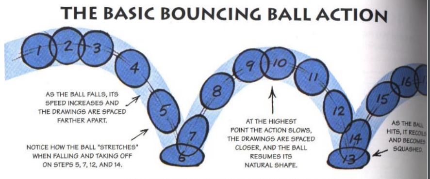
Once I was happy with the bounce I added additional squash and stretch, this is the one principle that I remembered from my student years so it was pretty straight forward to apply. Preston Blair in his book Cartoon Animation (1994) wonderfully demonstrates the application of squash and stretch.

As the ball falls I stretched it out to give the impression of speed and then when the ball hit the ground I squashed it to give more weight to the impact. Then repeated the stretch on the bounce up and returned it to it’s normal shape at the height of the arc. From here I simply repeated the squash and stretch with diminishing returns each time to reflect the drop in momentum. Once I looked at the graph editor I was presented with a sequence that was no where near as neat as my arcs.

I’m unsure if such an ugly graph editor is an indication I’ve done it wrong but it looks fine (at least to my eyes) in motion.

Looking at the animation now the ball at the end is meant to roll across the screen to a stop but due to the materials it appears as if it simply glides across to a stop. The drop in from the top left looks completely unnatural, it just sort of starts moving which makes sense since I focused more on getting the arcs and bounce right rather than paying attention to how the motion starts. In conclusion it’s not a terrible first attempt back at animation but it is very clunky.

  • There’s a nice arc to the ball. I like the first bounce and second and I think the squash and stretch here looks appropriate.
  • The 3rd bounce might have slightly too much squash on it which makes the 4th bounce a bit too snappy/stiff since it has no squash (I didn’t put squash on the 4th intentionally since it was such a small bounce I felt it didn’t need it.)
  • The ball might come down slightly too fast on the second bounce, I did try holding it for longer at the top of the arc but it looked weird.

When I finished the standard bouncing ball I began working on creating a heavier bouncing ball. I originally wanted to be ‘unique’ and ‘creative’ and try to animate a canon firing a canon ball into a wall then falling with a dull thud into the ground.
I quickly abandoned this idea for two reasons;

  1. I have a bad habit of when I’m learning something new to try and make it more interesting and therefore complicated, which doesn’t help me in learning the techniques at all.
  2. I couldn’t find any bloody reference anyway.

I decided to take scour Youtube and see what actual reference videos I could come across. This led me to quite a good few of reference videos featuring numerous different ball types

Sticking with my initial idea of animating a heavier ball I stuck with the bowling ball reference above. As with the other ball I spent most of my time animating this inside the graph editor.

In order to sell the weight of the bowling ball I gave it a faster drop with a smaller bounce followed by an even smaller second bounce. Looking at it now I think the second bounce is too fast. I had a look back at my reference video and the ball hangs in the air for longer than I’ve given it. This is probably due to the fact the bowling ball while heavy is also hollow so it shouldn’t come down quite as fast on the bounce. I had tried to hold it in the air for longer by levelling out the curve at the top but it might not have been enough.

In conclusion this feels like another clunky animation, it’s not quite right. I might redo this animation again and give a little more ‘air’ to the ball, it all just comes down to fast. This will however depend on how much free time I have. The more I look into animation the more I realise the breath and depth of it all, which makes me feel like I just don’t have enough time to properly study and apply the principles while working full time. At best I can hope for a fumbling amateurs understanding with an imperfect execution that should hopefully land me a 2:1.