Creative Futures

Files: https://ulster-my.sharepoint.com/:f:/g/personal/long-a8_ulster_ac_uk/EutCqiqod3hAp3QqW-O24gMBnl3phZycno_8FZ4QNx8uOQ?e=JEfPbE

Poster designs

The first piece of work I did for this module was several poster thumbnails. Whilst collecting references on Pinterest, I found posters from Arcane that I want to use as inspiration. Their use of contrasting deep reds and bright teals caught my eye and I thought they would work well as the colour palette for Charli’s fall, as it is the most intense and dramatic shot of the film in terms of animation. Henry stated that this poster thumbnail would work better for an opening shot for a trailer or in the film rather than a poster idea, so I spent a bit of time developing other ideas. I also used this colour palette for another poster idea from Henry where the city is seen through a brush stroke on the page.

I found posters for Life is Strange that I wanted to take inspiration from. As our animation centres around an artist and her sketchbook, I loved the use of markers and watercolours in these posters and tried to incorporate this in a couple different ways to my designs. The final one I did in this style ended up being one of Henry and Alec’s favourites. Even though I didn’t end up creating our final poster, I would love to clean this up a bit and make it into a print for the EOYS.

@derekdomnicdsouza gave me an idea for a poster which would focus on Charli running through the city. As the city was to be very overstimulating with signs, lights and colours, I thought using the signs as an intense backlight for Charli would give her a nice silhouette for a poster. If I was to use this design as our poster, I would have lowered the intensity of the lights as I felt in the thumbnail, they were too strong/distracting.

Poster thumbnails:

Pinterest References:

Render

To help promote our animation, I took part in the Cartoon Network cinema scene Ciara planned on putting together for the final year animation Instagram page. We felt to keep with the theme of the film, we would have Charli clutching her sketchbook, looking scared of the film.

For her lighting, I started with general 3-point lighting and later felt she needed a pop of colour, as I wanted to relate back to our original concepts of an overstimulating abstract world. I tried a few different combinations of contrasting colours, however, ended up landing on a combination of teals and pinks. One of my favourite scenes in our animation is the early scenes in Charli’s apartment. We wanted these scenes to have lots of blues/teals to express Charli’s negative emotions at the time. I felt these colours complimented her textures well, so I used these as well as the original inspirations I took from arcane for Charli’s lighting.

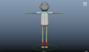
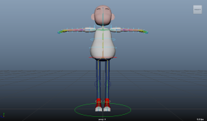
At this point, I had not used blender for texturing, cameras, lighting or rendering. I watched a few tutorials to familiarise myself and picked each step up very quickly.


A Guide to Three Point Lighting Techniques


Fundraiser

To help raise money for our fundraiser, I bought a ticket for the easter egg raffle organised by Ciara and shared the final year animation Instagram post on my Instagram story and amongst friends and family who all took part in the fundraising.


Business Card

I struggled a little thinking of a business card idea as I wasn’t 100% sure what route I wanted to go down after uni. I decided to stick with 3D generalist to keep my options of character animator and modeller open. For my business cards, I wanted to use different poses of Charli to show both my modelling and animation skills.

I started with a few different concepts using my render of Charli and sent them to Henry for feedback. He said that he liked the vertical and lower left concepts the most as in the others, the wording was too close to the boarder. He also said that if I was including a qr code of contact links, I didn’t need to have as many on the back of my card. I decided to only have my email on my business card. I then created a Linktree qr code for my Instagram, ArtStation, YouTube channel and phone number to include on my business card and CV.

After this, I posed Charli in a few different ways to find the best silhouette for my cards. I took inspiration from a character design I found on Pinterest. I also researched which fonts would be best for business cards and found that sans-serif fonts are best, so I downloaded a few for google fonts that I could then use for my text.

Fonts:

Through further trials, I decided to place the text at the bottom of the card as I felt Charli’s new pose distracted from the text when centred. I kept Henry’s feedback in mind and made sure to keep the text further from the boarder than my initial concepts. I will render similar lighting on Charli’s front and back poses as her main pose.

First business card concepts:

Test Poses:

Photoshop pose tests:

Lighting progress:

Photoshop render test (front):

Photoshop render test (back):

Business card so far:


CV

I already had a 3D generalist CV when applying for placement, so I used it as a starting point for my new CV. When applying for placement, I received feedback from lecturers and researched what information should be included when applying for a 3D generalist job, so I made sure to keep in my CV where I talk about being a communicative person in groups and someone who is always eager to learn. I did, however, want to take out some of the text on my old CV as it was quite text heavy.

I removed my A Level results because as a graduate, they were no longer needed. I also removed my portfolio and contact links and used the same qr code I used for my business card. As I had another job to add to my CV, I moved my experience with NI Screen and Berkeley City College to my education list. This meant I had enough room to list my work experience whilst being able to include courses I felt were important to list when applying for studio jobs in Northern Ireland. I still liked the style and colour of my last CV; however, I wanted to make it a little more simplistic and add a section where I could include the same image from my business card to show my most recent work on our film. At the moment, the only thing left to finish on my CV is to ask my previous employer for a reference.

Showreel

For my showreel, I felt there were a few things I wanted to change. I was still proud of all the work I had included in it when applying for placement. However, some clips were unnecessary to keep after completing animations for our major project. I cut a couple of clips from my classes with Chris Carter and my first year work as my skills have improved from some of this earlier work.

I kept what I felt were my best body mechanics animations at the start, including the fall and sketchbook bang from our film, and my spiderman swing from my second year body mechanics assignment. From this assignment, I also kept my spiderman walk and run cycle as I still wanted to include one cycle each and felt that, since I gave myself a style to focus on during this assignment, I showed their personalities well. Since most of my showreel is of Charli now, I thought it was important to show I am able to animate various character styles.

To build on the 3D Generalist showreel, I included a couple of clips from my second year unreal cinematic assignment to show even though I have a particular interest in character modelling, I have skills in prop and environmental modelling as well.

I unfortunately didn’t have time to add text to my showreel. However, like my previous showreel, I plan on including my name and email address at the beginning and end of my showreel. Throughout, I will state my roles as rigger, animator and modeller where necessary.

Audio: https://www.epidemicsound.com/track/kWdzaiCJhn/


Instagram, ArtStation, LinkedIn, Facebook

This year I feel I have been more active on Instagram and LinkedIn than previous years which has helped me gain more confidence when using social media, as it is not something I often do. I have made an effort to engage with others and to share not just my work, but other people’s work at an attempt to build a close network.

As my group and I have shots we would like to re-render, after submission I plan on updating all of my socials with my final animations from our film.

Instagram: @amylong_art

ArtStation: https://along_art.artstation.com/

LinkedIn: Amy Long

Facebook: A.Long Art


Display – Place holders

For our display, Caity and I purchased various items for our display, focusing on a city/street theme. we decorated our table with miniature road signs, traffic cones, traffic lights etc as an attempt to build the city that Charli runs through in our film.

I then purchased a box and boards to add larger decorations to our display. I plan on painting the hexagonal box as a stop sign, which will hold our stickers we plan on handing out to viewers of our film. We also wanted to add a little more colour to our display, so I plan on painting either a yellow warning sign or a blue keep out sign onto our boards in time for the end of year show, keeping to our theme of road signage.

Prints and Stickers

At the moment, I have my render of Charli for the Cinema scene ready to be printed as a sticker. I would love to print her mobile as a sticker as well, as that one was of my favourite prop designs for the film. I plan on re drawing the phone so it can be a higher resolution for printing.

As a print, I decided to use my favourite concept I completed this year of Charli’s apartment in its early stages.

Final Animation

Final Animation Link:

Submission Edit – OneDrive

All Shared Files:

AmyLongMP


After my animations were rendered, I noticed a couple of things about Charli that I would like to change for the end of year show. Caity, Adam and I have a snag list of our re renders for after submission:

Even with these improvements,  I am extremely happy with the work I have contributed to my group this year and feel Adam, Caity and I have have created an animation we should all be very proud of.

My final roles for this animation:

Script, Concepts, Storyboards, Previs, Previs Blockouts (Café, Signs), Assets (Phone and Pencil), Early Cameras, Character and Prop Rigger, Character Sculpt and Textures, Character Animation

Production: Animation

References for Maya Files:

AnimationReferences

My plan for animating was to follow Rachel’s advice of making sure every scene was blocked out first. I started by doing a couple of trials testing out my rig, then starting my blockouts from the beginning of the previs. I was told to animate to the camera angle as it would have wasted time animating what cannot be seen in frame, so I positioned the cameras as close as possible to the previs angles, altering timing slightly as necessary. As we were rendering in blender, throughout the blocking out stages, I exported my animations to make sure they played smoothly. Through these tests, I figured out how to play the animations on 2s and 3s by baking the animations in maya on 2s and changing the tangents to constant in blender.


For the apartment and balcony animations, Charli will be rendered on 2s to hint at early anxiety. From my blockout, Alec gave me feedback on her positioning and the movement of the pencil from the sketchbook to her ear, which was slightly too fast. From behind, Charli looked off balance as her arm was sticking out too far. I felt she looked ok from the front, so I moved her elbow closer to her body and snapped it back when the camera cut to the next shot.

During Rachel’s classes, she mentioned that eyes never move smoothly unless tracking something. I kept this in mind and made her tangents stepped when looking around as I felt this subtle change would help her look more natural.

Later on, Alec suggested adding more frustration by having Charli either rip out a page from her sketchbook and throw it away or banging the sketchbook onto her fire escape. Originally, I only added the banging of the sketchbook instead of having her simply walk back into the apartment in frustration. However, after receiving more feedback, we felt having her rip the page out of the sketchbook was needed as well. I used blendshapes on a single plane to create a crumpled sheet of paper when she rips it out and created a small pause after she rips the paper out and throws it away based on feedback I received on my timing.

Maya Files and Playblasts:

01Balcony

After importing the window shot into blender, I noticed that there was random jumping at her feet. I figured out through changing her attributes that the stretchiness was causing the issue as the attribute wouldn’t export as an fbx. Exporting the animation as an alembic worked, however, since alembic files are larger than fbxs and this issue only became apparent later on in semester 2, I decided to go back to any animations that this would affect and alter her movements so we could continue exporting fbxs, keeping our render times the same.

I used my trial animation of Charli falling off the back of the sofa and myself as references. Due to the issue of the leg stretchiness, I had to work with the hands a little and moved them across the sofa sooner as they could not stretch. To allow Charli time to fall asleep, I made the shot of her falling onto the sofa a bit longer than the previs. For the laptop grab, I had originally positioned her hand in the centre of the laptop. Andrew noticed this and recommended for her to grab the laptop instead from the side as this would be a more natural position. I feel this subtle change helped a lot.

References

To understand how Charli should look whilst anxious, I watched panic/anxiety attack scenes from Grey’s Anatomy, Iron Man 3 and Puss in Boots: The Last Wish. Watching these clips helped me understand mouth, shoulder and chest movements whilst hyperventilating, and ways other parts of the body can be affected by anxiety, such as shaking hands.

02Apartment

Falling through window shot:

Fall References

From the café to the end of the void, Charli will be rendered on 3s to show an increase in anxiety. In the previs, we originally had Charli’s laptop pinging more negative messages. When it came to animating, it was decided that we would cut the laptop and focus on showing these same messages only on the menu. However, the menu was then cut as well. This helped me a lot in some ways as it cut the number of shots I had to animate in half. However, I had to focus on Charli’s body language and emotions more as she ended up being the focus of the scene, rather than the words that surrounded and taunted her.

03Cafe

For the city blockouts, I created the walk cycle first in case we cut the café as Charli would then have to fall into the city street. I ended up doing 2 different walk cycles. At the time of the first walk cycle, Charli was only seen from the back. Therefore, she had no eye movement or facial expressions. A shot was later added in where she was seen from the front, so I added confused yet curious expressions. Once the café blockouts were finished, I did a run out from the left-hand side of the street which focused on her breathing and panic. As the café did not have a set place in the city environment, I chose to have Charli run into frame from the side, showing the lights and the chaos of the city behind her yet hiding the buildings to her left.

While she was walking through the city, I wanted Charli to interact with the signage closely. Alec suggested having lots of signs sitting on the ground so the ones that attacked her did not come form nowhere. This allowed me to have a little freedom in how they attacked her and where from. He also suggested that Charli needed a moment before the signs ambushed her of curiosity. I added a shot where Charli wants to touch the first sign, but it shakes, causing her to coward away from the signs as it reflected her shaking hands from the apartment animations.

During the final animation stages, there were a few cuts and changes to the city scene. The shot containing the silhouettes in the window was moved to before the introduction to the signs. To accommodate this, I changed the run from my blockouts and used my walk cycle to have her notice and interact with the window at a slower pace. Due to city changes late on, I couldn’t have Charli look directly at the window. Instead, I picked a general point to look at without the need for her to stand directly in front the building as the shot after would simply focus on the window before the first sign attack.

I finished the fall animation right after the balcony animations as this was the most complex part of the whole film. Therefore, I wanted to have as much time as possible to finish it to the best of my abilities. In the earlier stages of the blockouts, I received feedback on the parts when gravity caused Charli to let go of the windows that she’s holding on to. To help covey this, I squashed and stretched Charli more and moved her torso to one side to show that gravity is pulling her down. However, due to the stretchy attribute not exporting, I had to alter Charli’s movements slightly. Later improvements from Alec included moving her elbows out during the run cycle as from the top-down angle, her upper body looked stiff compared to her leg strides. The other pieces of feedback only included the positioning of her T-shirt as I found it little difficult to pose due to the constant changes in gravity.

04City

In keeping with the shaking theme in Charli and the signs, I wanted the same movements to be shown from the sketchbook in the void. Throughout the film, sketchbook is a shield that brings her comfort. The shaking would be the thing that helped her realise it was the thing that was fuelling her anxieties and the world that she was stuck in. After the final presentation, much of my blockouts were cut to try and narrow down the meaning of the sketchbook after receiving feedback from Alec, Henry and Mike. I would love to go back to my void animations after submission as I felt very rushed at the point of finishing them. However, I am happy with the starting place I have considering I animated with no previous set camera angles or an updated previs.

05Void

The final scene where Charli wakes up back in her apartment is also an area I would like to add to after submission. For the final scene, Charli will be rendered on 1s to hint at a more calming atmosphere. Unfortunately, due to limited time, I had to cut the pickup of the laptop from my blockouts. To combat this, I added roughly 100 frames to her sitting up on her elbows where she would have a moment of calm and realisation that she would be ok, where I focused a little more on her facial expressions. We also intend on having Charli hold her new sketchbook whilst having her sketchbook on display and proud, which was feedback we received.

To make Charli run up the stairs, I used Rachel’s method of creating a walk cycle by moving the main rig control and animating her limbs on a cycle. Instead of simply moving her forward, every cycle Charli would move up and forward 2 steps until she hit the top step.

06End

Final Presentation (Blockouts):

Finished Animations:

Animating with props:

Production: Rig

Files:

Rigs

Before this year I had not rigged since the vertical slice project in 2023. I was a little nervous about rigging again as it was not something that came naturally to me the last time, but I knew I wanted to give it another try.

Alec recommended using the Advanced Skeleton which sped up the rigging process a bit. Ideally, I wanted to give myself enough time to rig in case of technical issues, such as skin weights needing repainted etc, which needed done to the fingers, legs and face at various points during semester 2.


Since I used the Advanced Skeleton, all I had to do was select the biped rig which generated half of a skeleton that I had to manually align with Charli’s proportions. After the controls were set, I created a cage to Charli’s proportions so her initial skin weights would be as accurate as possible. When creating the cage, I had trouble with the feet as it kept collapsing at her toes. Alec told me that because the soles of her shoes were below the ground plane, this caused the cage to sit too high, unable to cross the axis. After moving Charli above the ground place, the cage worked as it was supposed to.

When I moved onto the hair, as Charli’s hair was not symmetrical the cage created for skin weights could not recognise the shape of the mesh. This caused issues when skinning, so I decided to wait until the rest of the rig was finished before creating the controls for the hair.

I moved onto creating the face controls by adding markers to specific parts of Charli’s face, including her eyebrows, eyes, cheeks, nose, lips and jaw. After the controls were created, I was happy with most of the face. However, I had to repaint a few areas where the weights had not applied properly, such as the eyebrows, eyelashes and the jaw.

I waited until I had begun animating to decide if I wanted to add joints to her T-shirt and trouser drawstrings. With the limited time we had at this point in semester 2, I felt it was best to rig them both. I experimented using proximity wrap at this point with various parts of Charli’s mesh, such as her trousers, bralette and top. The trousers were an area that I had struggled with throughout the rigging process as her legs kept poking through the mesh. I managed to fix many of these issues by repainting the hip and root joints, but I found that the proximity wrap helped with this around her thighs. However, the area at the top of her legs kept poking through. Therefore, I felt I had slightly more control with painting the skin weights.

For the T-Shirt, I created a loft between two nurbs circles and made joints and controls which would control the loft rather than the T-shirt itself. I felt that using this method would make painting the skin weights easier as the loft didn’t have the same folds and detail as the T-shirt did. Therefore, using it as a driver for the proximity wrap would cut out issues I would have later on when trying to balance the T-shirt’s weights. I managed to create a rig using this method I was happy with, however, due to the influences of the T-shirt, I kept having issues with double transformations. To finish the rig, I ended up using the joints I had already created for the loft and decided it would be best to spend time on the skin weights for the top itself and I knew I could create a rig this way that would not be affected by double transformations. For a future rig, I would like to experiment with simulating baggy clothing such as this, however, I feel due to our limited time to finish the film this way of rigging was the best option.

I also quickly found an issue with the proximity wrap and blender. As we were rendering in blender, all animations had to be exported as an fbx. The animations along with the proximity wrap did not export as the mesh was no longer bound to the skeleton, so when Charli was moving in blender the mesh of the bralette stayed in its origin position. I feel as though if we were rendering in Maya the proximity wrap could have worked well for certain areas that were skin tight, however, for this project the best solution ended up being to skin the character the way I originally knew how.

Other Rigging Research:


I also relearned how to create and use blendshapes for the top as I felt, considering its bagginess, there would be certain ways I wanted the top to move with when moving her arms a certain way. I tried creating blendshapes on duplicates of the top, however, when I moved Charli’s arms and keyed the blendshapes, her sleeves would snap back to her those position. Because of this, I created blendshapes directly onto her T-shirt for different arm positions. These blendshapes also helped with an issue I was having with the inner layer poking through the top layer. To help with this, I also duplicated her T-shirt, deleted the inner layer, skinned the single layer T-shirt and copied these weights over to the original T-shirt.

Two weeks before submission, I noticed that after I had finished the full rig, 2 of the corner mouth controls were no longer working. I spent a bit of time trying to fix them by redoing the whole face rig and just the mouth section after copying her skin weights over to a duplicate mesh to try and preserve them, however, they would not copy over after the new face rig was completed. Since we were so close to submission, I decided to animate with the remaining working controls.

Final Rig:

For our film I rigged an open and closed version of Charli’s sketchbook, a pencil and a phone that we didn’t end up using. For her laptop and the chair and table in the café, I either added parent constrains or I keyframed the mesh to move at the same pace as Charli. For the sketchbook tabs, I created 2 controls per tab to allow for as much secondary movement as possible. I also created quick sets in maya to allow for the selection of all tabs at once.

Other Links:

Production: Textures and Props

Files:

TexturesAndProps

I uv unwrapped after skinning my model which ended up causing an issue with random uv islands. Alec explained that this was the issue and told me in the future to select the mesh and delete non-deformed history which would solve the uv issue. I ended up splitting the trousers down the middle to allow for a higher resolution, however, the rest were my final uvs.

I had a few issues before I began texturing which started during my first blender animation tests Charli’s skin was importing extremely discoloured, looking as though there was an issue with the normals. This only occurred after I had to redo the finger skin weights. For whatever reason, going back to this file and reskinning the fingers solved the issue.

Later when importing Charli into blender, I noticed that the light was affecting her skin, top, bralette, eyelashes and shoes differently than the rest of her. After sending this issue to Alec, he told me to select these parts of her mesh in blender and go to edit mode, select mesh, then normal, average, and finally face area, which fixed the normals issue. After learning this fix, I feel as though this may have fixed the earlier issue I was having with her discoloured skin and will try this fix if I ever have an issue like that again.

When baking the high poly onto the low poly mesh, I encountered an issue with clipping and shadows on areas where the mesh was close to her skin. I had to bake each texture set separately which allowed me to change the max frontal distance as needed for each part of the mesh. I also made sure that the objects on both the low poly and high poly meshes were the same, which allowed me to bake individual meshes by mesh name, and changed the ambient occlusion self occlusion setting to only same mesh name.

Before:

After:

To add a bit of stress and anxiety to her appearance, I added deep lines below Charli’s eyes . Henry expressed a little uncertainty about this choice as he felt it aged Charli. However, Alec felt with the right textures these lines could add the right amount of anxiety. I kept this in mind when texturing Charli’s face as I wanted to emphasise her eye bags enough without aging her any further.

Every step of the way, I kept constant communication with Caity to make sure I was following her concept of Charli. I also followed YouTube tutorials which taught me to add a skin face smart material to her face and body, which added blush colours around her ears, eyes, mouth and nose and pore like details to her skin. I felt this smart material added too much colour to Charli’s skin as we wanted her to look very pale, so I changed the base colour of the smart material and lowered the opacity of the redness slightly. I also erased the pores around her body as I felt they were too intense on her chest and arms compared to her face.

Hair Experimentation:

I experimented using a dirt generator for contours on her face to help with the painterly look we were looking for, however, I felt it didn’t give the right painterly look I was going for as my main inspiration was the characters from arcane, so I decided to hand paint contours onto her cheeks, jaw and forehead. In the early contour stages, I used the rake brush to add details to her blush and contour, however, the more I textured the more out of place I felt those detailed looked, so I stuck with using an ink and a charcoal brush for these details on her face, ears and elbows. For the majority of my brushes, I stuck to the list Caity used in the studio interior to keep all the painterly textures as cohesive as possible.

In keeping with the arcane inspiration, I tested out smudged eyeliner looks on Charli as I felt that would both help with the tired look, as well as add to the slight 00s grunge style. I colour picked from Caity’s concept initially but felt that once I used the colours with my textures, the shading looked too warm and dark. I toned down and gave around her eyes a more orange tone which would complement her eye colour well.

Final Textures:

Assets Modelled:

Production: Character Model

I was nervous to sculpt the character as I had never sculpted a human character before and had done little sculpting prior to this year. Originally, Caity was the one who was going to sculpt her, with a little input from me as the rigger and animator. However, I knew it was something I wanted to try and an area where I wanted to expand my skillset.

I first imported blender’s stylised female base mesh into Maya to alter its proportions to fit Caity’s design of Charli. At this point, I decided that since I had a little experience in blender, I wanted to learn Zbrush while I had the opportunity as I had previously found it very confusing.


Once in Zbrush, I used Anatomy for 3D Artists as well as online images as references to understand where muscles and fat would sit on a feminine build, and how planes can add structure to different parts of the face and body. Through feedback, I was advised to move the nose and mouth forward as once translated into 3D, the face became very flat, making it difficult to add volume to the cheeks which, otherwise, made the model look sickly. Henry also helped by sharing a 3D skull model as my model was lacking in contours a cheekbone would cause.

I also took the opportunity to learn Zbrush iPad. I continued to use Zbrush on my laptop much more due to the larger brush selection, however, I found that Zbrush iPad was good for more basic sculpting.

To create the hair, I downloaded two IMM hair brushes. Henry also shared a set of IMM hair brushes with me, showed me how to create a custom brush and how to use Nanomesh for hair. I decided that sculpting the hair using the selection of IMM hair brushes I now had would work best with the style of our character.

Feedback from Caity and new ref i chose to help with shape:


IMM hair brushes:


Due to the bottom layer of Charli’s hair being seen, I was finding it difficult to build volume in the right way. I followed a tutorial which included a character with similar hair length to ours. This character had hair that was much smoother and tidier than Charli, so I altered it a little and added another later of hair at the neck to give more of an illusion that the hair was unkept, rather than pinned up.

Throughout modelling Charli, I followed Rheanna’s guest lecture videos. To create clothes, I chose to follow Rheanna’s demonstration of duplicating the body, masking out and creating Polygroups where I wanted to clothes to be, hiding and deleting the other areas, and using the edge loops tool to create panel loops. This allowed me to delete the inner layer of the clothes easily which otherwise could have caused problems when rigging and animating. To model the shoes, however, I went back to Maya.

I attempted using ncloth in Maya once I had a basic shape for the baggy crop top, which I was hoping would give me a good base to bring into Zbrush and sculpt from.

After my first attempt, i found that subdividing the mesh caused too much stretch and the inner layer was causing issues. After making changes, I decided it would be more beneficial to use the results as a reference rather than importing into Zbrush.

Following Rheanna’s advice to make folds in the socks, trousers and top, I used sharp S/Z lines using the standard and damstandard bushes and moving between subdivisions as to not lose shape. I also created my own stitching alpha for the seams of the trousers.

For the mouth bag, I had to learn how to use the zmodeler tool, which allowed me to extrude edges around the mouth and add creases at the opening of the lips. I found the zmodeler tool a little difficult to use to create the teeth and gums, so I went back to Maya to create those.

When I was happy, I sent the model to Alec for feedback. He advised that even though our concept had hands on the larger side, the hands might be a little large in proportion to Charli’s head, and to run this past Caity in case we wanted to change them a little.

Finished Model:

Alec also sent me a link to two YouTube tutorials on polygroupit which is used to retopologise meshes using zremesher by painting lines and creating groups in Zbrush. Both, however, stated at the very beginning that the Zbrush plugin was not ideal for characters that would later be animated. I decided that in the long run, it would be more beneficial to completely retop Charli in Maya. I followed various YouTube tutorials and Anatomy for 3D Artists to learn how to create hinges and create loops around areas such as eyes and the mouth that would require more movement.

At this point, I was not sure if the T-shirt would be rigged with joints or simulated later on in maya or blender when animating. Regardless, due to the bagginess of the T-shirt, I gave the T-shirt an inner layer so there would be a noticeable thickness. This layer would also help with the appearance and movement of the T-shirt later on if it were to be simulated.

Other Links:

Pre-Production

Our idea later evolved to focus on a 20 year old artist who would struggle with anxiety and imposter syndrome. I created the storyboards for our story thus far, trying my hardest to focus on the idea of being so consumed by your own anxiety that you fear nothing you do/create will live up to the standards you think others have of you. Another idea within the group was to record ourselves saying self-deprecating things which we think of ourselves sometimes, and other students within our course think as well. Each thought would be allocated its own colour, which would pulse around our character. Along with the manic sketchy lines we intended to include through our own mark making, this would cause a tunnel of overstimulation.

Mark-Making:

Storyboards:

I used Haley Williams from Paramore and Maeve Wiley from Sex Education as references for new character designs, as well as other y2k grunge images from Pinterest. One piece of feedback we received was to dress her in more relaxed clothing as she will have been inside for a lengthy period.

I used the controls of a Nintendo Gameboy as inspiration for her phone, whilst still having a touch screen inspired by the iPhone 5c.

I wanted to keep the idea of overstimulating surroundings which would trap our character in her “comfort zone.” I used Gwen’s apartment from Across the Spiderverse as a major inspiration for our studio/flat. I felt the bleeding colours would allow for us to create less of a room and more of a space that would mirror the mind of our character and her anxieties.

As our project developed, I created two internal concepts for Charli’s (our character) apartment, using two different colour palettes with the intent of creating a sense of peace by the end of the animation. I took inspiration from a concept Caity created, the Netflix film “Entergalactic”, and Leanna’s workshops to help with colour and lighting as they were two areas I struggled with the most. I also received feedback from Leanna on one of my concepts to improve my colour, lighting, and perspective. For the messy design, I had the opportunity to use a few of my own procreate brushes made during our mark-making trials.

Before:

Leana’s Feedback:

After:

For the animations, I took inspiration from the frame rate changes in Spiderverse as Miles becomes Spider-Man. Even as our story changed, I still wanted the frame rate of our animation to be linked with the emotions of our character. Whilst Charli is in a sense of calm, her movements will be much smoother, on 2s pre abstract, and 1s post abstract. Within the abstract world, as she becomes more and more anxious and fearful, her movements will become choppier, animating on 3s in the café and as she begins to walk down the city street, then evolving to 4s and possibly stripping her movements all the way down to blockout poses, showing as much emotion as possible in her most anxious moments.

Inspo:

I did an animation trial on 4s using the Azri rig early on. There were even fewer poses in a run cycle when animating on 4s than I first thought. This, in some ways, could speed up animation times throughout this part of the animation, but will also mean I will have to focus on conveying Charli’s emotions through even less movement which is something I would like to focus on in future trials.

As our animation changed, I created more finalised storyboards through the lens of an animator. We didn’t have a finished character design for the storyboards, but had a more finalised apartment layout. I kept the boards very basic as we had decided Adam would take my boards and update them. Adam wrote a script and included an abstract world with a café and a city Charli would navigate. I tried to visualise the new idea while adding in earlier elements we wanted to keep in our animation, such as, the overstimulating colours and self-deprecating words and voices.

For the previs, we decided our café was to be used as a slight mirror of Charli’s room, a place that is supposed to be her safe space but is only harming her. I took Caity’s apartment blockout and added chairs, tables, a till etc so it had a familiar feel. i also created several signage assets for the city shots in the previs.

I completed the previs based on the final storyboards and camera angles and various notes from Alec on timing, framing and ways to add intensity, specifically to the café scene and the abstract sequence. I added a sign to the café which read “you’re trapped”, prompting her to run out. A large inspiration for me was the animation “People Person.” I wanted to include similar camera framing and expressions/movements of their main character. My shots in the previs have a grey boarder, while Adam’s shots have either a black boarder or no boarder.

My Final Previs:


To animate a character walking forward, Rachel talked about starting with blockout poses and only adding in-betweens when the timing and spacing of the initial poses were finalised. The most helpful part for me was learning to count the number of frames one walk cycle takes and moving the main control at the same rate of the walk so you only needed to animate the steps walking in place.

I found expressions a little bit harder to convey. I attempted to create two different fearful expressions as I felt this would be most beneficial for our animation. Through Rachel’s feedback, I learned to add more tension in the hands to convey stress and anxiety, and to extend the body more to make my intended movement clearer.

I also learned how to pose hands to give a character more life by curling in all fingers, moving the index finger back slightly, and curling the pinkie in slightly more than the middle two, as this is the natural position human hands will fall to.

Development

For my final year major project, I worked mainly with Caity and Adam, with help from Cloe and Josh. Our first idea was going to focus on a roof top garden, which housed a child who was unaware of the world around her. The environment was to act as a mirror of societal pressures one might face, such as beauty standards, ozempic, and highlight the way in which man-made buildings on earth has taken over our natural world.

For style, we agreed early on to create painterly textures as if out of a sketchbook. The idea of having a child as the protagonist was suggested very early on, and it was an idea that I personally wanted to develop further.

My main role at this time was rigger and animator. From an animator’s point of view, I felt that I could have lots of freedom when animating a child’s playfulness and joy that would highlight a vital innocence in our story. Throughout my character concepts, I used Little Nightmares, Hobbit, Oliver Twist, Harry Potter and Lilo and Stitch as inspirations.

For our environment, I first took inspiration from the film The Day After Tomorrow as it centres around the New York Public Library. I felt having our natural environment on top of a low and wide building would both allow more freedom for character movements and would contrast well with the skyscrapers. Our man-made environment later developed into overstimulating, glitchy buildings that would indicate a watcher of some sort keeping an eye on our protagonist. We also thought of including a subway that would create a bridge between both worlds, giving our character a choice she would have to make, whether to stay in her comfort zone or venture out into an unknown world.


Assessment 1 – Reflection

I chose the role of a rigger/animator as I have loved animating throughout my second year in university, and I knew I wanted to develop my skills even further in this area. However, I was not comfortable at all with rigging. Before this semester, I had done very little rigging and found it quite confusing. After this semester, I feel I have learnt much more than if I had picked another role because of this. I now understand rigging much more and feel confident in my skills. There were many things that went wrong in creating my character rig, and I would like to go back and practice these areas more, such as creating an FK/IK switch the correct way. However, I now know how to fix these problems and feel I could create a rig much quicker now.

I also feel more confident in working within a group. Being put into a group with unfamiliar people from another course for a module which was much tougher than previous modules gave me more confidence in working with other people form other areas of the industry. I feel this will help me when it comes to working in a fast-paced studio environment with new people.

Assessment 1 – Portfolio

Rigs:

Animations:

Props:

https://skfb.ly/oHp8N

Amy Long Vertical Slice

Gameplay Footage: