Book Research-The Design of Everyday Things (IXD303, IXD304)

The Design of Everyday Things

The Design of Everyday Things is a book originally published in 1988 by Don Norman. He is well known designers and author who has written other books. This book has been since revised and expanded upon since it was first written.

This book promotes good design and gives designers a realistic view how and why some products meet clients needs over others based on the design. The book explains how great designs can be nice to look as well as usable and useful in the everyday world. Whereas some design can be disastrous and ruin the way the product works and take the joy out of the users experience and possibly cause harm. This book gives many examples and anecdotes to back up their points.

This book is timeless and still used today by many first time UX, product and graphic design students. It’s great book and it is a must read to help you get a better insight until design of everything things. It is an enjoyable read and the author is very down to earth. He is someone we can relatable as we all get mad with bad designs.

This book will help your spark your ideas on how you can make a great design which focuses on the needs on the user.

I hope to find other books written by Don Norman which I can read to further my knowledge.

The key point I’ll take away from this book is that when designing a product, it’s important to meets needs of our audience.

Article-100 Things Every Designer needs to Know about people (IXD303)

100 things Every Designer Needs to Know about People

This is book written by Susan Weinschenk. The aim is to help designers understand people and how can improve your designs. In this book there is a combination of both science and research with examples to give the designer an ultimate guide to design. There is a lot of points you can take away from this book and use in real world.

This book will therefore help you the designer to design more innovated and appealing apps, websites and products that will meet users needs through a way they think, decided, and behave.

This book answer particular questions such as:

What grabs the user’s attention?

How to make my products stick in people minds?

Are some fonts better than others?

This book goes into depth about all your queries.

I would highly recommend reading this especially if you are student or new frist time UX or Graphic designer/ developer. It is a very good book and may give some great tips to improve greatly your design. This book is visually appealing and breaks down the content easily to help people understand.

I’ve learned so much from reading this and will continue looking out for similar books on this topic. This has helped me to enhance my knowledge in this area and hopefully can take it into my own designs.

Laws of UX- Aesthetic-Usability Effect IXD303

Aesthetic-Usability Effect

Another common Law of Ux design is called “Aesthetic-Usability Effect.”

This law states that users often perceive aesethetically pleasing design as design that’s more usable.

Key points:

  1. An asethetically pleasing design creates an postive impact on users and make’s the overall design seem better
  2. People are more tolerant of minor issues when a product or service is nicely design.
  3. Visually pleasing design can mask usability problems and prevent issues being discovered by users.

Origins 

In 1995 researchers Massaaki Kurosu and Kaori Kashimura were the founders of Law. They carried out study by testing users to rate each design on the use and appeal of a website. They discovered users rather a visual appealing interface, even if they had underlying problems. 

Reflection

Aesthetic-Usability Effect is important to consider in design. This can determine why other products or sites are perferred over yours. Its important to use this law effiectly in order to make my site/ or app eye catching and visually effective to my targert audience. The more interactive effects, colour and images I use the more likely user will continue to view my site and keep them interested.

IXD303- Gestalt Principles

Gestalt Principles are principles that describe how humans group similar elements, recongise patterns and simplify complex images when we perecieve objects. UX Designs commonly use the principles to orgainse content on a websites to make it visiually appealing and user friendly.

Origin

These principles were discovered in the 1920s by germany Pyschologists Max Wertheimer,Kurt Koffka and Wolfgang Kohler. According to this “the mind informs what they see by perceiving a series of indivual elements as whole”

The Word Gestalt is German for “Unified whole”

Today graphic and UX Designers have adopted these principles to help them with their overall designs to help capture the eye of the users by adding in visual elements.

The main principles are:

  • Promoxity
  • Similairity
  • Continunity
  • Closure
  • Perception
  • Organization
  • Symmetry
  • Common Fate

Reflection

As a Ux Designers it’s important to know these principles and I will do my best to try to incorporate these into my design work in order to improve my user’s expereince. I will do my best to make my users feel comfortable when they first click on my website by creating a lasting impression. The users needs are essential in industry. We must strive to towards satifying their needs. These principles will help us to acheive it.


Law of UX- Tesler’s Law (IXD303)

Tesler’s Law

Another law to look at in UX Design is Tesler’s Law which can be found in the Laws of UX Book.

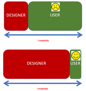
Tesler’s Law states that “any system there is a certain amount of complexity which cannot be reduced.”

Key points to takeaway are:

  1. Is such a function required
  2. Balance the difficulty
  3. Reduce the burden on users during the design and development stages of your design
  4. Make sure the system is simplified to a point.

Origins

During the 1980’s Larry Telser a computer scientist discovered the way in which users interact with an application, was just as important as the application itself. Larry Telser said in an interview that enigneer should spend time reducing the complexity of an application rather than making users spend alot longer using a program.

If an application is simple to user they will continue to use it and attempt more complex tasks.

Above is a diagram which explains the basics of Tesler’s Law

Reflection 

I think this Law is very important in UX Design. I will learn from this law and reduce the complexity of my webite and application to help improve my user’s experience using this product. I will make a huge effort to work hard during the design and development in order to make it smoother and simplifer process for users to use efficently.


IX303- Designing my logo/wordmark

Once I came up with a name for my health care app I wanted to design a logo/wordmark which represented my app.

I made a few sketches on paper how I wished my logo and wordmark would look like on screen. They have involved since.


I then took these ideas and tried them out designing them using Figma.


I came up with different verisions with the hope of finally coming up with the best verision.


After receving feedback this is the final logo and wordmark I came up with. I am happy how I came to the final outcome

Week 12- Class Feedback Session

Today was our final class before we finished up. It was an excellent opportunity to recieve some further feedback and advice on my Health Care App to date, so I can make further improvements and updates.

As well as recieving feedback from my class mates, I wanted to make I give everyone else some helpful feedback in return. I thought the standard of work from was really good I was happy to view everyone’s.

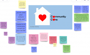
Here’s some of the feedback I recieved:

  • I think the one occuring feedback was to improve the logo and wordmark.
  • I need to make sure my content is structured  and aligned approitately.
  • Apply spacing.
  • I will make sure the content is easily to see and colours are well constrasted.

I will use the feedback I recieved today from Paul and class mates wisely and spend the next few weeks making the nesscary changes and make sure the work is well up to standard that I’m happy with in order to have it submitted for the deadline known I’ve put in my best effort in my work.


Week 11- 1 to 1 Tutorials

On Thursday during class, Paul give me some helpful feedback on my healthcare app in current state. He give me some great advice in terms of the navigation, layout, typeface and how to create compotents which can be reused on app to save a lot of time.

I will spend this week making the nesscary changes to improve my overall app design and layout. This will hopefully make my final outcome successful and make it more professional looking.

I continue to work on this app and my blogs up to the deadline to make sure I am happy to present to my class, lecture and finally my users.

I feel the app will be very helpful for carers in the local community and i hope they can benefit from this.


Week 10- Final Countdown (IXD303)

Today’s lecture was preparing us for the final push on Healhcare App Project in order to have it handed in by the deadline.

Paul started off class running through a tutorial on, “how to create our own buttons or compontents. He advised once we made them we could build up a component libary and reuse them in furture projects. By doing this you can keep the same button but change the colour and design easily.

Laws of Ux

Users often perceive aesthetically pleasing design.

The design is not just what it looks and feels like. “Steve Jobs”

Orgins 1995 by Kurosu and Kashimura.

Daniel Kahneman- “Thinking fast and slow”

Task 1

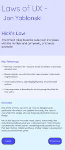
For our 1st task in class, we were given sample text on Hick’s Law and had to structure the content according. Paul asked us to use the typescale guide on Material.io to help us with this to task.

Here is the design I came up with. I choose the quicksand typeface. I experimented with different shades of blue for the headings, background and buttons. I wanted to give the content a clean and simple look.

Automatic Cognitive Processing

System 1

  • Intuitions
  • Feelings
  • Intentions
  • Impressions

System 2

  • Focus
  • Research
  • Searching Memory
  • Mathematical Operations
  • Suitational Awareness

Apple are a great example of using Automatic Cognitive Processing to interest their audience.

People will judge on the first 55 millseconds of seeing a product. Therefore it is important to make first impressions count.

Usability testing is great as it demostrate how a user uses my product.

Gestalt Principle was introduced in 1920’s. These include:

  • Promoxity
  • Simialrity
  • Conitinty
  • Closure
  • Common Fate
  • Figure ground

Task 2 

We were asked to create a card compotent with Google’s Material Design based on our favourite/ most recent book we read. The dimensions were 350px times by 480px.

Here’s my design I came up with. The book I choose was “Once Upon A Tyne: Our Story Celerbating 30 years together on telly.” I give a brief desciption of the book and creating two buttons.

Mental Models/ Congintivte load

What to take away:

  • Carryout usability testing
  • Content Audits
  • Labbelling
  • user Research
  • User Interviews
  • Card sorting

Resources

Material.io

Reflection

Overall after this week’s lecture I feel more confident creating buttons and structuring my work. This will help me with my HealthCare App become successful.


Research- Liz Danzico- The Power of the Pause

Liz Danzico is a part designer, educator, editor from New York is the chairperson of the MFA in interaction design at the school of visual Arts. She is also a good speaker and done a ted talk recently on “the Power of the pause”. I thought it was very interesting.

Summary

Many people may consider a pause as awkward. As Ux designer pauses are very important part of design, we value whitespace, as they can be used to fill a gap. For example, this can be in the form of animations or visual effects to make it visually appealing to the user. By creating an effect can make the transition smooth and less awkward.

In the right moment Pause’s can create an impact such as in film, it can be used effectively to create suspense, making the easy feel uneasy waiting for the jump.

Famous speakers such as Edison and underhill used pauses efficiently when giving their speeches.  We can learn so much from pauses. They can be very powerful.

Skip to toolbar