Week 1- Exploring Identity (IXD103)

This Week were introduced our new unit “IXD103 Exploring Identity” by Daniel. He outlined the aims and criteria for this module and where we could access this on blackboard. He showed examples of previous years’ work and what we can expect to achieve in this unit. During class we used menti to take part in an interactive session where he showed us a brand and we had to write down particular words which best described the brand. It was fun and we able to see what words each person used to describe the brand. The 4 brands were Apple, Calvin Klein, Coca-Cola and Amazon. As seen below the words we came up to describe them.

During class he give us small task. We I had to pick an object and describe it to the class without telling them what it was. This helped us think about branding and what keywords they use describe and sell these products to their target audience. Brands use specific words that you assoicate with the particular brand. I choose laptop and my to description was: “I am a small portable device with over. I am Thin and have a screen which light up. I am covered in plastic coating and have buttons which you can click. I am used to store or access infromation, emails, play games or simply browse the web. ”

It was good listening to everyones description of their products

He then talked about brand ideas and tone of voice. Then went on to explain about personal branding and content audit before setting the first tasks.

He explained to us he will set weekly tasks after each class to complete for the following week which we can access on blackboard along with the lecture content. This is good way for us to focus and motivated.

This week he set us a couple tasks to help us start thinking of ideas. He asked us to write a social bio which we can use across different social media platforms. He also wanted us to set up an about press on blogs which is a longer version of social bio. This was to help us set our tone of voice. Finally, we were asked to complete content audit exercises to get us to grip with copywriting.  The first exercise was to create a word bank, the second was create brand dictionary and last one was to create a tone of voice guide. These were interesting exercises and will help us with our own brand.

IXD103-Monogram Research

A Monogram is a short motif made by overlapping letters or shapes to form one symbol. Monograms are can usually be combination of an individual’s initials or a company who uses well known symbols or logos.

One of the earliest Monograms first appeared on Greek Coins in 350BC.

Monograms were also famously used by Albrecht Durer to signature his work. He represented the letters “AD” for his initials.

Monograms can be seen everywhere nowadays from on the side of buses to clothing and products,etc. Above is famous brands that use Monograms. Everywhere we go we spot monograms without realizing.

I researched Monograms and collected some examples I liked to add to my Moodboard on Pinterest.

Week 2-Lecturer Notes (IXD103)

This week Daniel’s lecture was on Monograms & Lettermarks. He gives us a brief overview of the next stage in our branding project. During class we were given a small task to design our first name through the use of Geometric shapes. For example, we could use circles, squares, or triangles, etc to create our name. It is important to make these letters recognizable and consistent. You can see my designs for this task on a separate Blog post.

He showed us a few examples of resources and references which may help provide good research when looking at logos.

We got a brief definition of what a Monogram is and we went through a lot of different examples of Iconic well known monograms. We looked at the early example’s monograms and wordmarks from Greek Coins and Albrecht Durer’s. Then we looked at monograms of famous companies such as IBM, CNN, Gatwick express, and Hp, etc.

We were then asked to go around our houses and take pictures of different types of typography we can spot which represent a letter and post onto our blog.  He also wanted us to collect images on to internet and create a pinterest board of inspiration linked to our monograms.

He explained about our personal branding and designing the monograms as this week we were going to start researching monograms and sketching out our own monograms. He went through the requirements to help us make an effective Monogram such as Simplicity, attention value, application scaling, competition, tone of voice and Timelessness.

The tasks this week was to continue to research our identity design and specifically investigate monograms and gather examples of them. Complete a mood board on these monograms. Then based on this research begin to sketch out on paper different monogram ideas, using my initials based on shapes, letter, and typography. It is important to come up with different iterations and further develop my ideas. For now, I will just focus on the form and began using black and white before adding colour in the coming weeks. I will at attention to detail.

All my work in progress I complete will be posted onto my blog. These initial ideas will be refined and modified through the next few weeks.

I will be able to access more content on blackboard as well as finding examples and resources to help me get started. He shared designers such as Wim Crouwel and Armin Hofmann. He showed and shared a video of Moving brand. A Link to MIT Media Lab and Canadian National. He showed a video of how geometry Influences Logo design and MIT Monogram Video.


IXD103 Week 9- Portfolio Sites (lecture notes)

This week he said we should understand our own personal brands and apply it to our own portfolio sites. It’s important before we start creating our site to have our brand complete with a brand guideline including voice and tone, content and clear visual content.

This morning Daniel asked us to create a SWOT analysis listing our own strengths, weaknesses, opportunities, and threat. By doing this we can highlight our strengths to show off our abilities and show what we are good at. As well as looking at our weaknesses which we may have an opportunity for us to improve upon. Threats is what difficulties we our facing which can stop us achieving our goals.

When completely any project it is worth doing a Swot analysis to outline areas of your strengths and areas of improvements.

My strengths were Voluntary Work, Teamwork skills, Focus and resilience, problem solving, Microsoft office- word, excel, office and PowerPoint, sketches, etc.

Weaknesses were photoshop, coding, working under pressure, time management, designing, presenting.

Opportunities this is what I hope to achieve and want to improve upon. This is passing my course, gaining more confidence, improve communication skills, self- management, develop my design and visual skills, planning/organizing.

Threats- lack motivation, missing deadlines not sticking to schedule, procrastination.

To help improve these I will speak more, set myself mini deadlines, list task I need to complete and get rid of my distractions.

Next Daniel asked us to use sticky notes and write down a few words or sentence on miro describing what we felt the purpose of creating a portfolio site is. We then had to grab some of the notes and place them on different sections of the Bull’s eye diagram in order of which we felt were important. Some we felt very important which we placed on the inside others not as important we place on the outer layers. This was all down to personal preferences each person’s priorities may be different.  This was an interesting exercise.

The key to a portfolio is the work followed by the brand. From doing this work it will theory help me write our own mission statements explaining my goals and aims.

He then he explained and provided us with links to different articles he wanted us to look at which may give us an a few notes when designing our portfolio site. Next, he explained about content planning and how it should be laid out. He said using the element college from last week will help plan our content. Include heading, button, typography, colour scheme and brand guidelines. We must consider the formatting and placement of elements in our sites and what we need to display these.

On our website we need to include projects we completed, informative information to talk about the process and tone, should it be in a diagram or table, add imagery, mention the bio, write down contact details, additional links like blog and social media.

I need to decide is our websites going to be mostly text or images. Will it be 1 spilt into sections or muti web pages with buttons. He then provided us with a couple of examples of portfolio sites as Inspiration for us when designing our web portfolio.

Then he explained the web standards to help with sites.

He mentioned wireframing which is very important to making a website successful. This week he wants us to sketch out and plan our webpages. Best way is start on paper then begun digitalizing the wireframes.

Lastly, he provided us with some helpful tips which will be useful when creating our portfolio sites. He give us a checklist of content we should include and recommended using a gantt check to help plan out our time for each task making sure we give ourselves plenty of time. These tasks will also be added to the blog.

IXD103 Week 5- Colour and branding

Colour

This week during class we learnt about Colours. By understanding the different colour systems it will therefore help me achieve consistency in my own branding designs across both digital media and printing.

Georgia O’Keeffe stated, “I found I could say things with color and shapes that I couldn’t say any other way- things I had no words for.”

There are four distinct colour systems for CMYK, Pantone, RGB and RAL. Each colour system has its own unique usage. For example, CMYK is used for print, RGB is for on-screen like web, Pantone is for accuracy for calibration, and RAL is used in Powder coating and plastics.

Below I’ll explain about the 4 colour systems in detail:

CMYK is the main colour system used in printing images. It is made of 4 basic colours which are Cyan, Magenta, Yellow & Black. CMYK are subtractive colours which means they get darker when you mix them together.

Pantone is a large standardized colour system used in production of digital designs and printing. Pantone is mainly used in the design industry. It is made of a lot of different shades of every colour. Many graphic designers use pantone see what specific colour brand they want before printing. This colour system helps keep design consistent.

RGB is the colour system used for displaying designs/images on screen such as tv, computer and phone. It is made up of 3 additives primary colours red, green, and blue which are combined to reproduce a wide range of colours. RGBA is the extension of RGB with an alpha channel which represents the opacity of colour.

RAL is a European colour system used painting, coatings, varnish, and plastics. These colours are used in architecture, trade, construction, industry, and road safety. RAL is made up of a wide range of colours. For example, you could use RAL if you are looking for a specific colour when painting a wall in the house.

Hexadecimal is made of 256 colours. It is used to display colours on a web page. Using Hexadecimal colour chart or picker allows users to select a specific colour in CSS or HTML according to its specific hex colour code. It is made up of a hashtag followed by 6 digits. For example, #FFFFFF this is the colour white.

Then we learnt about why specific brands choose certain colours in their logo and what each colour stands for. Such as blue the NHS logo which shows the brand is confident, secure, trust, loyal, cleanliness, success, etc. When selecting our own colours we must be careful with our choices.

I felt this week’s lecture was very interesting and made me consider colours to use in brand. This lecture will help me when choosing a colour for my own brand. I also now know what colour system to use for my brand. Colour is very important in branding so it is essential to choose an appropriate colour that fits my overall concept. I will now start playing around and research different colours to see which one suits my brand.

IXD103 Week 8- Style Guides

This week our lecture was about Style Guides. In the PowerPoint presentation we learnt about style guides and pattern libraries. These elements will help me when creating my own brand.

Style Guide

A style guide is a design document which signifies the styles, patterns, practices and principles for a specific person or business. These standards may include the typography, logo/icons, colour palette, grammar which is based on its guidelines.

Pattern Library

A collection of design components related to the brand that appear multiple times on a website. Ui-Patterns.com defines the UL design patterns as “Recurring Solutions that solve common design problems.” Some examples of design components may include: Slideshows, Navigation, Social Media icons, New listings, hyperlinks, Carousels, etc. A pattern library document describes how a component behaves, looks like, and coded. Any organization must have interface patterns to digital products. Mailchimp, BBC Gel, Starbucks and Yahoo have examples of their own pattern in their pattern libraries.

Component

A Component often referred to a reusable pattern. Components are interactive elements e.g buttons, links for creating a user interface. These are available for Android, IOS, the web and Flutter.

Daniel went into depth about the pattern libraries, managing code and Style guides. We must keep these elements consistent. He shared plenty examples on the following slides of style guides and pattern libraries and showed a few links to websites on the slides where we can find more information and examples which we can check for some further inspiration.

In terms of own style guides it is important we consider the following:

  • Establish a table of contents.
  • Break information into manageable chunks
  • Use plain English and explain things clearly.

He then went on to talk about Modern Tools such as style tiles, Element Collage and Interface Inventory. He shared examples with us and use of these helps keep the interface consistent.

For this week he asked us to complete a interface inventory on specific website as well creating an element college on our own brand which I will add to my blog and finally ensuring my own research blog is kept up to date.


IXD103- Interface Inventory

This week I have been given the task to choose a website and complete an interface inventory document of the different interactive elements used throughout.

Interface Inventory is “a comprehensive collection of the bits and pieces that make up your interface.” According to bradfrost.com.

Interface Inventory is basically a range of interactive elements/components that make up your website or app.

I choose the Ford website for my interface inventory analysis as I already done some research on Ford before.


As you can see above there is a lot of interactive buttons/ options used throughout Ford’s website. Above is all the screenshot’s I took of the various buttons used on Ford’s Webpage. This makes the website user friendly and allows users to find the specific information/ car they are looking quickly and easily. The buttons they use are clear and accurate. The colours work well together. There are a range of button styles throughout the site. It is interesting seeing the different interactive elements on the website.

Categorize

I am now going to Categorize these buttons into different sections according to their colour and button style.


IXD103 Brand Guidelines Research- Ford

My task was to research my favourite brand and dicuss the branding guidelines of the specific company.

Brand Guidelines

Brand Guidelines or brand style guide as it is known are basically an instruction manual to help businesses/ organizations to communicate their brand. Most established company’s have brand guidelines. It is a document which explains the company’s brand through its logo, range of visual images and notes regarding its voice, tone, and messaging. Brand guidelines is a good way to help the brand maintain its consistency through the way it looks and feels.

According to Spellbrand.com, Branding Guidelines is “A set of rules and procedures for creating promotional material in order to stay consistent with a brand’s chosen image.”

The 6 essential elements of a brand style guide are its:

  • Brand story- This includes the company’s vision and mission.
  • Logo- Make sure it is consistent and clear. This includes logos and icons. Consider the size, space and colours.
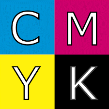
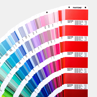
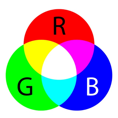
  • Colour Palette- Digital (RGB and HEX codes), Print (CYMK) and colour match (PANTONE name and number) primary and secondary colours
  • Typography- Explaining why you choose a specific typeface relating to your brand.
  • Imagery- Appropriate photos, illustrations and artwork relating to the brand.
  • Voice- This is the company’s voice, tone and messaging to explain how your audience feel’s. Such as words they use.

Any company which starts off should make sure they carefully consider their brand guidelines which is a good way to keep their brand consistent.

This will help the company in long term as people will get familiar and more recognition with well-established brand.

The Brand I choose to research and talk about if Ford as I really like their cars and I own one myself, so I am really interested in their brand.

Ford

Ford is one of the largest car manufacturers in the world and is a well-established brand which was founded by Henry Ford.

Mission statement

Ford’s corporate mission is “to make people’s lives better by making mobility accessible and affordable.” This mission statement focuses on moving people, which is a basic function expected in automobiles and the transportation sector. Such emphasis on mobility indicates the purpose of Ford’s business in society.

The 3 main things to take from this statement is ford wants to make people’s lives better, make mobility accessible and make mobility affordable.

Vision

Ford’s corporate vision is “to become the world’s most trusted company, designing smart vehicles for a smart world.” This vision statement reflects the multinational company’s strategic goal of becoming a leader in the automotive industry.

The 3 main points to take from their vision is the Worldwide scale, most trusted company and designing smart vehicles for a smart world.

Slogans/ Taglines

Throughout the years ford launched marketing campaigns using different slogans/ taglines:

  • Go Further
  • All New Focus and Drive one
  • Everything We do is driven by you.
  • Built Ford tough

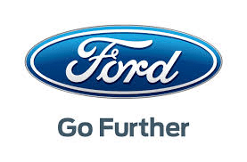
This slogan is Fords new branding strategy which applies to both car buyers and ford employees. These advertising campaigns help benefits the company.

Logo

Ford is a famous/ well know brand which people recognize straight away. This is because they have been business since 1903 when it well founded and have built themselves up to become the well-established trustworthy company they are today. Logo has been advertised for many years promoting its sales, encouraging customers, and making it internationally recognized.  Although the Logo may have changed and tweaked over the years the idea and their concept has been the same. The products they provide are quality and they have built up a customer loyalty.

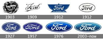
The logo below is their most recent logo which they have had since 2003 and has been ever present since. I feel this logo is very simple but effective. It gives a clean and nice feel to it. It consists of a round oval shape with shades of blue in the background and the white colour for the inner ring as well as the text. The colours of the background and text contrast well together. The use of blue in logo shows its confident, secure, trust, loyal, cleanliness and success, etc whereas the white shows nobility, elegance, and purity. Ford are making a bold statement with their brand which helps make them standout, especially for first time drivers or people are wanting an affordable, reliable, and well affordable cars that are well run.
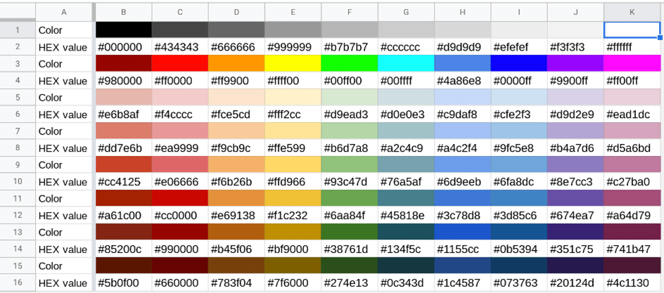
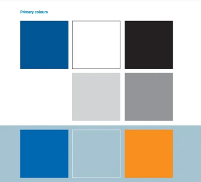
Colour Palette

Ford logo primary colours

Typography

Their use of typography works well and contrasts the oval shape and colour. This typeface shows it is a professional brand and has a classy feel to it. It is a classic handwritten font very similar to FordScript. The writing style over the years have been consistent through its revolution with the style staying the same. The stylish text represents the famous signature of Henry Ford.

Here is the famous ford typgrophy.

The name Ford is the brand name should be written in bold rather the model names.

Voice and Tone

Ford’s voice and Tone reflects its overall brand. Ford is a well-established and professional company which manufacturers and sell vehicles throughout the world. Their target audience is for any driver from all backgrounds, genders who look for affordable motors. Ford are innovated in their design and modelling of cars. Ford always looking to wanting to get better and improve their cars. When your purchase their vehicles you know what you are getting from them. They are quality and sturdy cars.

Ford brand is very trustworthy and affordable and reliable.

My first car is ford as I liked the look, the drive, and the overall feel of it, etc.  I also spoke to my cousins who had fords and they are highly Recommended. Also, it is easy to get parts I need and environmentally friendly and easily run. The brand represents the personality.
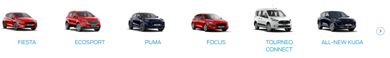
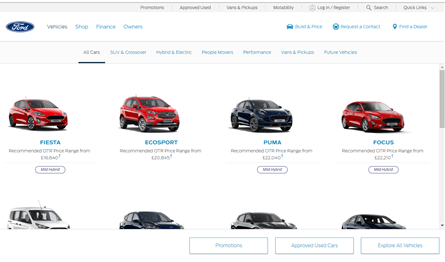
Imagery

Ford make sure they use good quality images for their products. Here is example of the exterior imagery from Ford guidelines.

Here is an example of the interior of ford car.

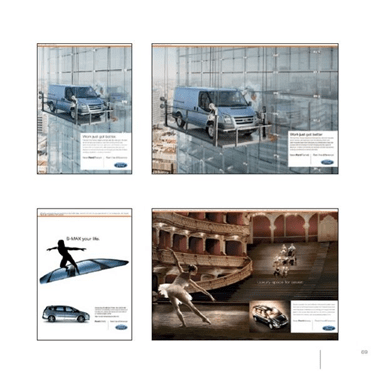
Here is an image of a ford car in advertisements

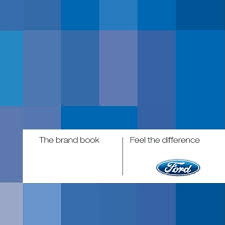
Below are images from the guidelines of the Ford brand box which is present on stationery and advertising materials.

Concluision

I felt this was an interesting brand to research and I felt I have gathered sufficent details. This will give me a good indiction on what all infromation and sections to include when creating my own Brand guidelines. It’s important I ensure the infromation is clear and easy to understand with good use of images to convey a point. I will continue to research bands I like which will help with my branding.


Week 5 – Pizza brand project- IXD103

Daniel gave us a 1 week project to design our personal pizza brand. I started off benchmarking competitors.

I looked at different inspirtations online and created a moodboard using pinterest based on the local brands and pacakging I liked the look of.

Next I researched and benchmarked local competitors

La Dolce Vita

La Dolce Vita is a family run Pizza business from Newry. La Dolce vita is owned by Giuseppe Fallone and his wife. They have 3 takeways located in Camlough, Warrenpoint and Newry and 1 Pizza Restraunt/ bar in Newry. All their Pizza’s are baked in a traditional wood fired ovens. During the first lockdown they produced their own branded Pizza kits which comes with fresh pizzeria dough, a tomato sauce base, cheese and toppings of choice to encourage customer’s to make there own dolce vita pizza’s at home. They provided a huge hit with many supermarkerts across the country promoting and selling their pizza kits. To keep up with the demand they had to produce 6,000 to 7,000 kits a week. Since the pamdemic they have a new 7,000 sq ft headquarters and prep centre at Camlough Retail Park where they develop a range of products to help their bsuiness.

Below is images of their pizza logo which is eye catching.

Domino’s

Dominos is Pizza delivery/resturant chain which started off in Amercia in 1960. It was founded by Tom and James Monaghan. Dominos has since become a globally recongised brand with over 17,000 resturants Worldwide. Once people see the logo they automatically know. The first ever Domonio’s store was in Luton in 1985. Dominos has become the leading Pizza Brand across the UK and Ireland with over 1,200 stores including Newry, Banbridge, Armagh, Portadown, Belfast as well as many others Places. Domonios offer a wide range of pizzas & a variety of other dishes & sides. Domino’s vision statement is “We’re passionate about becoming the number one pizza company in the world and in every neighbourhood.”

Below is an image of Domino’s Logo.

Macs Pizza

Macs Pizza is a local takeaway located in the heart of Newry city which is available for both delivery and collection. Mac’s Pizza have a website and app.

Saporni Italiani

Saporni Italiani Ristorante Pizzeria is an authentic Italian which opened in Newry beside the canal in August 2001 and has been in business in 20 years. It has provided Irish customer the best products imported directly from Italy. Once you step in you feel like your transported to Italy and will surely re-create memories. Sapori is an ideal place to enjoy lunch or your evening meal whether after shopping or on a day out.

Below is the logo of the Sapori Italiani

Four star Pizza

Four Star Pizza is a fast food company which orignated in Washington USA in 1981. It was founded by Alan and Susan Cottri. Alan Cottri sensed a market for American style delivery pizza which is the colour of the amercian flag. The name comes from the 4 stores they started off with which give it the idea. In 1986 Alan traveled to Ireland and opened a pizza store in Dublin which is where it’s main headquarters is located. This pizza company operates throughout Ireland with 60 Locations throughout the Island. They have one store in Newry. They are planning to expanding their business by opening up more stores in Ireland and Britian/ Four Star Pizza says “To bring you a truly authentic pizza experience our dough is still freshly made every day and we ensure only the best ingredients are used. We’ve been round the block a few times, so we know what we’re doing. You can taste it.”

The Blue print

The Blue print Pizza is local family run business with a passion for and a genuine concern for our customer’s welfare. It was founded in 1996 and is an outstanding restaurant located at Cornmarkert in Newry. Also available Take-Away Menu. Their menu is diverse which caters for all tastes and ages.

My own business brand

I came up with my own Pizza Monogram and wordmark based on my research which I created using Figma. I thought of using the Italian colours and decided using the pizza panel with a pizza for the logo. See below to see my work.

The Social Story

If you want to taste the real, quthentic flavour then come to “Flavour of Italy” were we still use the orginal wood fire pizza ovens. Close your eyes and you could be in the city of Naples. We are open for both sit ins and takeaways. To order please download our app which can be got in the app store.

The Physical touchpoint

This is the indital sketch of the Pizza box i will produce for my pysical touch point.

Step 3- Digital Touch Point

This is how the contact page will look like on a mobile phone.

Conclusion

I really enjoyed working on this project this week as it was something interesting and it was good to design a new identity brand and explore ways of designing it. I will continue to work on this in my own time.

Week 4 IXD103- practising drawing techniques

In today’s task were given a list of objects which we were asked sketch out in our sketchbooks using the various drawing techniques as this would be good pratice for our coursework.

I drew the following images:

  • An ipad
  • Laptop
  • Camera
  • Sketchbook
  • Pencil
  • Browser
  • USB Stick
  • Paper
  • TV
  • Radio

Below you can see examples of these:

Next I drew a pengiun following the “How to draw penguin” guide by Oliver Jeffers.

Here is my attempt:

Skip to toolbar