IXD103- Week 10- Minor Task

The Minor task for this week was to choose three businesses I respect and study how they form emotional realtionship with their customers. I choose the following three companies cause I really like these brands and I feel they use Brand value well to improve user experience and create a good emotional realtionship with customers.

Adidas

Adidas has been established since 1949. Adidas is one of the Uk’s leading sports clothing brand. Brand value is very important to them. Adidas take great pride in their brand. They have provided customers with quality products throughout the years.

Adidas have created ways of connecting social values in order to form relationships with their customers emotions.

The use of marketing campaigns such as “Impossible is Nothing”.  Adidas encourages people than anything is possble and not to give up. The use of celebrity endorsements such as Lionel Messi who is one of the best footballer in the world have created a huge a positive impact upon their customers and have increased their brand identity.

In 2013 Adidas used the “#MyGirls” which was a campaign used to support woman by celebrating young girl and female athletes keeping active. This campaign started as part of International Women’s day. It rolled out a lot of content across it social channels and shared stories of inspiring female sportswomen from all over the world.

The main focus of Adidas’s approach to marketing is it’s use of storytelling. This has been used by Adidas for years. These stories include their own and allows people connect with stories from sporting superstars to celebrities to everyday athletes. Doing this has helped Adidas build relationships with their customers and therefore has become a household name.

This classic Logo which appears across all their products to date. It’s a well established brand and well reconigsed.

Ford

Ford is a well-established brand. This is because they have been in business from the early 1900s. The brand has been greatly promoted through its various advertising campaigns. Their most recent is called “Backbone of Britain” Ford’s latest ad looks to shine a light on how its vans and pick-ups are used in the daily lives of the British workforce. Ford have built themselves up to become the well-established trustworthy company it is today. The vehicles they make, and sell are of excellent quality. Due to the success of their brand, they have formed emotional relationships with their customers therefore they have great Loyalty. Although the Logo may have changed and tweaked over the years the idea and their concept has been the same. Ford has a strong set of values which they abide by.

Ford is a well know brand which people recognize straight away and they are a successful and trustworthy company.

Samsung

I really like Samsung as a Brand. Samsung was founded on the 1st March 1938 and has since become one of the most popular brands globally. Samsung have formed a strong emotion relationship with their customers. It is one of biggest smartphone companies in the world.  It often competes with Apple for sales. Customers like Samsung as a cheaper alternative to Apple. Plus, it’s Android interface rather than Apple. The Home appliances and entertainment products have helped gain more interest in the brand. It is introduction of the VR Set and Samsung Watch have helped increase its sales and interested it is many followers. They are forever producing products to deal with their customer demands. Their many advertising campaigns have really helped in building a strong emotional relationship with their customers.  The latest advert shows the power of their camera on the phones. It encourages people to get out and about to capture great memories using their camera.

Reflection

I enjoyed this task as I got to research 3 companies that I like. These brands I choose cause I use them in my daily lives. These particular brands provide good customer values and create great realtionships with them due to their products and markerting. These brands are all very different but all equally successful. By researching I discovered the importance of providing emotional realtionship with customers. It is essential I consider this in my own branding as it will help make it more successful in long term.

Portfolio Website Wireframe Sketches- IXD103

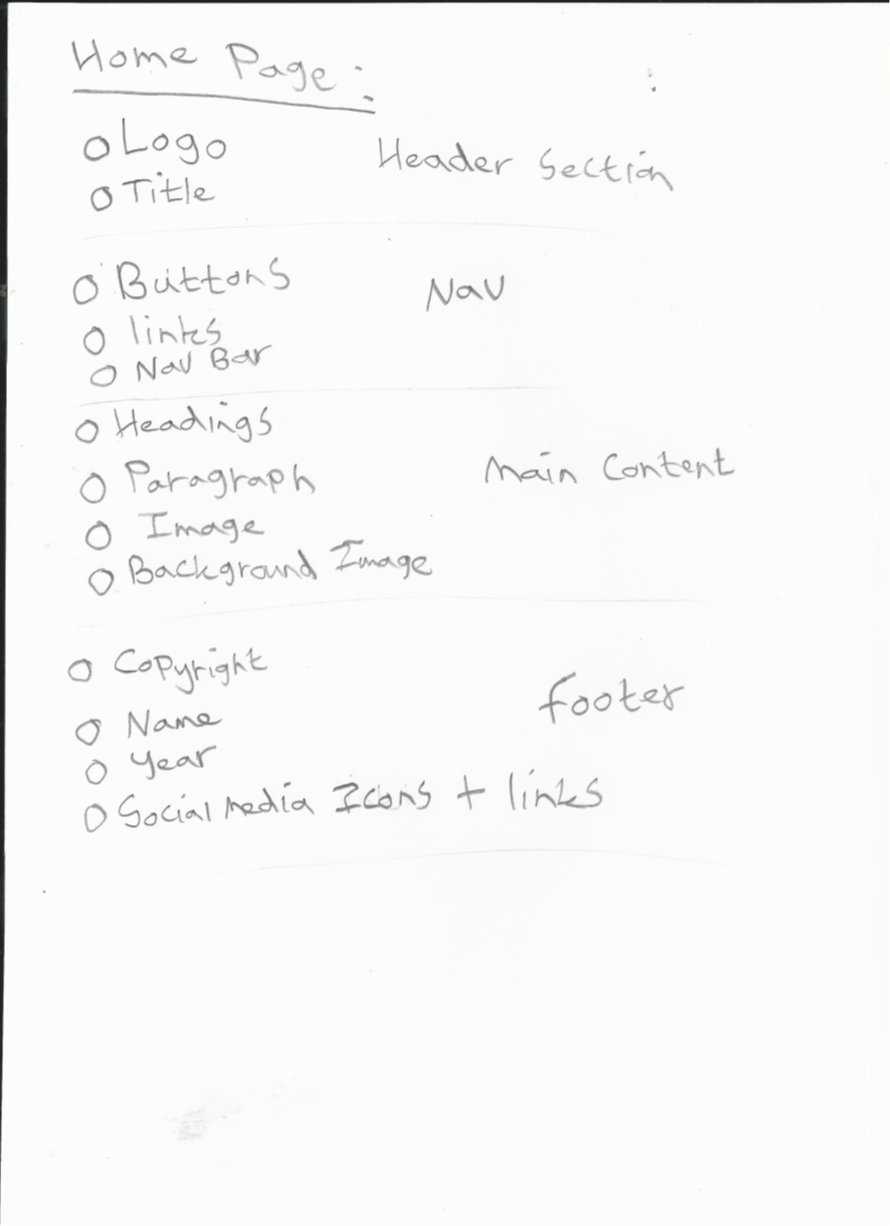
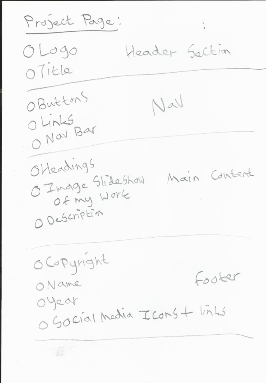
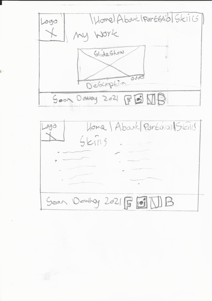
I designed a number of different sketches on paper for my Portfolio website. I started off making a list all of the elements I want to include on each Web page. I split these elements into 4 sections. Below you can see a list of elements for each Web page split into the different sections.

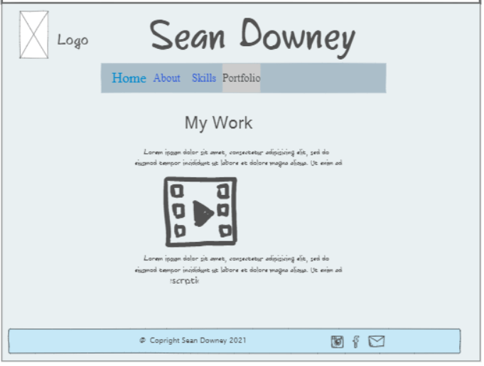
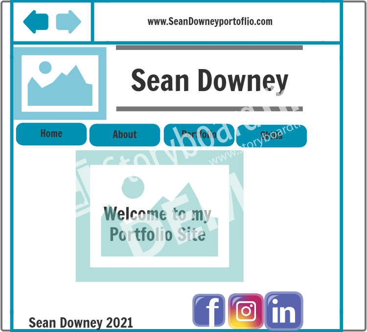
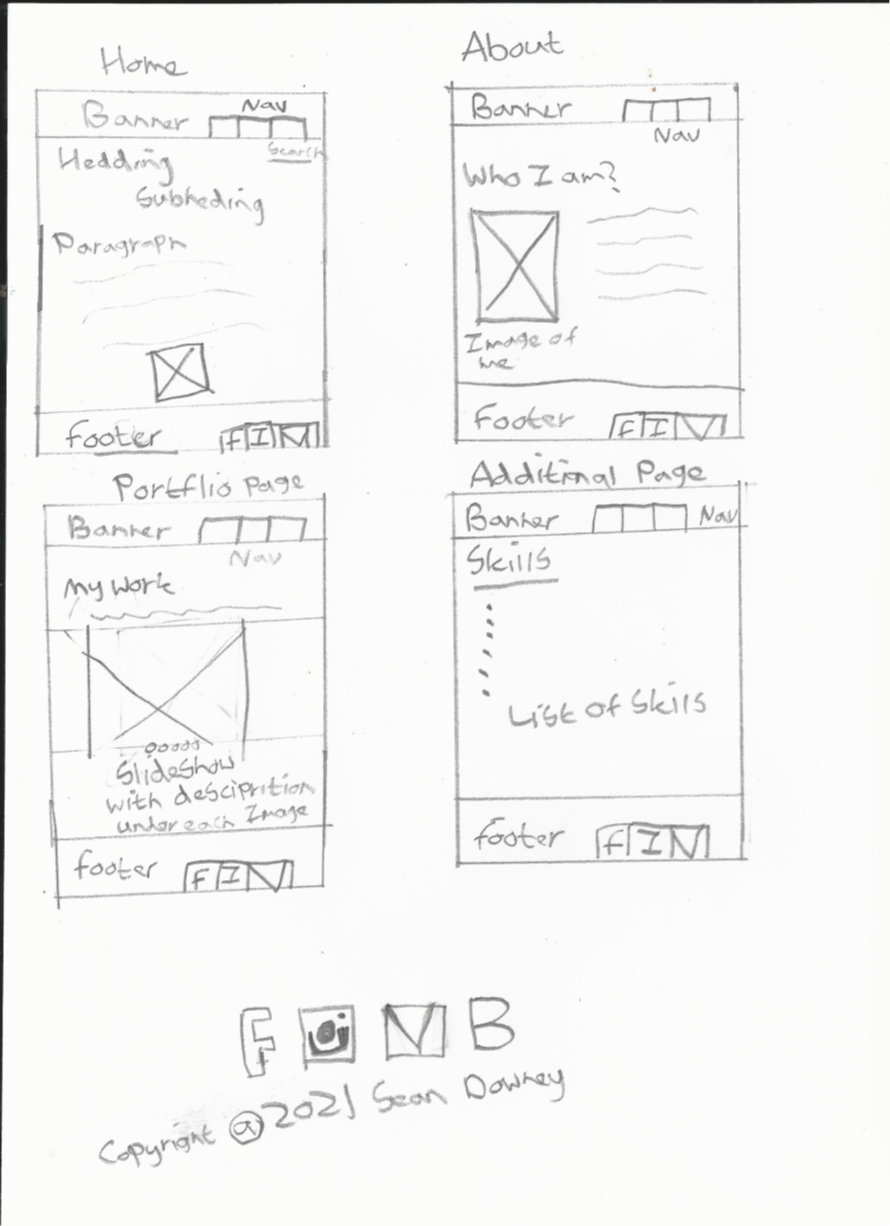
I then I began to make sketches fousing on the layout and design. I simply used pencil and paper to sketch them out. For now there is no colour but I will consider that later. I wanted to try a number of different ideas for sketches before choosing on to follow for my website.

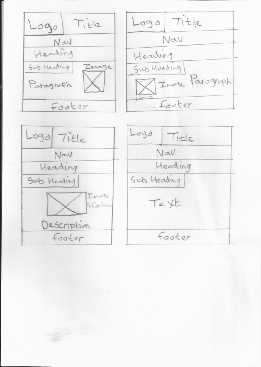
Below the sketches fcous more on layout of the webpages rather than focusing on content.

Then I started sketching out webpages adding in more detailed content in the various sections and placed it where I wanted it to go.

.

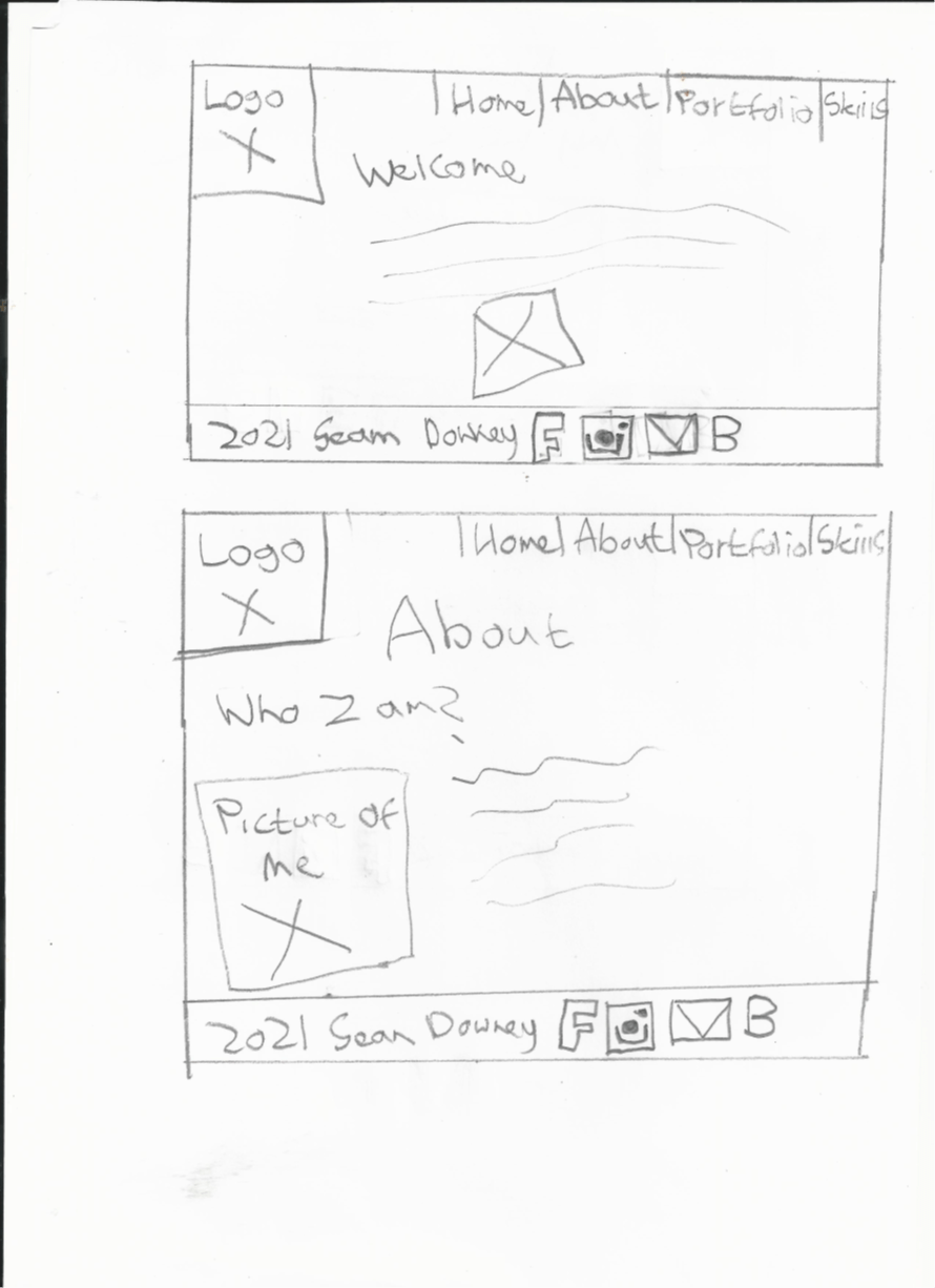
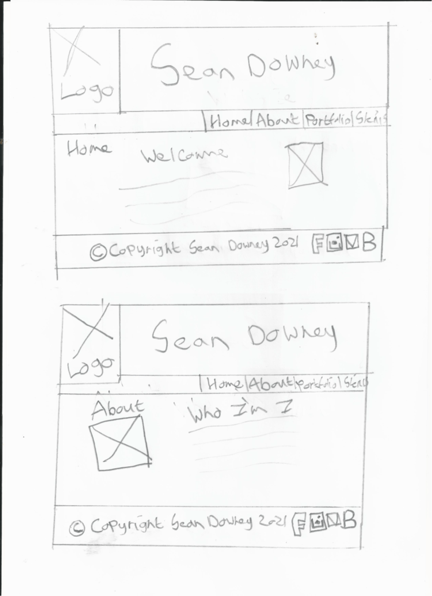
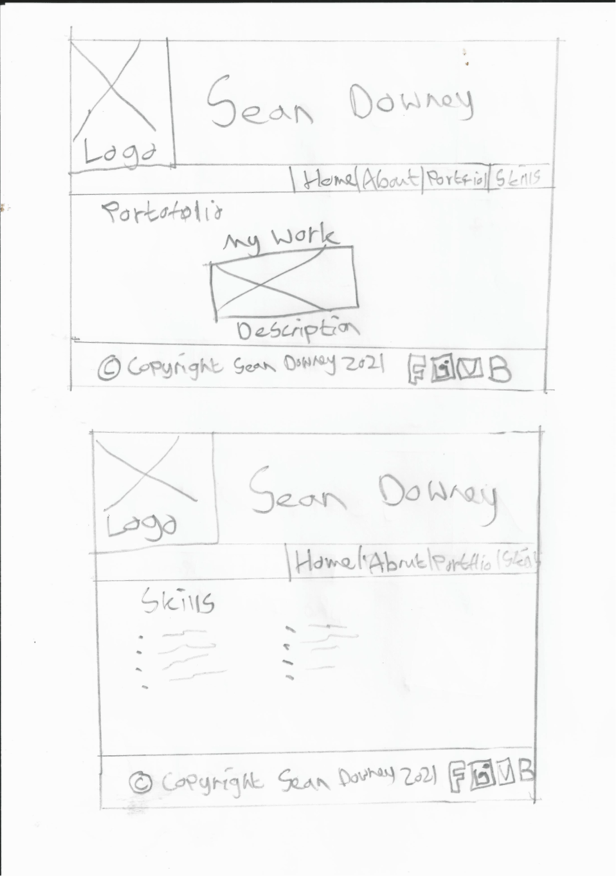
I then made more sketches this time adding a title banner to website in the header section and copyright in the footer.

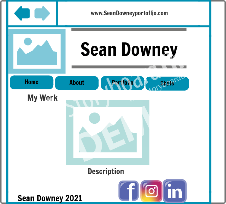
Overall my website will conistent of 4 wepages. My first webpage on my porfolio website is the Home Page. This page will introduce and welcome users to my website. It will have title and my Logo in the header section. Below in the Nav section I will have a Navigation Bar with buttons which users can click on to navigate themselves to various webpages on the website. This makes my website user friendly and allows them to access specific pages. For example if you click the “About page” it will take you to a page about me. The buttons will be in the center of the navigation bar. Then the main section is were the content. It will feature the heading and subheading. It will also include a pargraph of text and an image to back up the text. I was also thinking of possibly adding a background image which will be displayed on each page across the site. At the bottom of the page will be the footer which will include the copyright symbol, my name, year and social Icons which when clicked on will take the user to my social media accounts. The design, layout and background image will be kept consistent throughout.

The rest of the webpages follow the same layout. The only difference is the text and images.

I haven’t decided on the text or colour yet. I will expriement with colour and choose an approitate type of font at a later date.

The next stage of my design process will begun to start developing my website. I start coding my website before adding in content and finally add in css styling such as colour.


IXD103- Development of Monograms and Wordmark

Heres how my Monogram and Wordmark design has been developed

This was my orignal Monogram and Wordmark I designed.


This is how my Monogram and Wordmark it has developed since. I tried out different examples, experimenting with different text to see which one I liked the best.

I choose my favourite Monogram design which worked well then I wanted to experiment with different colours.

IXD103- Task- Digital Touch Point

Today we were asked to design an additional Touch-point based on our own personal branding. It was important we made it eye catching. We were given examples.

Heres my design that I came up with. I thought it was a good idea to use my Brand on a Phone case as I felt it was suitable and more people could connect with it. I thought my monogram worked really well for this design. I will contiune expreimenting with different colours for my phonecase and working on other digital touch-points.

Week 10- Beyond the Brand IXD103

This week Daniel done a quick recap on the previous lectures to date ensuring we were on course to complete our work. He looked specific areas that we may need to go back over and further development on each task. This refresher helped to give us an eye opener on were we are in terms of assignments and research. He give us a checklist of the topics and and tasks which we need to be included within our blog. He said at the moment “our Blogs are light” and we should “add in more development work and research”. Daniel showed a book on Brand Idenity which we should look at called “Designing Brand Identity”  by Alina Wheeler. He mentioned also the book “The Future Beyond brand lovemarks by Kevin Roberts” Daniel give us an explaintion about the book. He showed us a diagram split into four sections Brand, Lovemark, Products and Fabs and give us an example.

Daniel then explained to us the importance of Brand Values and how important they are to create an emotional connection and therefore help make our brands successful.

We looked at the BMP Value Proposition Map. This was another example. Value proposition is the promise of value to be delivered and communicated. This which is split into 4 sections:

  1. A brand: Users develop emotional connections to brands.
  2. Experience: The experience customers have with your brand connects your products use with the user’s emotional reaction.
  3. Product: Your product may do something better than other products, solve a problem that hasn’t been solved yet or fill a need in the market.
  4. Value is at the core of this model which is made up of the The brand, product and expereince

He asked us to choose a brand, product and explain the expierence. I choose the brand: HP, product: Technology and exprience: it’s purpose is to make daily life better for everyone.

As an additional to reviewing our work and add in content to our blogs, Daniel set us to class tasks to complete today. The first was find 3 business you respect and study how they form emotional realtionships with their customers. I will post the examples to the Blog.

The next one is a big task called One Step Beyond. This is were we had to design one additional touchpoint for our own personal brand. Purpose is to promote an emotional reponse to my brand. It’s important that it’s eye catching. Examples being an Animated Monogram/wordmark, a gif of work, a t-shirt, branded merchandise, a desktop background or supporting app. He wanted us to return back online at 3pm and post our designs to Miro. This is where we will have 2 minutes each to show us our ideas.

It’s important my work is desirable. My ideas will be revelant to the brand/service with customers and people in the mind. I will first draw out my ideas on paper and then I shall develop my touchpoint digitally using figma or illlustrator.

For next week I’ll work on the website designs and brand materials as we will have a group critique session to review this work.

Reflection

I felt today was a very interesting class it give my a clearer insight into brand values. The recap helped me know where I am in terms of my coursework and what I have been missing from my Blogs. The checklist for the research Blogs was useful as I know what work need to added to my Blog. When looking at the Brand values it allowed me to gain knowledge of the value of a brand and think more outside the box in terms of my brand. It also made my think of emotional responses to my Brand. Today also give my more ideas for designing my digital touchpoints. I also I’m aware what tasks I need to complete this week so I’m ready my group critque next week. I hoped today’s session helps me with my brand going forward.


Week 4- Lecture Notes (IXD103)

Daniel this week started off with a quick recap to date on where we should be at in terms of our designs. So, in week 1 we looked into our bios and came up with word associated with our values and tone of voices. Next, we’ve created our unique monogram and wordmark based on our own initials and we’ve crafted our wordmark as a primary touchpoint for our brand identity.

This week we learned about Visual Identity. Specifically, we looked at pictorial and Abstact which is basically an image used to represent a unique brand. Next, we learned about Combination marks which our wordmarks combined with either a letter mark or symbol. He showed us a few examples of these. Later he went on to mention a few visual designers such as Tim Boelaars, Jeroen Van Eerden, Fabio Basile, Vic Bell, Ivan Bobrov, etc. He showed us the design process for the dream ranch brand designed by airside.

He then showed this the step-by-step guide of “How To Draw a Penguin” by Oliver Jeffers. He wanted us to attempt to draw the penguin using these simple steps. Daniel then talked a little of the importance of sketching out your ideas on paper. To help you come up with ideas it’s good to start of drawing a mind map and write down words best associated with project or design. Once your happy develop your sketches, make changes, and then digitalize the sketches. We were given different examples.

Todays tasks was to sketch out the list of objects using the various drawing techniques showed on the previous slides. Then specifically pick 5 key words from our week 1 word association mind maps or bio and explore a range of ways to represent them visually.

This week task was to research visual marques and design a symbolic visual marque. I will look at blackboard for more resources.

(IXD103) Sunni Brown- Doodling Ted Talks

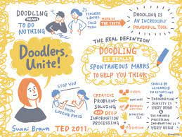
This speech Sunni Brown is given is called “Doodlers unit.  During this talk she talks about doodling. “Doodling has a profound impact on the way that we can process information and the way that we can solve problems”. She was curious about the way there was a disconnect between the way our society perceives doodling and the way that the reality is. She discovered the definition of doodle has changed throughout the years from the 18th century to now which she feels it is the most offensive definition.

She gives us an examples of some teachers or bosses for not allowing people to doodle in the classroom. There is no crime committed.

She explained different examples of why there is a psychological aversion to doodling.

She believes the real definition should be :Doodling is really to make spontaneous marks to help yourself think. That is why millions of people doodle. People who doodle when they’re exposed to verbal information retain more of that information. Doodling does not allow you to stop losing focus. It allows us to process information and solve problems.

There are four ways that we can use to intake information so that they can make decisions. They are visual, auditory, reading and writing and kinaesthetic. Doodle is that it engages all four learning modalities simultaneously with the possibility of an emotional experience. That is a pretty solid contribution for a behavior equated with doing nothing.

She then went on to explain her point on why she thinks why doodling is important.

From listening to this speech I feel Doodling is an important in communicating  the visual language. It allows people to express ourselves. The doodle helps us to come up with great ideas. It is an important part in society. There is nothing wrong with doodling as it helps us learn and enables us to jot down our ideas on paper in a creative way.

Week 3- Lecture on Typography and Wordmark (IXD103)

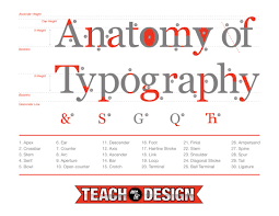
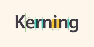
This week we were given lecturer on Typography and Wordmarks. We learnt about Why type is important and the tone of voice with some examples. We also looked at Anatomy of type and kerning. We were shown different examples. During class we were asked to complete our own Anatomy of type exercise on figma using out first and second name. We had to select an appropriate typeface we liked and write out name and label the terms. This was so we could identify and understand the elements used in typography. We made a start and then finished off completing this in our own time. This task can be located on another Blog post.

Next, we looked at wordmarks. He showed us a few examples of famous wordmarks and personal brand. When choosing our own wordmark, we must choose appropriate font. Another way to distinctive a wordmark was to word play to create an effect. We were giving another task during class where we had to pick 6 words using the Helvetica and convey it is meaning through typography designs. You can see this found on another Blog post.

So this week we had to continue working on monogram by starting to digitize our designs on illustrator using the sketches we made the pervious week. We then need to start researching our wordmark perhaps creating a moodboard to save our research to. Finally making a couple of sketches on paper and if we are happy make refinements and start bringing them to life on illustrator.

I felt Today’s Lecture was interesting. I enjoyed learning about Typography and Wordmarks. This will hopefully help when designing my Monogram and Wordmark in the next coming weeks. I will do more research into this subject and practice sketching my Wordmark and Monogram.

Skip to toolbar