Project 3 Follow the Rhythm- updated

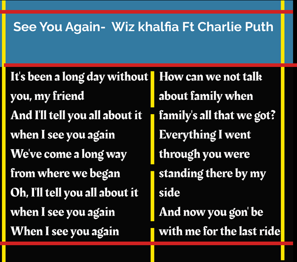
For this project I was required to choose a song I liked and present lyrics in manner which was appropritate to the music or artist in question. There is so many songs I liked which had meaningful lyrics. I orginally went for the song “See You Again” by charlie puth and Wiz Khalfia cause I really liked it and was written for Paul Walker and had good lyrics. But then I changed my mind and decided to go with the song “Wake me Up!” which is one of my favourite songs from one of favourite music artist’s Avicii who sadly passed away a few years ago. It’s very popular and classic tune that everyone knows. His music legacy especially this song will live on in his memory. This is a dance/pop/country song which is lively and uplifing lyrics. It goes out good vibes and makes people dance and sing along everytime it’s played.

I researched both songs lyrics on google and pinterest. I created a pin board on piniterest called follow the rhythm and saved a couple of images I liked with the song lyrics to “see you again” and “wake me up” which helped to inspire me when creating my own indidvual designs. Above you can see some examples of these images I saved.

As you can see above an image from the official lyric video which give me inspritation to design something similar along those lines.

I created my designs using photoshop as I felt it was the most appropitate software to use. Fristly the song was called wake me up so I needed something to represent that. I wanted to make sure I didn’t over complicate the design as I wanted to make it simple but effective. I liked the idea of having an image of a lovely morning sky/sun in the background with the lyrics of the song in the sky above.

I started off googling the lyrics of the song to get some ideas and looked for images of a nice sky background.

For this design I choose this background of the sun rising over the hill with a tree then added the song name and a verse from the song with this typography. This is orginally my intital idea for the song. I felt it worked well.

For this design I liked the image of the red sky I found on google. I then added text where apporitate. The text “Wake Me up” I sourced from the official music video.  I selected and pasted the text into the document and deleted the orginal background with the magic wand tool. Then I used the recentangle to underline the text. For By Avicii and the lyrics I choose my own font. I made sure the aligning of text and design was apporitate.

Once I was pleased with how my final designs looked on photoshop I saved the file as a Jpeg Image as it is the best image format. The latter one will be very final digital verision which I will upload to blackboard as it is my favourite.

I felt this song and idea was better than my orrignal one and I am happy with the overall outcome.


100 Iteration’s- update

I was given feedback on my intial post by paul we told my to experiment with photoshop on each of the images. I added a cartoon effect to the images which I feel makes them unique and adds a different dimension to the orignal images and gives a lense of life.

As a group we gathered a 100 images collectively which we saved as project board on pininterest. We all came up with our own individual images. We discovered their was examples everywhere of lines. I mainly foucsed myself on finding example of lines in nature as I felt it was interesting. I though looking closely at trees and leafs was a nice concept with lots of different colours and patterns. I been to tollymore forrest park a few times and I liked being the nature so inspired me to use images from their for my project.

I found 9 images of tollymore forrest park through the various seasons on Google which I edited on photoshop. I will also post these images onto my interaction design instagram page.

Follow the Rhythm

This is my first attempt at follow the Rhythm excericse. I used figma to create this. I choose the song “See You Again” by Wiz Khalfia Ft Charlie Puth as I really liked the song and the lyrics were meaningful. I will try work on different verisions of this excercise using figma and see which on is the best.

Week 5 –UI Cards

On Monday’s class we had a look UI Cards on webpages. As a group we collected images of buttons and UI Cards on Miro. Then we were given a task to create our own UI cards on Figma using a similar layout for the UI cards on material.io/components/cards. The cards we created were for advertising our favourites artists music albums or tracks. Once we did it we posted it up on Miro. I decided to choose the album “The Marshall Mathers LP 2” by Eminem for my UI card as it is one of my favourite music albums.


Separately I used inspiration from Spotify to create a UI Card for the artist the killers.

IXD101- 100 Iterations

As a group together, we collectively choose 100 images relating to nature and building’s which feature lines from the internet and our own camera then saved them Pinterest. I posted this images onto my Instagram.

There is so much inspiration around us we need to learn to appreciate the wonders of nature.

Here I’ve selected my favourite 9 images relating to this project.

This image was taken at Killeavy Castle County Armagh as I really liked the stone work.

This is an image of a corn field in Ireland which I found on Pinterest . I quite liked the lines in the grass.

This is an image of a group of Pine Trees in Tollymore Forrest park. I liked the veritcal presentation of the trees.

This is an image of the stepping stones across the Simian River in Tollymore Forrest park.

This is an image of a Spiders web which showed lines. I imagine this was photographed on a frosty morning when you can se the wonder in nature and the unique lines of the web.

This is an image of Liverpool Fc which was designed during the first lockdown to play tribute the NHS workers.

Lines are found everywhere even as patterns on animals. This is an image of Zebras coat.

This image of a leaf which has nice line patterns

This is an image of the stone wall at Hare’s gap  in the Mourne Mountains Co Down


Typography

During Monday’s class Paul  give us a few exercises relating to typography by asking us to experiment with text according to size, colour, effect and shape, etc.

First task Paul asked us to recreate this line by resizing the text according how we felt it fitted on screen. Making certain sections bigger and smaller to fit the importance.

This next task Paul asked us to choose letters we liked and make changes to the letter form. I choose S and D and cut a few chucks out of them to create a new look and feel to the two letters. I felt it looked well.


Next he asked us to combine two letters. Here is a examples of a combination of 2 letters or numbers which I felt fitted well together. I experimented by placing letters beside, below and above each other and changing the rotation of the letters. This give it a new dimension.


Skip to toolbar