User Personas for Health Care App- IXD303

User Personas

I created three different user persona’s, based on my user research from three indiviuals that would benefit from a health care app.

I asked them their interests, influences, goals, motivations, pain points/frustrations, needs/expections from the app.

The First Person I asked was the carer.

Carer User persona

The carer wants to carry out their duties with the service user and is able to input information quickly and efficently so they can spend more time with the service user rather than taking ages using the app.

2. The Family Member

Annette

Following my research on the family member, Annette was looking for an app that was quick and easy to use. This means she could give feedback to the other family members on her mothers care.

3. Elderly Service User

Eldery Persona Mary

The elderly woman wants the best quality health care provided by the carers. This app can help them.

Reflection

I think this research gathered we help me design an app that would cater to all 3 of the users needs and meet their expectations and goals.

IXD303- User Journey and Site Map

During my developing and planning phase of my health care app I designed a User Journey Map, Site Map and empathy Map.

User Journey Map

The User Journey Map talks about the different stages of user’s journey currently and while using my app. I explained about the actions, questions, pain points and opportunities of each of their users.

So I spoke about their current suitation at the moment before they needed the app. I broke down the different steps the user takes when caring for their patients. I thought their was an opportunity to improve the users experience by creating a user friendly app for the carers to help and care for patients/clients.

I looked at different suitations, possible questions and opportunities I could come up to help with planning idea’s for my app.

By doing this user Journey Map was able to discover things such as their happy moments and pain points. This allowed me to find out things the users likes and things I should include and try to avoid when creating my app. For example if the app was inaccture then user wouldn’t be interested in using it.

User Flow Map

Site Map

I first designed my sitemap on paper then developed it my figma. This is basically the breakdown of steps what the user will do to potenitally use this app efficently.

When designing my app it’s very important I make the process is and consider their needs. By doing this, I have clearer image in my mind of what the user will do when on my app. I started off by downloading the app, then go to sign up then login in and so on.

Component 1

Reflection

Once I completed this, I feel I have a much better understanding of the users which will help when designing my app. I discovered thing’s about the user and what I could do make my app as useful as possible


Week 7- The Story of eBooks (IXD304)

Today Kyle give us a brief lecture on ebooks.
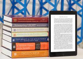
What are eBooks?

An eBook or electronic-book is simply a digital book that can be displayed on a screen through mulitple mobile device. This books can be adapted to be read on Tablets, Kindle, Ipad or mobile phone, etc.

Characterisitcs

  • reflowable- which means they can fit for purpose on any screen (with the PDF being exceptional)
  • Noneditable- mean it’s can’t be changed or edited in any way

Three Main Types of eBook file format:

  • Epub– the most common file format for ebooks. It is compatiable across all digital platforms which makes it reflowable and easy accessible for alll users. The frist verision of the Epub file format was released in september 2007.

  • Azw– This is a kindle file format developed by Amazon back in 2007. It can be used on smartphones, tablets, computers. It is an aternative to Epub but mostly for kindle e-readers.

  • PDF– this stands for Portable Document Format. This was developed in 1991-2008 by Adobe. It allows users to present or dipslay content appriotately in order for them to be read or printed without making changes.

Indesign is an excellent software program allows us to create eBooks. I am tempted to try this out.

Layouts

It’s important to consider how our work can be layout out on screen.

Examples:

Single Column Grid

this is a very simple grid structure which is often referred to as a block grid.  It’s format consists of one big rectangular area it is used to continious reading. This can be seen in books and essays.

Two Column Grid

This is a clear layout commonly used in Magazines and websites to display text and images in neat way

Multi Column Layout 

This is where you can seperate content into mutiple columns. Good example of this is a newspaper. It means can quickly scan through information
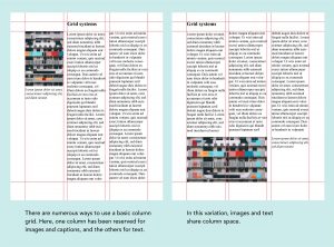
Modular Grids

A modular grid is a grid which has consistent horizontal divisions from top to bottom in aiddition to vertical divisions from left to right. You might see this layout in some websites.

It’s good to be able to experiment with different layouts to see where to place the images and content appriotately in your design. I will start trying to find inspiration of eBooks by looking at website, magazines and newpapers. Literally anything that I think would have a good layout weather it’s online or in the ship

When designing an eBook it’s important to consider the following:

  • All elements including Images, text, content, etc.
  • Define space with colours. Explore colours. Key tip: having a good colour palett is important
  • use space a graphical element. The use of blank or white space can be effective
  • Maintain interest with pacing
  • determine margins- make sure the leave plenty of space
  • Design for function
  • Alternate format/Layouts
  • Layout Inspriation- Pininterst, Dribble, Magazine, Newspapers,etc.

Example

Apple are the king of storytelling. They use animations to great effect as part of their markerting techinique to add to the user experience. Such as they can always make something like a monitor interesting to read through their special effects.

Reflection

I thought todays lecture was very interesting. It’s certianly made me consider designing an eBook to tell the story of the Apollo 11 space mission.  As my audience is Primary School kids, I think this would be something them be interested in and may appeal more to them rather than the website.

This week I want to look further research about eBooks as it is an alternative option to my website.

IXD303- Week 7 Group Critique

Todays class was a group crtique/ presentation. Each of us had a brief opportunity to talk about our work to class by showing the presentation slides. We also recieved some critical and helpful feedback.

From the feedback I received I have a good bit of work to do to improve my design.

Below is a screenshot of the feedback recieved from the class:

Reflection

I think the class thought my concept for my healthcare app was good but maybe i could work on body copy and content. I must make sure everything is aligned and stuctured apporitately. The user persona’s were good but make them more clearly and add a real life person. I thought this feedback was very useful and hopefully help improve my overall app and design. I’m really pleased Paul liked my idea. Obviously there is bits and pieces I need to improve and brush up on but I’m confident I’ll get there.

(IXD303) Week 6- The Design Sprint

Today in class we looked at the technique called the “Design Sprint” which was based on Google’s method in UX design to practice design leadership in a team. It is used to solve problems when developing ouur design,prototyping and test out our ideas with users.

Design Sprints are a process which happens over 5 days. But today we were asked to complete it in a day.

The Problem

Too much pressures in hopsitals. How many we ease the pressures on E&A Department in Hopsitals.

I worked with Matthew, Florence and Cormac to come up with a digital soloution to this problem. We were asked to follow 6 point stages in order to pitch a product.

  1. Understand- Who are the users and needs?

During this stage we wrote down a list of “How might” or How can” we questions. Then we catergorised them together and selected the best post it and go with that idea.

2. Define

3. Ideation- Brainstorm Ideas

4. Decide- What is the best idea?

5. Prototype- Design One

6. Validate- Testing

Reflection

I thought this was a fun task to do as a group. It got us to think outside the box and got us working together as a team to come up with a solution. I really enjoyed it and it was nice to have a change from the usual lectures on Thursday. I felt our group worked well and in the end came up with a good idea which I could see it being produced to ease stress and anxious in the waiting rooms and hosptials.

Week 6- Group Critique on Prototype.

Today we had a group critique session on our prototype so far. It was good opportunity to receive some helpful and informative feedback on my work  from my Kyle, Mal and my class. It also allowed us to review each others work.

Below is some of the feedback I recieved from fellow class mates.

The general feedback was pretty much similar patterns. They pretty much told me to:

  • Have a high resolution image of the moon
  • Work on my buttons
  • check my grammar
  • change the star to maybe something different such as the american flag or NASA symbol
  • resturcture the content
  • don’t have colour clashing
  • add more context before going into talk about Neil Armstrong
  • Also look Apple’s Human Interface design for guidelines.

Reflection

Overall I felt from the feedback I had recieved that I have a lot work to still do in order to make it visually appealing and effective for my audience. I thought it was very helpful and hopefully will allow me to further improve my prototype design therefore making my final outcome stronger. I think the rest of the class work was really strong and hope I can be inspried by them to become a better designer and more confident with my work.


Research- How to Choose the right Typeface (IXD304)

Following on from last weeks class, I looked at an article called “How to choose the right Typeface” By Veronika Burian & Jose Scaglione. I thought this would help me when it comes to choosing my apporitate Typeface. This article offers designers ten tips on selecting a good typeface. “95% of the web is text” therefore choosing a typeface which transform your information into an effective piece of content. The aim of this article is simplifying the selection process of your fonts.

  1. Nine points small or nine feet fall? – Consider the size of the article.
  2. How Many fonts? It’s better to have a small selection of fonts rather than choosing too many.
  3. For reading or for researching?- The type of typeface you choose will depend if the user is reading or will they be briefly through the data until the find what they are looking for.
  4. Can is set Moliere, facade, Beyonce and Capek Correctly?- Select an approitate font family which contains all the required glyphs. Many designers have made mistakes were they have missed out on accents, fractions, or small caps.
  5. Book, Newspaper or screen? Choose the right typeface that works for the purpose. Common Sense will help you decide which weight, size and typeface works well on screen or newspaper.
  6. Devil in the details: Have you head of hinting and kerning? Hinting and kerning are two important ways of keeping your typeface consistent through your selection process.
  7. And how about OpenType?- Provides designers with unlimited possibilities of typefaces to choose from.
  8. Trendy, beautiful, emotional?- Tends are constantly changing therefore they can be outdated. Be careful when choosing an apporiate typeface and how it can impact the user.
  9. How can typefaces be combined?- Consider how to create a realtionship between content and reader.
  10. What is the budget?- Sometimes consider using the open source fonts as they are free and more to choose from.

Reflection

In my Apollo project choosing the right font is soo important and can create an impact upon the user. It’s important that the use an appriotiate typeface which can help get the story across. Hopefully this article will help me limit my process when selecting typefaces.

User Research- What they would to find out the Apollo Mission (IXD304)

I cairred out use research on primary school Pupils from Primary 2, 4 and 7. They told me they would like to find out the following information on the Apollo 11 mission and the astronauts that went to the moon:

Primary 2

  • How he got to the moon? (Emma P.2)
  • Why was he famous? (Olivia P.2)
  • How did he become an astronaut? (Ronan P.2)
  • Where does he live? (Conal P.2)
  • What age is he? (Eve P.2)
  • How long did it take him to get to the moon? (James P.2)
  • Was he famous for anything else? (Cahal P.2)
  • Why did he want to go to the moon? (Rory P.2)
  • Did he see any Aliens (Conor P.2)
  • When did he go to the moon? (Jack P.2)
  • When was he born? (Ruiri P.2)
  • Did he have a pet? (Lucy P.2)

Primary 4

  • Was Neil Armstrong by himself. (Adam P.4)
  • What space company was he from? (Adam P.4)
  • Did he see Aliens? (Adam P.4)
  • The main details about it like;-
  • What year it was?
  • How long the journey took?
  • Where was the launching?
  • Maybe photos of the Rocket
  • and photos of the people.
  • When did they come back?
  • What year did they come and return?
  • A video of the take off and the rocket coming back.
  • How much fuel they used?

Primary 7

  • How they ate and drank? (P.7 Pupil)
  • The landing
  • The name of the ship
  • How long did it take to get back
  • What was the month and date (P.7 Pupil)
  • What year it happened?
  • How long it took to get there?
  • Who were the others?
  • What was the temperature? (P.7 Pupil)
  • Where and when it happened? (P.7 Pupil)
  • What year it was?
  • What year was he born?
  • What was the temperature? (P.7 Pupil)
  • What age was Neil Armstrong when he went to the moon?
  • Where did he take off?
  • What year was it? (P.7 Pupil)
  • About the Rocketship
  • How long it took to get there?
  • What year.
  • In the video clip I would like to see the actual landing.
  • What time he landed at?
  • How long did it take to prepare for the take off (P.7 Pupil)
  • The temperature
  • How long it took to go to the moon?
  • How did they eat?
  • How much fuel did it take?
  • What was the speed?
  • How long did it take to get to that?(P.7 Pupil)
  • The main details
  • What year it happened?
  • How much fuel it used?
  • How long it took to get there and back?
  • How they slept?
  • How did they go to the Toilet? (P.7 pupil)
  • What material was the rocket made from?
  • How long did it take to get ready?
  • How did they test the rockets?
  • Did they get a prize or medal for coming back down?
  • Where did they get the material?(P.7 Pupil)
  • How long did it take?


Reflection

I learned that primary school pupils wanted images and videos of the Apollo Mission, which I would try to include on my website. Its important I meet their needs by keeping the content and images simple, clear and straight to the point. Perferly they would love it to be in colour as well as videos during take off and landing.

User Research- What Primary School Pupils knew about Neil Armstrong (IXD304)

From gathering furher research from the prmary schools pupils, they told me:

Neil Armstrong

  • What we know
  • First man to go to the moon. (Ronan P.2)
  • Neil Armstrong was the first man to go to the moon. He put down the American Flag. (Adam P.4)
  • First man to go to the moon was Neil Armstrong (P.7)
  • Someone landed on the moon.(P.7)
  • He was called Neil Armstrong. The name of the rocket was Apollo 11 (P.7)
  • They were American (P.7)
  • What year it was and who went(P.7)
  • We know that the rocket ship landed on the moon in 1969. (P.7)
  • What his name is. (P.7)
  • The First person to land on the moon was Neil Armstrong(P.7)
  • His name was Neil Armstrong. He was Russian (P.7)

Reflection

Primary school Pupils new some information on Neil Armstrong but I would like to tell them about the other Astronauts and the Mission to the moon.


User Research-What Primary School Pupils would like from a website IXD304

I decided to carry out some user research on primary school pupils. I started off asking them what they would like from a website.

Below is what they said:

Primary 2 Teacher (Term Topic on Space)

  •  Very visual.
  • · Easy to navigate.
  • · Basic information for P.2 level.

Primary 4 (Age 7/8 year olds)

  • · Find out information to tell others.
  • · Good information so we can find out things for our School Projects.
  • · If there were lots of information it would take a lot of time to read.
  • · If there was something at the bottom of the page you may not have enough time (We get 25minutes in the Computer suite/Library)
  • · Like Good pictures so we can draw them.

Primary 7 Pupils (Age 10 and 11 Pupils)

  • · Colourful animation
  • · Video
  • · A bit of information but not too much
  • · Pictures
  • · Easy to find information
  • · Realistic Graphic animation (Conor age 10)
  • · Pictures
  • · Videos
  • · Narrators
  • · Easy to use (Laura age 10)
  • · More images
  • · Less writing
  • · Good pictures
  • · Real life pictures
  • · Colourful
  • · Big/large writing (Colm age 10)
  • · I like pictures in colour.
  • · I like when they are real information.
  • · I like when it is all in one website and when you chose one page it only takes you to another page.
  • · And not take too long to load.
  • · You can search for images about whatever you are learning about.(Frank)
  • · Lots of colour
  • · Not a lot of information
  • · Pictures
  • · Moving pictures
  • · Easy to use (Michelle)
  • · Real life pictures
  • · Videos
  • · Narrators
  • · Easy to use
  • · Easy to read
  • · A lot of colour (John age 10)
  • · I don’t like loads of information
  • · I like a summary that is detailed about the subject.
  • · Something very clear
  • · Simple to use
  • · Easy to navigate.
  • · Colourful. (Peter)
  • · Colour photos
  • · Videos
  • · Not much writing
  • · Step by step
  • · Easy use
  • · Colourful
  • · Key information
  • · Large writing
  • · Real life photos (Brian age 10)
  • · Good Colouring
  • · Great Sounding
  • · Not much Information
  • · Pictures
  • · Videos
  • · Animation
  • · Fast
  • · Fast graphics (Niall )
  • · Quick loading
  • · High graphics
  • · Narrators
  • · Important Information (Sinead)
  • · less writing
  • · more writing
  • · easy to use
  • · quick processing
  • · narrator
  • · Narrator (Emma age 10)
  • · More pictures
  • · Not so much words
  • · Easy to use
  • · Not so many links
  • · Make it fun to use
  • · News in pictures and animation.
  • · Colour (Jude)
  • · Not a whole long paragraph but just the important details.
  • · If it’s a school website not too complicated words for young people.
  • · Bright colours of pastel colours for young people but not eye burning bright colours.
  • · Again if it’s a school website maybe each class should have their own section.
  • · If you’re talking about the man on the moon maybe say how long it took to get there.
  • · I’d like a website to be colourful, animation big pictures. And it to have a narrator. And to have good graphics and quick loading. (Carol)
  • · A bit of info
  • · No colour
  • · Real life images
  • · Detail
  • · Good info. (Ross)
  • · Probably not bad animation and good advice or information or good colourful
  • · Maybe old pictures with colour instead of black and white
  • · And some words to see what really means. (Aiden)
  • · Animation good punctuation not to wordie
  • · Easy to navigate big writing. (Adrian)
  • From a website I would like maybe some small facts and then the main information related to the person/subject and also pictures that you could title. I would prefer the pictures in colour just so it shows a bit more about the photo and on the website there should be paragraphs about the topic instead of one big piece of writing and maybe a photo related to the paragraph beside if you’re reading off that paragraph you can use the photo so you can have less writing. (Jackie)

Reflection

I will try to take this information on board and try to take on board suggestions what the  pupils are looking from a website. I have realised pupils would like to see real life photographs ofthe people involved  and the space craft. I also want to try to include videos of the launch and landing as I feel it would be very visual.

Skip to toolbar