
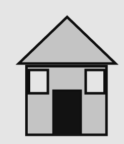
Before designing my app I came up with a set of Icons that I wanted use in my app. I wanted to keep my Icons simple and easily recoginsable so it is user friendly and allows users can navigate around my app with ease. I sketched out on paper a number of different Icons. Then I went to Figma and digitalised my Icons. I felt the Icons I choose to design were apporitate as my App was on the Mourne Mountains.
Icons on paper
![]()
Digital Icons
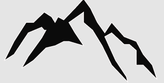


![]()
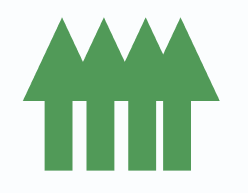

![]()
Once I created my Icon set I created a Map of the Mournes. I drew out a Map and included some of my Icons on the Map along with a colour coded key which makes it easy for users to follow the Map. This was also digitalised using Figma. I started off sketching around the out line of a Map of the Mournes I found. I then added names of the different locations on the map and started to pinpoint them on the map. The Location, Forest, Moutains and Lough were added. I made sure I made them colourful so they attract the users attention. Once I finalised the map I copied this onto my App on Illustrator.
Map sketched on Paper

Digitalised Map of the Mournes

I felt happy how my Icons and Map turned out in the end and I feel they work really well on my App. Hopefully these Icons will help make my App a success and they will stand out on screen. I enjoyed being creative and making my own Icons and app. By adding some colour they can create an impact on the user.