Data Visualisation
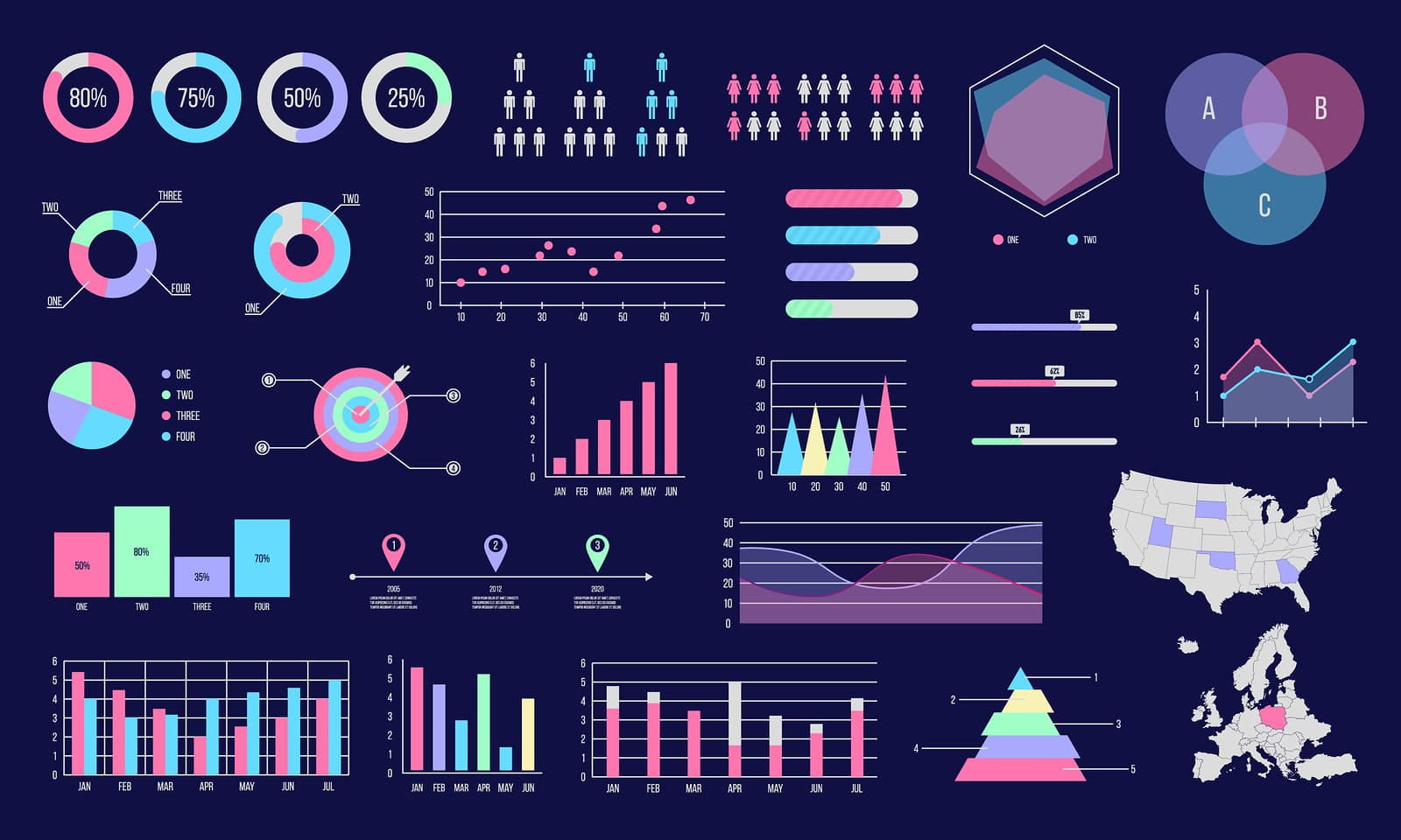
Data Visualisation is the way of representing data as a visual form using charts graphs and maps, etc in order to view the data in clear and efficient ways making it easy to for users to understand and read. It allows users to easily spot the trends, patterns bars and points which visualize data for user insight. Once any data is collected It must be visualized in a visual format.
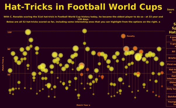
Example data visualisation can be used by teachers/ lecturers to display a student text results or football analysis may use data visual to display a player goal scoring form. There are many examples in our daily life’s where data visualisations are used. Many Businesses collect data to show their trends. Data visualisation are quick and easy ways to see the overview of specific data in a visual way.
Data visualisation is commonly used in sales and marketing, Politics, Healthcare, Scientists, Finance, Logistics, Data scientists and researchers, etc.
This data can be represented in following ways: line charts, pie charts, bar charts, area charts, scatter plots, Treemaps and population pyramids, etc.
Microsoft Excel is a popular tool used for data visualtion as well as other ways
Figure 1- A timeline highlighting the history of data visualtion.
Infographics
According to the Oxford English Dictionary, an infographic (or information graphic) is “a visual representation of information or data”.
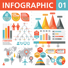
Whereas Data visualtion is a collection of data in visual format, Infographics are similar to data visualtion, they are a collection of images, charts with minimal use of text which allows users to see a clear understanding of a specific subject. It is a good way to communicate information in a quick and easy way.
There are different types of infographics such as Statistical Infographics, Informational Infographics, Timeline infographics, process infographics, Geographic infographics, Comparison infographics, Hierarchical Infographics and List Infographics.
Infographics can be used to help promote events or rise awareness for poverty and other causes, they can be used in schools to make content more outstanding for students, local governments may use infographics to share stats and data on the census. Many small businesses may use infographics to create a brand style guide, promote their business, showcase their products, etc.
This research here will therefore help me when creating my own infographics.
For my own Infographics I will choose one of the following areas:
- Births and deaths in world – past and/or present
- Population figures specific to country
- Population in the last 50, 100 years (future?)
- By religion
- By environment
- Climate change
- Disease / Illness


