Futura Research
My first project for the module is to create a type specimen for screen based on one of the 6 fonts we were asked to choose from. The designs should be designed for an iPad screen and I will be creating it in Adobe Illustrator. The font I chose was Futura.
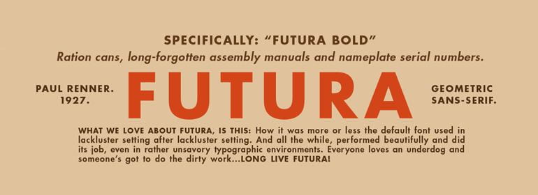
Futura was designed by Paul Renner in 1927 and was created as a contribution to the New Frankfurt project. The design is based on the simple geometries that became representative of the Bauhaus style. Renner was not part of Bauhaus, but he shared their beliefs regarding fonts as expressions of modernity. The design of Futura helped usher in a new Modern age and was emblematic of the era. It is still considered a modern font that conveys progress.
Futura’s design is based entirely on simple geometric forms – triangles, squares and near-circles. The stroke weight is almost even throughout, except for on letters like the lowercase a. Futura is distinctive for its long ascenders and almost classical Roman capitals – these elements give it its stylish elegance and differentiate it from other geometric san-serifs. If your goal is to create a design with modern, clean elegance – you can choose Futura with confidence as your typeface of choice.
Futura can be used as a display and paragraph font and is seen in many notable and historic projects. Examples are the commemorative plaque left on the Moon in July 1969 is set in Futura, Stanley Kubrick said Futura was his favourite typeface of all time and used it for 2001: A Space Odyssey and the cover of the album release of Little Red Corvette by Prince. Other popular brands which use Futura include, Nike, Supreme, Ikea, Gillette, PayPal, Red Bull, Domino’s, In-N-Out Burger and Omega.