After finishing the last page of my type screens for my app, I decided I wasn’t fully happy with the final outcome of the product. I realised some screens were a bit too cluttered for my liking so decided I needed to change the layout. I also decided to change the font of the main body text as I felt it was too bold for the small size of the text, making it hard to read on some screens.
EG Old vs New type screens

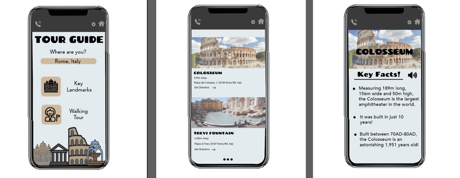
I have changed the body font from Chango Regular to Avenir. I think this font is much better for the main body text as it is easier to read and it is less in your face, making the screen feel less cluttered. I have also changed the layout off the “key landmarks” screen as in the old design I had put the title in thick black type on top of the picture, which the user would click on to be taken to the key facts page. However, I decided this looked too cluttered so changed the layout to two landmarks per page, giving me more room to put the information below each landmark, making it much easier to read. In my opinion I think this layout looks a lot more professional and a lot less cluttered.
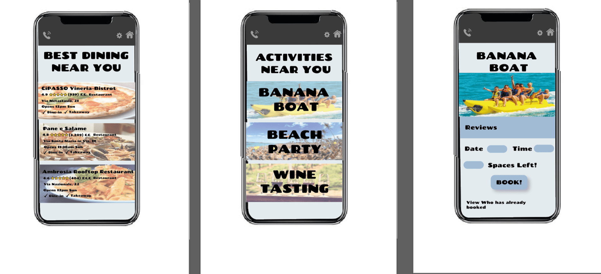
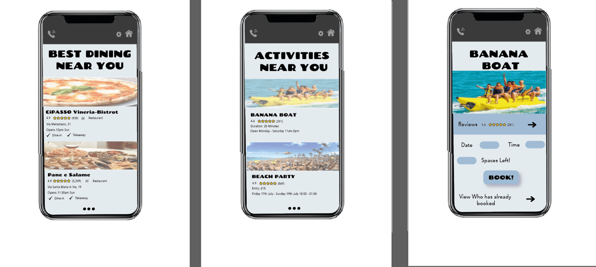
I changed the layout the same way in the final three type screens too and I think the new design works so much better as it is much easier to read and navigate through each page.
Below is a PDF of my final type screens for my travel app which I am very happy with.