This week’s task included creating six word plays in which the design of the word looks like the meaning of the word. this was an extremely fun task to do as it allowed you to be creative and expressive when choosing the words and recreating the structure of them.


These are the words I chose to recreate and I am very happy about the final outcome of these. This task allowed me to be free with my ideas and allowed me to be as creative as possible. we were told to keep the font to Helvetica to ensure it was the actual words we focused on and not the fonts. I added in some colour where necessary to make them stand out but apart from that I decided to just keep it very minimal and focused on the meaning of the words.
I played around with the sizing of the words EG in Falling, I gradually kept decreasing the size of the letters because when something falls it gets further and further away from where it initially was.
I also played around with the orientation of the lettering EG in Blow, I created a gap between the B and the rest of the letters, piling “lOW” on top of each other, as if they had just been blown away.
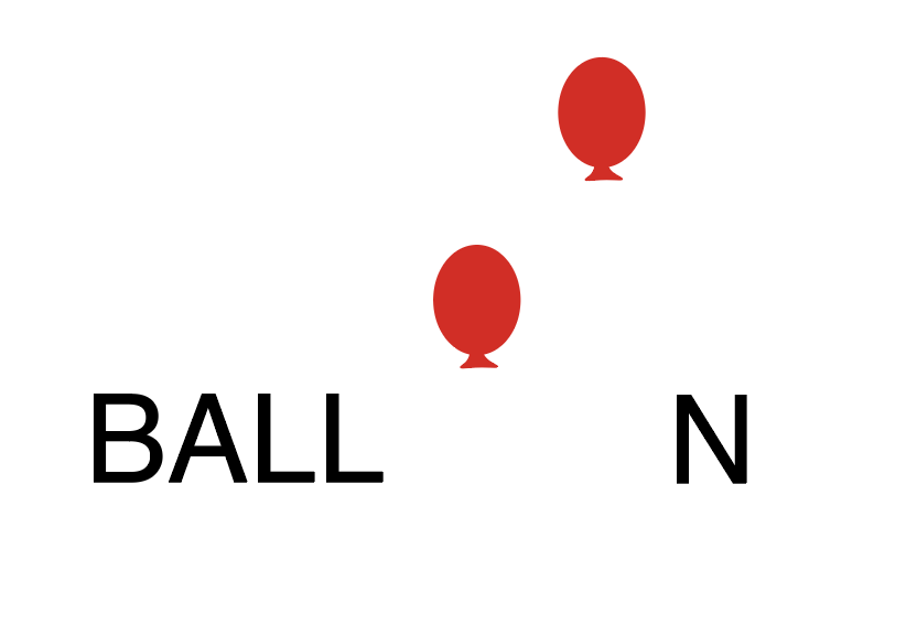
I incorporated colour into some of the words EG in Balloon, I made both O’s into actual balloons and changed the colour of them to red to make them stand out more, as well as because red balloons are highly iconic due to movies such as”IT”
this task has really helped me in my brand as it has helped me to think outside of the box more and to be more creative with my lettering, as well as making me more free when thinking about my own monogram design that I am creating.