In today’s class we learnt all about Type anatomy and why it is so important. Typography is a vital component of user interface design. Good typography will establish a strong visual hierarchy, provide a graphic balance to the website, and set the product’s overall tone. The choice of Typography will also reflect your brand as people will begin to associate the chosen typography with your business. this makes it even more important that we begin researching the anatomy of type now so that we can get the best understanding of it and therefore create a respectable, professional brand for many to see.
It is important to keep your typeface consistent which is why it is important for me to choose a style tat contains a range of weight and style in it so that I am able to make my brand eye-catching and versatile whilst still keeping it professional and uniform.
One of our tasks of the day was to write our name in a chosen font and identify the different elements of the typeface. the font I chose was Minion Variable Concept. I chose this font as I loved the heaviness of the lettering and is a serif font so it meant there was lots to label, making the task as beneficial as possible.
I found this task extremely interesting nd beneficial as I did not know that every part of each letter had a name and therefore helped me expand my knowledge and vocabulary when it comes to typography.
Kerning
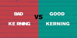
We also leant about the subject of Kerning which is the spacing between letters. this was very interesting to me as I had never previously realised how much was considered within typography design.
Although it sounds like a very minor detail, it can make a massive impact on your brand as bad spacing can lead to confusion of words and therefore misreading what you’re originally trying to say. this has really made me think what fonts are best to use and consider spacing more thoroughly in the future.

