Once I had researched some artists and found that I liked Paula Scher’s bold typographic style the best I decided to start designing my own lyric poster.
First of all, it was important to select the lyrics from the song which I wanted to feature on. I decided to choose the chorus of “The Nights” by Avicci as to me they are the lyrics that are the most meaningful and stick out to me the most. Once I had decided on the lyrics I felt it was important to then look at the sizing of the typography on the poster and decide what words were more important than the others and therefore what words should be bigger.

I had decided that the sizes of the words were correct, however I was not happy with the initial design of my poster as I felt it was v very plain and boring.
this led me to brainstorming around what words I felt stood out to me most.
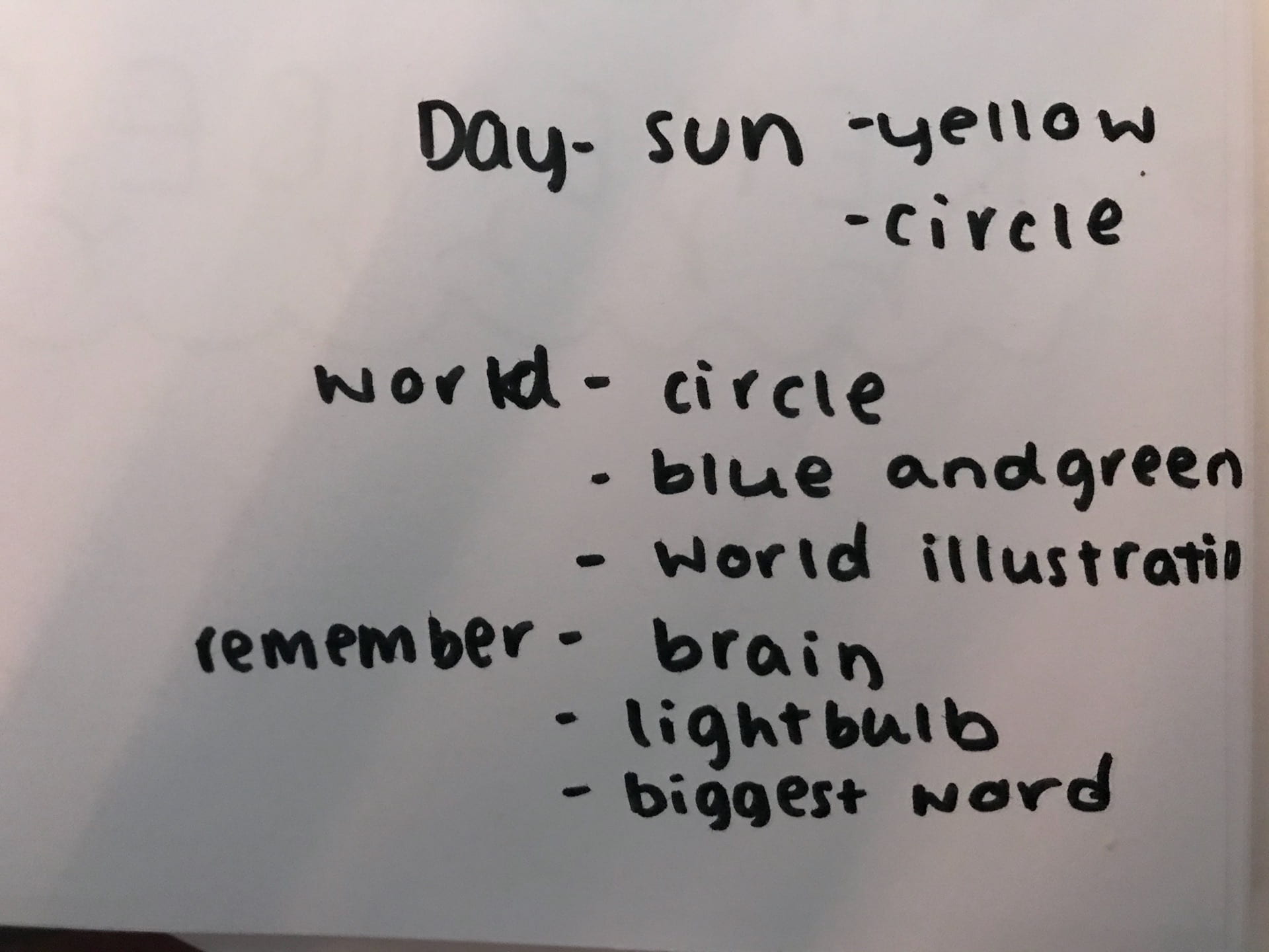
this triggered some ideas and led me to begin to add icons into my poster to make it more visually appealing. I decided to add these images into the poster using these words.
 \
\
I liked the boldness of this poster, however it is still too boring to me and is also very squished.
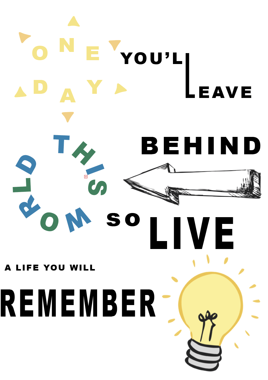
I started to like my poster a lot more since I began adding illustrations to it. I enjoyed experimenting with the type path feature as it enabled me to write in circles which allowed me to resemble the sun and world. despite me being much happier with this, I still was not satisfied as I felt it was still very plain and felt I had not used the space correctly.
I went on to Adobe Illustrator and began to design an illustration of the world in which I could use instead of actually writing “the world.” as I felt that two circles of words was a bit too much.

I was already much happier again with this poster as it was becoming brighter and more visually appealing. However, the typography still felt a bit too squished so I decided to slightly change the layout of the poster to allow the typography to increase in size as that is what the project is mainly focused on.

This layout felt much more natural to me as it allowed the most important words to stand out. However, I decided I wasn’t a fan of the white background so referred back to the original “The Nights” cover and decided to make my own poster bright and colourful as that is what the original artwork is like.
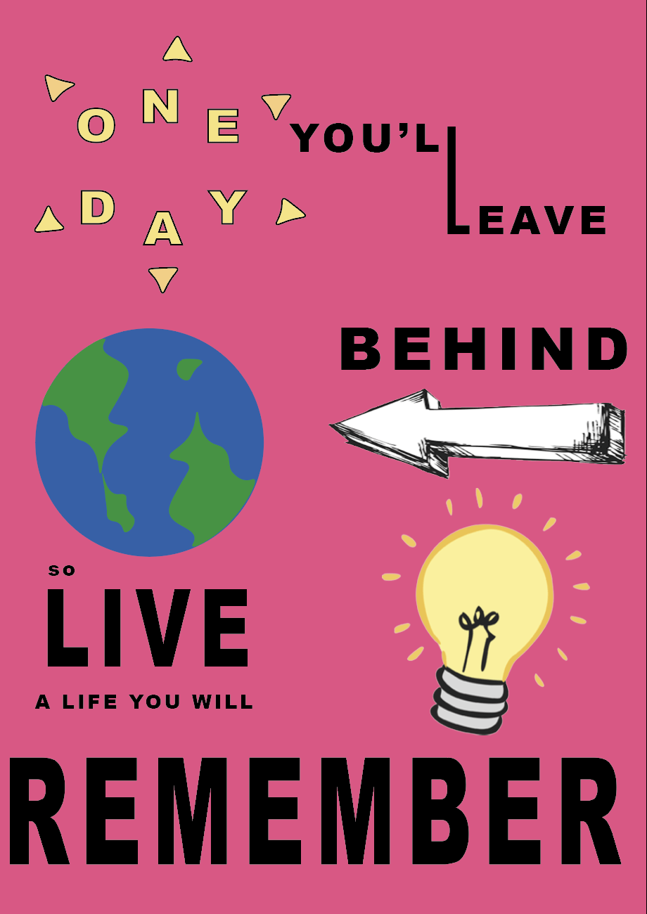


The vibrant background made all the difference and helped make the poster as bold and fun as the song.
Final Design
This is my final design for this Follow the Rhythm project.
Overall, I am very happy with the final outcome of my poster. I chose the pink background as I felt it stood out to me the most. to confirm this I placed all my colour options side by side and asked my friends to look at them and tell me which one they were instantly drawn to. we all agreed that the first poster we set our eyes on was the pink. I also think it makes the illustrations stand out the most as there is not pink in any of them. pink is also the most prominent colour in the “The Nights” cover, making it feel even more appropriate for me to choose this colour as it ties in well with the original artwork. I feel the graphics make the poster stand out even more and make kit a lot more visually appealing as I have replaced some words with illustrations, causing the viewers to almost have to work out for themselves what the poster says, making it a fun and interactive poster.