What is a manifesto?
A manifesto is a published declaration of the intentions, motives, or views of the issuer. It is a battle cry to inspire you when things get tough.
“a public declaration of policy and aims, especially one issued before an election by a political party or candidate”
Manifestos to me are inspiring as they keep me motivated and remind me to never give up if times get tough. I chose two manifestos to create on adobe illustrator. I chose both of these mottos because I feel like they inspire me the most to keep working as hard as I can and helps me remember that the best things cannot be achieved overnight. I chose these as both messages are inspiring and reassuring.
Manifesto Inspiration
Whilst looking for some inspiration for my manifestos, I looked on pinterest to see what style and layout I found most effective. From this I realised I found that mantras with very minimalistic backgrounds stood out the most to me as I focused soley on the words and not what was going on behind it.
Some examples of posters I found on pinterest


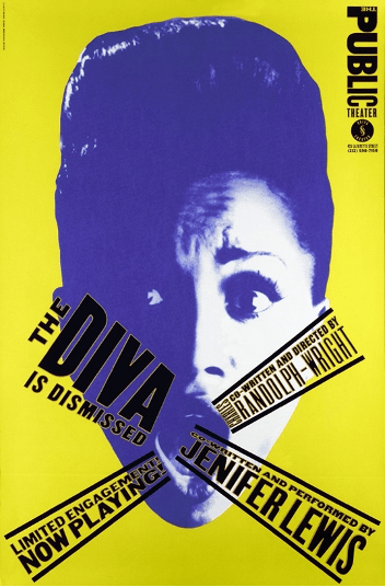
Design 1
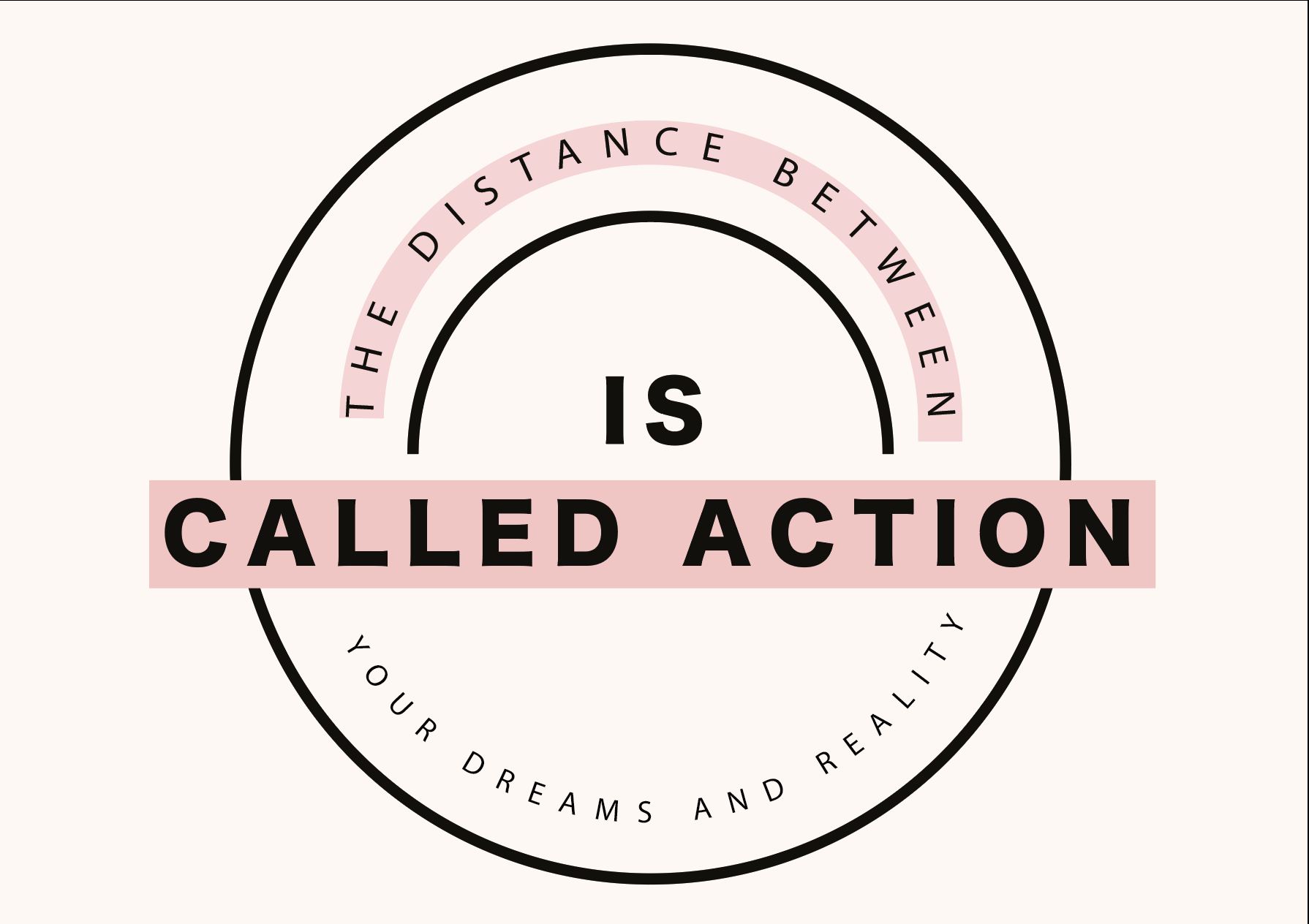
The first manifesto I created read “The Distance Between Your Dreams and Reality is Called Action”. I felt this was very inspiring to me as it reminds me that your goals will not just be handed to you on a plate and that you have to work hard to get what you want. The main part of this text to me was “Action” and so I wanted to make that the boldest part of the poster. To do this, I felt a circle format was the most appropriate and so I sketched it roughly on paper and found the design I liked.
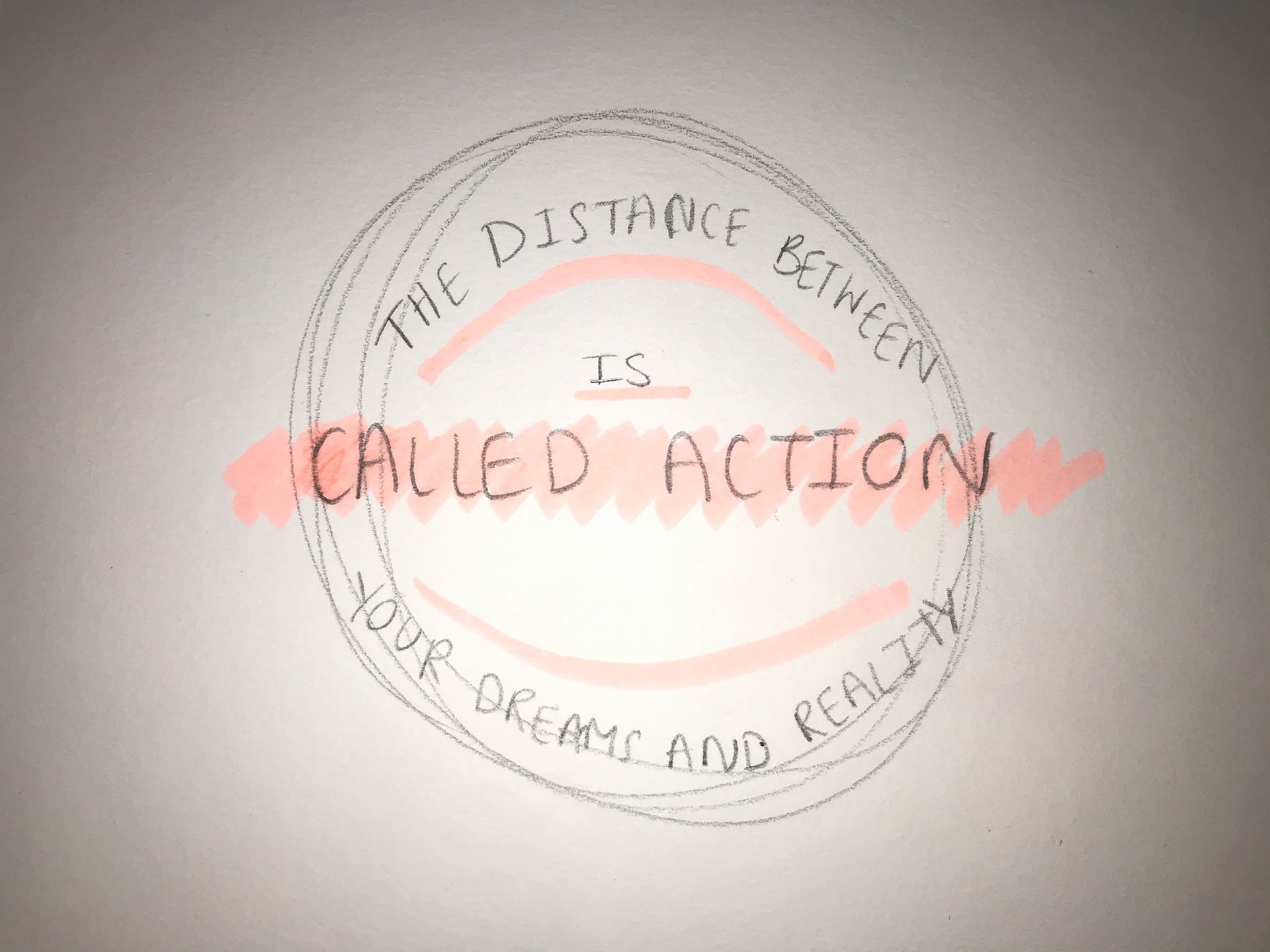
I then went on Adobe Illustrator and fixed it up until I was happy with the final outcome. I’m happy with the colours I chose to use as they are very neutral tones which are noticeable however also do not take away from the main point of the poster.
Design 2
The second manifesto I designed was “Focus on the Step in front of you, not the entire staircase”. I felt this was a reassuring moto to use as it reminds you to not get ahead of yourself and to just take one step at a time. I love this quote as it also reminds you to not take on too much and overwhelm yourself.
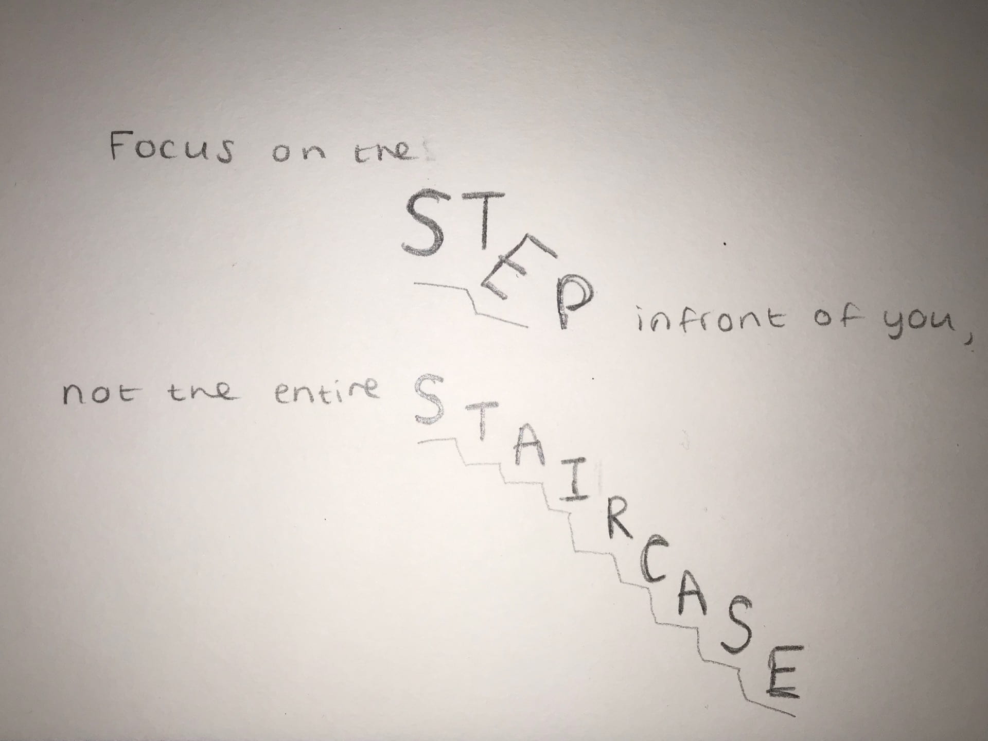
I then took the design onto Adobe illustrator. I am very happy with the final outcome and think I prefer this design to the first one as I really like the layout of the words “step” and “staircase” as I feel it depicts well how daunting it can be to look at the bigger picture and how it’s so much better to take it step by step.

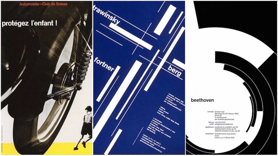
Swiss Typography
The International Typographic Style, also known as the Swiss Style, is a graphic design style that emerged in Russia, the Netherlands, and Germany in the 1920s and was further developed by designers in Switzerland during the 1950s. The International Typographic Style has had major influence on graphic design as a part of the modernist movement, impacting many design-related fields including architecture and art.
What distinguished Swiss Design was the use of asymmetric layouts, the use of photographs instead of illustration; and, most importantly, the placement of a mathematically determined grid to determine the placement of design elements which is a method that is still extremely important to this day in web design.
Müller-Brockmann was one of the leading protagonists of Swiss Design in the 1950s. He is admired for his posters which use text, photographs and simple graphics to create striking compositions. He is also well known for his commitment to grid-based design. In his own words he states, “The grid is an organisational system that enables you to achieve an orderly result at a minimum cost. The task is solved more easily, faster and better.”
Paula Scher
Paula Scher is an American graphic designer, painter and art educator in design.
Scher’s “instantly familiar” yet iconic style is something we all see regularly: in the street, on supermarket shelves, and while browsing the web.

I am very interested and inspired by Scher’s work as she makes the typography part of the photograph in her work. The use of the different size, colour and orientation of the typography makes her work stand out and become one of a kind. It also makes the audience pay more attention to her work as you have to study it to find where the test begins and ends and what the shape of the text resembles and therefore what it symbolises in the picture.