Mood Board

I began branding my product by first researching other charities and considering names around the theme of helping the homeless. I then started to consider the fact that the primary aim of my system is to deal with the problem of cashlessness. I, therefore, started to consider names relating to the donations points and chose the name SpareChange. I felt this was particularly appropriate as it doubled as a plea for money that might be heard from a homeless person requesting spare change as well as presenting the notion of spurring change along.
From here I began looking more specifically at logos for charities considering established organisations such as Oxfam and stand up to cancer as well pictorial marks found on Pinterest.
Sketches
This brought me to my sketching phase where I considered how to present spare change visually and incorporate coins in the logo. I also experimented with monogram outcomes and tried including a hand or an icon of someone that is homeless in the logo as well.
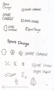
Development
![]()
When moving into the development phase I decided to stick with either lower case or capitalising each word in the logo as I felt using all CAPs made the name harder to read. I experimented with including half a circle which was supposed to represent a coin as well as a house split in half to represent helping the homeless on their path to a new home.
On receiving feedback on the logo it was highlighted that the half-circle shape was not clearly indicative of a coin and that the inclusion of a house may lead those donating to believe that the money donated will be going towards housing rather than directly to the homeless. It was also advised that as the product was dealing with providing an alternative to spare change in relation to making donations that I could consider the logo used within finance and banking. Another point raised was that the house looked like an arrow as this could be a nice inclusion keeping the theme of the logo more geared towards optimism rather than charity.
A change in direction

This encouraged me to go back and look at bank logo’s and pictorial marks related to finance and experiment with customising my wordmark. I was particularly drawn to the sharpness of the M in the Manzon monogram as can be seen in the development of my logo below.
![]()
I began altering my original outcomes by making the text italics and adding the other side of the coin and offsetting it diagonally to make an abstract mark. I then tried rounding the edges and then cutting diagonal lines off the ends of letters with ascenders and descenders using the base typeface Satoshi. I was very pleased with this outcome and added the head of an arrow alongside the wordmark to represent optimism and change.
Final Outcome

I am very pleased with my final outcome shown above. I love the sharpness added to the wordmark by replacing the original horizontal edges of the lettering with diagonal edges. I also like how this balances with the arrow pictorial mark beside the outcome that I should be able to nicely incorporate throughout my presentation.