Learning Responsive Web Design

To begin my recap of responsive web design I began my reading Learning Responsive Web Design, A Beginner’s Guide by Clarissa Peterson.
My understanding of responsive design before reading Peterson’s book was that responsive design incorporates new design parameters and styling at certain width points so that a series of changes are made to the design as the screen width is reduced or increased making websites easily viewable on multiple devices. Most tutorials that incorporate responsive design tend to design/build mobile first, I had imagined this was because most web content is now viewed on mobile. While mobile first is a rule that should be followed this is not the reason for it as discussed later in this post. I am, however, used to designing desktop first and Webflow does not allow for mobile-first design as all the styling elements are set on desktop and can be changed as you move down screen width without impacting the larger screen before. Therefore, attempting to build mobile-first is not possible as when you move to larger device screens the changes you make do impact the smaller screens.
As websites were originally only viewable on desktop devises mobile design was originally not a consideration. It was only when touch screen smartphones were introduced to the market that viewing websites on mobile became more popular. Up until this point as outlined by Peterson web designers, primary focus was designing for multiple desktop screen widths, a task that could be handled with fixed-width designs, a setting that made designs look the same no matter what screen width they were being viewed on.

This problem was resolved by making separate mobile websites with a fixed page width appropriate to a mobile screen. As this meant more work for designers it usually resulted in a vastly simplified version of the website as demonstrated in the above image. However, as more smartphones entered the field the number of screen sizes that had to be accounted for increased dramatically resulting in media queries.
Media Queries
At this point what was needed was a way to make one website that could be adjusted to match the requirements of the device it is being viewed on e.g. providing a 3 column layout on desktop and a one-column layout on mobile to make text readable on all devices. Media queries allows us to do this.
“Using a media query, we can ask the device how wide its screen is. Then we can tell it to display the content in two columns only if its screen is wide enough for the columns to fit nicely.”
As previously stated it is now common to design mobile first so the instructions provided on how to do this are mobile first. This is something I really need to consider in my future design and build work. I have attempted to do this in my portfolio website mock-ups i.e. creating a mock-up considering mobile design before desktop.
In the instructions provided it is suggested that you first style your page for mobile i.e one column width. You then add a media query that asks if the screen is 40 em or wider, I am used to stating the width in pixels however I imagine there is not a massive difference in this. I have included an example of my approach below however it is important to note that my approach deals with max-width i.e the stated width or smaller.

From here I can apply changes to the new screen size that only apply to that screen size, not the originally designed screen size.
Mobile First
Mobile first is a term coined by Luke Wroblewski in his book Mobile First. The approach is specifically designed to encourage the designer to consider and prioritise users who are using mobile devices and how those users interact with websites on mobile. This forces you to think about the constraints and capabilities of mobile devices first. This means considering touchscreen and addressing important interactions such as making elements easily selectable by considering touch target-sizes etc.
It is also noted that designing for mobile or small screens first does not mean that small screens are the most important. This was an assumption I had previously made as stated a couple of paragraphs above. It simply means that you are ensuring full accessibility and readability for the user on mobile before moving to a less constrained portion of the design.
As I have covered CSS Grids in good detail, see blog on Tables, Image and CSS Grids. I am happy with my understanding of the basic fundamentals of how to create grid layouts. I do however want to look at layouts more broadly and how to make them responsive.
Ten Modern Layouts in One Line of CSS

Included in our recommended resources was an article titled Ten modern layouts in one line of CSS. This seemed like a great way to explore how to build different layouts and I have followed the instructions to create my own version of the layouts using codepen, shown below.
Super Centered (place-items: center)

This layout centres all elements. I found this exercise fairly easy to replicate however I did have to add padding and background colours to make the effect more visible. It provides a simpler solution than place-items: center. It is also described as a ‘single-line’ layout
The Deconstructed Pancake (flex: 0 1 <basewidth>)

Again the above layout was relatively easy to follow. For this layout I struggled to get some of the attributes to work before realising that my CSS class names were not matching my HTML class names. This layout is a flexbox layout removing the need for media queries. When the above screen is stretched the columns all appear side by side. When it is made narrow they columns stack.
Sidebar Says (grid-template-columns: minmax)

The above sidebar layout is a layout I am actually quite familiar with I have used it to organise content on my previous portfolio website. However, I did note that my version had a few unnecessary items and would definitely follow this guide in future. Here min and max values and percentages are used to control the size of the sidebar. This added as a value to grid-template-columns and the left-hand column is classed as main and takes up the rest of the space as a single 1fr track.
Pancake Stack (grid-template-rows: auto 1fr auto;)

This is similar to the deconstructed pancake struture however the parent element in the structure doesn’t wrap it’s children when the screen size changes. Generally, when creating a structure like the above I wouldn’t use a grid I would simply use the normal flow of CSS to structure the content. This is likely as my experience in building websites is limited and as I am sure there are times when the above grid structure would be necessary.
Classic Holy Grail Layout (grid-template: auto 1fr auto / auto 1fr auto;)
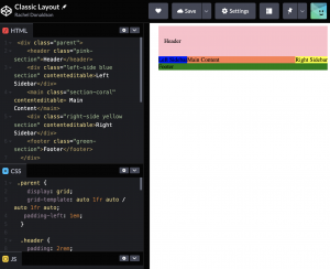
I have never used a structure like the ‘classic holy grail structure’ shown above however, I can imagine having knowledge of how to build this structure to be very helpful in future. At this stage, I was starting to get the hang of building the various structure and was able to reconstruct this layout without any problems.
12-Span Grid (display: grid; grid-template-columns: repeat(12, 1fr);)

The above structure is helpful to know how to build as guidance is provided in how to easily adjust column spans.
RAM- Repeat, Auto, Minmax (grid-template-columns: repeat(auto-fit, minmax(xxx px, 1fr)

This is a great grid layout as it moves from a one-column layout to a four-column layout. The only thing that puts me off the outcomes slightly is when the fourth column drops to its own row at a certain screen span. I would also be interested to see how adding images would impact a layout like this. This is something I intend to experiment further with in future.
Line Up (justify-content: space-between)

This layout keeps the cards fixed in a three-column layout and they adjust to appear more narrow as the screen size is reduced. To include a layout like this in webpage media queries would be required to stack the content on mobile.
Clamping My Style width: clamp(<min>, <actual>, <max>);

It is noted at the top of the write up on this structure that the structure has less browser support. The card remains intact as the screen size is increased and the width of the content inside the card increases until it hits a max-width.
Respect for Aspect (aspect-ratio <width> / <height>)

The final layout is described as the most experimental. It increase in height and width as the screen size is increased while keeping its set aspect ratio that can be adjusted to fit the design.