This week we looked at the Art of information and how as stated by economist Kenneth Cukier
“We are at the onset of a new movement in art that is built around data.”
We are now turning the data around us into art worthy of museum collections. This can be found in resources such as creativeapplications.net an organisation that focuses on design technology and business. In a recent post called Found in Translation- experiencing the process of machine translation created by TheGreenEyl the visceral experience of the process of machine translation is displayed.
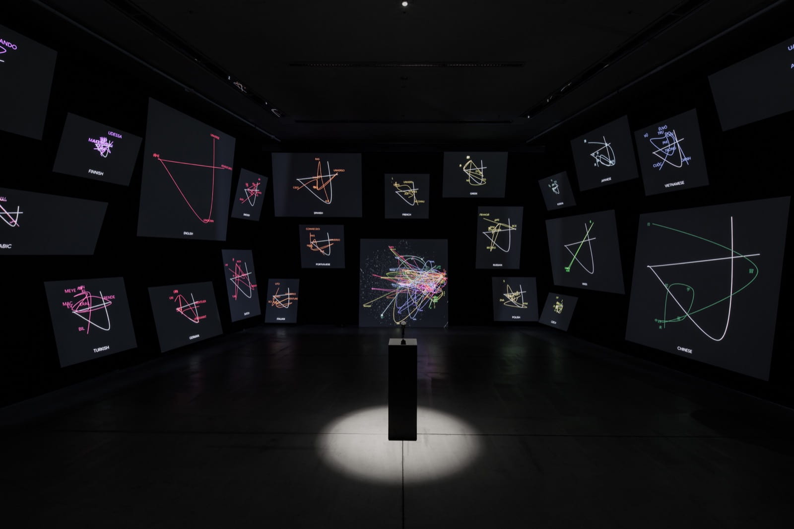
The above instalment can be found at 21_21 DESIGN SIGHT in Tokyo. It really is an incredible feat of design and technology and uses the visitor’s spoken sentences to create visualisations and audio to show how the machine learning model clusters words from different languages across 24 languages. The instalment includes 24 screen panels and 24 audio speakers.
This exhibition really demonstrates how data and art are merging to create incredible outcomes and new experiences. I think it is amazing to actually be able to experiences the complicated processes of machine translations in this way.
Brendan Dawes

Another example of this can be found in the EE launch which commissioned the Digital City Portraits by Brendan Dawes as shown above. The above outcome was made using millions of bits of data of people talking about the current events of the day. The mathematics are based on the same mathematics used to create the head of a sunflower. The three days worth of data collected by University College London looked for keywords such as Hurricane Sandy, money, Skyfall with subjects localised for each city. Each piece of data uses the same system to generate a unique image resulting in the incredibly intricate and beautiful outcome above.
Again this displays just how amazing the presentation of data can be resulting in incredible works of art.
Big Data
Big data can be broken down into three defining properties know as the three V’s.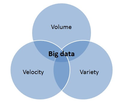
As demonstrated above the three V’s are volume, velocity and variety.
Volume
Volumes of data can reach unbelievable heights and of course, big data is all about volume. It’s estimated that 2.5 quintillion bytes of data are created each day.
Velocity
Velocity relates to the growth of data and how fast the rate of growth is happening. With more people online and the dependency of the corporate world on data the rate ad which data is gathered is growing. Data can be gathered in real-time, fits and starts and batches.
Variety
Variety refers to the forms in which data is gathered and delivered. Data was once generally found in the form of database files such as excel and csv however now data comes in a much larger variety of forms from videos to graphics to social media.
Data is incredibly useful and is creating work in the form of analytics and even design.
Netflix

Big data can be used by companies like Netflix and in fact it is estimated that 80% of what we watch is because of big data. Netflix is said to be able to hike prices and block VPN’s and still see rapid growth in subscribers due to big data. Netflix uses big data to find out exactly what users want and give it to them with a big portion of their budget finding content and user experience.
However, there are concerns that arise from this approach for the user as it can cause us to fall into a filter bubble. This means we are only seeing more of what we like i.e. if your interested in horror and sci-fi you’ll be recommended more horror and sci-fi and potentially miss out on other genres and a greater variety of options.
Jer Thorp
Jer Thorp is an artist, writer, teacher and is best know for his designing the algorithm placing nearly 3,000 names on the 9/11 Memorial in Manhattan. He is one of the leading voices in the ethical use of big data.
In his Ted Talk Thorp talks about his work on the 9/11 Manhattan Memorial with Jake Barton and a company called Local Projects to develop an algorithm and software tool to help the architects build the layout for the memorial. On the memorial, the names are not listed alphabetically or in chronological order but are laid out in a way in which the relationships between the people who were killed are embodied in the memorial. Brothers are placed next to brothers and coworkers are placed together. This was made possible through the algorithm and software tool developed by Thorp and Barton. It allowed almost 3000 names with almost 1500 adjacency requests to be presented in this memorial in a way that considered the connections that were part of these peoples lives resulting in a dense narrative that becomes an embodied part of the memorial.
Hearing the story behind the memorials and how the connections were considered in this manner is really moving. Thorp goes on to talk about the importance of putting big data in a human context. This would help us to get a better understanding of the type of information that we’re sharing. However, this can go further if we can do this with other data in a human context (not just personal data like location data being shared on our phone.) Examples Thorp gives is when looking at data such as stock prices, mortgage reports we should try to think about the data in a human context. Thorp hypothesises that by looking at data in this way we will automatically build empathy for the people involved in these systems. In turn, this will help to build fundamental respect which Thorp believes is missing in a large part of technology.
This is a really interesting concept and something I believe that we as designers can play a pretty important role in. As seen in Thorp’s algorithm, making it possible for almost 300 names to presented in a way that highlighted their connections to the others included in the memorial. Likewise, the way in which we as designers choose to present data can have a huge impact on how people relate to it. By including the names in this way they didn’t just become a long list of people who had died they were people with brothers and sisters, friends and co-workers, this memorial not only memorialised the people who had died but also the connections they had to one another.
Aaron Koblin
Aaron Koblin is an artist, designer and programmer that specialises in data and digital technologies.
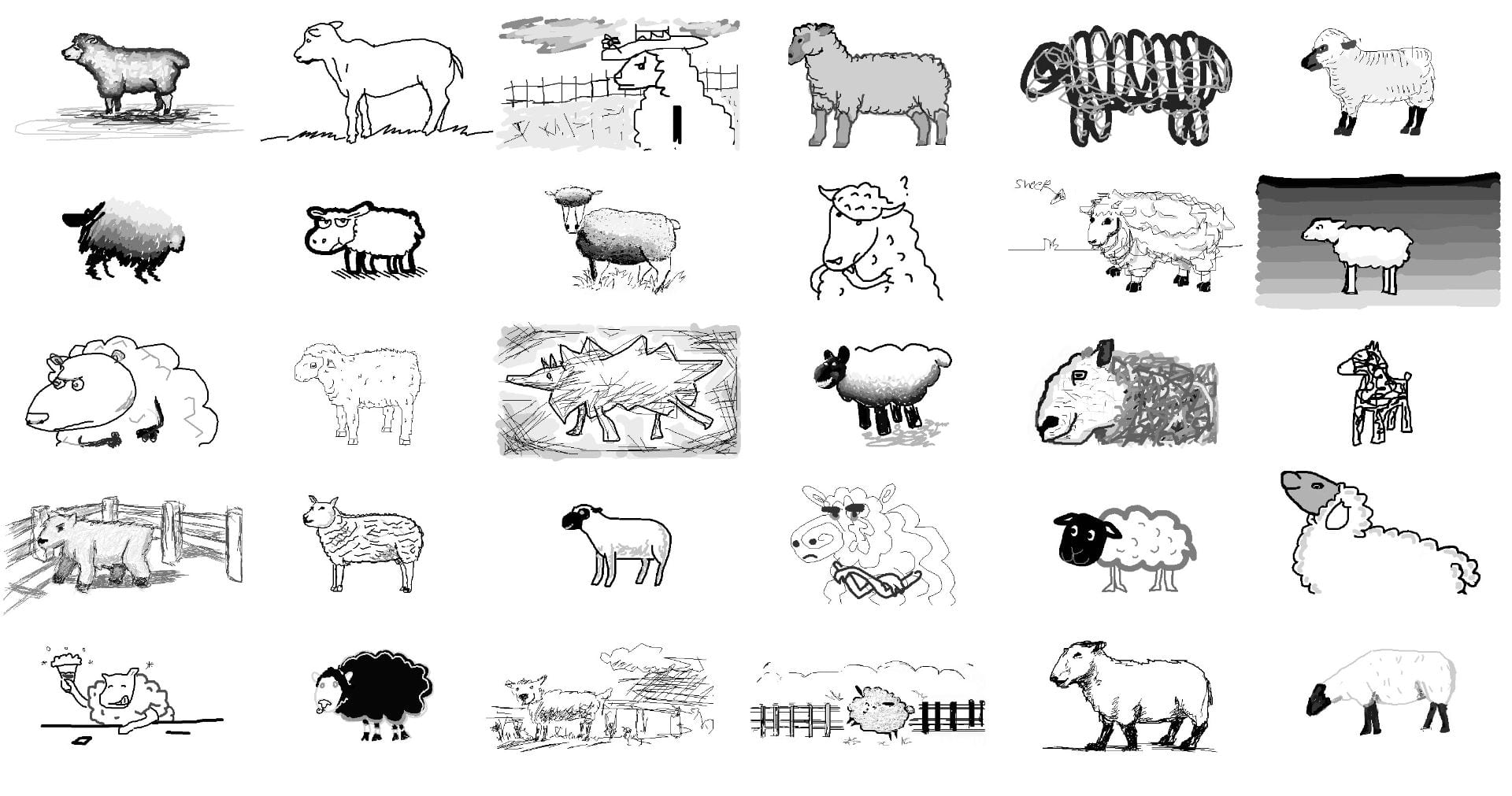
Koblin has worked on fun and interesting projects like The Sheep Market. In this web-based art project, Kobin collected 10,000 left facing sheep created by workers on Amazon’s Mechanical Turk. This project was a Human Intelligence Task and casts a light on the human role of creativity being expressed by workers in the system. I found the purpose of this project to be a little too abstract but found the outcome to be quite fun and interesting.
Koblin also worked on the Jonny Cash Project. In this project participants were tasked with creating drawings that were then combined and placed within a collective music-video tribute to Johnny Cash that was set to his song “Ain’t No Grave”. I found this project to be incredibly moving and creative and was blown away by the effectiveness of the outcome.
What have I learnt?
- Combining data, with technology and design can result in amazing, immersive experiences.
- There is a whole field of opportunities and careers opening up in the combination of data and art.
- Big data means big business and there are multiple ways it can be applied to industry and help companies target the wants and needs of their customers as seen by Netflix.
- By applying a human context to big data we can begin to build empathy for the actual people involved in the systems and that the data relates to.
- Art can be combined with data and in response to virtually anything to create intricate and memorable outcomes.
How can I apply this to my work in future?
- When data is presented in a particular form it can become beautiful and intricate and this is something I would love to experiment more with, in my work in future.
- Data can also be presented in ways that help viewers to make connections between items this is something I would love to be able to produce in my own work with data.
- It’s important to deal with data in a respectful way as data is generally made up of human experiences and I should therefore always try to consider the human context when working with data.