I found Information is Beautiful by David McCandless to be a great resource full of interesting and different ways to present information. As the content is so broad and features so many different graphs and charts I have included the ‘Key’ of charts found at the end of the book. 
While the images in my opinion could be slightly more detailed I still believe that having a chart like the below will be very helpful during the wireframing process.
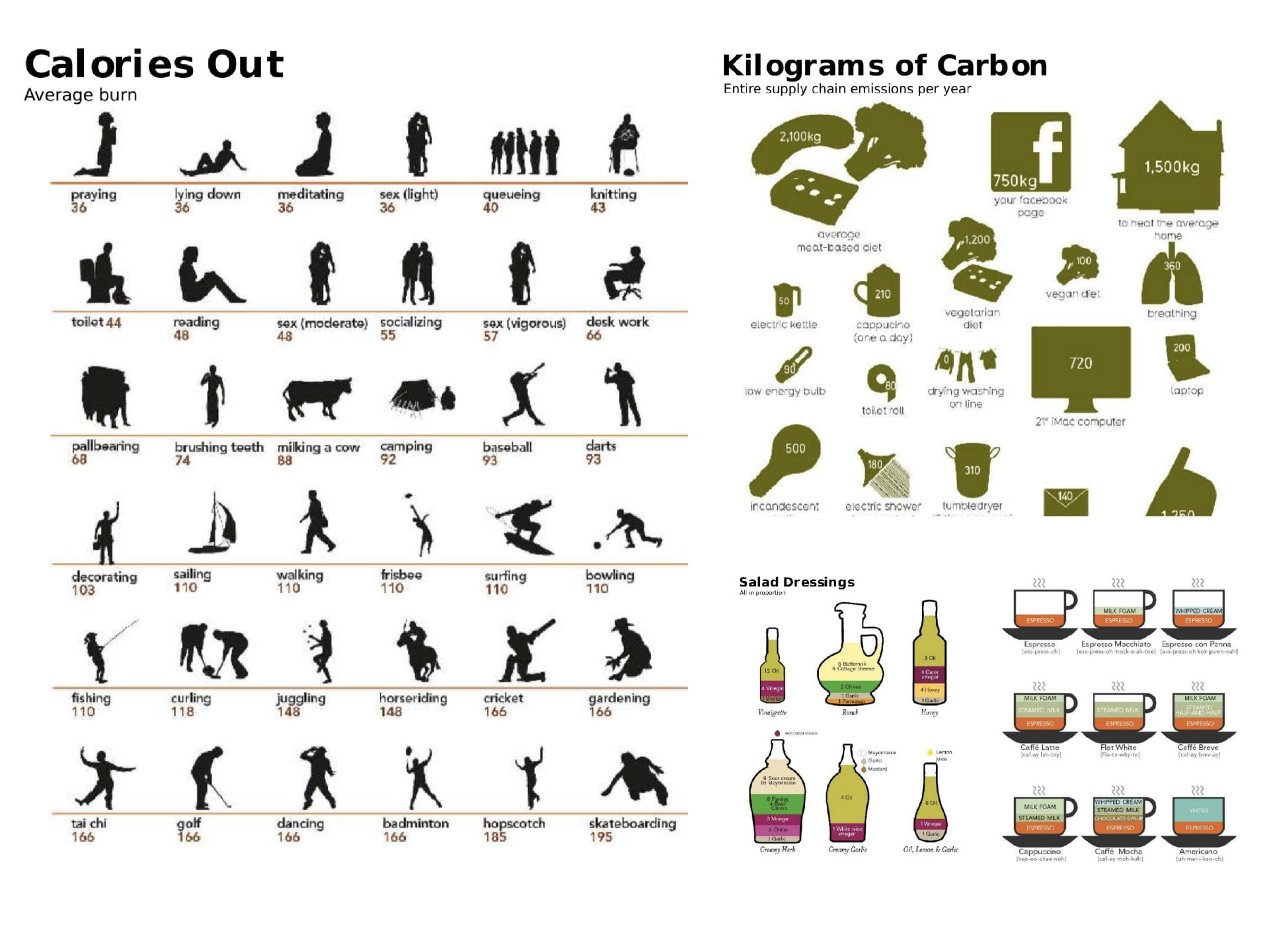
Above I have pulled some of the diagrams that have presented information through/ and in combination with imagery. The Calories Out outcome shown above to the left displays imagery of people carrying out activities along with the figure of the number of calories burned while doing this combination. Similarly, the Kilograms of Carbon display object with the kilograms of carbon emissions produced by the entire supply chain by year. This is a really great way to make the information more engaging and easy to absorb. I also love how the salad dressings and types of coffee are presented with the ingredients and proportions highlighted in layers.
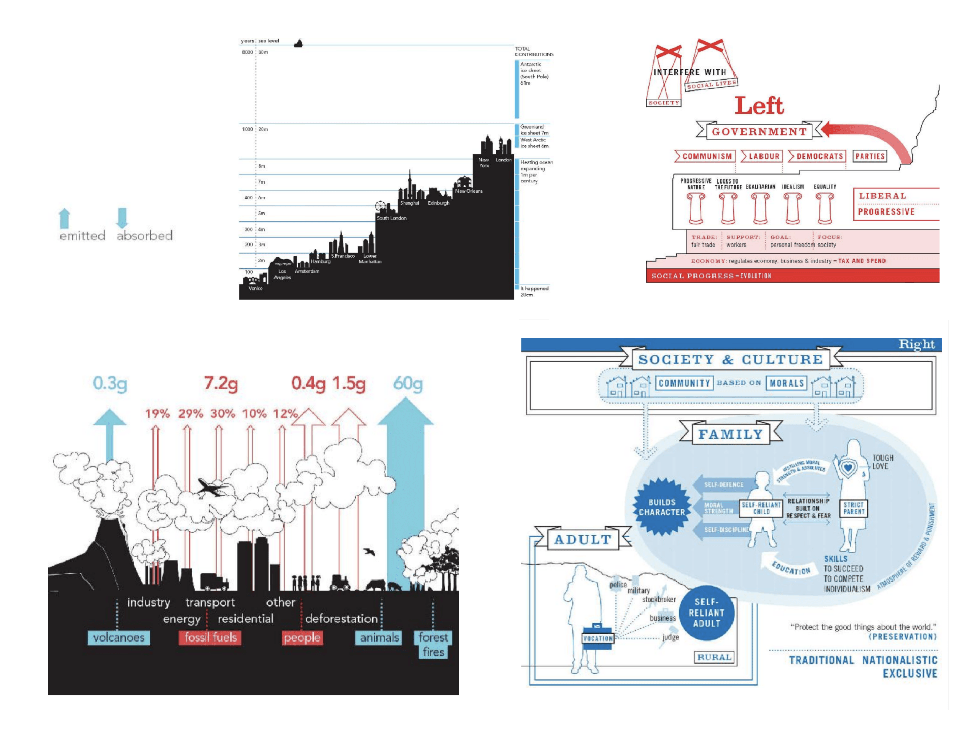
In the above outcomes, pictures have been integrated into the charts and diagrams in a more integrated way. In the top left sea levels outcome, it appears that the city referred to has been included on top of an area chart style outcomes creating a very interesting silhouette. Similarly in the carbon emission of volcanos, vehicles and animals have been placed in line with arrows and clouds along with figures outlining carbon emissions. While on the right images have been used to reflect the principles of conservative and liberal views depicting pillars, posters/signs and houses. I really like this approach as it’s a little less structured and provide an interesting overall outcome. I would love to incorporate imagery in this way in my own infographic.

I the above charts slightly less appealing however in context area and line charts may be more appropriate and I should keep this in mind if attempting to reflect a more serious point within my infographic. I do however find the tree map to provide a great overview of millions billions and trillions at a glance.

I love the above circular gauge and sematic polar grid outcomes I find them both very elegant and interesting to look at. I particularly like how the sematic polar grid resembles a flower I feel this could be played on further. My only concern with the above outcomes is that I find the information slightly more difficult to read and digest and this something I would have to consider when creating my own outcome.

I really like the above bibble outcomes as I personally din them to be so much easier to read and understand. I definitely want to experiment with outcomes like the above in my own work. I do however wonder about the accuracy in size differences and if these are done to scale. This is something I would definitely want to consider in my own work and have therefore sourced the below resource on how to do this in illustrator.