Adding movement to my logo.
I began my research for adding movement to my logo by looking at examples of how other brands had incorporated movement into their logos as seen in the above video. I also looked at opening title sequences to television series and was particularly influences by the moving text in the opening sequences of Homeland and How to Fix a Drug Scandal. How to Fix a Drug Scandal looks at misconduct in a lab setting so I appreciated the link to the lab which is included in my brand. Both display text with letters appearing out of order as if a message was being decoded.
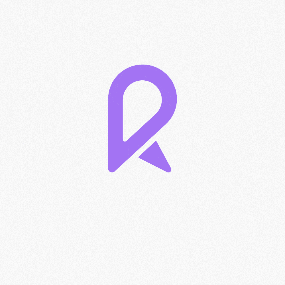
I really liked the idea of including this decoded animated text in my moving version of my logo. I also wanted to ensure the lab theme remained clear so I included a push motion to the monogram as if the logo itself were a piece of lab equipment and when the ‘R’ button was pushed the wordmark begins to process and slowly be revealed. See final outcome above.
Second option
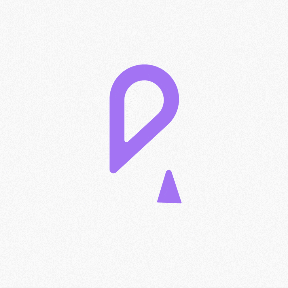
Following feedback, I also produced a second moving outcome incorporating a spinning feature. I loved the idea of making a part of the monogram spin and the main portion of the ‘R’ lends itself nicely to being presented as the spinning part of a gage. The idea of spinning equipment in a lab could also be related to a centrifuge or spin coater, so the motion drew a nice parallel to the lab theme as well. When creating this outcome I wanted to consider the physical response a gage would have when hitting a stop so I added a slight bounce to make the outcome seem more realistic and then had the type being revealed in order, reflecting the orderly nature of a lab.
Overall I am really please with both outcomes I have created. I particularly like the spinning outcome as I feel it is more unique and fun.
Notebook
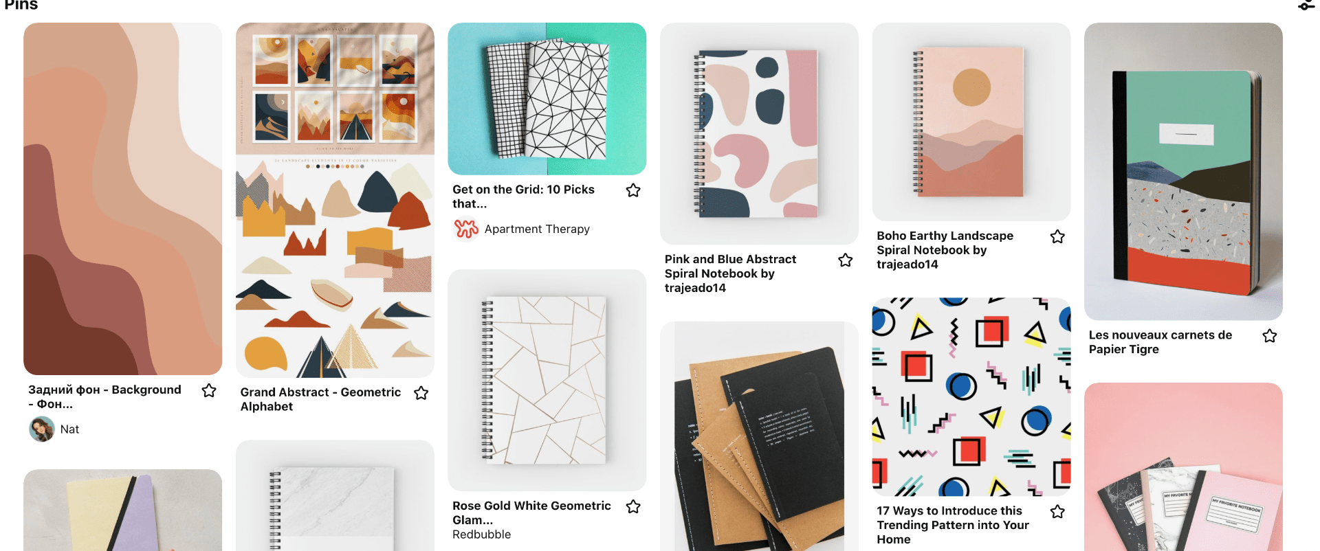
I decided to also create a physical touchpoint and liked the idea of producing a notebook as I feel once again the idea of orderliness and note-taking fits with my brand theme. It also fits with design services where sketching ideas is a vital part of any designers process. I then did a little research and created a Pinterest board of various notebooks.

I sketched out 3 variations keeping in mind I wanted the overall outcome to be quite minimal in style and to reflect the quality of the brand.
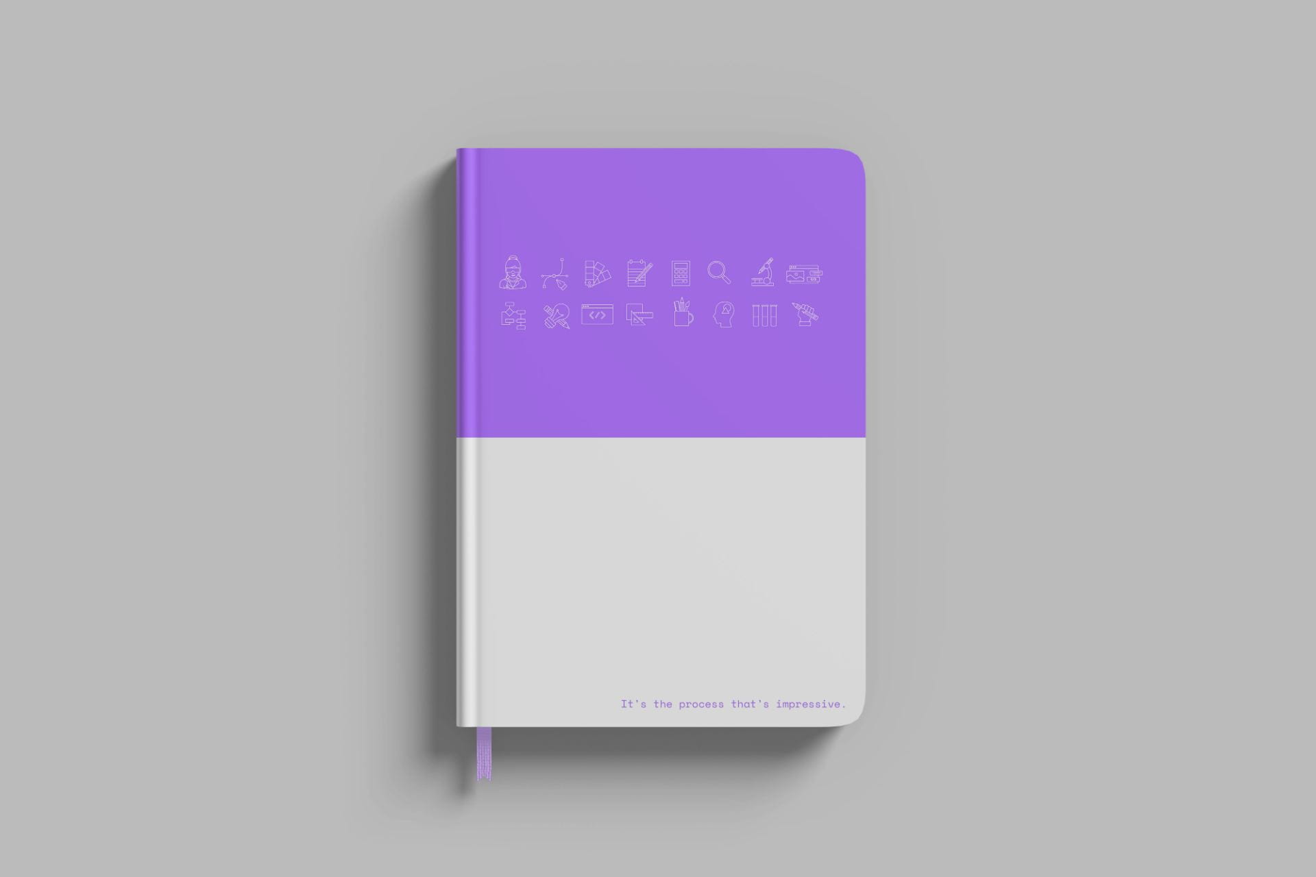
I created my second design outcome on illustrator as I felt this was the strongest it also gave me the opportunity to incorporate my icon set and my manifesto “it’s the process that’s impressive.” I then found a prototype of a hardback notebook with a little bookmark as this was of the higher quality notebook prototypes I found to find. I did not want a spiral bound outcome as I felt this would detract from the overall design. I loved that this prototype included a bookmark as it gave me the opportunity to incorporate a lighter shade of purple which I feel sets off the whole outcome. For the colour choices, I decided to split the book in half colouring one half purple and the other half white which I think balances out the icons set and text and the bottom really nicely.

When receiving feedback it was highlighted that my first outcome featured too many icons horizontally throwing off the balance of the outcome. On reviewing the outcome I realised this was definitely the case and I removed two of the icons that I felt were the least interesting and balancing out the final outcome. I am really please with how the notebook turned out and feel that it captures the considered, minimalist and quality that I want to be reflected in the visual language relating to my brand.
What have I learnt?
- How to use Adobe After Effects
- How to make items increase in size and spin in After Effects
- How to export videos through Media Encoder
- The importance of getting feedback from others- they may see something I’ve missed or influence a fresh perspective.
- The importance in presenting the tone of a brand in a physical touchpoint rather than simply throwing a logo on the item being designed, while it may present your logo that does not mean it effectively represents your brand.
How can I apply this to my work in future?
- I can now continue to work on improving my animating skills with the potential of combining this with illustration or web building/ design.
- I feel more confident with working on touchpoints and this is a skill that will be useful in future
- I should actively seek out feedback from multiple sources, there is always room for improvement!