An interface inventory as described by Brad Frost is similar to content inventory however rather than reviewing and categorising content your categorising UI components. It basically means reviewing all components and elements of a brands UIs screenshotting them as you go followed by categorising. Frosts suggest using PowerPoint or Keynote and even provides a template (unfortunately I couldn’t get the download to work) and grabbing the following elements: text fields, radio buttons, carousels, accordions, tabs, images, icons, video players, graphs, etc.
Frost describes the benefits of completing an inventory interface to be laying the groundwork for a sound design system, encourage others to see the value in having a design system, promoting consistency, ensure no elements or areas of an interface are missed in a design overhaul and for responsive retrofitting. Responsive retrofitting is generally required when designers don’t have the option to design mobile-first responsive design and required to retrofit a responsive site onto an existing site. Interface inventories can help teams to establish what elements to include based on the viability of including them in a responsive environment.
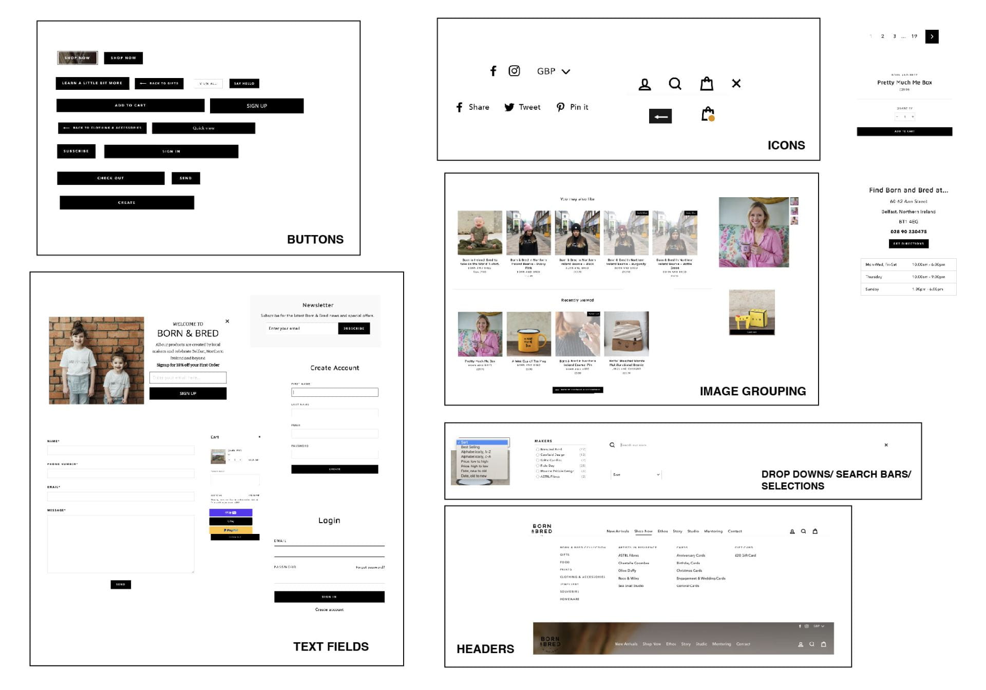
I decided to complete my interface inventory on Born and Bred following the brand guidelines exercise I had completed on the company. This was a great way to get a grasp of how to carry out an interface inventory. As the born and bred is relatively small and didn’t have a mass of components to sift through I decided to drop my screenshots on 1 illustrator artboard. I categorised them into buttons, text fields, icons, image groupings, dropdowns/ search bars/ selections and headers. I also pulled a few elements over to the side that did not end up being repeated through the site and didn’t fit within a category. Overall I found there to be really strong consistency throughout the brand’s website. Again this is to be expected as Born and Bred are a local company and therefore are likely to only have a small number of people contributing to the site design and format. The buttons primarily used a black fill bar on the rare occasions in which I found a white or black outlined button (also not a bad thing, in my opinion, it’s nice to mix up every now and then.) There were no bevelled corners on any of the button borders or images. Social media icons were all filled and search, bag and profile icons all used stroke.
There was also strong consistency in text files with accompanying buttons generally spanning the length of the field. Dropdowns/ search bars/ selections were not strong enough related to evaluating together and in reflection, this category was probably not needed. The header had 2 stated one black on a white backdrop and white on an image backdrop.
What have I learnt?
- An interface inventory is a technique used to review and categorise the UI components that makeup interfaces associated with a brand.
- When completing a user face inventory lookout for text fields, radio buttons, carousels, accordions, tabs, images, icons, video players and graphs. However, this list will need to be adapted based on the common components and elements that make up the brand.
- Interface Inventories can be used to help responsive retrofitting.
How can I apply this to my work in future?
- If am working on a brand that appears to lack consistency across its interfaces I can carry out an interface inventory in order to encourage more consistency throughout the brand sites and platforms and use it to set the precedence for the creation of a style guide.
- While working on any project this a good technique to ensure I haven’t missed or mistakenly included elements that don’t fit with a given style choice for a brand and to ensure I’m not including too many variations throughout a site.