Born and Bred
Born and Bred is a unique gifts and accessories store, created by artisans and craftspeople in Northern Ireland. It operates online and has 1 store in Belfast. I really like this brand and the ethos behind it of helping local artist thrive and promote Northern Irish culture. I, therefore, decided to create a set of brand guidelines using Born and Bred as my subject, shown below. This exercise was a great way to help me consider how to format and execute brand guidelines as well as implementing the structure and necessary content required in brand guidelines as the content was available online.
I began by following the structure set out in our lecture Which suggested Tone of voice, Logo, Typography Colour, Layout, Hierarchy, Sizing and Structure and Photography as these were the areas most relevant. I also led with the brand story and ethos as I felt these were particularly relevant to the brand.

I wanted to style the brand guidelines similar to Urban Outfitters as I felt the commercial element of their brand was similar to Born and Bred. I began by gathering images from the companies Instagram and website and set out a table of contents page as shown above. I also took an image of the brand’s logo found on their Instagram page and incorporated it as my cover pages shown above.
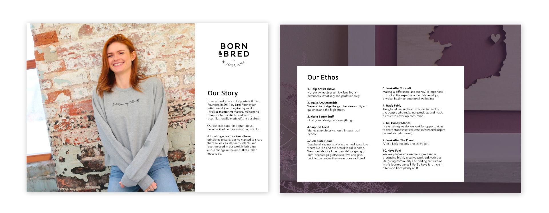
I then combined imagery, story and ethos found on the brand’s website to create the above pages.
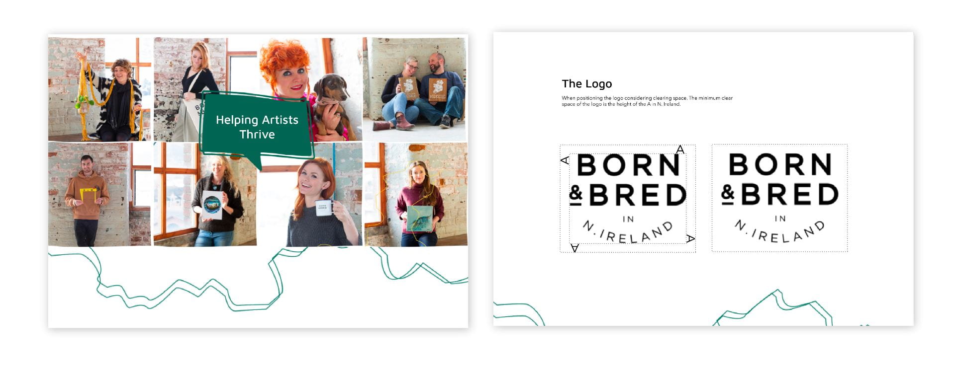
This brought me to the logo portion of the brand guidelines which reads:
When positioning the logo considering clearing space. The minimum clear space of the logo is the height of the A in N. Ireland.
I followed this clear space approach from the Netflix brand guidelines as I felt that by using a portion of the logo itself a clear measurement is set that is not impacted by scale. This is something I intend to use in my own brand guidelines.
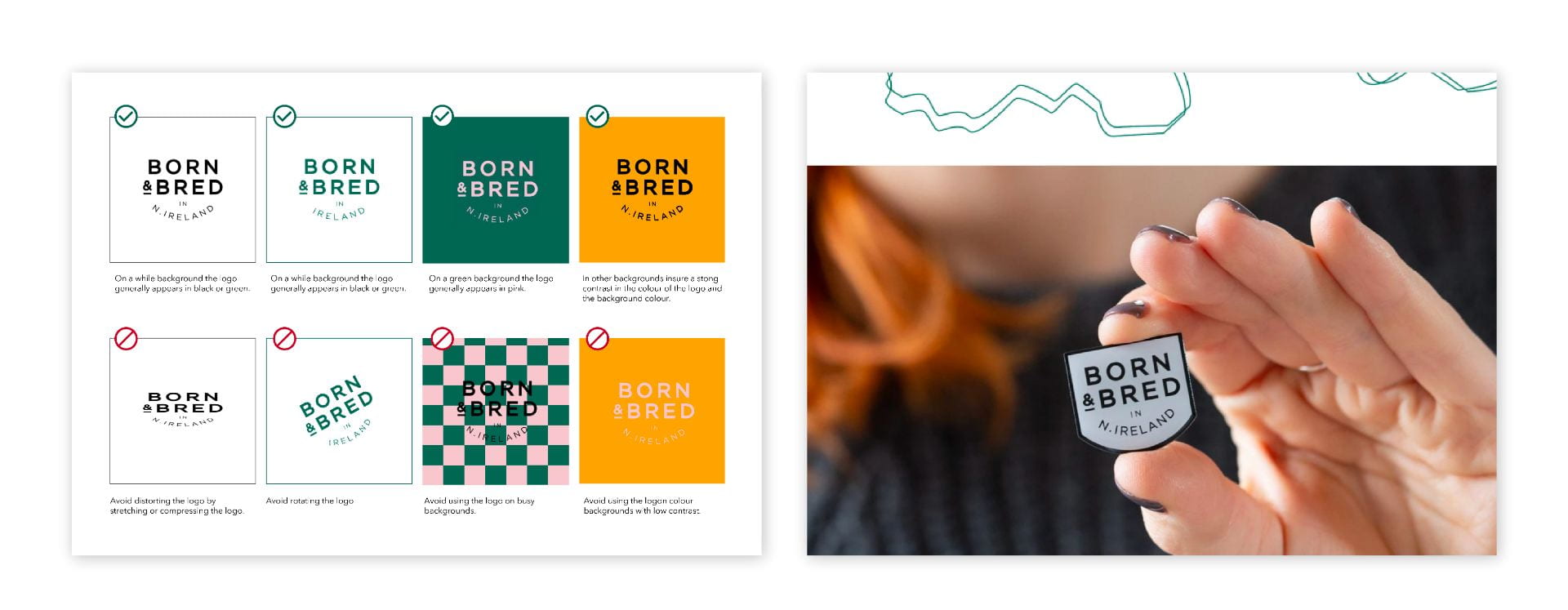
I then moved to the do’s and don’ts of logo use. This was a fun section to create as I could manipulate and push the logo to extremes to get a clear understanding of what really did not work.

The colour section reads:
We use a range of colours in our brand however we do have some favourites. We like to incorporate deep green and light pink in our social media and online presence. We also throw in a little mustard every now and then for good measure but we don’t stop there. We let creativity rule and like to mix up our colour combinations depending on what’s going on in the studio.
I generated a colour palette based on the companies website and Instagram.

The typography page reads:
Titles, Headings and Product names all use Maven Pro Medium. Page tiles use type size, line height and leading of 32px 41.6px and 0.8px. Page headings and product names generally use a type size, line height and leading of 27px, 35.8px and 0.7px All body text, prices and navigation tabs use Avenir Next Medium. Body text generally use a type size, line height and leading of 15px, 24px and 0.4px.
I gathered this information from how typefaces are used on the brand’s website.
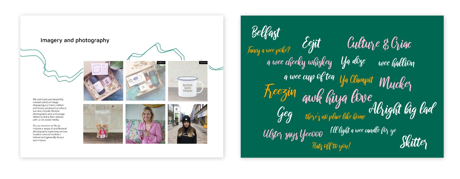
Imagery and photography reads:
We don’t just use beautifully created product image displaying our handcrafted and locally produced products but also include lifestyle photography and encourage others to share their photos with us on social media. On our website, we like to include a range of professional photography capturing various location around Northern Ireland and generally favour warm tones.
I created the above short paragraph based on the images found on Born and Breds website and Instagram.

The tone of voice page reads:
We are:
Fun/ Raw/Colourful/ Real/ Personal/ Authentic/ Humerous
Born and Bred’s tone is open and honest particularly when addressing some of the challenges that artists face as they work from home and potentially alongside other jobs. We place a strong emphasis on creating a sense of community and present a sense of openness and friendliness.
We also want to keep our tone light-hearted and fun and celebrate our culture from all angles.
I generated the above content based on how the brands story and ethos read.
Review
This was a great exercise and I really got into it as I was able to source loads of content from the companies website and social media. I am really pleased with the content and overall aesthetic. I would also like to continue with a similar format when creating my own brand guidelines.
What have I learnt?
- It really helps to begin with a clear formatting structure that will be used throughout the document
- It is great to consider the aesthetic of brand guidelines by including interesting design elements like additional imagery as it breaks the text up and makes the content more digestible.
- It should be easy for anyone to have a clear idea of a companies tone of voice through a well-written brand story.
How can I apply this to my work in future?
- When creating brand guidelines in the future I will begin with deciding what content will be included then gather imagery and consider formatting (there are loads of examples online so looking to them is a great place to start)
- As these are rules for how to present the brand I need to remember to be very clear in what I am saying and ensure I don’t overlook any detail.