As outlined in this weeks lecture brand style guide helps to maintain consistency across all platforms and materials the brand is presented on. This should mean that there are little to no differences in how the brand looks, sounds and feels. We also discussed a number of resources which I have taken the time to go through in a little more detail.
How to Create Brand Guidelines
On 99designs Shirly Chan has written an article on the topic of How to create a brand style guide. I found this to be a brilliant resource with some great suggestions on how to produce brand guidelines. There are broken into 5 steps:
- Collect brand guide inspirations
- Define the 6 essential brand guide elements
- Make a list of other brand collateral your brand should cover
- Make an outline for your guide
- Plan for the evolution of your brand
The suggestion was made in step 1 collecting inspiration to create a Pinterest board in order to demonstrate what the core values mean to them. I have carried this out quite loosely selecting any outcome I felt had strong visuals and interesting structures that might tie in with my brand: My Pinterest Board
The 6 elements of a brand style guide are brand story, logo, colour palette, typography, imagery and voice. Each of these elements are written about by Chan in some detail and I intend to use these elements as a guide for my own brand guidelines. I am particularly interested in attempting the words we like and words we don’t like approach suggested as a way to define my brand voice. I think this could be really helpful as I feel I might have the tendency to present myself as all-inclusive and all capable however this exercise will help me to narrow my vision and present myself in a more defined way.
In the make a list step make a list of other brand collateral Chan suggests looking at additional elements that might need to be covered in the guide. In. the case of my brand guidelines I will be including my brand on a business card and may all present my portfolio website on completion.
Making an outline for my guide is an important step that I intend to complete before generating my guidelines while planning for the evolution of my brand is likely to be fairly limited at this time but something that could be reviewed on a 6 monthly basis or more regularly if required.
Examples of Great Brand Guidelines
Amanda Gaid presents 12 examples of Brand Guidelines and how guidelines may vary on the basis of the brand’s needs. I have included below some of the brands that jumped out at me and what I found helpful.
Asana
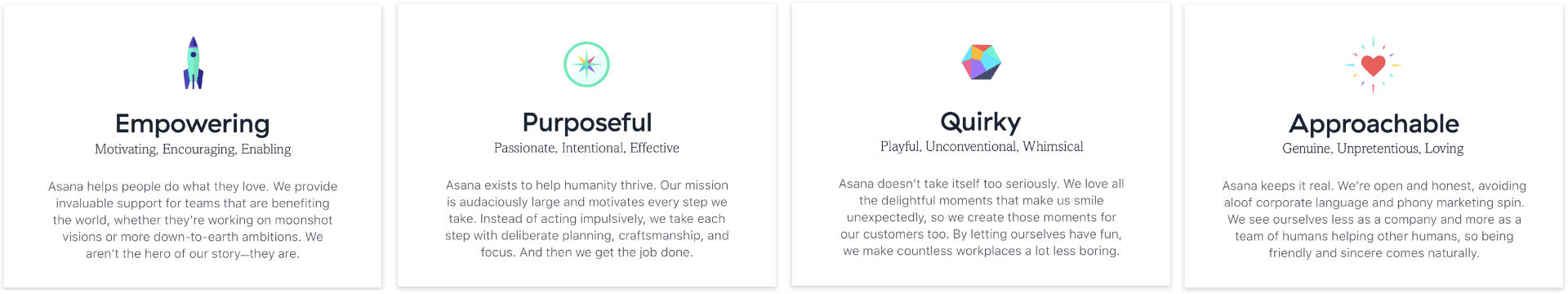
What drew my attention to the brand guidelines produced for Asana was the focus placed on generating 4 brand attributes that would be memorable and comprehensive I also like how they incorporated related works and short descriptions along with these brand attributes see below.
I think this is a really great way to tackle the setting of a clear identity and a great starting point for developing a consistent and tone of voice. Asana has included their brand system which is split into core identity, brand elements and brand application that I felt was a great reference see below.
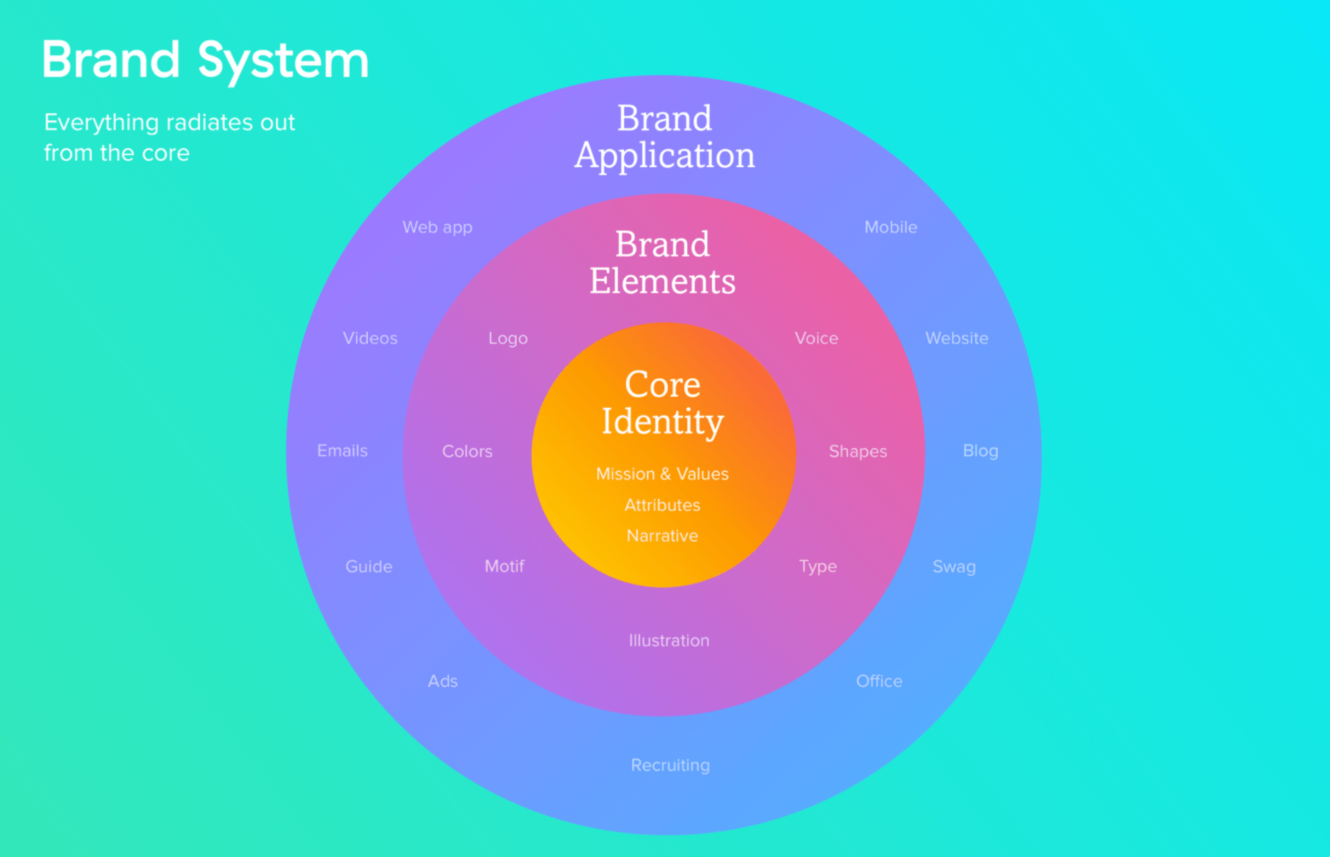
While I will not begin with this level of detail in my own brand guidelines this is definitely a system that I would like to refer back to as my personal brand develops and I have additional elements and attributes to consider.
Urban Outfitters
I found this to be a great reference while developing my practice brand guidelines for Born & Bred. What I love about this brand guideline is the structure and presentation.
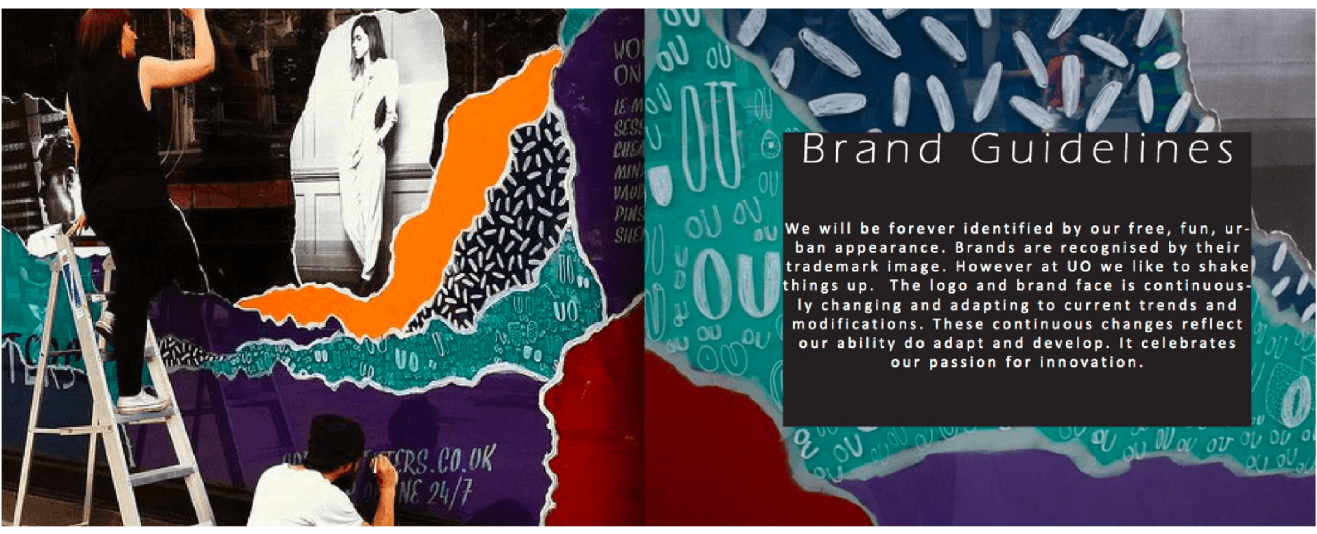
I love the use of photography, typography and imagery in the presentation of the guidelines and how this fits with the brand’s overall identity. This is an approach I have tried to adopt in my brand guidelines for Born and Bred.
Netflix
What immediately jumped out to me in Netflix’s brand guidelines was their level of simplicity. The brands full brand site centres on the logo and symbol and how it should and shouldn’t be used. It is interesting to note that Gaid presents this as an effective approach as “brand guidelines only need to go as far as the scope of your brand”
This is interesting to note and while I feel my personal brand will require considerably more detail than found in the Netflix brand guidelines it may be something to consider when working with brands in the future.
I also found some interesting approaches to how to place logos and how to check colour contrast.
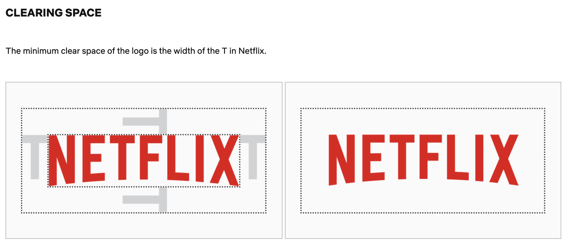
As shown above, Netflix has taken the T from the logo and used this as a guide for the clear space that must surround the logo. I found this to be an excellent way to measure the clear space required as the logo can be presented at any size and the T can be used to measure the clear space required without any measurements required. This is an approach I intend to incorporate into my brand guidelines for Born & Bred as well as my personal brand guidelines.
The guidelines also provided the following source to check colour contrast when placing the logo on a background colour which I felt had the potential to be quite useful: https://webaim.org/resources/contrastchecker/
NASA
NASA’s brand guidelines are at the opposite end of the scale with every detail of the brand and how it should be displayed written about in a 60-page manual called NASA’s Graphic Standards Manual. This comprehensive document is organised into 10 sections, The NASA Logotype, Reproduction Art, Stationery, Forms, Publications, Signage, Vehicles, Miscellaneous and Supplementary Guides. These categories are broken down further with Publications for example being divided into 16 subcategories.
It is interesting to note the grid-based structure of this document which comprised of 3 columns throughout giving the manual an almost textbook feel. This grid-based structure has not changed in the updated NASA Style 2019 publication however the sections have been reduced to 5 overarching categories, Introduction, Basic Elements, Applications, Stationery Products and The Nasa Insignia which have been broken down into headings and subheadings.
I feel these manuals particularly the 1976 version are in my opinion great points of reference particularly if I am struggling to find important details that may be required in future in relation to brand placement as so much of what is written about in these brand guidelines relates to the brand’s application.
What have I learnt?
- I now have a clear understanding of what a brand guideline is and how it should be created.
- I now know to include additional elements in a brand guide such as important touchpoints.
- Brand guidelines can be customised to the needs of the brand.
- I now have a better understanding of brand application and how brand guidelines can be used to outline important details in relation to this.
How can I apply this to my work in future?
- When working on branding projects I can now produce brand guidelines as required.
- I now have a great structure to work from to produce brand guidelines in future.
- When working with different companies I can adapt my brand guidelines to meet the need of the company and format them accordingly.
- Netflix’s approach to clear space is a great way to tackle the problem of scale and this is definitely something I want to incorporate in brand guidelines in future.