As we covered the principles of user interface and looked at a couple of UX Laws including Jakob’s Law, Fitt’s Law and the Law of Pragnanz I decided to take a look at the Laws of UX in a little more detail and was particularly interested in Jon Yablonski’s work in the area.
Laws of UX- Jon Yablonski
At the beginning of the book, Jon Yablonski describes some of the difficulties he faced when working on a project that was breaking new ground and therefore didn’t have any proven examples to explain to clients why he was choosing the approaches he was taking. He found the answer to this problem in behavioural psychology and has listed the laws and principles that he has found to be most relevant to designers.
Jakob’s Law
Users spend most of their time on other sites. This means that users prefer your site to work the same way as all the other sites they already know.
How can I apply this?
Research is vital to understanding sites and products that are similar to what I am creating. By incorporating some of the key features (particularly those in relation to navigation and utility) I will be able to produce an outcome that is more automatically usable as the user will transfer expectations and won’t have to learn every element of how to work the app/system from scratch. I have been able to this with my own travel app by drawing inspiration from apps such as google earth, google maps and NASA.
Fitts’s Law
The time to acquire a target is a function of the distance to and size of the target.
How can I apply this?
As touch targets must be accessed easily their placement on the screen is very important as well as their spacing to prevent the user from selecting the wrong touch target by mistake. Guides such as material design can be particularly helpful as they provide detailed measurements on spacing and how to produce layouts. Another factor to consider when producing products and apps that include CTA buttons is to make these buttons larger and more accessible on the screen.
Hick’s Law
The time it takes to make a decision increases with the number and complexity of choices.
How can I apply this?
This I believe may be a more or less complex problem depending on the product being designed. e.g. account or banking software may be relatively complex and require several different functions and therefore simplifying the design to avoid the inclusion of too many complex choices may not be an option. Yablonski has highlighted a few alternatives to this such as breaking complex tasks into smaller steps to reduce the cognitive load or highlighting recommended options to provide guidance for the user and to prevent them from becoming overwhelmed or using progressive onboarding. In relation to my travel app, I have produced an app the attempts to make information finding interactive and fun. Therefore I have in instances added to the complexity of the app by doing this. However, I have tried to compensate for this by adding list and search features for those that want to find specific information simply and quickly.
Miller’s Law
The average person can only keep 7 (plus or minus 2) items in their working memory.
How can I apply this?
Miller’s law appears to be most usefully applied to the chunking of information. Chunking information helps the user to process, understand and memorise it more easily particularly when coupled with the provision of hierarchy and whitespace. This is particularly important for me to remember when producing my planet profiles as I want to provide a detailed level of information about the planet in this section. By chunking this information and setting out a clear hierarchy with headings and subheadings along with using an appropriate amount of whitespace I will make the users experience more pleasant and the information easier to digest.
Postel’s Law
Be liberal in what you accept, and conservative in what you send.
How can I apply this?
When broken down and applied to design this law means accept feedback from users from any input mechanism e.g. have a response to a swipe e.g a movement or vibration, even if it doesn’t do anything. Being conservative in what you send relates to making sure that the interface design is easy to use for as large a spectrum of people as possible. While designing my travel app I must attempt to make my interface as usable and flexible as possible by predicting and allowing various actions and providing feedback to users on how the action they have taken is being interpreted by the app in an intuitive way as possible e.g. when I little bounce movement happens after scrolling to the bottom of the page.
Peak-End Rule
People judge an experience largely based on how they felt at its peak and at its end, rather than the total sum or average of every moment of the experience.
How can I apply this?
I think the first step in applying this law to my work will be defining the users’ journey through my app and distinguish the peak point of the experience. I believe the peak point of the experience is the 3D view of the galaxy and how this space can be navigated and a search bar has been incorporated to make navigating this space as easy as possible. The endpoint of the user’s journey will most likely be at a planet profile or at a badge/spaceship profile. I, therefore, need to pay the most attention to the design of these 2 screens and ensure that the actions and information provided are exceeding the expectations of the user.
Aesthetic-Usability Effect
Users often perceive aesthetically pleasing design as design that’s more usable.
How can I apply this?
Designing an aesthetically pleasing UI can actually make users feel that the product is more usable. This is a really interesting effect as I feel helps to demonstrate the importance of the role designers play. When using well-designed apps people have more tolerance to minor usability issues so ensuring that the app is attractive can actually impact on how the viewer perceives functionality. I have attempted to produce an aesthetically pleasing design for my star wars app by consistent use of colours realistic style illustrations and subtle use of gradients and hopeful that I will achieve an aesthetically pleasing end result.
von Restorff Effect
The Von Restorff effect, also known as The Isolation Effect, predicts that when multiple similar objects are present, the one that differs from the rest is most likely to be remembered.
How can I apply this?
This is particularly helpful when designing buttons and CTA’s or any important information. By making the item I want to be viewed first or most focused on stand out against the rest of the information to achieve this. However, there are further considerations that need to be made when implementing this effect. These include: avoid making too many items stand out so that there are not too many items competing with each other, take into consideration those with vision impairments and colour blindness and consider motion-sensitive users when applying contrast through mostion.
Tesler’s Law
Tesler’s Law, also known as The Law of Conservation of Complexity, states that for any system there is a certain amount of complexity which cannot be reduced.
How can I apply this?
I feel this acts as a balance to Hicks law and the importance of what is being said should not be overlooked. While I want to produce a pleasant and intuitive human-centric user experience for the user I can not eliminate all of the complexity of the system. Therefore I think it’s really important to first establish the primary, secondary, tertiary and so on functions of an app and ensure that the UI design makes these function easier to complete but does not attempt to irradicate them. I feel this is best approached in a similar manner to Hick’s Law by breaking the actions into steps and highlighting primary function steps and through progressive onboarding.
Doherty Threshold
Productivity soars when a computer and its users interact at a pace (<400ms) that ensures that neither has to wait on the other.
How can I apply this?
I should consider loading times and even the inclusion of animation during these stages as it is a way to visually engage people while waiting for a page to load etc.
Colour
As I feel I have a pretty good grasp on the colour wheel and colour combinations e.g. monochrome, complementary, triads etc. and have covered this in my Typography and Colour blog here I want to explore colour combinations and moods.
Mark Boulton talks about this on his sight designing for the web.
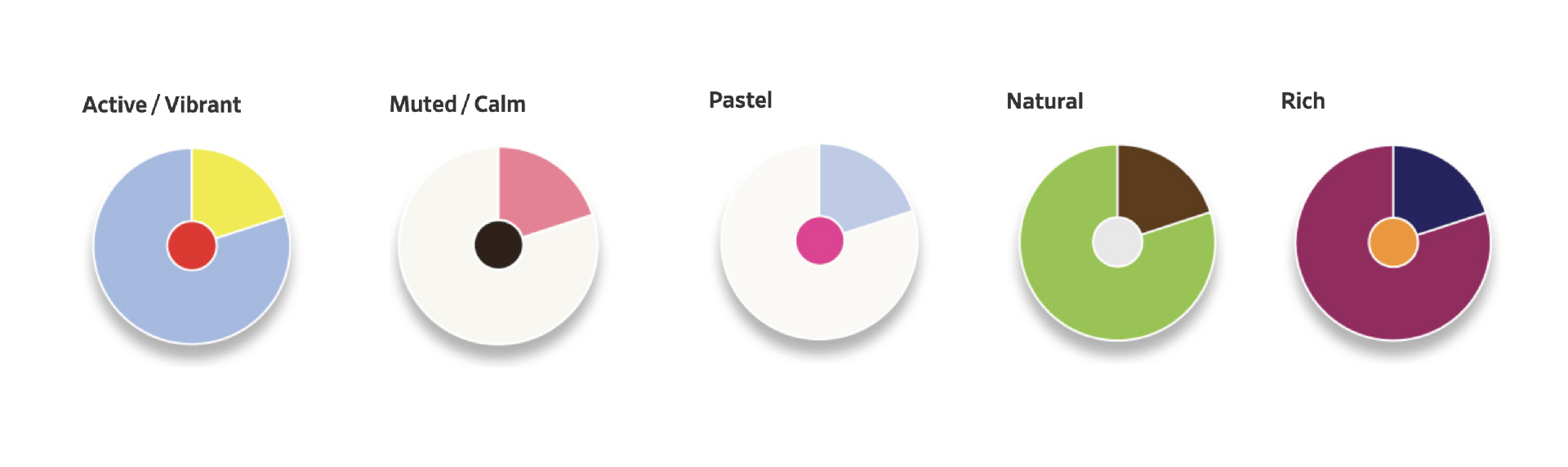
The above image outlines 5 different colour combinations each presenting a different type of mood from the viewer. The first is described as an active/vibrant colour combination. The blue yellow and combination above present a bright combination of complementary colours and while this may vary cross-culturally active colour combination are generally aimed at young adults.
Muted and calm colours generally feature a lot of white in the hues which are generally combined with blue, green and violet areas of the colour wheel which are supposed to convey visual quietness. The above example describes the dominant colours within the calm composition to be blue and lavender however I see the colours as closer to black and soft pink yet I still feel a calming feel is achieved by the inclusion of a large amount of white. Pastels are quite similar to muted colours as they contain a lot of white however pastel themes combine warm and cool tones more regularly. Natural or earth tones are generally warm colours drawn from what can be found outside. Boulton describes pulling colour from photographs taken outside to produce stunning colour combinations. I really like the warmth of earth tones and feel they are particularly effective in generating a rustic feel. Finally, rich tones generally relate to wealth, royalty and tradition. Boulton suggests mixing these tones with natural tones to create a fuller pallet.
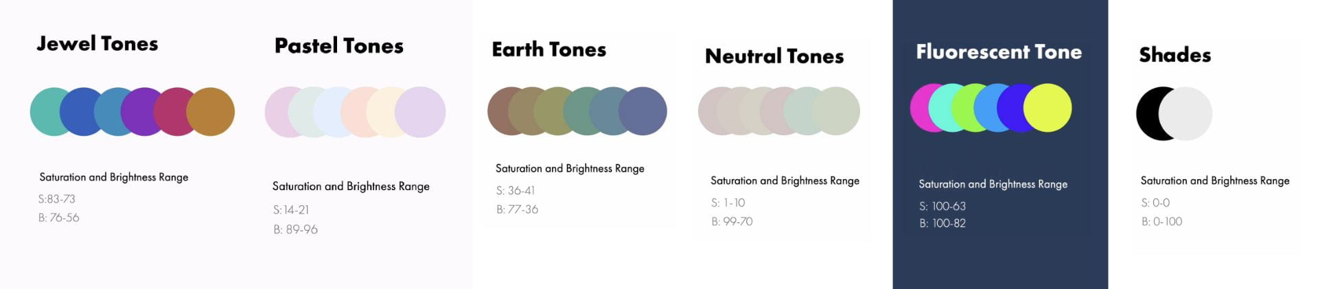
Designer up however breaks colours up slightly differently and goes into the detail of how to produces different colours by adjusting hues within a colour pallet while maintaining consistent brightness and saturation levels. I found this to be a really interesting approach to colour and while I feel I might match colours in this way without thinking about it I have never at the beginning of a project created a full-colour palette in this way and intend to experiment with this on my next project.
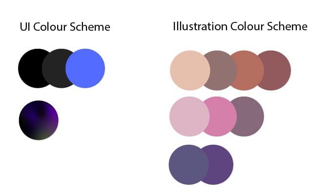
As shown above for the colours used in my Travel App I have selected a fluorescent blue to be my highlight/ dominant colour and the rest of the colour pallets to be primarily presented through illustrations of space the outcome being a dark colour theme coupled with warm coloured illustrations featuring warm earth tones and gradients to present light and reflect a slightly more futuristic feel.
What have I learnt?
- There are several rules, laws and effects that can be used to measure the utility and effectiveness of a design outcome.
- It’s really important to have a clear understanding of the users’ journey so that problems and obstacles can be talked about and addressed during the design stage to make this process as smooth as possible.
- If I want to make the biggest impact on the users experience I need to focus my attention on the peak and final scenes in the users journey.
- Design can be very helpful in lowering dissatisfaction over small usability issues and can be incorporated to reduce frustration with loading times and therefore can really enhance the users experience by simply being aesthetically pleasing and responsive.
- Colour combinations can have a massive impact on the meed and feel of a design and there are at least 5 categories to choose from which is particularly helpful when creating illustrations and broader colour palettes are needed.
How can I apply this to my work in future?
- I can take note of the laws set out by psychologists and make sure that they apply with reason to my design work- this will general a strong a consistent level of design work- from there I can push boundaries to see what works.
- I can develop a user journey before even producing sketches to narrow my focus and produce design work that will help to carry the user through this journey.
- I need to remember to always include an onboarding process that will walk the user step by step through how to use an app or product.
- When producing a design while it is incredibly important to focus on and integrate usability into my design it’s also important that I keep the app aesthetically pleasing as this will help to compensate for any usability issues that do arise.
- I can now experiment with creating colour palettes by adjusting hue within a preset brightness and saturation level.