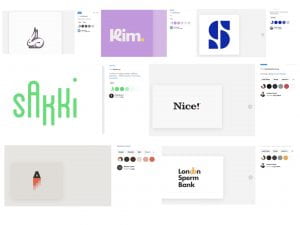
Designspiration
To start my colour considerations I began by looking at logo’s in designspiration to help get a sense of what I like and what I don’t like. What jumped out at me was that a lot of the logos on the site were primarily black with small highlight colours. Due to the design of my monogram and wordmark, a style like this would be difficult to achieve as there are do small defining feature to put in a highlight colour. I have screenshot some of my favourite outcomes and included them above. The outcome I like best is probably the bright green used for Sakki followed by the yellow and deep grey used in London Sperm Bank. I also liked the muted tones in the rabbit outcome and the pastel colours found in the Kim outcome. I wanted to stay away from blue as I feel it is generally quite overused as a colour however I felt the electric blue example above was distinctive from the lighter shades of blue found Facebook, Linkedin, Twitter and a number of banks.
Colours used in established branding
I then moved on to look at the colours used in the logos for my favourite established brands (I wanted to primarily focus on tech companies as I felt that these would be most compatible with my design lab theme). It was interesting to note the combination of colours used in google, slack and Playstation use of primary colours, plus green and how by adjusting the tint and tone a different overall atmosphere is created in the outcome. Again in the above examples, I find myself very drawn to the bright greens used for Spotify and survey monkey. It is also interesting to note that the design studio Hey uses black for their logo which does make me think that keeping my outcome black/deep grey should be considered as I might want to place the outcome on top of images and I don’t want it to detract from the design work I am presenting on my portfolio website.
Colour Options
I placed my logo in a number of colours as shown above. I also experimented with ways to include additional colours such a putting the leg of the ‘R’ monogram in a different colour and part of the wordmarks in different colours. I did not feel that either of these outcomes worked. I also tried layering the colours on the monogram and using a gradient. Again I felt this didn’t work as took away from the minimal feel of the outcome. I, therefore, felt a monochrome colour selection the most appropriate. Of the outcomes presented above my favourites were the green, purple, red and black and white selection.
In order to help me select the strongest outcome, I reviewed some of the psychological and cultural contexts relating to the colours. While I like the idea of the green and felt it worked with the lab theme I didn’t like the colours ties to jealousy in western culture and inexperience in European culture. I also felt green was slightly more too masculine. While I liked the red outcome I felt that the colour choice was quite common across branding and less unique than purple. I loved the freshness of the vibrant purple shown above and felt that it still fit with my lab theme. I also liked purples western links to creativity and felt that it was more memorable than the black and white outcome
Colour Selection
I briefly experimented with monochromatic shades of purple before finally settling for 1 shade of purple and off white as shown above. I experimented with different shades of purple in business card and brand guideline outcomes before making a final decision on the above outcome. I have also attempted to find a Pantone match for this shade of purple as this would be required for any print work.
What have I learnt?
- It is helpful to consider the shape and arrangement of a logo when making colour selections
- It is also helpful to look at examples for inspiration including established brands
- Gradients can work in branding but only when used effectively. If used incorrectly they can look over the top and even a little tacky.
How can I apply this to my work in future?
- I believe colour choices in a project should remain relatively fluid at the beginning. While a set of colour choice needs to made for a logo I think it is good to leave room for colour selection to be added to a brand when creating physical and virtual touchpoints as it is helpful to see colours in context.
- When making final selections reviewing psychological and cultural ties is important. While this does not have as strong an implication on my own brand as I will most likely continue to operate as a designer within a western culture it is very important when creating work for brands that are global or based in or from another country.


