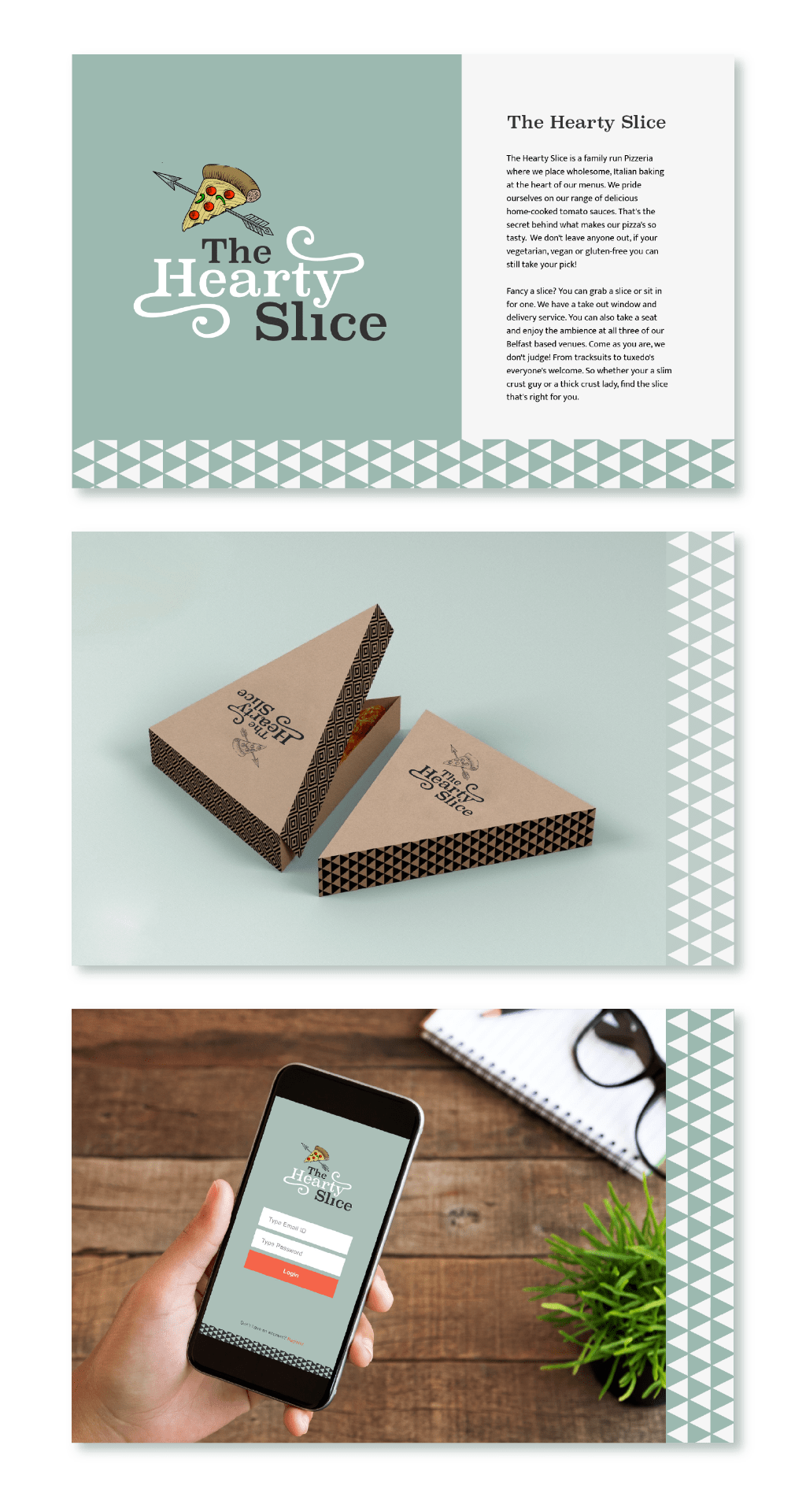
The Hearty Slice
The Pizzerias personality is friendly, quirky, humorous and diverse. A USP is that it sells slices from their take out window which makes the pizzeria particularly popular for lunch with those working locally and students. The Hearty slice has 3 fun, relaxed and quirky venues generating a good crowd in the evenings and on weekends. Portion sizes are large and good value for money.
Competitors and similar brands
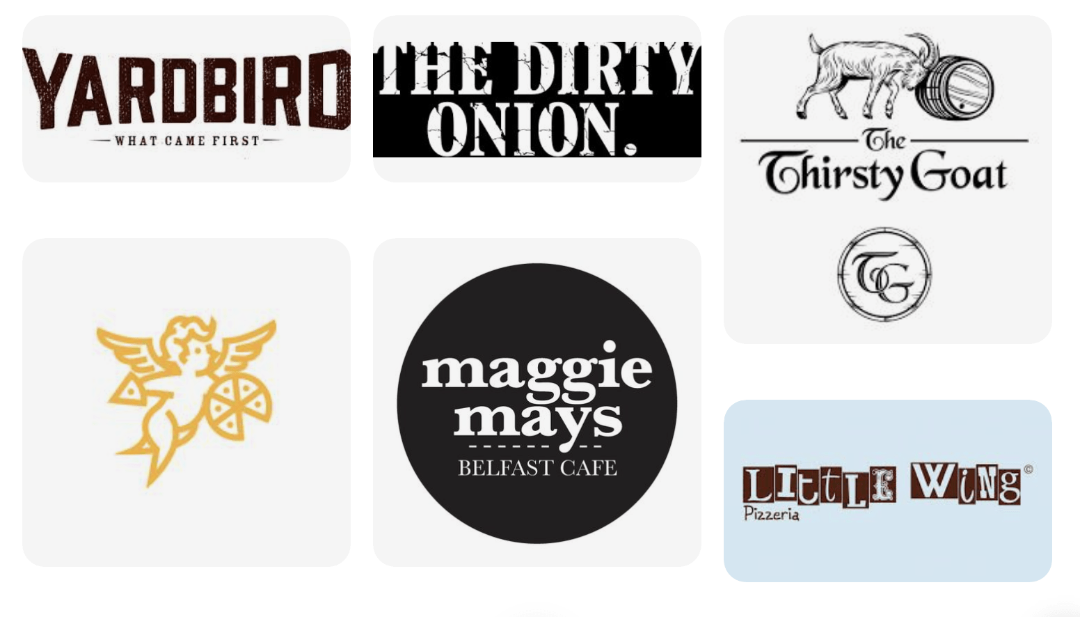
These are the primary competitors and other local restaurant’s, bars and cafes that have developed a similar tone of voice as what we are trying to achieve for The Hearty Slice.
I also researched scrapbooks, alternative album art and jazz album art to generate a clearer theme to create the brand around. Further to this, I looked at Italy, Naples in particular and authentic Italian pizzeria’s, sculptures and artworks to see if the could be pulled into the branding in some way, see Pinterest board below.
https://www.pinterest.co.uk/rachelmd46/pizzeria-branding-exercise/
Tone of Voice
- Warm, friendly and welcoming- At the top of our list is generating a tone of voice that is warm and welcoming, encouraging customers to feel as comfortable and at home as possible when enjoying a delicious hearty slice.
- Quirky/ Eccentric- We want the environment and feel of our pizzeria to be a little on the eccentric side, with quirky menus filled with interesting meal titles and serving options and lots of variety in the food being served, taking into consideration a variety of dietary options including vegan and gluten-free.
- Humourous- Where possible an undertone of humour is great to encourage a joyful dining experience at the hearty slice.
- More Informal/ Personal- While we always remain professional we would like to let our customers know that we want them to enjoy informal and reasonably priced dining with good portion sizes at a fun and inviting, on-trend venue.
Brand Bank of Words
- Hearty
- Warm
- Tasty
- Italian
- Buon appetito
- Delicious
- Chunky
- Thick/ Thin
- Slice
- Yummy
Story
Combined logo Sketches
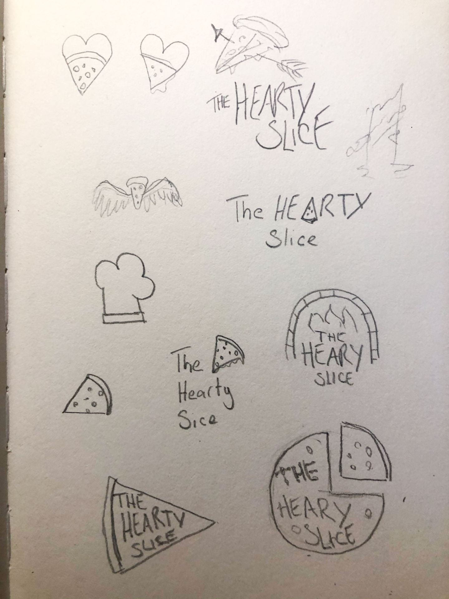
Once I had developed a story and clear town of voice that I then started drawing sketches. For this outcome, I knew I wanted to use a pictorial mark and was keen to include a slice of pizza in some form to match with the title. I was really excited with the arrow through the pizza slice idea and wanted to create it alongside a wordmark as I felt it captured the quirky feel I was going for.
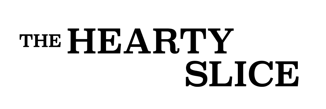
Selecting a Typeface

I reviewed a number of typefaces shown above and selected Superclarendon. I liked the subtle old English feel to this typeface and felt that worked with the arrow in the pictogram (creating a very subtle Robin Hood tone.)
Adding Custome Element


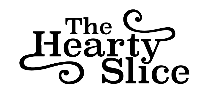
I then experimented with the typeface in lower and upper case and decided on simply capitalising the first letter of each word. I then went on to arrange the words together and customer elements such as the cutouts and swirls attached to the ‘H’ and the ‘y’.
Adding Pizza Illustration
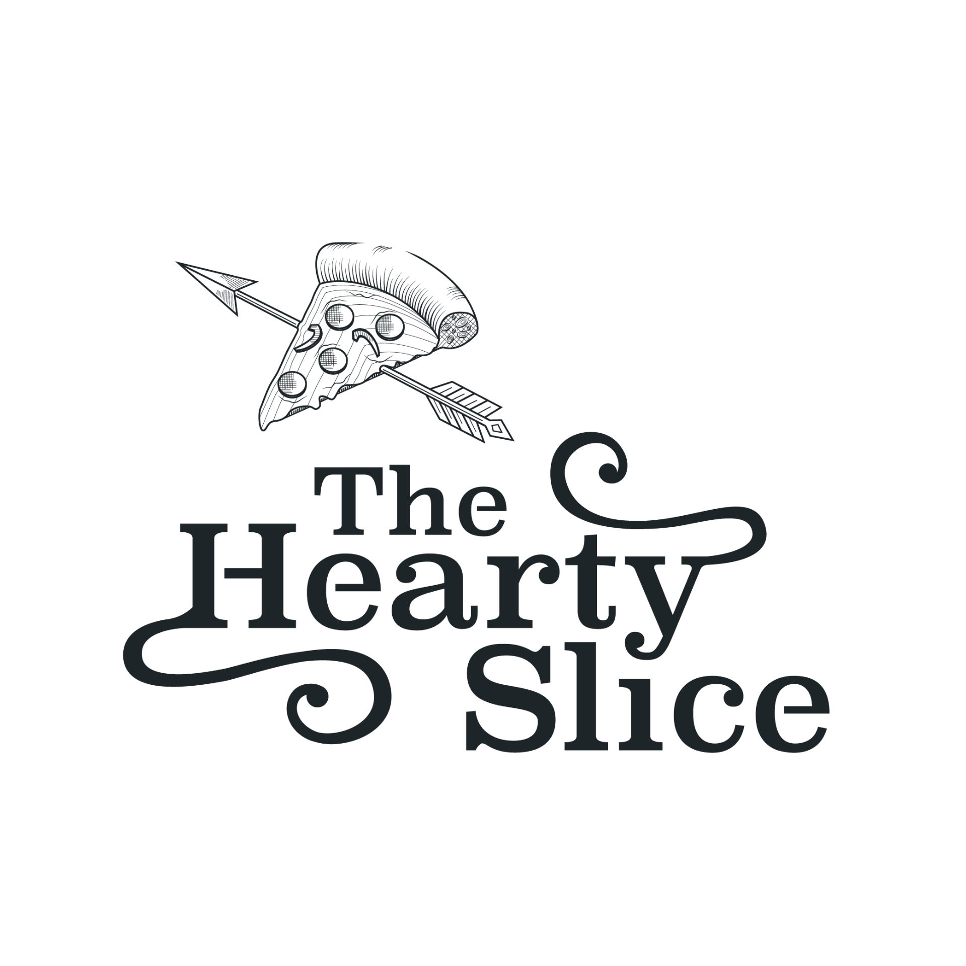
I created the pizza illustration on illustrator using a fine stroke and linework for shading. I was really pleased with this outcome as I wanted the final outcome to appear hand-rendered.
Colour Options
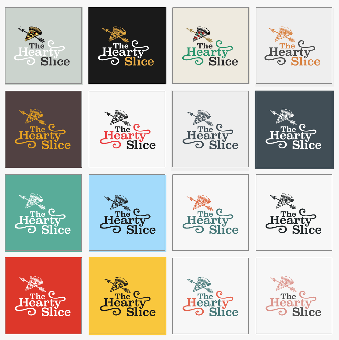
I experimented with a number of colour options focusing primarily on colours associated with Italy, the Italian flag, and pizza. I selected the first outcome as I felt the subtle green set a slightly more high end feel and that adding colour to the pizza really helped the illustration to jump out.
Final Outcome
Feedback
The feedback I received on the outcome was really positive with only a few small suggestions for changes. These were to remove the question from the brand story and to adjust the swirl in the ‘H’ and move the word slice slightly more to the right to ensure that the dot incorporated in the ‘y’ lined up better with the ‘i’. Below I have made the changes and on reviewing the outcome with what I had produced originally I feel that the changes have helped to finalise the outcome and made it more balanced. In the story, I removed the question and rewrote the majority of the second paragraph as on reflection I felt the whole thing was a little cheesy. I am really pleased with my updated story and feel it is more in line with the quality I would want a customer to associate with my brand.
![]()

What have I learnt?
- It was great to complete a full project within a more limited time frame and it has taught me how to make more decisive choices more quickly.
- I feel that I now have a better grasp of content wiring and have gone back and reviewed my content blog post and read around the topic in order to help me make the above changes to the brand stories.
How can I apply this to my work in future?
- When writing content I should always go back a check the fundamentals of copywriting to ensure I’m not including any obvious don’ts like including a question.
- I Found it helpful to produce my wordmark in conjunction with my pictorial mark and this is definitely something I will continue to do in future.