Sketches

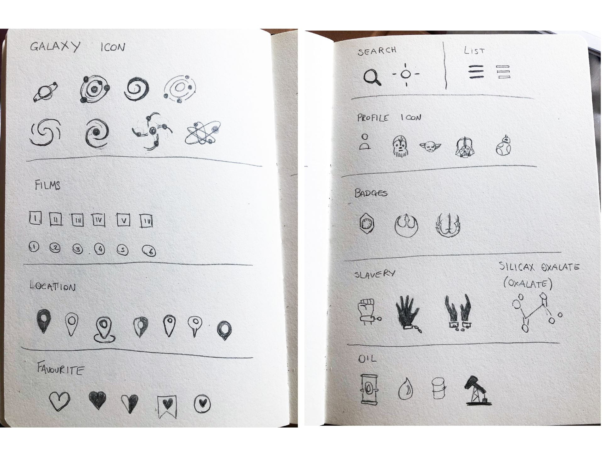
Once I decided what icons to include in my navigation after having complete my artist research I created the above sketches of possible outcomes for my icons. As I continued planning and developing my app further icons were needed such as badges and exports which were then added to the above. I found producing the above sketches to be very helpful as it allowed me to brainstorm ideas quickly such as using a Star Wars character for a profile image as the user logs in.
Nav Icons
![]()
I then moved on to quickly producing what I felt were the strongest outcomes on illustrating and trying out small variations such as adding fill. This was interesting to experiments and may be useful when it comes to producing a selected state e.g. adding a fill to the icon when it has been selected. I found creating the galaxy/home icon the most challenging of the above to create. As can be seen above I attempted multiple outcomes before returning to my first attempt as I felt the spirals mixed with the circles was the clearest at a glance. As the icons for favourite, lists, profiles, locations and back are well used across multiple platforms I wanted to stick with outcomes the user would be most familiar with and kept these inline with icons used on other applications.
![]()
Once I was happy with the range of icons I had produced, focusing first on navigational icons, I then created a separate file with a number of artboards each sized 28 x28 pixels to create icons that I could export at the correct size. I used the technique outlined in the Icon Handbook to ensure that each icon was visually balanced due to the differences in shape and how this is perceived by the eye. I feel this is a really effective technique and one I intend to continue with as I developed my icon creating skills.
![]()
Before exporting I quickly placed each icon in a blue box to ensure the correct spacing and tested them in context by placing them in a mock-up of the bottom navbar. I think this is a great technique and I found it particularly helpful to view the icons as a set before exporting as it meant I could check for any inconsistencies.
Rewards Icons
![]()
I then moved on to creating icons/ symbols that would be used as rewards as the person using the app will receive access to the symbol and it will be placed in the bottom navbar the more they use the app and try new features. I researched various Star Wars symbols and found the above to be the best guides as they also provided a description of what the symbol relates to.
![]() I then produced the above outcomes using the line approach I had used previously on my nav icon set in order to maintain a level of consistency across the app.
I then produced the above outcomes using the line approach I had used previously on my nav icon set in order to maintain a level of consistency across the app.
![]()
Finally, I created smaller versions of the Separtisit symbol that to check how the outcome would appear at a smaller scale. I found the double lines to be too thick and not in keeping with the style of the other navbar icons and so reduced to a simpler version. I then added this to the other navbar outcomes as shown above.
![]()
I decided I also wanted to include spacecraft as rewards as I felt this might be more engaging for users and therefore perceived as more valuable. While I do not imagine I will have time to produce these further in this project I like the concept that once a spacecraft has been earned the user would have access to view the spacecraft spec including movies the spacecraft has featured in and the associated characters that have used it in an additional page. As I wanted to ensure a level of accuracy in my depiction of the spacecraft I used the above outcome shown to the left as a guide. I then experimented with different line width.
![]()
Once I had completed the symbol and spaceship outcomes I then placed them in context however I found their icons to be a little bland as seen in the above left. I, therefore, drew inspiration from the coloured symbols presented above and added a curved fill at 50% opacity covering half of the square the icons were placed in. This created a glass-like reflective effect and which I feel worked really well to make the outcomes appear more interesting and desirable. I also experimented with adding a highlighted selection and greying out the icons of the spacecraft not yet earned. I am really pleased with this outcome and feel that the icons for both the symbols and spaceship work well together and a level of consistency in their outcomes.
Export Icons
![]()
Finally, I have created the above icons to break up the text on the planet profile page by presenting the primary exports of the planets in icons as well as words. The first icon represents Dilarium Oil, I have created the above outcomes drawing on examples of current icons used to represent oil. The second Silicax Oxalate, the above outcome is a replica of the symbol for oxalate and the third Slavery, for this icon I wanted to include a change but felt the outcome was too detailed and would not be recognisable at a small scale so instead created an outcome of hands bound together.
What have I learnt?
- It is very helpful to complete thorough research into an area and to create sketches when creating icons.
- I found the process of creating and developing icons together on one large artboard to be a great approach as it allowed me to consider the icons as a set.
- I found using the guidelines suggested in the icon handbook very helpful when it came to scaling and achieving visual balance throughout the set.
- Attention to stroke with us really important.
- Viewing icons in context is very helpful.
How can I apply this to my work in future?
- I found stroke icons to be the most effective outcomes for this project however I would like to experiment with fill icons in future.
- In future, I intend to follow the same process as above when creating icons sets as I feel it lead to a consistent and visually balanced icon set.
- If I need my icons to stand out more against their surrounding I will experiment with adding textures and colour changes as presented in the rewards icons above.