Research
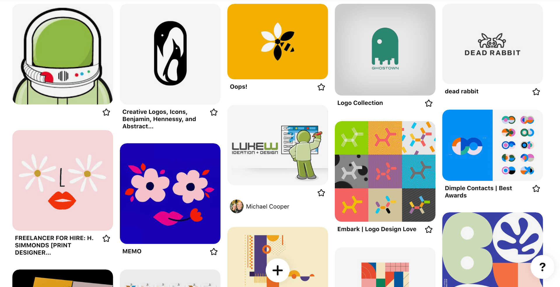
I began my research by looking at visual marques used by other designers and my top outcome was the astronaut shown at the top right of the above Pinterest board and used a visual marque by Luke Wroblewski. As Wroblewski is a leader in the field of UX design this outcome particularly caught my attention. I like the interesting space associations and the choice of colour which is very unique. Other outcomes I liked included outcomes with vibrant colours links to science which I felt I could relate back to my lab theme and animals built of simple shapes.
To view my Pinterest board click here
Ivan Bobrov
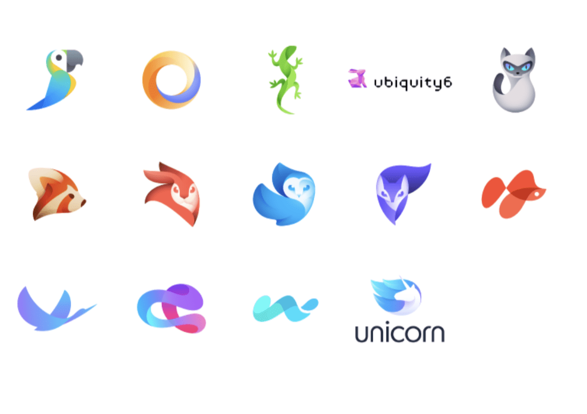
I also looked at the work of Ivan Bobrov shown above. I love how Bobrov creates a dimensional feel and sense of light through his use of gradients. I also love the use of sweeping curved lines creating interesting silhouettes. While the majority of the above outcomes present animals I would still love to be able to produce an outcome that had a similar look and feel. However, my only concern is that the outcomes are perhaps too detailed and not clearly be identified as logo marks.
Jordan Jenkins
Jordan Jenkins is a freelance designer who specializes in branding and illustration. I really like the graphic style of Jenkins work and that he also focuses on branding as I’m wanting to draw inspiration for a visual. marquee this feels like the perfect blend.

Above is an ebook illustration completed for Google Drive. I love the simplicity and icon style of the above illustration as well as the combination of flat and dimensional elements. I also really liked the use of colour and how the background setting is grey and the colour runs through the centre almost mimicking the google logo. I thought this was very clever.

Above are five character illustrations completes by Jenkins. I really like these outcomes and the little added details like freckles and dimples. I love how Jenkins has presented the jawline and added the side shading in these outcomes as this is always something I struggle with and generally end up having to make the neck a different shade from the chin. I also like the variety of shapes used for the hair and mouth creating a nice visual balance to the set while also making each outcome unique.
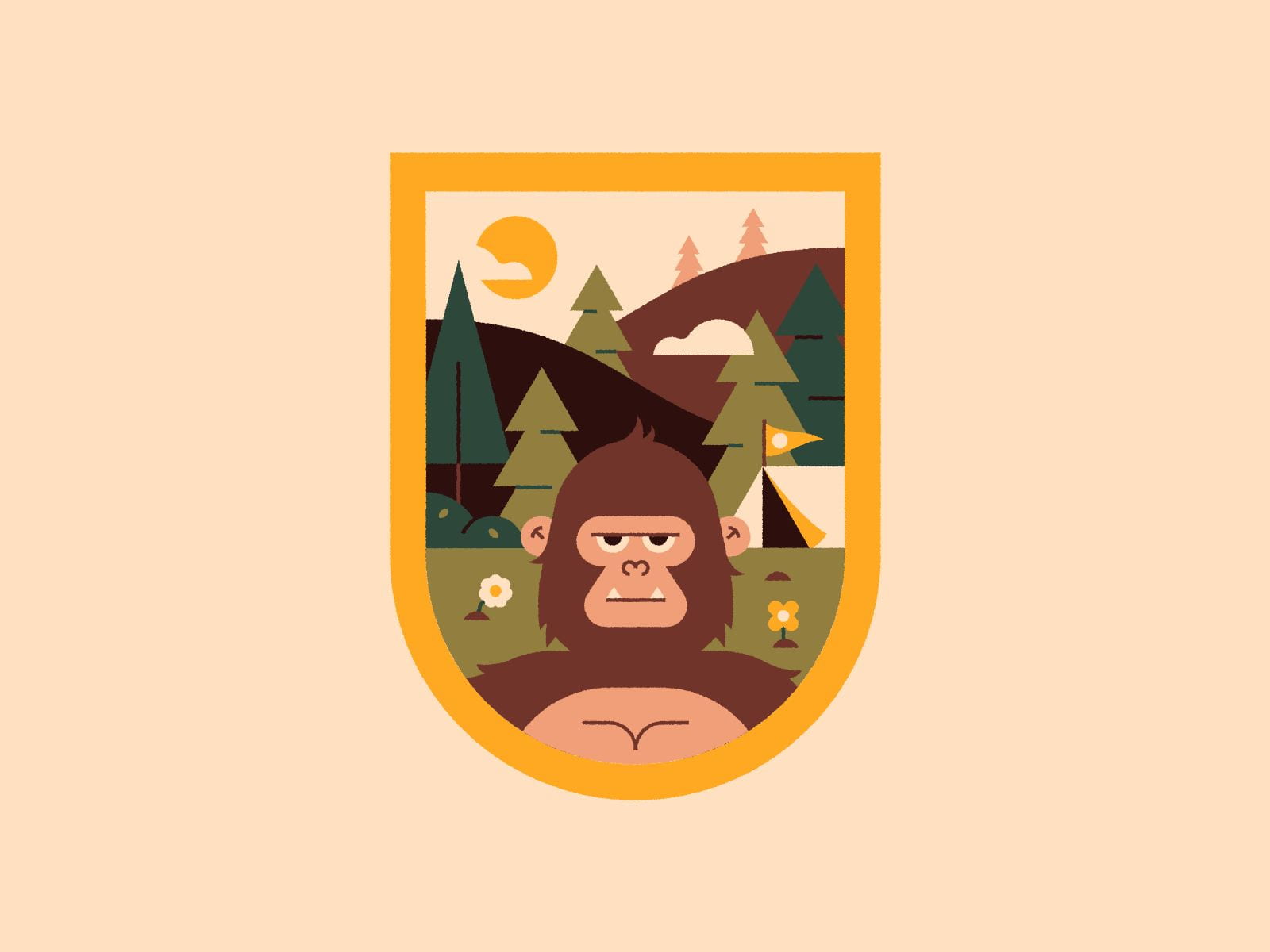
Finally, I have included a sasquatch patch created by Jenkins for a mythical creature patch design Livestream. I love the colour scheme used in this outcome and the shapes used to create the trees and cloud resulting in a balanced and interesting outcome. I also like the one lined eyebrow on the monkey/gorilla and the use of symmetry in creating the monkey/gorilla. Overall all I think this outcome has a really strong composition.
I would like to be able to draw from Jenkins minimalist graphic style in order to create a visual marquee that will be in keeping with my brand.
Jenefer Hom
I really like Jenefer Hom’s illustrations for Airbnb and feel that they are particularly unique in style. I, therefore, wanted to look at Hom’s work in a little more detail in my research for my visual marquee.

I really like the composition of the above outcome and feel that it fits perfectly with the Airbnbs hosting and accommodation services. I also think it’s really interesting how Hom has placed each of the characters looking in different directions and has therefore created separate face profiles for each.
 I love the combination of stroke and fill in the above outcome and the delicacy used on elements such as the glasses and hands.

I felt this outcome was particularly playful and love the concept of people featuring in speech bubble rather than outside of them. I also like the use of lowered opacity and how the colours don’t always stick within the lines as I feel it give the outcome a more hand-rendered feel.
Overall I love Homs work with a lot of her illustrations beyond the Airbnb outcomes shown above taking on the feel of hand made works of art. However, in the context of my visual marquee, I felt the graphic style used by Hom in the above examples would be most fitting and would love to be able to produce something as unique and interesting as the above.
Sketches

I began by experimenting with shapes found in my monogram and looking at how I could combine the design and science theme. I then decided to try to make a little avatar of a female scientist. I felt this was the strongest idea and therefore experimented with various styles to create her in.

I drew up what I felt was the strongest version resulting in the above outcome.
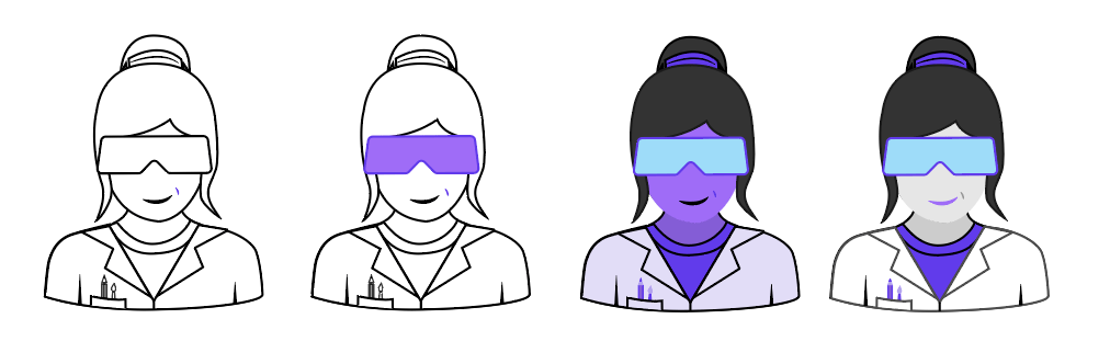
I then tried playing about with colour to highlight the science goggles and tried to emulate Wroblewski’s use of green in his astronaut using purple. I enjoyed creating these variations however I didn’t feel they completely fit with the direction I wanted to bring my brand.

I then returned to one of my original outcomes and experimented with scale. I always find this to be helpful as I feel it is important to review how outcomes will look in smaller and larger settings. This also gave me an opportunity to review what detail could be removed from the outcome.

I also experimented with adding my wordmark to the outcome to see how the entire outcome would appear as a logo.

Finally, I reviewed the pencil version with the logo and to scale. Overall I am quite pleased with the outcome however I do not feel it is as strong as my monogram. The outcome is slightly too playful for me and while it could be a fun avatar for social media it does not in my opinion fit as a logo mark as there is simply too much detail in it.
Creating an Icon Set
![]()
Following the creation of my scientist, I felt I didn’t want to lose the outcome altogether from my brand and therefore decided to generate an icon set based on the line version shown above. I, therefore, researched different science lab and design icons as seen on the Pinterest board above and artist research below. I also used the process set out in The Icon Handbook by John Hick’s as reviewed in a previous post (to view post click here) to help me create my final set.
Martin David
While I had a pretty clear idea of the style I wanted to present my icons in following the development of my visual marquee I still felt it would be helpful to conduct a little more research specifically on iconography and decided to look at iconographer Martin David.
![]()
Above is one of David’s slightly earlier icon sets however I loved the look and feel of the above outcomes and felt that the approach taken would work really well with my lab theme. I like how David brings in very small colour details and little shadows around the icons resulting in a nice playful and unique set.
![]()
Above are a more recent icon set created by David for Pitch, a collaborative presentation software company. David’s describes the focus not only being on visuals and aesthetics but also scalability. While scalability is not something I am particularly concerned with right now as my icon set is to be used as a visual guide through my projects rather than system icons, however, this may be something to consider as my brand develops. Overall I think the above icon set is really effective, well balanced and can see the considerations around scale have paid off as each icon is clearly displayed in a simple and effective.
Budi Tanrim
Budi Tanrim describes himself as a human-centred practitioner that has led large design teams and has worked with Shopify, Yahoo, Marvelapp and various others. His work is distinctive and fresh and I love his approach to design.
![]()
Above is Tanrim’s weather icon set for Yahoo. I love the scaling in the curves of the clouds as well as the shading used throughout the set. The approach results in a really nice simple and playful feel to the set that communicates weather conditions really clearly. This is a point I want to consider in my own icon set and make sure that I am adequately communicating what the icon relates to in each outcome.
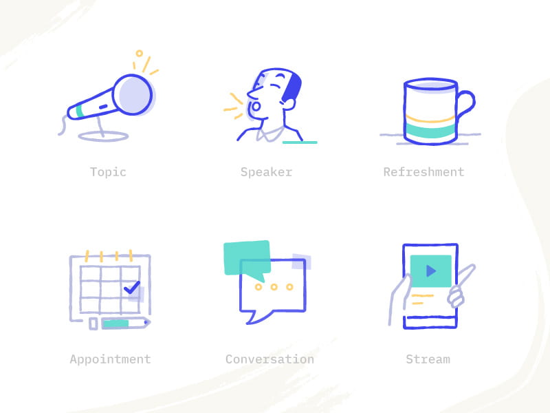
Above are slightly more detailed illustrative outcomes complete by Tanrim. I wanted to see how Tanrim presented slightly more complex ideas visually I this may be a problem I run into in my own icon set. While the above outcome does have a more illustrative feel I also think then general shapes and structures could be easily simplified to create a more graphic icon style. However, it is interesting to see how Tanrim pulls additional items into the above illustrations such as the pen for appointments and the hand holding the phone for stream. I feel these add personality to the set which be something for me to consider in my own icon set.
Sketches
![]()
I then picked a number of items that I felt it would be helpful to have an icon for (primarily relating to the design process). There were Designer, Colour Palette, Notes, Vector, Planning, Concept Ideation, Coding, Measuring, Research, Experimentation, Mock-ups, Design Psychology and Tools. Later to even up the number and cover what I wanted to include in the project section of my portfolio site I also added, calculations, testing and results.
![]()
I began digitising my icons on illustrator experimenting with using fill at the beginning and then deciding on only creating no fill outcomes. I then experimented with slight design changes and scaling.

When I had selected my final outcomes I added each icon to an individual are artboard (128px x 128px- as used in Mac IOS) as added a guide at 80% less than the artboard to each to ensure the held deal with irregular shapes and ensure all outcomes were balances as suggested by Hick’s. I used 1pt lines throughout all 0.5pt lines for smaller details.
![]()
This resulted in the above outcomes. I am really pleased with the level of balance I have been able to achieve and am happy with the blend of a design and science lab feel I have been able to generate. I am particularly excited about how I will incorporate the above outcomes in my portfolio website.
What have I learnt?
- It is important to consider the wider style of a branding project when creating any design outcome and not get to focus on the design of single items.
- It can be very helpful to experiment with different styles of a similar outcome at the sketching stage.
- Creating icons as a set and then moving to individual artboards once the set is complete is a great way to produce continuity in style
How can I apply this to my work in future?
- When working on visual marques particularly pictorial marks that may be included within a logo it is really important to ensure that the requirements of the visual language are met and I will consider these more thoroughly from the research stage.
- It is helpful to explore use of colour, fill and scale in visual marks and this is something I will continue to experiment with in future.
- When creating icons in future I will use the above process of creating the icons as a set on one large artboard and experimenting with different styles and once I have selected my favourites then move to individual artboards to scale using a guide as presented above.