What I took away from our lecture on illustrating interfaces is just how important effective illustrations and visuals can be as it makes information more easily digestible and appealing to view. There are also different approaches and styles of interfaces design that may help users to engage with the UI. Minimalism is a great way to focus the user’s attention and make the information readily accessible as seen in the outcome below.
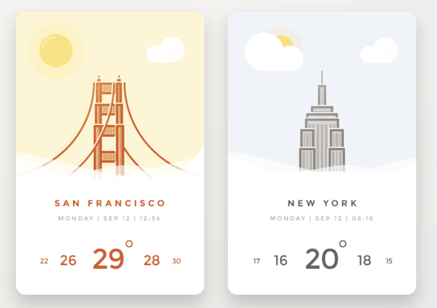
What I find particularly interesting about the above outcome is how the information is communicated through both text and illustrations for the location and weather status. While the outcome is quite visually appealing a concern would be how the scroll menu works at the bottom of the screen or if it is a scroll menu or not. If it’s not then this particular weather app appears to provide very limited information about the weather beyond what it is at the current time and when people are searching for weather updates it’s generally to find out what the weather will be like ahead of time which begs the question of whether the above app contains useful information. A further question that comes to mind is will the illustration change with sky conditions or is it linked to the temperatures displayed below (two weather attributes that don’t always correspond). If the illustration does change in accordance with actual sky condition I would then question if it is too abstract to present sky conditions in an illustration alone rather than in a list or chart. If the bottom menu is a scroll menu and allows you to view the temperature every hour for example I would then question if the day, date and time list is visible enough and clearly demonstrated as being directly linked to the below menu as I imagine this would update as the user scrolls through the temperatures. After having reviewed this outcome it appears to me that while creating a minimal user interface is a desirable outcome it may not always be practical.
Other illustrative styles and components can also be included in UI to create a completely different feel e.g. diagrams and charts can be used to present detailed information creating a more informative view. Hyper-realistic illustrations and photographs can be used to also produce a detailed and realistic view of the subject while icons similar to the above can be used to produce minimalist views.
It is interesting to note that the jump from hyper-realistic to iconic was a design change made by Ian Spalter when redesigning the Instagram app icon with initial feedback not being overly appreciative of the new design direction, I have covered this in more detail in the following post, Pocket Profiles: Abstract, Paula Scher and Ian Spalter.
Hand-drawn illustrations can also be effective in UI in producing a more unique and in my opinion generally more informal style outcome.
Another important consideration that should be made when design an app is how to include the onboarding process that explains to users how to navigate and use the app. While I’m more of a skip and ‘hopefully I’ll figure out’ type user when it comes to onboarding screens it is important for me to remember that other users will likely not operate in this way and by giving the option of a short user guide on first downloading and opening an app as well as a skip option I will be catering to all audiences. This is not something I have considered in my own app yet and something I need to look at in the course of the development of my travel app UIs.
A feature that I have considered in my own app is the inclusion of rewards. I hope to incorporate this into my own app by including badges as users view more planet profiles and spend longer on the app.
Material Design
When looking at different approaches to illustrating interfaces we were directed to Material Design to look at some of the principles and formatting presented in this resource. I love material design as a resource and have written a broad overview on what can be found on material design in a previous blog, see link below:
https://blogs.ulster.ac.uk/racheldonaldson/2020/10/25/week-5-formatting/
I also looked at creating a card element in a bit more detail. To continue on from this I am going to look at layout and navigation in more detail and attempt to include the guidelines presented in my travel app UI.
The first point highlighted in the understanding layout section is the emphasis placed on consistency across platforms, environments and screen size. This achieved through the use of uniform elements and spacing.
Three further principles highlighted in relation to layouts are:
Predictable: Use intuitive and predictable layouts with consistent UI regions and spatial organization.
Consistent: Layouts should be consistent in the use of grids, keylines, and padding.
Responsive: Layouts are adaptive and they react to input from a user, a device, and screen elements.
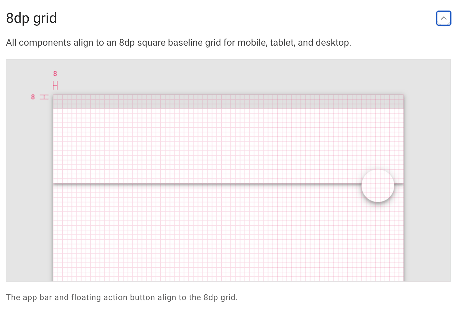
Consistency in spacing can be achieved by aligning measurements to a grid. Material design aligns most measurements to an 8dp (density-independent pixel) grid however for smaller items like icons and type sometimes a 4dp grid is used e.g. pixel measurements move up in 8’s or 4s. See grid example below.
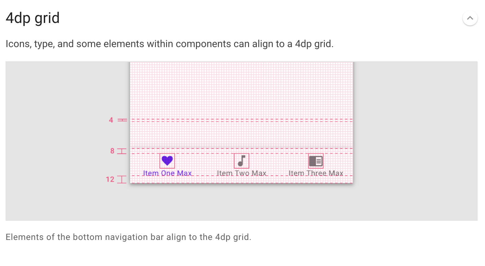
4dp grids are also used to align type however the type can be placed outside of the grid when it is centred in a component e.g. button, list etc.
Padding must also be taken into consideration. Padding is presented as an alternative to keylines. Keylines are an alignment tool and display as vertical lines that show where elements are placed when they don’t align to a grid. I have never used keylines in my own work however I have used padding so this is an area I feel more confident with. As with most material design elements, padding is measured in increments of 8dp and 4dp. In the examples provided the padding measurements included 24dp, 56dp and 88dp. This is something I definitely want to consider in my own work and will try to apply to my travel app when looking at placement and spacing.
Dimensions are used to measure width and heights with some elements only having heights such as app bars, which don’t have a width to accommodate designs that are responsive to a viewport width. By keeping element dimensions where possible the same across multiple screens and devises greater consistency can also be achieved.
Alignment can also be used to format interfaces and relates to the placement of items within a component e.g. centre aligned, left-aligned, right-aligned.
Keylines as previously mentioned are another way to guide UI structure and can be used to align items vertically using the distance between the edge of the screen and are measure in 8dp increments.

This is great for responsive design as they are adjustable per breakpoint range e.g. every 8dp.
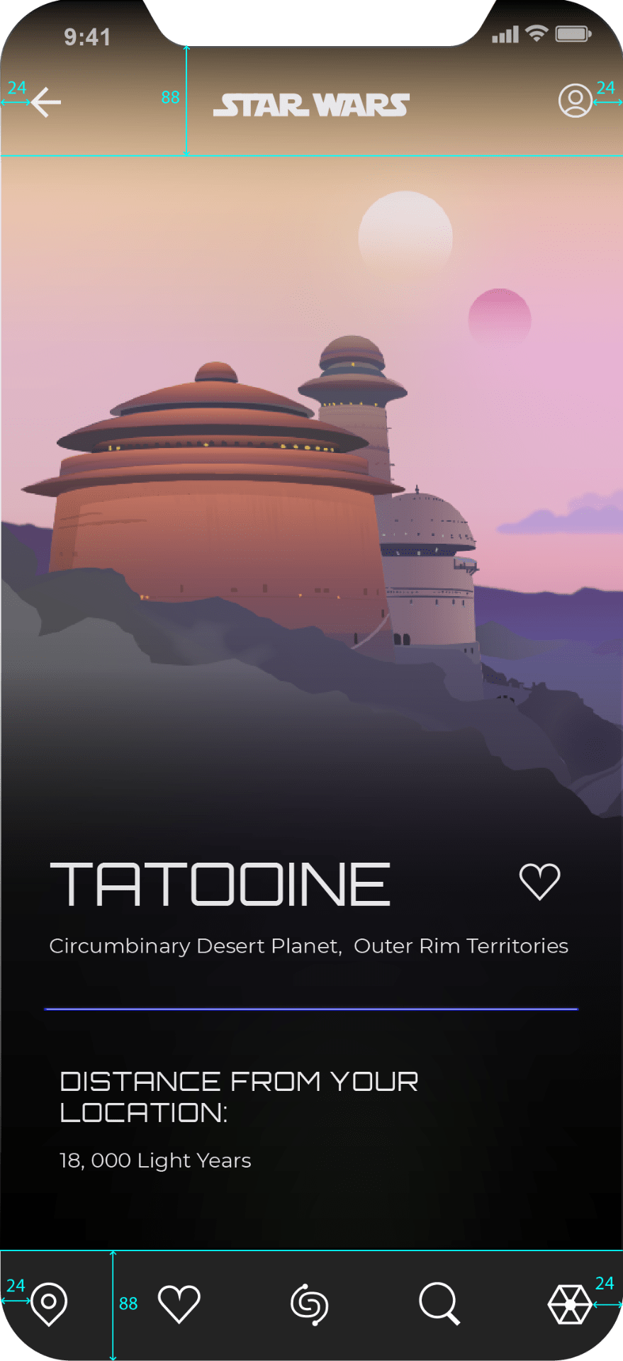
I have used the above guide to structure the top and bottom nav’s on my app making each nav height 88px and placing icons 24px from the screen edge and evenly distributing the icon’s in between on the bottom nav and centre aligning the star was logo at the top.
Navigation
In the understanding navigation section lateral, forward and reverse navigation are all covered in some detail. Lateral navigation is achieved by the inclusion of a navigation drawer (side nave that generally slides out from the left), a bottom navigation bar or tabs. Navigation drawers and bottom bars, both house top-level destinations, its interesting to note that material design limits bottom navigations to housing between 3-5 top-level destination on mobile.
Forward navigation refers to moving between screens consecutively through the hierarchy while reversing navigation refers to moving backwards through screens chronologically or hierarchically. I have presented the navigation of my travel app taking into consideration these 3 forms of navigation- see below.
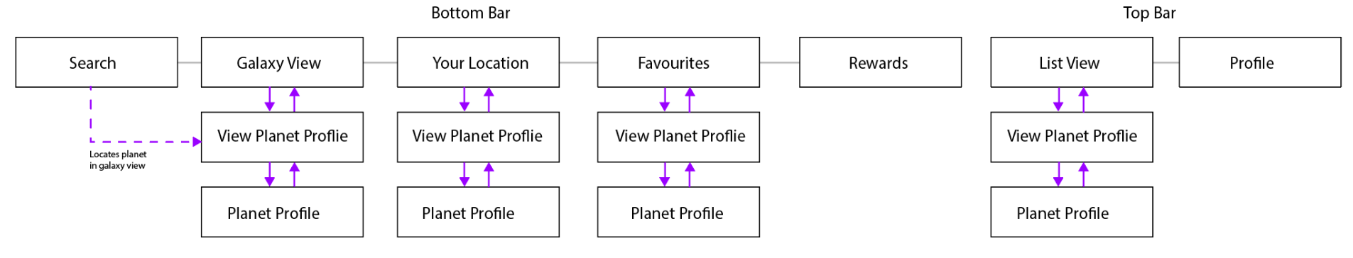
As can be seen above the top-level destinations can all be found in a bottom navigation bar. Two further destinations can also be found through a menu at the top nav of the screen however this is not accessible from all screen views and therefore may not be considered top-level destinations. Forward and backward navigation is demonstrated above also demonstrating how the app can be navigated chronologically from each top-level destination.
While each screen brings the user through the same navigation process it is important to note that this app provides information about various planets and that addition top-level destination allows the information to be viewed in different formats e.g. galaxy view provides an interactive 3D illustrated view, favourites provide a shortlist of favourite planets making them easily remembered and found etc.
Tips for Sketching user interfaces
I thought it might also be useful to recap on some of the points outlined on sketching user interfaces as I have already tackled this but feel that the outcome is not visible enough as I have used a pencil on red dotted graph paper.
In contrast, I plan to redo these initial sketches taking into account the following considerations:
Using a thick pen, drawing sketched on more muted graph paper, including colour considerations (currently most of my notes relate to navigational concerns). I will also attempt to do this in a timely manner and without getting into too much detail as it’s a sketch not a work of art.
What have I learnt?
- While a minimalist design outcome might be preferable it may not always be the most sensible design approach if cutting out important information or impacting on the accessibility of the information being presented.
- Illustration style can really impact the overall feel of an app/UI so it is important to consider this when making style choices.
- Consistency is really important and should always be considered in relation to element placement and size in UI.
- Navigation is also very important and will impact the usability of an app and therefore finding ways to make the app easier to navigate such as a search bar allowing the user to get straight to the information they want can be really helpful.
- Always use the right equipment for producing sketches and produce them within a reasonable amount of time in a clear outcome with colour considerations.
How can I apply this to my work in future?
- When designing a UI in future I believe that it is really important to first consider what the UI is supposed to do e.g. what content and navigation options will be included, who is the target audience etc. and from there begin to make style choices.
- Always consider how style choices will impact the overall theme and feel of a UI before implementing any design choices.
- Good design requires consistency through screens and in multiple views. Therefore I should make measurement decision before producing any digital outcomes so that each element is consistent throughout the design process- this will eliminate time waited in returning to correct and resize items.
- Navigational option should always be considered by taking into account lateral, forward and backward navigation during the sketching process and implemented when prototyping future projects.
- Practising quick sketching using the right materials will be a great way to save time and get my thoughts on paper in a more coherent way.