Initial Sketches

Above are my sketches for the wordplay exercise that required me to present a word including a visual representation of what the word means. Following sketches, we digitised the words using Helvetica. This was a really fun and creative exercise that I imagine I will play about with again in future even just as a little exercise to clear my head from another project. The above outcomes are a variety of ideas I came up with, from these I selected my favourite 6.
Final Outcomes
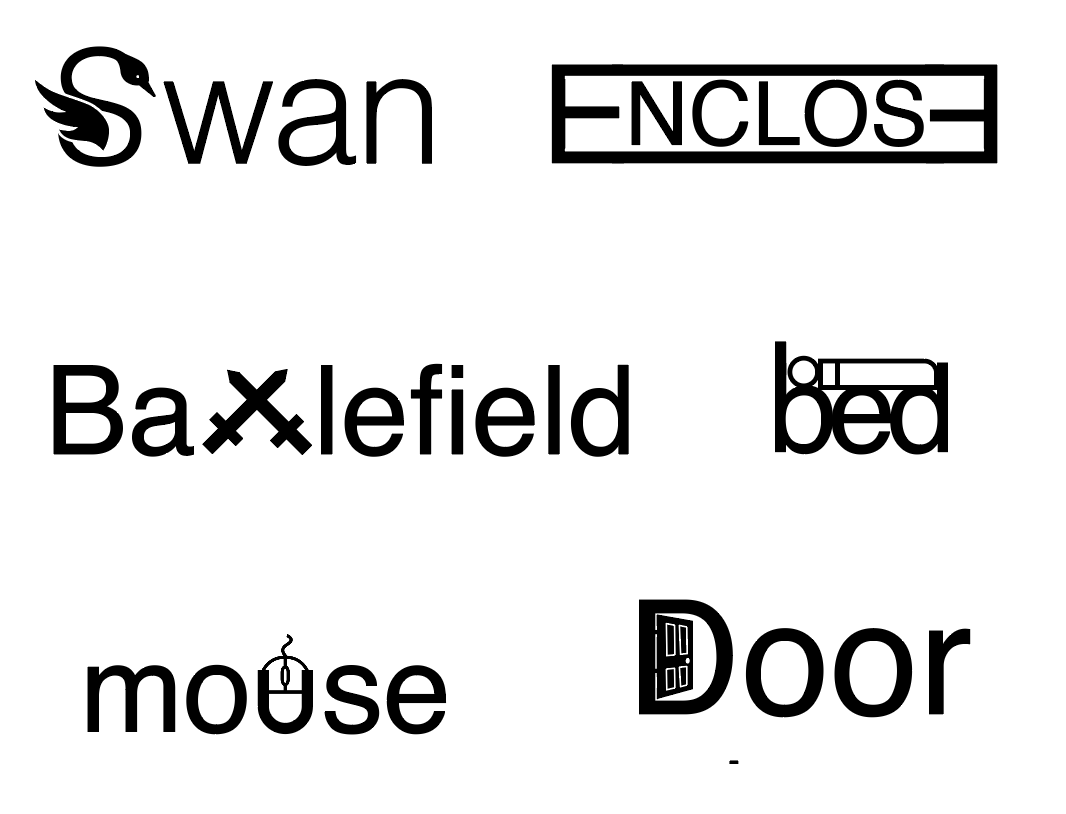
In the first outcome, I have presented a swan in the ‘S’ of the word swan. Similarly, I placed a computer mouse inside the ‘u’ of mouse. I am pleased with these outcomes and how the letterforms fit the shapes of the swan and mouse however I feel that the rest are slightly more subtle which in my opinion makes them more effective. Enclose is created with two capital ‘E’s facing each other and joining together to enclose the word. Battlefield presents the ‘t’s as swords, bed becomes a bed with a person and a blanket on top and the stem of the b heightened to represent the headboard and the ‘d’ lowered to create the footboard. Finally, Door has an open door within the D adding a nice element of perspective. While the above outcomes are not polished I am still pleased with what I was able to create particularly the outcomes for enclose, bed and door.
What have I learnt?
- Small adjustments to lettering can have a massive impact
- Simple outcomes can often be the most effective
- There are an endless number of ways you can use and adjust type to create multiple outcomes
How can I apply this to my work in future?
- This is a great exercise I can turn to if struggling to find a creative solution to a problem to help me think in a more visually creative way.
- There are so many ways to communicate through type and it doesn’t always have to be simply a means of making something readable. Type communicates a message visually before even being read which will be picked up by the viewer which is something I should always consider when selecting a typeface e.g. what is the visual language of the type.