Mood Board 1

In the above mood board, I have explored type in primary and secondary research forms from looking a type on lamps stands, frying pans, gas cylinders and welly boots to iconic branding created by Saul Bass as presented in the book Saul Bass. A life in film and design. I find the United Ways and Warner Communications as shown above to be particularly memorable and can draw comparisons for the Warner Communications monogram and the Monday monogram also shown above. I think this is particularly interesting as it shows that you can pull elements from existing brands and present them in an entirely different way producing an individual outcome. I have also included some playful outcomes from Pinterest such as the think and space outcomes that play with negative space. I really love these outcomes as they cause the viewer to pause for a moment in order to fully take in what is being presented. I would love to be able to include an element like this in my own outcome.
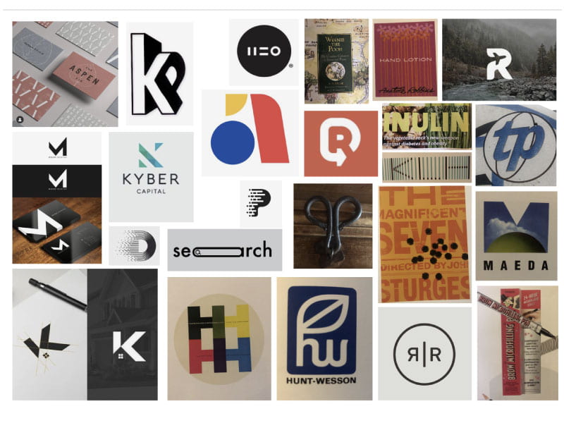
Mood Board 2
 Above are further illustrations and branding by Bass and some real-life examples of letterforms and type I noticed in my surroundings such as the upside-down ‘m’ shaped handle presented in the centre of the board which has been taken from my coffee table. This was an interesting exercise trying to find type shapes in objects around my home as it really causes you to consider the shape form found in lettering and capture it out of content. Above are also a number of outcomes I found on Pinterest with interesting combinations, 3D elements, use of negative space and even combining pictorial elements as seen in the search outcome and the R with the aeroplane placed in the centre.
Pinterest Board
https://www.pinterest.co.uk/rachelmd46/monogram/
Above I have also included a Pinterest board with further inspiring outcomes that I hope will help me to develop an interesting and unique design outcome.
What have I learnt?
- I can draw inspiration from anywhere including my surrounding environment, masters of typography and icon design and even wordplay examples.
- It is helpful to look at the shapes that make letters up and consider how these can be adjusted to create interesting outcomes.
- It’s important to consider the space around the letter, negative space is as much a part of the design as the form itself.
- Also, consider texture and form such as 3D outcomes and can elements be drawn from these aspects to produce an interesting and memorable outcome
How can I apply this to my work in future?
- When creating a monogram in future I think it is really helpful to start with a broad range of visual inspiration from everywhere, a change of environment in itself can be helpful to get new ideas going.
- The next step I will take when creating a monogram will be to draw inspiration from multiple sources and accumulate my findings on a mood board. This is really helpful for providing an overview of what jumps out, what works, what doesn’t and is a helpful step in the process of creating something original.