Travel App Ideas
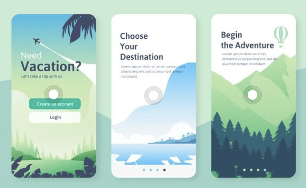
I began researching my travel app ideas on Pinterest with a primary focus on UI and illustration. The above outcome really jumped out of me due to its minimalistic style and cool colour palette. It appears to be carrying the user through an onboarding process which is an interesting starting point for me to consider- i.e. what do I want my Travel App to do, how can UI help me to make it as easy as possible to do and if I were to create an onboarding process could I do it 4 steps or less. I feel it is equally as important for the app to be useful as it is to be usable.

I then went on to look at other UIs for a range of travel and weather apps with a particular focus on how they organised the information and combined the text with imagery in a consistent and readable way. I like the layering of image and text and feel that this really enhances the overall design outcome however I do not want to lose too much readability by doing this e.g. the Little Rock section in the example above which layers 13° over a mountain landscape however as it partially sits on a tree and partially sits on the sky readability becomes a little too reduced in my opinion.
What I also thought was interesting was the illustration of light particularly as demonstrated in the above-left outcome. I think the inclusion of light in these illustration produces a very dramatic and effective outcome. I’d love to experiment with this in my own work.
Airbnb
I thought it would also be a good idea to look at a Itcouple of leading travel apps and decided to begin Airbnb. I love the design and user experience of the Airbnb app. I believe Airbnb do an excellent job of storytelling, selling an experience rather than accommodation.
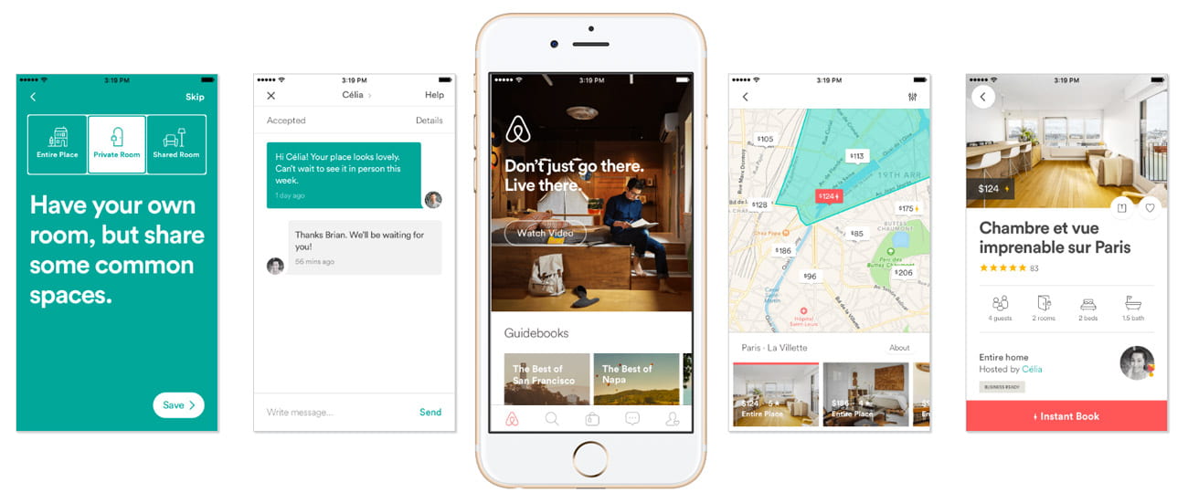
The UI is relatively minimal and incorporates lots of warm images and a fresh green, coral and white colour scheme. Typography is presented clearly and information is broken up with images and icons making the app feel easy to use and navigate and the information more digestible.

I also looked to see what illustration associate with the brand and found the above illustration on Airbnb’s website. I really like the above outcome, how it presents light, its pastel colour scheme and generally how appealing it makes an outdoor holiday appear. I also feel that the dusty effect used creates a nice hand-rendered feel to the outcome. Due to current lockdown conditions, it appears that Airbnb are preparing for restrictions to lift with outdoor activities being the first activities to be allowed. It is interesting to consider what the app is promoting and how this is being done e.g. while Airbnb primarily sells accommodation it’s focusing on encouraging people to focus on holiday activities rather than the accommodation alone.
![]()
I also took a little time to review some of the icons used by the app to see how much detail has been included and whether they use fill or not etc. I love the icon set shown above the images are easy to understand and playful they use bevelled and straight corners when required and are only made up of strokes. The choice of colour adds to the overall softness of the outcome. There is also a very high level of consistency that has been achieved with an obvious level of attention having been taken to achieve this visual balance.
Google Maps
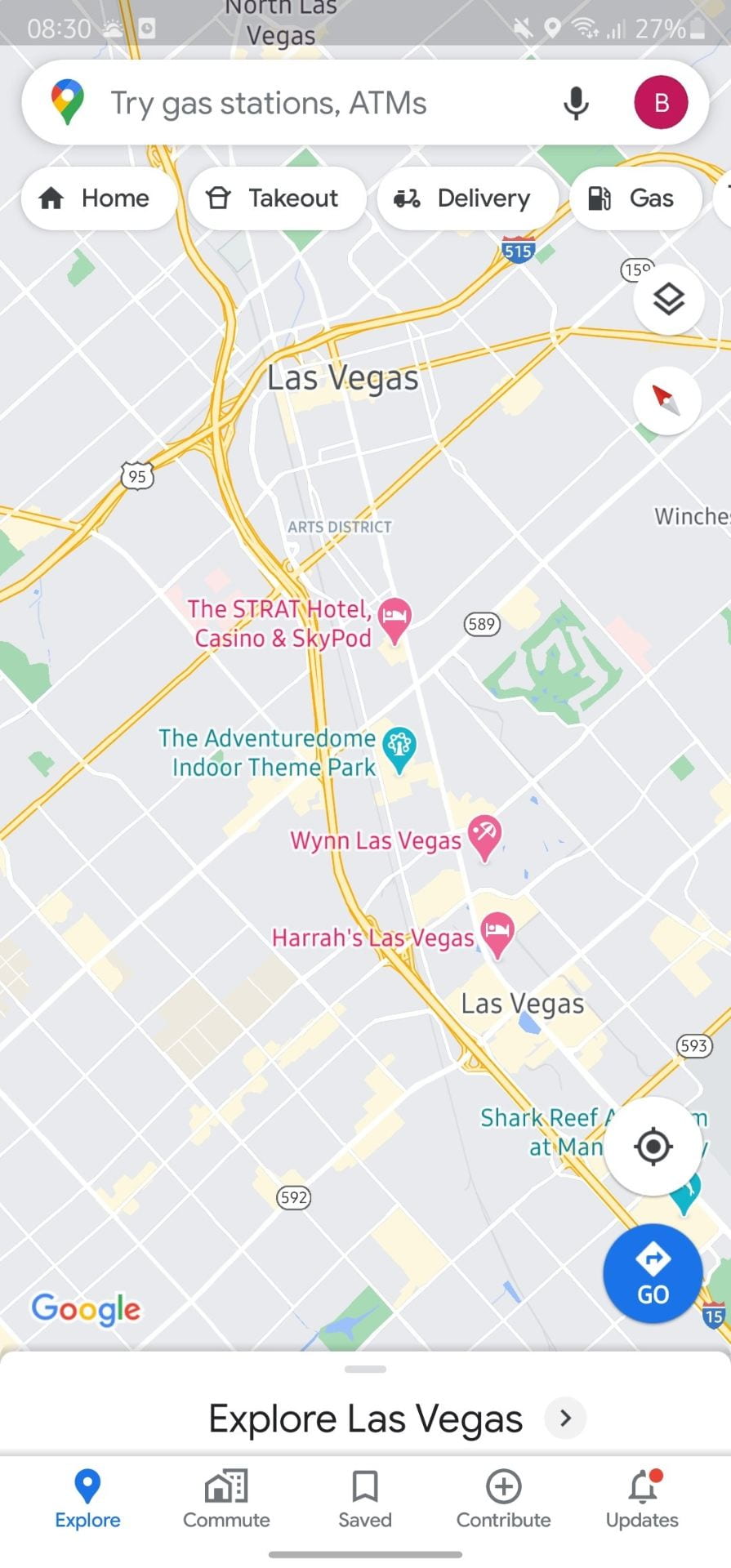
I also took a little time to review the Google Maps interface. In this instance, the UI is all about clarity. I completely agree with the approach as when people are trying to get direction to where they are going a nice visual is appreciated however a clear visual is required. Use of colour is very important as there is a lot of detail included on a map and it’s important to decide what needs to stand out and by how much when making colour decisions. Google Maps handles this really well in my opinion with urban areas coloured pale grey and rural areas coloured pale green road coloured pale yellow and selected roads coloured a vivid blue drawing the users attention to their selected journey.
When creating an illustration for my app I should also consider my design in relation to usability e.g. am I creating a map and what do I need to highlight or make interactive.
![]()
It was also interesting to review I google maps incorporate icons as part of their location pointers that feature on maps. In this instance, icons are made of white fills with colour surroundings to make them more identifiable. Its interesting to consider how the use of the icon as in this a=instacne can impact the design.
Master/Apprentice Exercises
![]()
![]()
I have practised drawing icons doing a master/apprentice exercise shown above in which I attempted to copy the above icons as accurately as possible. My outcomes are shown to the left and the original outcome is shown to the right. This is an exercise I have attempted before so I was able to complete it fairly accurately but I was still surprised by the attention and time required in order to ensure that everything was aligned correctly, all stroke sizes match and that shadows were placed correctly. While the icons appear very simple in their outcome there is still a lot of thought that has gone into them.
![]()
I am fairly pleased with these outcomes and feel that the green gradient gives the icon and individual style. However, on reflection, I think I could have perhaps been more careful with strokes on the screwdriver, flag and stethoscope to ensure there was continuity in stroke size where possible.
Mind Map
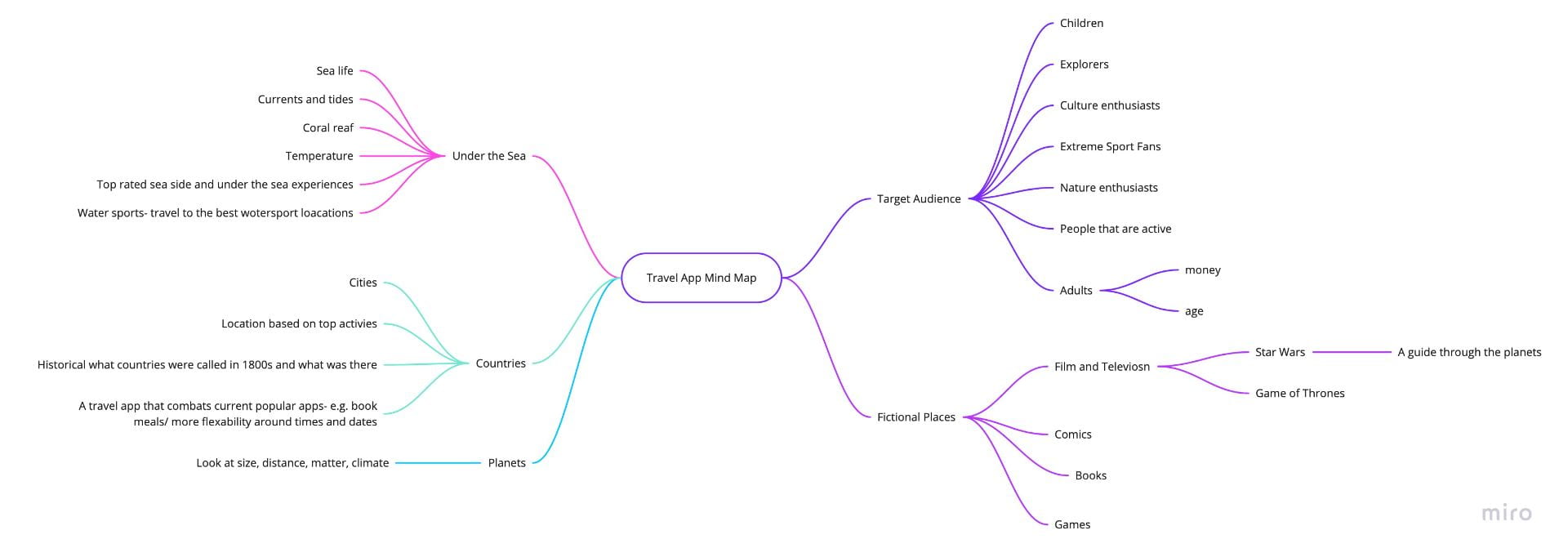
I then moved onto miro to make a mind map of the potential concepts I could create my travel app around considering the target audience, fiction and non-fiction apps and locations including countries, planets and under the sea. This was a really helpful process in getting me thinking about the numerous possibilities. What really grabbed my attention was the idea of planets however I wanted to push this further as we are limited in terms of our knowledge of planets and I’m not sure how this would benefit people beyond academically. This set me off in the direction of expanding on the idea of planets which brought me to the notion of fictional planets such as those found in Star Wars. As I am a fan of the franchise and there is a considerably large fan base with loads of potential content to draw from in relation to making a viable travel app e.g. an app for characters within the plot to help guide them through the galaxy. This has opened up an entirely new (fiction) target audience and this is something I intend to look at in more detail.
What have I learnt?
- It’s important to consider how text and images can appear together and instances when layering and works and when it doesn’t.
- It is also important to consider light, particularly if trying to create an atmospheric illustration.
- It’s important to consider the story you want the illustration to tell.
- It’s important to consider the purpose of the illustration and use this to make decisions around colour and focus points.
How can I apply this to my work in future?
- I can develop my illustration skills by practising master-apprentice exercises and applying the learning to my own work.
- It is helpful to do some preliminary research at the concept ideation stage. It is also helpful to use mind maps to help brainstorm ideas and this is something I intend to continue to do as I begin projects in future.
- When making icons it’s important to consider their scale and to use this to inform decisions around colour and fill. This is something I will do when designing icons in future.