Tables
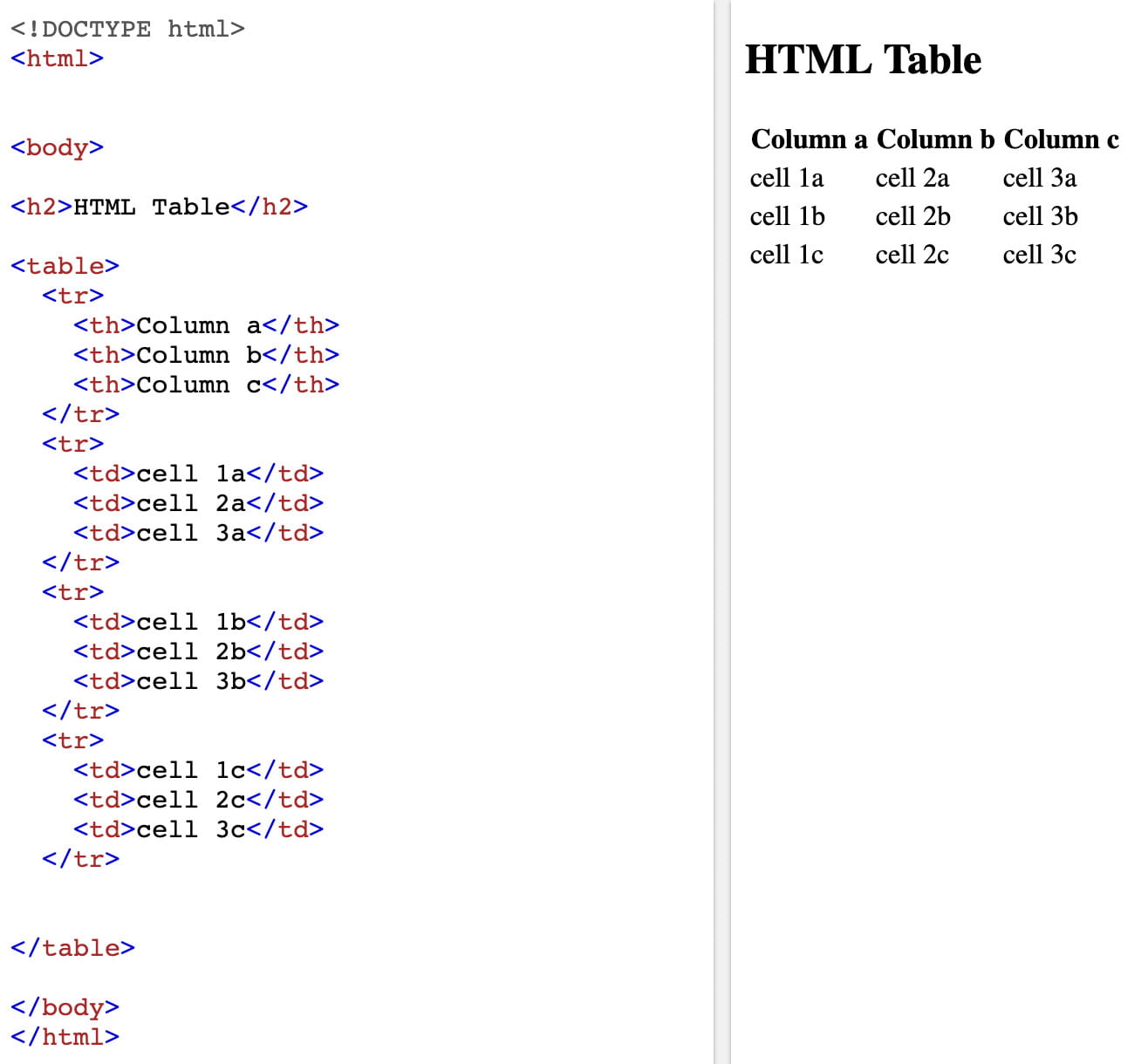
Jon Duckett in his book HTML & CSS Design and Build Webites describes tables as information in a grid format. In HTML tables are written row by row. A table can be created in HTML using the element <table> this followed by table row <tr> and then table heading <th> or table data <td> see example below.
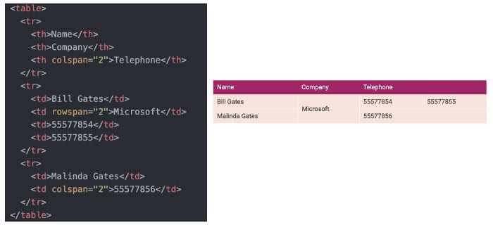
Headings can be added above columns and beside rows by adding scope=”row” or scope=”col” within the header <th> element. Column and row cells can also be spanned using colspan and rowspan, see example below.
When generating large tables elements such as <thead>, <tbody> and <tfoot> can be helpful for screen readers to read the table and allows allow style elements to be added to these sections.
Adding CSS
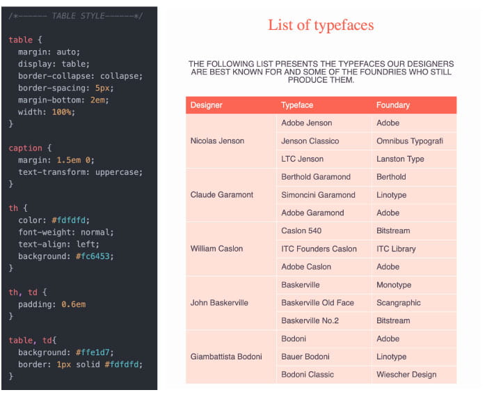
CSS can be used to style tables as seen in the outcome above styling has been added to generate the deep magenta background used on heading cells. Styling attributes can be added to elements such as the <table> can be used to apply styling to the whole table e.g. border-spacing, margin and width. While elements such as <th> and <td> can be used to apply styling attributes such as background colour and font-weight to specific area’s of the table see example below:
Images
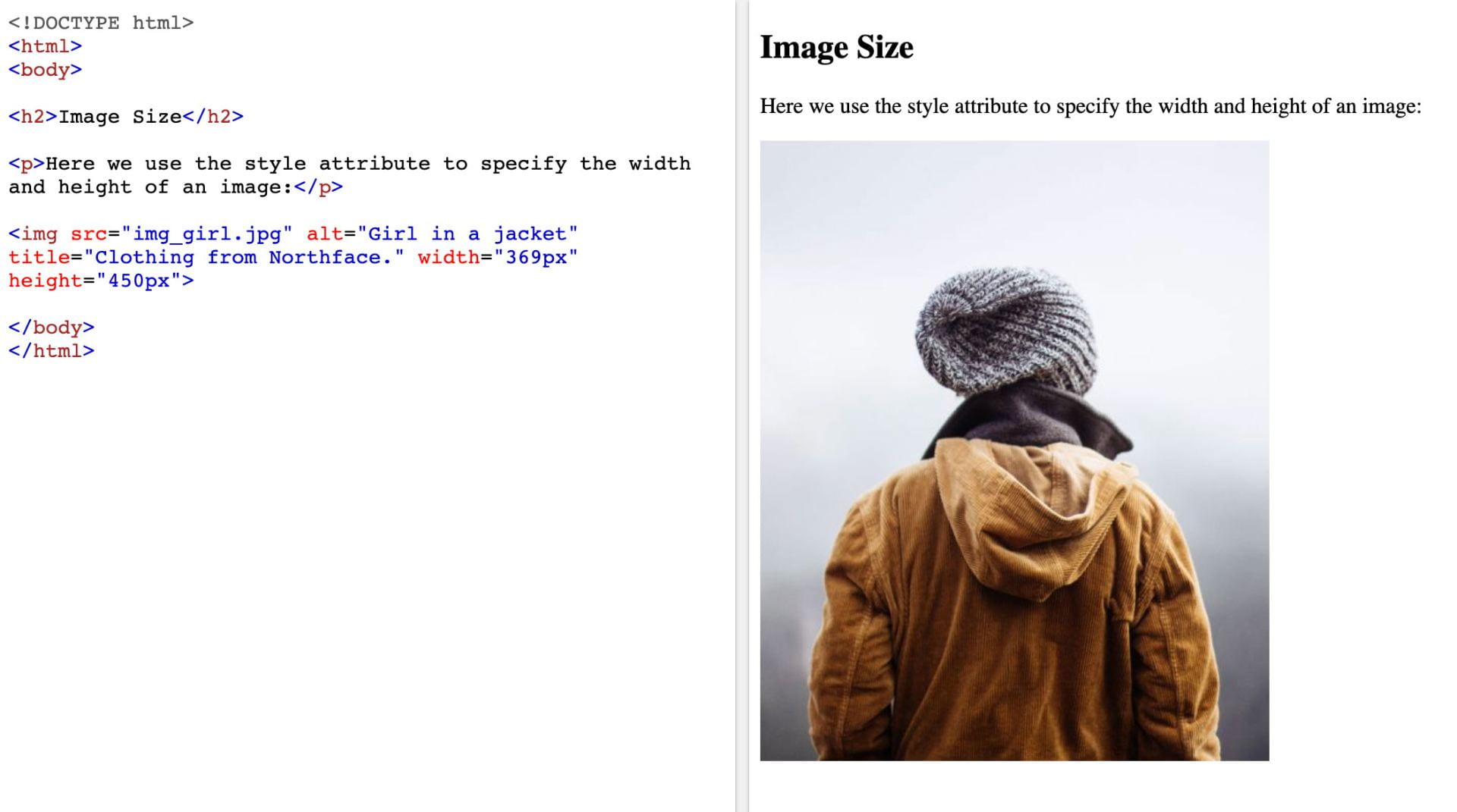
Images can be added to a page using the element <img> within that element src= is used to tell the browser where the image is e.g. if my image is saved in a folder labelled img the src would be src=”img/imagename.jpg”. alt is used within the <img> element to provide a text description and title is included to add additional information about the image with browsers displaying this information when the user hovers over it.
Height and width can also be added to the <img> element, see the example below, however, this is more commonly done using CSS.
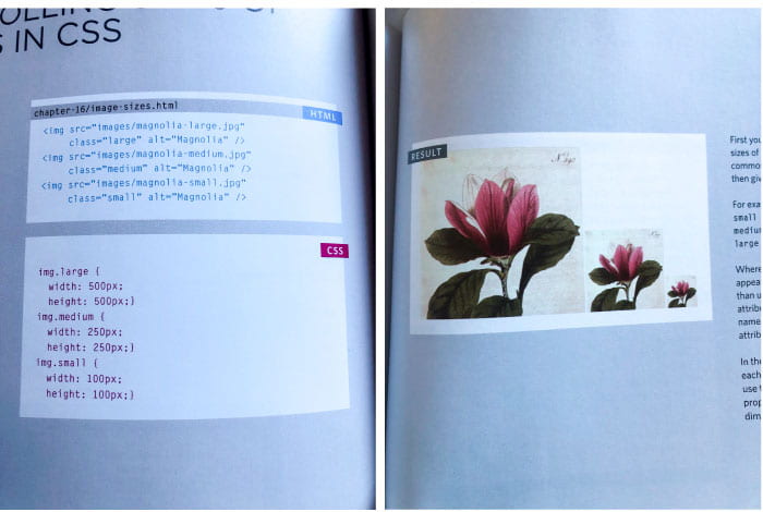
The image size can be adjusted using CSS by adding class identifiers to images and adding height and width attributes, see example form Duckett’s HTML & CSS Design and Build Webites below.
However, my preference is to determine the size I want the image to be before uploading to the webpage, using image editing software such as photoshop or illustrator to change the image size. This allows me to keep the second rule dictated by Duckett in his 3 rules for creating images:
“save images in the right format, save images at the right size, measure images in pixels ”
In terms of adhering to save images to the right format, I generally stick to the rule that all photographs should be saved as jpegs unless there are translucent elements in which case they should be saved as pngs and save flat coloured illustrations as pngs as the majority of browsers can now support pngs and logos should be saved as SVGs.
As a general rule, I also save images using the save for web option which allows me to reduce image file sizes without losing too much quality.
Images can also be aligned in CSS using float, display and margin.
Background Images
The property background-image can be used in HTML to place images behind any HTML element. I was able to add a background image to my portfolio website by adding <div class=”background-image”> to my HTML file and the below to my CSS file producing the following outcome:
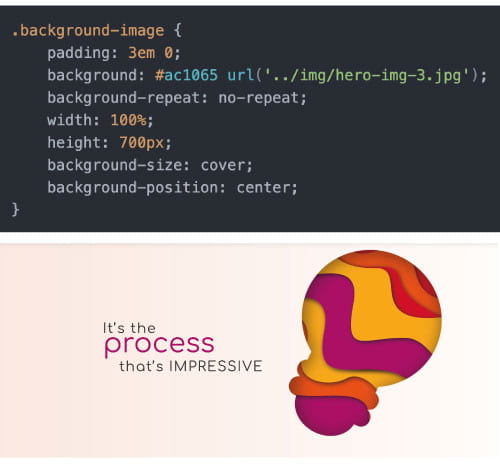
I found this to be a great way to add the image as it means that I could place my type above the image so that the type could adapt with the page to different screen sizes etc. I was also able to make the image the full width of the screen using width: 100% and height: 700px and position the image using background-position: center.
CSS Grid
Layouts for web pages can be created using CSS grids which allows for a lot more control over the content. This grid-based layout system structures the layout of a page into rows and columns making it easier to float and position content.
Grids are broken down into 2 primary elements parent and child elements e.g. HTML code:
Parent element: <div class=”grid-container”>
Child element: <div class=”grid-item”>1</div>
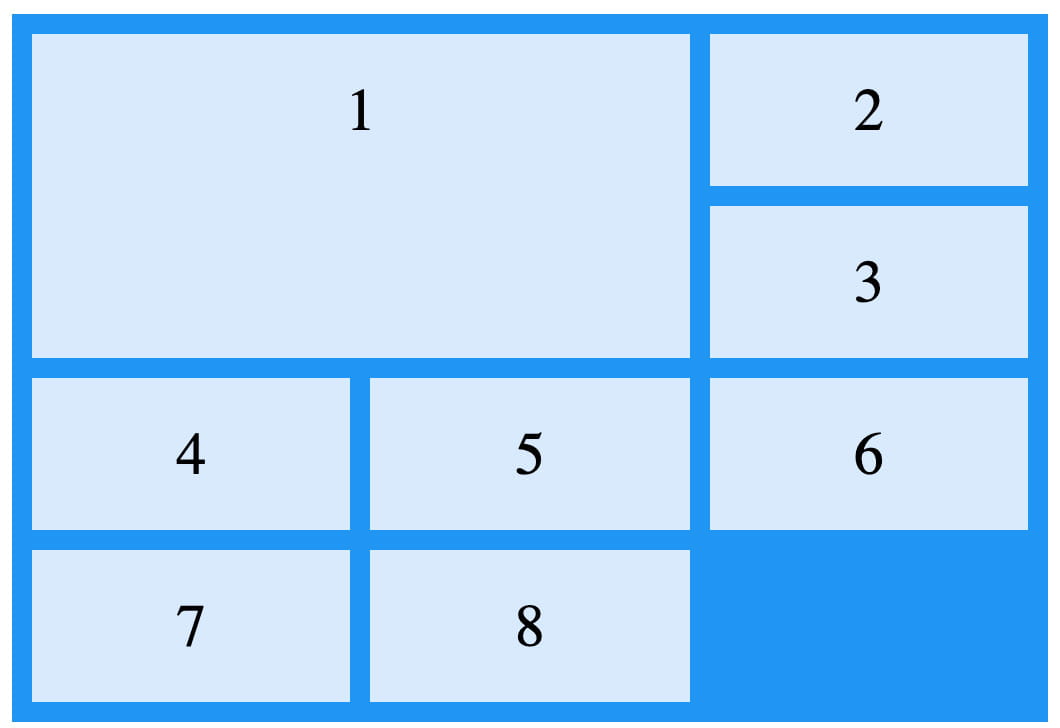
This means that the child element is held within the parent element, to refer back to Duckett’s box analogy the grid item box sits inside the grid container box. There can be multiple child elements held within a parent element see example taken from w3shools below:
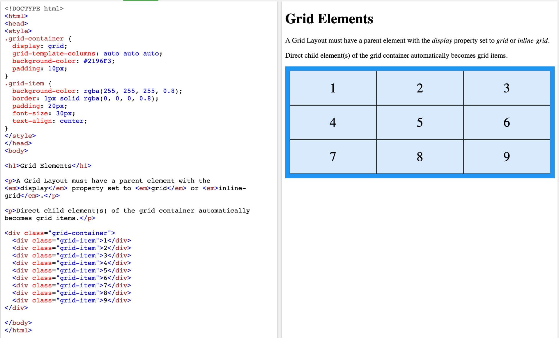
In order to make sure this displays properly the CSS display property must be added as grid or inline-grid to the parent element e.g. CSS code:
.grid-container {display: grid;} or .grid-container {display: inline-grid;}
The above example used display: grid and generates 3 columns by adding the style property:
grid-template-columns: auto auto auto;
to the CSS code along with properties background-color and padding. Further styling such as border, font-size and text-align are added to the child element grid-item (this will be applied to every element labelled with that class)
An in-line grid will adapt column and row size based on its contents.
Grid gap and grid lines
Further styling properties can be added to grids by adjusting the size of the gap between child elements see w3schools example below:
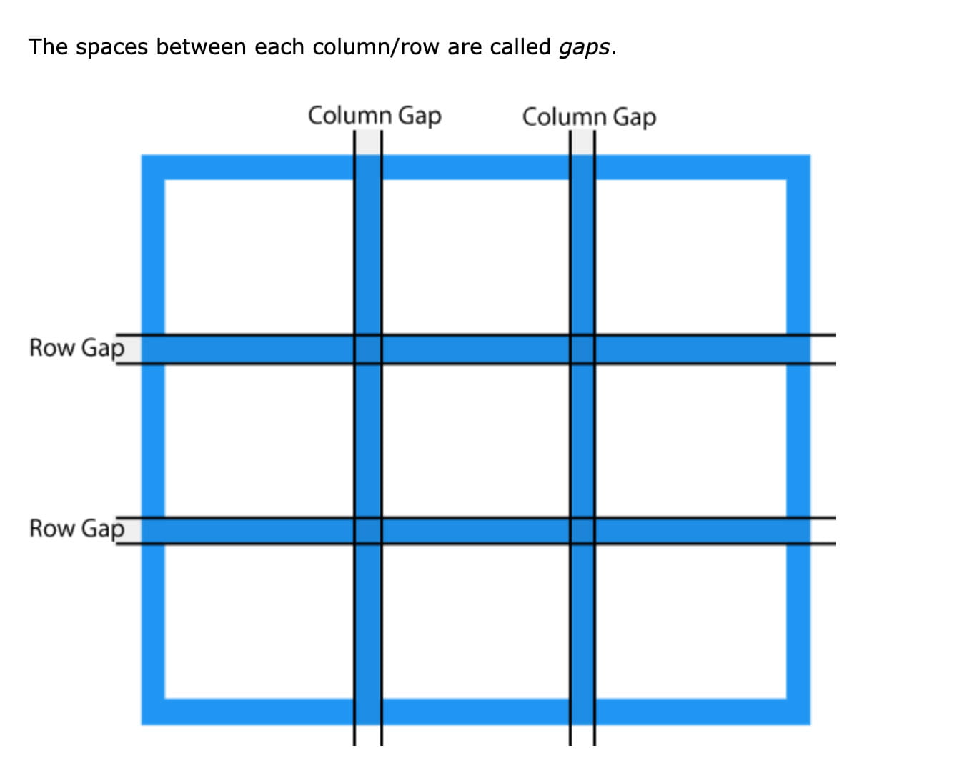
Gaps can be adjusted using grid-column-gap and grid-row-gap or grid-gap which is the shorthand option which allows you to set both column and row at the same time e.g.
.grid-container {
display: grid;
grid-gap: 150px 100px;
}
Column and row lines as shown below can be used to determine what portion of the grid an item will cover but must be counted as shown below.
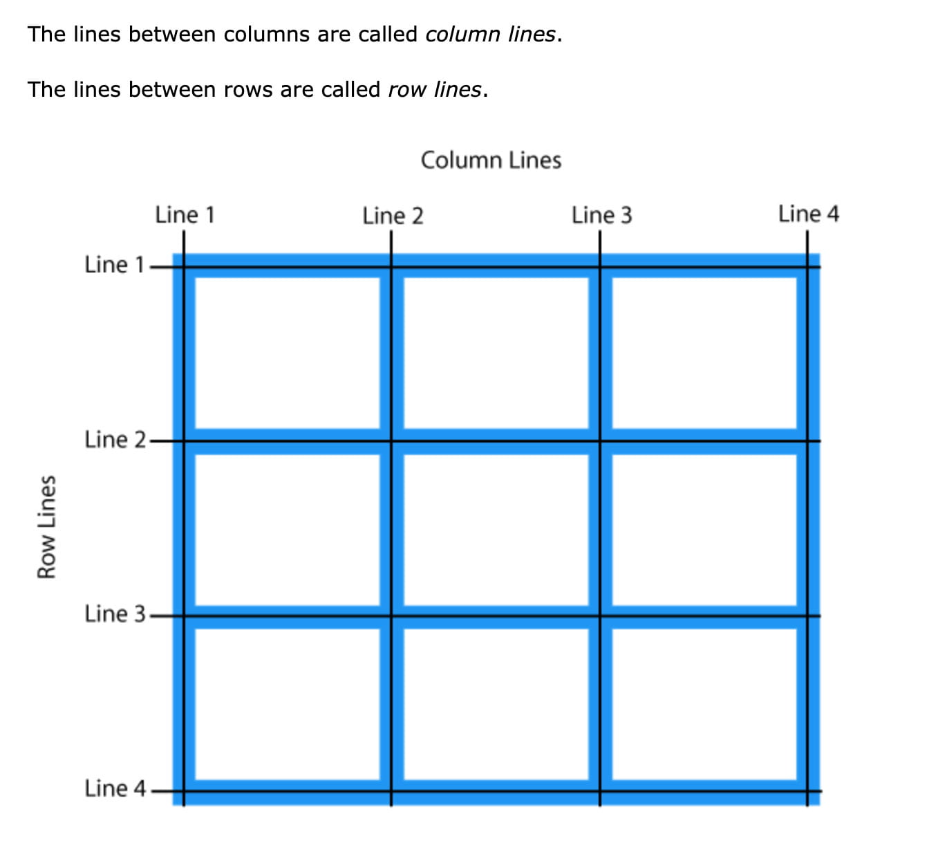
In css it is written like this
.item1 {
grid-column-start: 1;
grid-column-end: 3;
grid-row-start: 1;
grid-row-end: 3;
}
producing the following outcome:
Grid Container
By adding display: grid/ display: inline-grid to the grid-container element as previously discussed the element will now behave like a grid container which is made up of grid items placed within columns and rows.
This allows properties to be added such as grid-template-columns to be applied to specify how many columns will appear in the grid containers and what size when auto is applied all columns should have the same width. e.g. CSS code
.grid-container {
display: grid;
grid-template-columns: auto auto auto;
}
The above code will produce a grid with 3 columns if 5 autos are added then a 5 grid column will be produced and so on.
It is my understanding that the number of rows it then based on the amount grid items and the grid-template-rows property is used to set height. e.g. css code
.grid-container {
display: grid;
grid-template-rows: 100px 300px 200px;
}
This will produce a top row that is 100px in height and a second row that is 300px in height and a bottom row that is 200px in height.
The properties justify-content and align-content can also be used to structure how the items display within the grid.
CSS grid items
Grid items (child elements) are arranged 1 item per column and row however they can be spanned across multiple columns and rows as shown above and using grid-column, grid-row and grid-area properties.
Grid-columns and grid-rows are written from the column the item begins to the end before column as shown below: css code
.item1 { grid-column: 1 / 5;}
.item4{ grid-column: 1 / 5; grid-row: 2/4 }
.item15{ grid-column: 1 / 7;}

Similar to grid-gap, grid-area allows you to span columns at the same time e.g. item 4 as shown above would written as: css code
.item4{ grid-area: 1 / 5 / 2 / 4; }
What have I learnt?
- How to create tables using HTML and can adapt the tables to fit my contents by spanning column and rows.
- How to style tables and can build upon this using resources such as material design and attempting to recreate these outcomes myself.
- How to add images to HTML files and what format they should be added in.
- How to add background images
- How to style and format images using CSS
- A number of ways to use CSS grid and how to format grids in different ways.
How can I apply this to my work in future?
- I can now add tables to webpages and am aware of when tables should be used and when they should not be used (only for tabular data not for formating or design)
- I now have a good understanding of the importance of formatting and sizing images correctly before adding them to a webpage and will therefore have a better understanding of what is required from me when working with a developer.
- I can now produce more interesting design outcomes and have more control over how they are presented as well as the limitations involved when using CSS grids.