Essay writing process
For my Web Essay, I chose to write about Saul Bass and how he changed the face of movie title sequences. As I was already familiar with a number of designers and have looked briefly at the work of Saul Bass before I automatically knew this was the topic I wanted to focus on. I love design in film and am still in awe of the Stranger Thing’s opening title sequence so I couldn’t have found a better designer to look at than the man that kicked it all off.
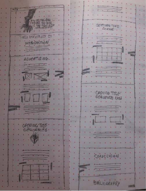
I began by watching several of Bass’ title sequences and conducting some general research into Saul Bass and quickly learnt that Bass has not only made his mark in title sequences but also corporate design and logo’s and has even made short films and produced keys scenes movies such as Psycho. With so much to look at I decided to begin by choosing my title/ question and breaking my essay up into sections. I chose to run with the example question provided; how did Saul Bass change the face of movie title sequences? This automatically narrowed my focus to movie title sequences so I decided not to look into Bass’ input into corporate branding, logo designs or even his role in producing films. From there I decided I wanted to look at the journey of title sequences in general, Bass’s journey as a designer and what launched him into his role as a movie title sequence designer meaning I had to cover his input into film advertising as well. The sections I decided upon where as follows: Introduction, Advertising, The Title Sequences, Setting the Scene, Title Sequences Now and Conclusion.
I conducted further research into the film industry and advertising in order to apply context to Bass’s role within the industry as a whole and the significance it had. I feel I was able to produce a well-rounded account of Bass’ role in changing the face of movie title sequences and set a clear picture of Bass’ approach as a designer and how his impact on advertising lead to his career in movie title sequences and how his work has subsequently impacted on title sequences today.
Designing the webpage
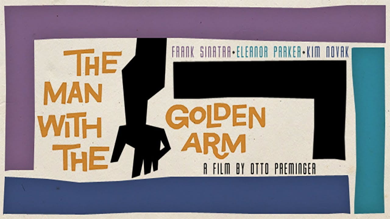
Before even having begun the essay I had a very clear picture of how I wanted the hero section to appear and the inclusion of Bass’s infamous The Man with a Golden Arm illustration is a definite must, while I have looked at other potential outcomes I am confident that this will be a very effective visual to include in the top section as it will automatically tell the viewer what the essay is about without having read a word.
Before beginning my research into the design of the webpage I wanted and to have finished my essay and have managed to do so bar the conclusion as well as having selected the images that will run alongside the text. I find this to be very helpful as I now have the necessary content to know which of Saul Bass’ works have been included in my essay and therefore which will be the most appropriate to draw design influences from to incorporate into the page design. I also know some of the design challenges I have ahead of me such as I have incorporated images of pre-Bass film advertising which present conflicting visuals against the work of Saul Bass.
Initially, I liked the idea of adding movement to my webpage but as I am a beginner in coding and have not had the opportunities to make gif’s or animation (outside of drag and drop programmes such as go animate) I was aware that there was a strong possibility that this wasn’t going to be achievable for me in this project. However, I still conducted some research into the area with the thought that I might be able to allude to movement if not actually include it.
I began with the notion of having an illustration of a man much like the one in Why Man Creates and have him placed in each section using his eyes as a focal point with the suggestion that his facial expressions are in response to the text. See sketches below.
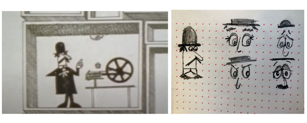
While I liked this idea I didn’t want the illustration to draw concentration away from the text I also wanted to avoid negative facial expressions and thought this may limit me in what I could produce.
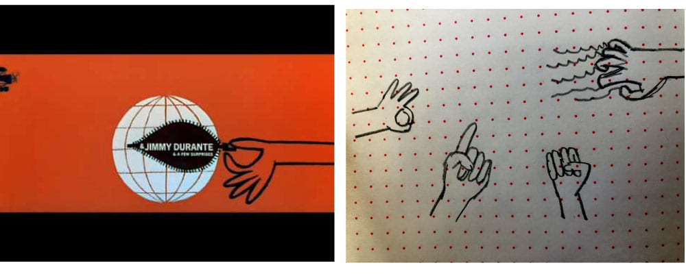
As hands feature regularly in many of Bass’ productions another idea I had was to include illustrations of hands guiding the reader down the page indicating justices and suggesting movements if not making them, I drew out series of sketches as seen below to help me visualise what the gestures could like.
Finally, I drew inspiration again from the opening title sequences of The Man with the Golden Arm and the inclusion of bars throughout similarly found in Bass’ Psycho title sequence. What I fond particularly appealing about this concept is that I can frame things that I use throughout the text in order to produce a more cohesive design outcome.

Wireframe 1
From the above ideas, I decided to run the bars concept and produced the above wireframe with a hero section featuring the arm from The Man with the Golden Arm drawing my inspiration more from the book cover of Saul Bass: A Life in Film and Design than the actual title sequence and including lines between each section signifying a change in colour.
Wireframe 2

In my second wireframe, I drew more heavily from the poster created for The Man with the Golden Arm with the arm illustration running at the side and again including the bars however rather than having them display as a side detail this time I had them dividing up the sections rather than colour and not framing the images.
Wireframe 3
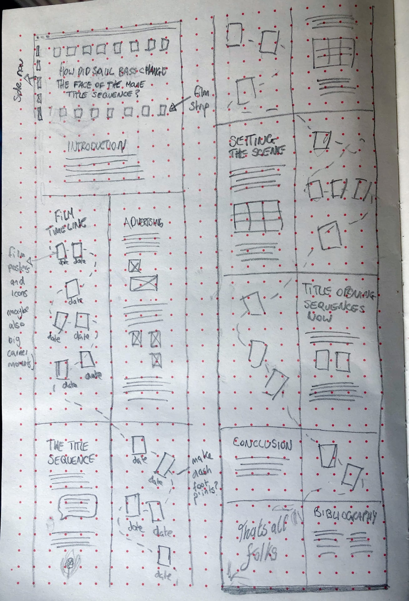
For my final wireframe, I went for a grid layout with a side nav in the hero section and the hero section itself being designed as a strip of film tape. The rest of the layout is halved with the content moving diagonally down the page with the idea of producing a roadmap of Bass’ major achievements weaving alongside the essay. This was a really fun concept to create however I primarily want to reflect the minimalist style of Bass’ work in my page design and the above concept if far from it. Other concerns would be that viewers would simply look at the roadmap of Bass’ work rather than reading the essay and mobile adaptation which would most likely mean having the roadmap disappear on mobile view.
Creating the Webpage
For the webpage I used a combination of my first and second wireframes to create the outcome using the hero section from the first wire frame and the 1 background colour approach from the second.

The above left is my first attempt at creating my hero section. I struggled with this slightly as it took a little time for me to figure out how to place the various elements via coding rather than generating an image. However, once I established the gird structure using a grid container I was able to get the illustration (I created the arm illustration by tracing over the original using the pen tool on illustrator) and titles in the placement I was after. I selected the sans-serif typeface Cabin for my headers as I wanted to use a sans-serif typeface but felt typefaces like Ariel and Helvetica were too strong and I wanted a slightly softer more playful look which I feel was achieved in this typeface. I didn’t want to push this too far with a display font as I feel it would have detracted from the minimalist style I was hoping to achieve.
I loved the contrast of the colour of the arm (#1a1a1a) with the almost white background (#f5f5f5) and therefore decided to use the almost black on the background of the nav. I was a little unsure whether this was too bold a choice as it is literally a thick black line running across an otherwise practically fully white page however with added elements like the bar illustrations and due to the bold line features that recurrently appear in Bass’ work I now feel that this was a really strong design choice that ties in well with the rest of the design.
Following feedback, I was advised to increase the size of my title, add my name and increase the size of the links in my nav. I made all of the changes suggested with what I feel are great results shown above right. The increased size of the title really makes the hero section a strong design feature of the site and while I struggled slightly with how best to include my name slight variations like making the lettering all caps and reducing the colour to a light grey and reducing the size slightly helped the type to blend more seamlessly with rest of the outcome. Increasing the nav links was a very practical and important change as the original size made them harder to read and may be difficult to select the correct one if viewing on mobile.
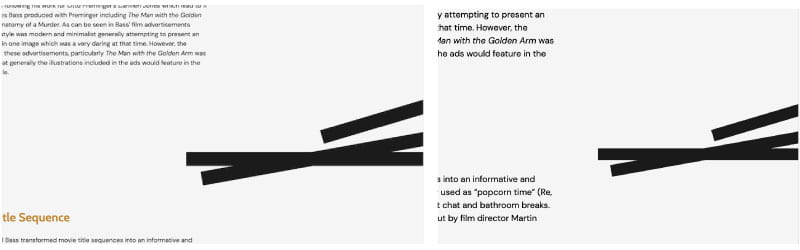
When originally adding the illustrated bars I produce on illustrator primarily working from my sketches, I wanted to use the bars as dividers between each section (as in my second wireframe) however as I was unsure how to do this I added additional padding to the end of the image, see above left. This was not effective and immediately caused a problem when being viewed on a wider screen than mine as the padding was not long enough and the bars began to disrupt the text. It was suggested that I remove the padding and have them sitting alongside the text which I did using max-width 25%, see above right. I found this to also be effective in that I was concerned that having bars framing the images throughout the body content was a little much and reducing the bars at the side of the page created a nice effect without being overpowering.
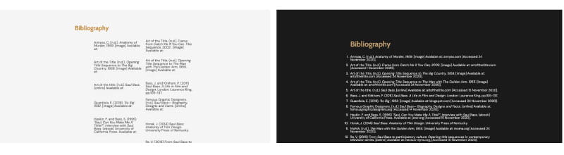
For my bibliography I had originally attempted to divide my references into two columns using a table (see above left), I am now aware that this was the wrong approach and instead I should have used a grid container. However, I was advised to remove the table and format my references in an ordered list. I feel that this was definitely the better approach as it made my list of references more readable see above right. I also added a nearly black background (#1a1a1a) which I had intended to do but had not included at the earlier stage of my first attempt at my bibliography.
Additional Design Features
I also included additional design feature like increasing the size and changing the colour of my black quote and adding a 10px border to the left as well as illustrations of Bass’ work which I traced over in illustrator.
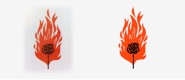
Above is the illustration used in the title sequence for Carmon Jones. I wanted to include the illustration within the body text however I found that any of the images online either feature backgrounds that were too light or too dark, shown above left and I could get the level of clarity I wanted using image trace. I, therefore, created the above right outcome on illustrator using the pen tool so that it could include the illustration as a png.
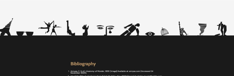
As there were so may of Bass’ outstanding works that I did not get to mention in the body of my text I thought it would be really nice to include a compilation of his work in an illustration attached to the top border of the Bibliography section of my web page. I was really pleased with this outcome as I feel it adds an additional level of interest at the bottom of the page and is quite unexpected due to the very minimalist structured feel of the rest of the design.
Effects and Sizing
 As this year is my first proper introduction to coding and web building the effects I have included in the page are limited to however states and adapting for varying screen sizes. Above are the examples of colour changes in my hover effect in my footer links along with short descriptions and a colour change when hovering over nav links and website links in my bibliography. I am pleased with this effect and feel that the gold/oak colour I have applied to the links contrasts the nearly black well.

I also made media changes to the header which allowed me to reduce the size of the arm illustration (see above image left) and remove it altogether when the screen sizes hit a max-width of 710px (see above image right). Likewise, I was able to remove the bars when the max-width hit 1250px and the illustration began to disrupt the text.
To view my web essay follow the link below: