For this project, we were required to select our favourite song and present the lyrics in a style that is reflective of the artist/artists that perform it. I began by selecting the Holocene by Bon Iver. I love the Indie Folk/ Baroque Pop feel to this song and how it often features in films at plot points when characters and gaining new perspectives on their lives and circumstances. There is a soft wistful feel and rhythm to the music that I would particularly like to reflect in my final outcome.
Designer Research
I began by researching typographers with minimalist approaches including Wim Crouwel and Josef Müller-Brockmann in order to see the various techniques they used in typography.
Wim Crouwel

Three of my favourite outcomes by Crouwel are shown above. In the Frieda Hinziker poster, I was first drawn to Crouwel’s use of white space strong colours and varying type sizes and placements. In the Edgar Fernhout poster, I was particularly drawn to Crouwel’s choices of colour as I feel that a similar theme could be effective in my own work in representing the more muted feel of the song. I was also really drawn to the use of line in this outcome and how the green takes up two-thirds of the layout and ends where a horizontal gap in the lettering runs through the primary text. I also like how lines divide up this primary text creating an interesting geometric feel to the outcome. There is also a theme of thirds with the body text throughout the rest of the layout taking up two-thirds of the page. Finally, I chose to look at met textile in more detail as I again I was drawn to the muted colour pallet and also loved how the texture was created through lines. What I found to be interesting in this layout was the placement of the blue square framing the text and placed toward the bottom of the layout. I find it to be a very bold statement and can’t decide if I feel it looks out of place or if it is a clever additional element added to break up the layout and add interest to the outcome.
Josef Müller-Brockmann
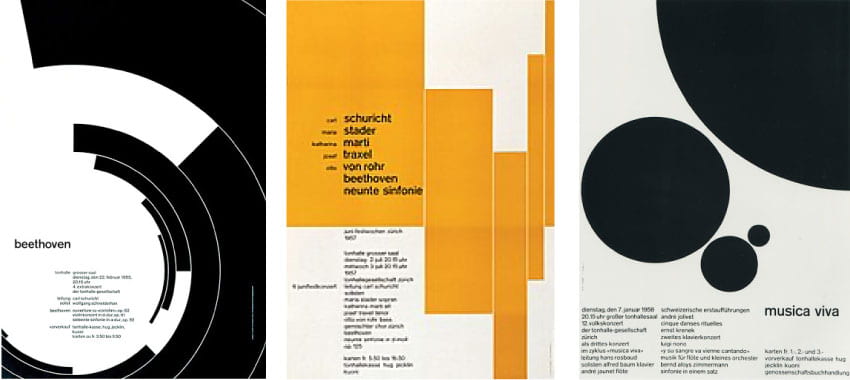
What I found particularly interesting about Müller-Brockmanns work was that he had actually created several music and concert posters. Therefore I was able to see how Müller-Brockmanns presented rhythm and music in his work. This was really interesting as in the first poster I can imagine the black curling lines representing the orchestra while in the second outcome I imagine the yellow bars and their varying placement and width to represent musical notes and the length of time they are played for. In the Musica Viva poster, I imagine the dots to represent the various acts performing. What is also interesting to note is the grid-based structure used for the text placement which appears in narrow columns though out each of the posters with only marginal differences in the size of the headers which are often also highlighted in bold.
Concrete Poetry
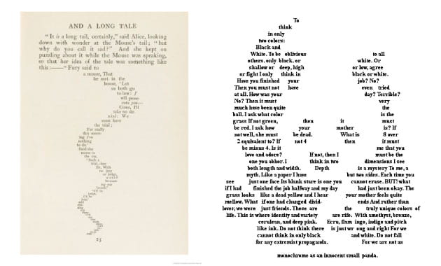
I also look a little time to look at concrete poetry in which a poem is laid in a visual representation of something above I have included examples of concrete poetry above to the left is Lewis Carroll’s And a Long Tale in which the text placement mimics the shape of the mice’ tail that is written about. To the right is an example taken from Pinterest which creates a panda outcome. I have included this example as while it is effective shaping the text to appear as a panda it doesn’t maintain a high level of readability. While I really like this effect I feel it much better used in more subtle ways as in Carroll’s outcomes as I don’t want to lose the readability of the text.
Mood-board

Above I have created a mood-board of the of album cover and posters associated with Bon Iver in order to draw inspiration from them as any Bon Iver fan will automatically aconite the look and feel of Bon Iver’s album art with their music. I really love the album art used by the band and can see how the draw from printing photographs and line to produce really interesting outcomes.
Sketches
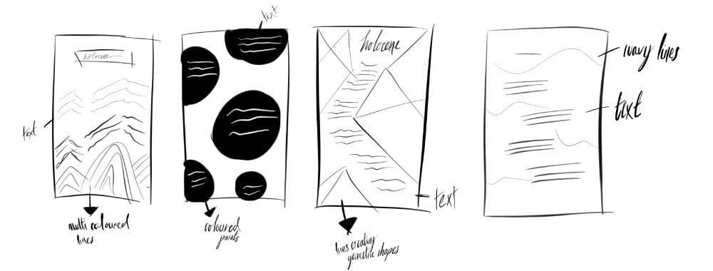
I then mocked up some sketches of various layouts that may be effective in presenting the lyrics. I was particularly drawn to the first and fourth outcomes shown above as I felt I could draw in nature and landscapes through line relating to the lyrics “But I could see for miles, miles, miles”
Experimentation
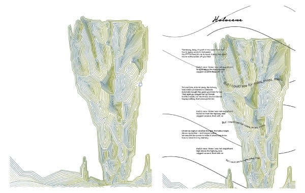
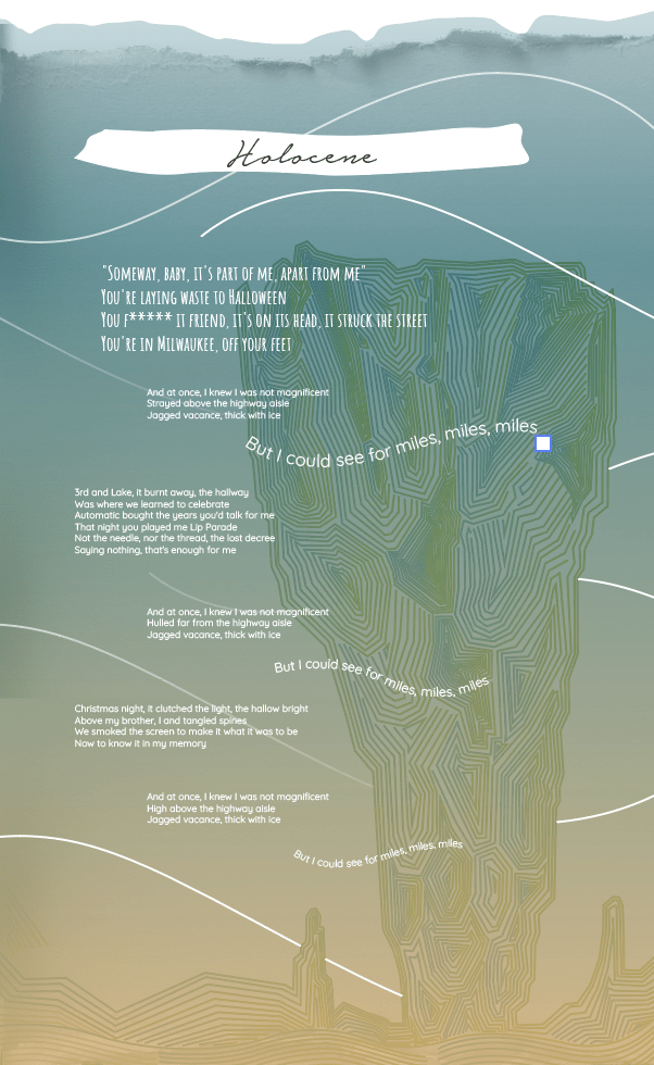
I then used one of the cliffs taken from a concert poster to produce the above line outcomes on illustrator. This was a very detailed and time-consuming process however I do feel that the outcome is really effective. I then dropped in the lyrics trying the text placement in a variety of ways before producing the above outcome using the sans serif typeface Quicksand. I decided to the used the staggered in and out effect I had mocked up in my fourth sketch and had the repeated lyric “But I could see for miles, miles, miles” running across a wavy line and scaled smaller each time to represent distance and to create a wavy dreamlike effect as though the word were floating in the sky. I was really pleased with this outcome as I feel that is is an accurate representation of the style of music that was being presented. I also included the title in they typeface Notera to give the outcome hand-scripted feel that may be associated with folk music i.e. the idea of passing from one generation to the next.
Adding gradients
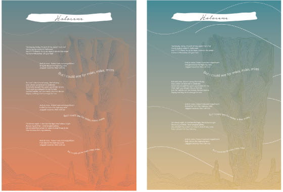
Above I have experimented with a couple of background colour gradients to mute out the linework of the cliff and highlight the text. I feel that this was effective however it may have muted out the cliff a little too much. I also added a white background to the title of the song to help it stand out against the background and creating a mild torn paper effect. I was very please with the outcome and decided to use the blue/yellow outcome as I felt it generated a softer more wistful theme.
Adding a torn paper effect
I then attempted to add a torn paper effect and began to experiment with further typefaces. I really struggled with this and found that when I finally achieved the paper effect I wanted that the quality was not high enough and therefore decided to create something completely different altogether. At this point I started to take a more pointed approach in creating a design that would be displayed digitally rather than in print and even returned to my manifesto design to produce an outcome that could be used as the basis for the theme of my webpage and would therefore be drawn from in this outcome.
A change in direction
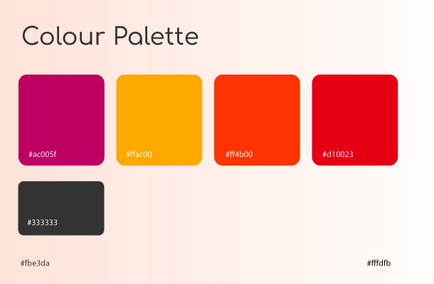
At this point I decided to choose a different song that would reflect the new theme a colour palette I had established in the design of my manifesto in order for there to be a consistent colour theme throughout my page, see colour palette below.
I wanted to pick something more upbeat and decided to for another of my favourites, Gnarls Barkley’s Crazy. The song’s genre is described as being Neo-Soul, Psychedelic Soul and Alternative Rock. This is at the other end of the spectrum to Bon Iver’s Holocene, therefore, I decided to conduct further research on artists such as Paula Scher that generates more bold design outcomes that would perhaps better display Neo-Soul and Alternative Rock.
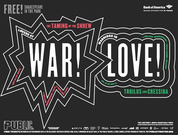
Paula Scher
I love the bold designs Scher has made for The Public and am particularly drawn to the colourful outcomes above with the incorporation of circles and square creating what looks like a stop button as well as her bold use of colour and playful text placement and scaling. All of these components combine to make a really interesting and vibrant outcome. I love the inclusion of shapes and how they are combined with the text to replace the ‘o’.

I also thought it would be useful to look at some of the more typography-based album art Scher has created. In the changes, one and two Scher has created a really nice wood type effect has been created and it is also interesting to note the reduced height of the typography used for one and two.
Artists that listen to Jazz while they paint
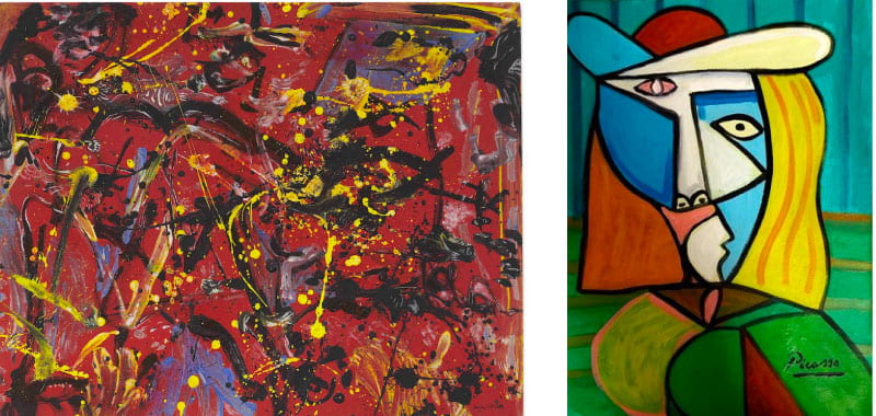
I decided it might also be useful to look at artists that depicted Jazz in their work (I felt Jazz wasn’t too far away from the songs Soul feel) however I struggled to find exactly what I was after until I realised that both Jackson Pollock and Pablo Picasso are said to have listened to Jazz while they painted. I have included Pollocks Red Composition from 1946 to the left and now looking at the brush strokes and drip-style I amazed at the amount of movement that can be found in the piece particularly the imaging the work actually being complete. I think this is a great demonstration of how pint and line can display movement and hope to apply this to my own work to not only display movement myself but also rhythm. To the right is Picasso’s Cubism woman with its bold shapes and colours but also multiple perspectives. I love the simplicity of this outcome and would love to draw the idea of multiple flattened along with the use of block colours and bold lines.
Additional Sketches

I then drew out some more sketching playing with point and line to incorporate and feel of rhythm and soul with particular inspiration being drawn from Paula Scher’s The Taming of the Shrew poster for The Public see below.
Experimentation
I began experimenting with point and how I could show rhythm and movement through point.
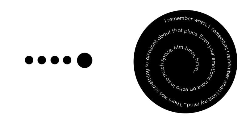
The first concept that I hit on that I felt was particularly strong was using point to reflect the beat. This worked perfectly for Gnarls Barkley’s Crazy as there is a really strong beat throughout the song particularly at the beginning and end of the song which is where I decided to include the above arrangement (at the beginning and end) having the dots placed even and in groups at the bottom to display the rhythm of the beat. I then went back to my original sketches for the Holocene outcome and drew inspiration from my second outcome (a composition made up of point. I tried placing the lyrics in the centre of the circle normally which I felt was a bit boring and around then around the edges which didn’t provide enough room and the finally used the spiral tool and type along the path on Illustrator to create the above outcome shown to the right. I really love this effect as it fits perfectly with the Psychedelic Soul genre the song also falls under as the serial effect has hypnosis associations and by reading the text the viewer will be following the same motion with their eyes. This circular motion also mimics the repetitive nature of the lyrics and melody.
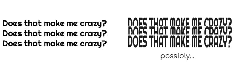
As with my colour palette, I wanted to reflect the common themes of my manifesto and therefore decided to use the typeface Comfortaa for the majority of the text however I wanted to branch out from this for the chorus and tried a variety of typefaces before choosing the typeface Righteous which I felt conveyed the 70s soul feel I wanted it to really well. Again, I wanted to do something playful with the text and the line is repeated 3 times I had the room to be creative without losing legibility. This lead to the outcome shown above in which I had the text placed in all upper-case, creating a nice straight line at the top and the first two line cut in half with only the top half visible. I am really pleased with this outcome and feel that is does suggest a level of movement with the view having to skim their way down to read what the line says.
Portrait Outcome
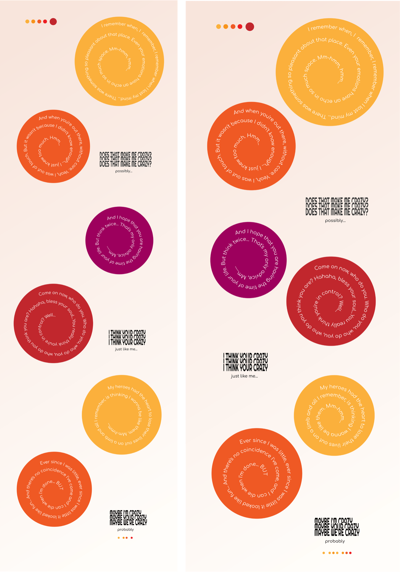
I put the above experimental outcomes and added my colour palette to create the above outcome. Following feedback, I made some minor adjustments like moving the circles with the verses closer together and making sure the chorus was placed directly between the versus so that it was easier to follow.
Landcape Outcome
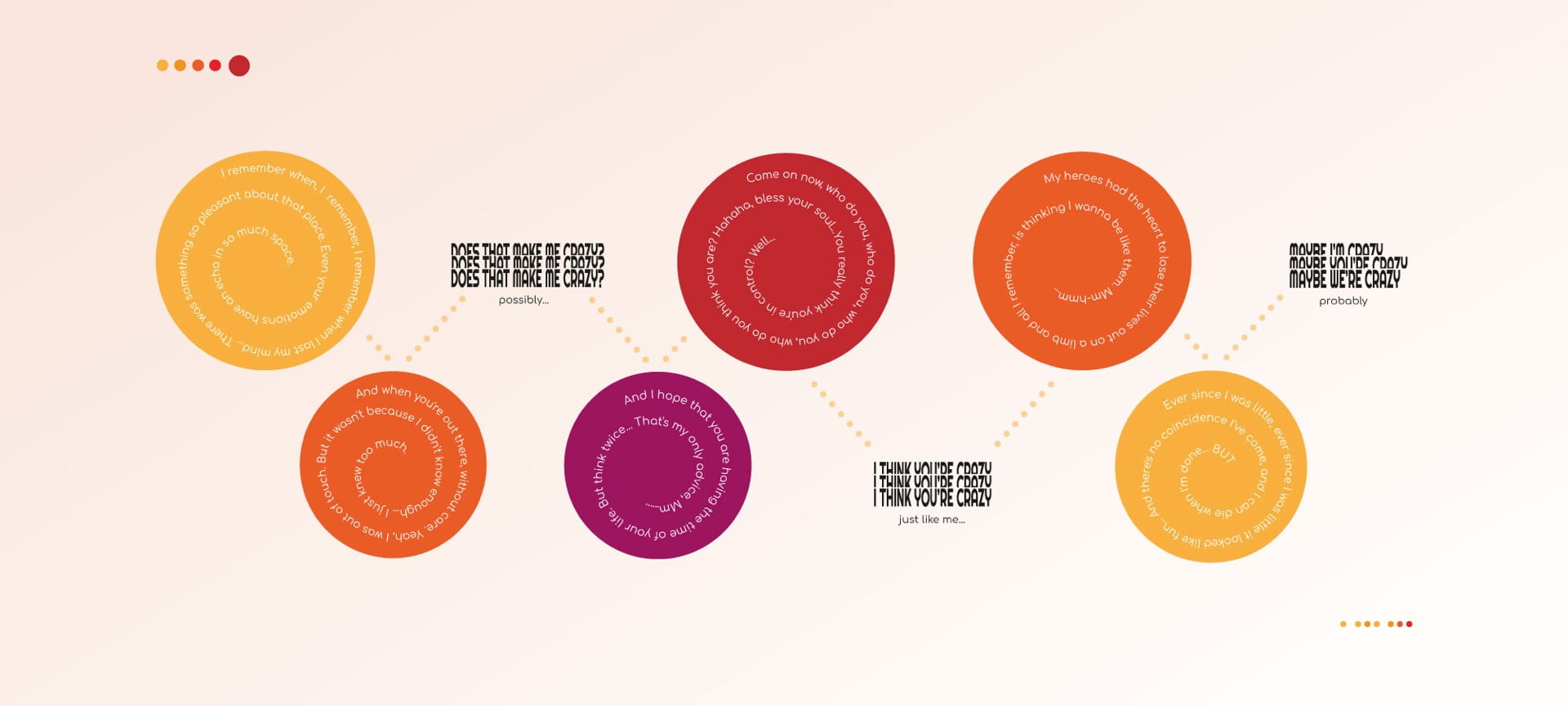
Following the production of my portfolio website, it became clear that a landscape outcome was going to be far more appropriate and sit more seamlessly in the layout. I, therefore, adapted my above designs to the above. This generated what I believe to be a very well balanced outcome, however, I was concerned that the viewer may struggle with the new format to know what comes first e.g. do you read left to right or top-line then the below line. I, therefore, used a dotted line to guide them through the composition which I feel works really well.
What have I learnt?
- It is importing to consider formatting in layouts and how to split up contents and effectively use negative space e.g. split the layout into thirds texture.
- Adding interesting effects like texture into design can make outcomes more interesting.
- Always consider text placement and type scale in order to maintain a certain level of readability, this can be helped by the inclusion of aids and measures such as grid formats.
- Point, line, and plane can be used to represent a variety of subject matters playing with these fundamental design elements in this way can be really fun and produce interesting outcomes
- It’s important to always consider the medium being designed for as this can impact the outcome
- Shape, colour and line can be used to present movement in interesting ways.
- There are a number of ways to guide people through a layout always consider the different ways this will be approached as it may impact the effectiveness of a design outcome.
How can I apply this to my work in future?
- When wireframing design outcomes consider layout, text placement and the use of guides like grid structure.
- When working on layouts remember that typography and text placement is an important part of the design outcome and take time to set out a clear hierarchy of information and to present text in a form with good readability.
- Consider incorporating effects like adding texture and visually representing movement when attempting to create more playful and engaging designs.
- Consider the medium being used when creating a design.
- Using simple forms such as point, line, and plane can be highly effective in presenting a variety of subject matter and may be useful in a variety of layouts. When I’m struggling with an outcome it might be helpful to revert back to the fundamental elements.