What is the Golden Ratio?
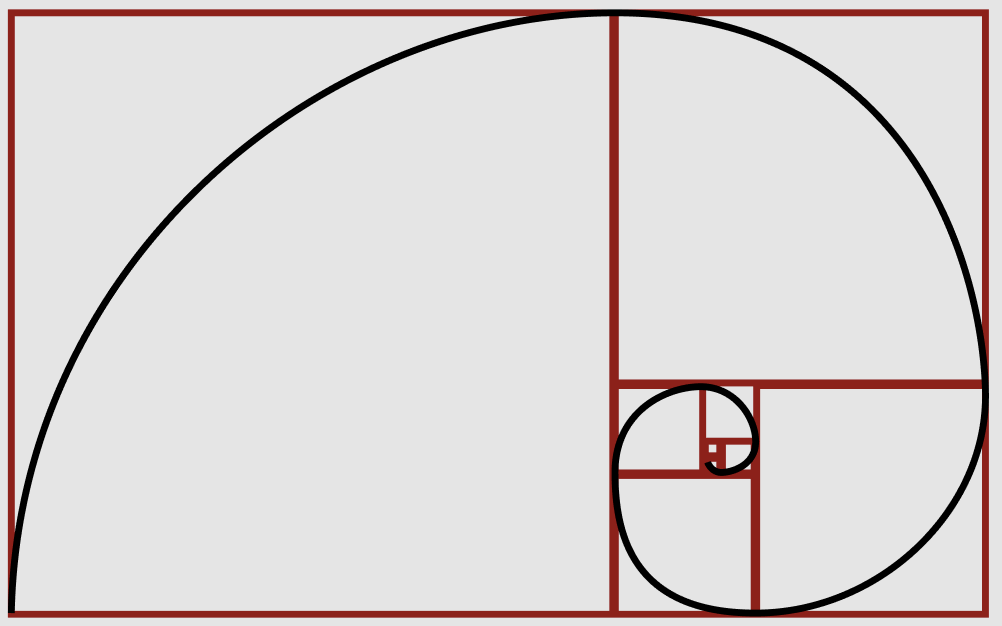
The golden ratio is a ratio that uses mathematics to create balanced and athletically pleasing composition as often seen in nature. The Golden ratio is closely tied to the Fibonacci Sequences. The Golden Rectangle is produced by using the ratio 1 to 1.61. This ratio creates rectangle where, if you cut off a square from the shortest side length the remaining rectangle will have the same proportions and the original. When done repeatedly the below red shape is formed (this also forms the golden spiral as seen in black).
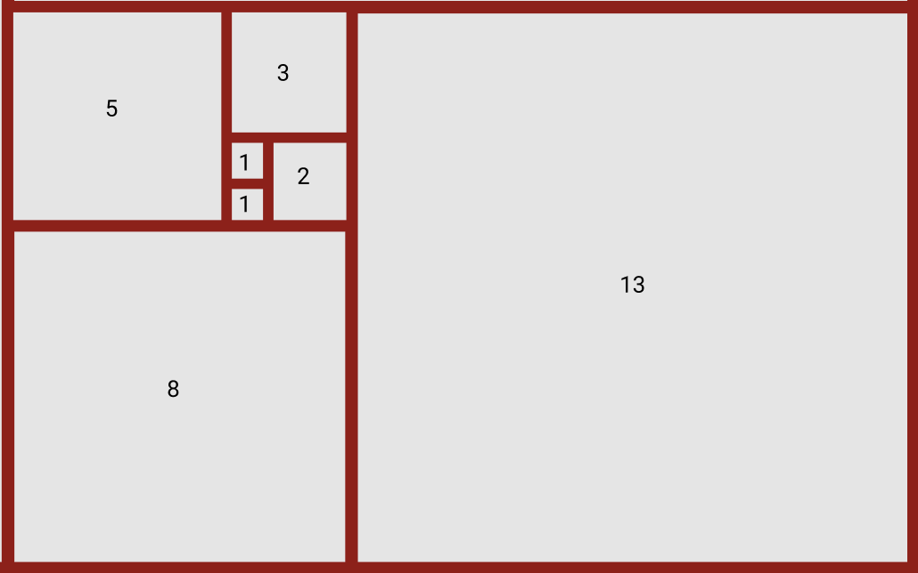
The Golden Ratio is also demonstrated in the Fibonacci sequence in which each number is the sum of the previous two e.g. 1, 1, 2, 3, 5, 8, 13, 21, 34 and so on as demonstrated below.
Incorporating the Golden Ratio into my design
In a previous exercise, we looked at creating outcomes using point, line and plane. In this exercise, I will restructure 3 of each of my outcomes using the Golden Ratio/ Fibonacci Sequence.
Point
Before

After
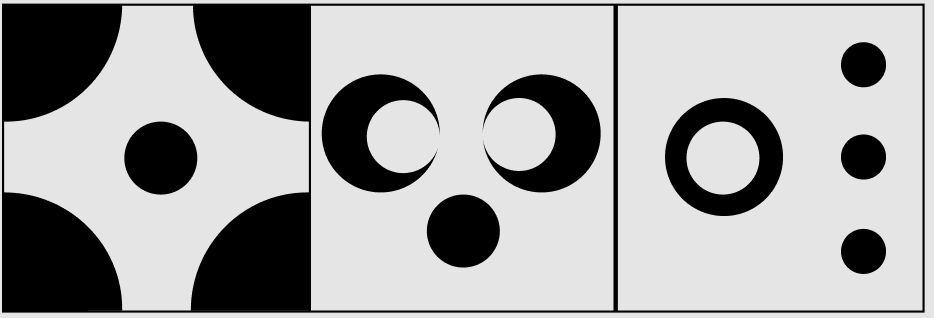
The before panel shown above displays my original point work using 5 points, the after panel show the same work resized and displayed using the dimensions found in the Fibonacci sequence. While the outcomes are still recognisable when compared to my original the addition level of balance in the outcomes is clear and interestingly an additional amount of white space becomes evident as well.
Line
Before
After

In my line panels, the same changes are evident with a particular improvement in my opinion, to the first 3 line outcome with the more narrow horizontal line strokes and an overall greater amount of white space creating a more balanced and athletically pleasing outcome.
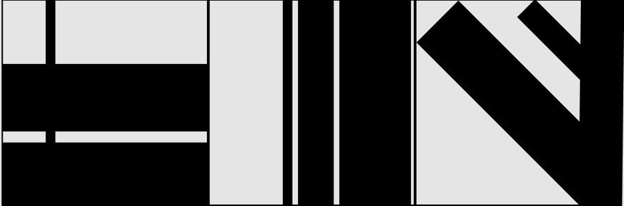
Plane
Before
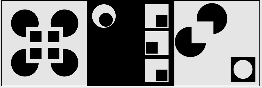
After

Finally, the changes my plane panel again increase the amount of white space is increased in all outcome creating a greater contrast in size to each shape and improving the overall balance of each outcome throughout the panel.
Apps Layouts Using Plane and the Fibonacci Sequence
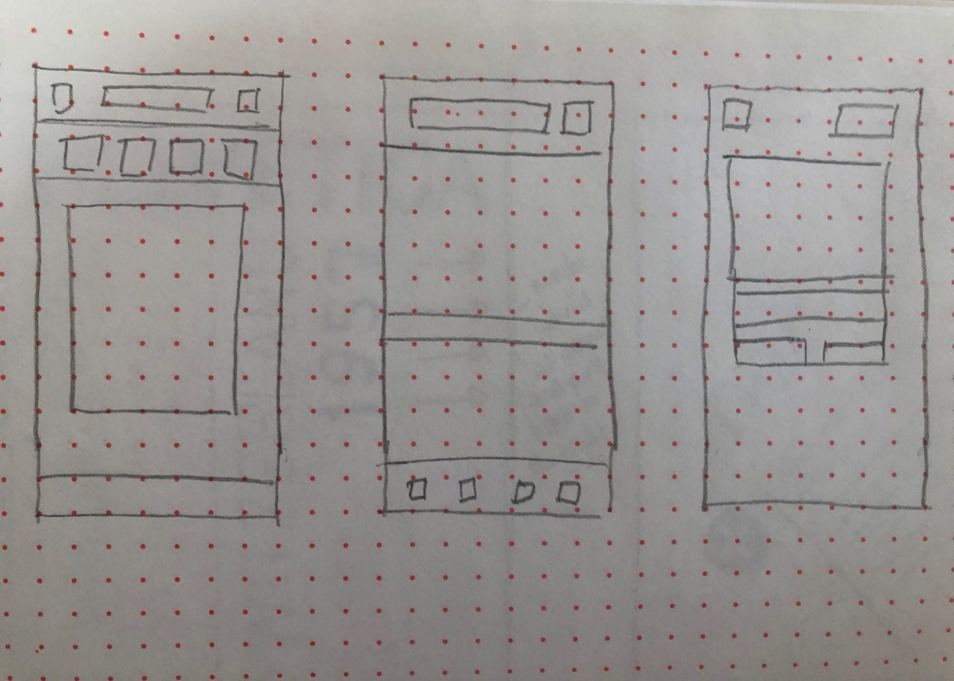
For our next exercise, we applied the Fibonacci sequence to app layouts. I began by sketching out my three layouts using squares to define the main elements. In my first sketch, I used Instagram as my inspiration in order to get an idea of how one of the leading social media platforms tackles formatting and layout. In the second sketch I used the get your guide app as the basis for my layout, this app promotes local events and activities and allows for online booking. Finally, I looked at the layout for the Domino’s app login page to see how they present their opening sign up interface for their app.
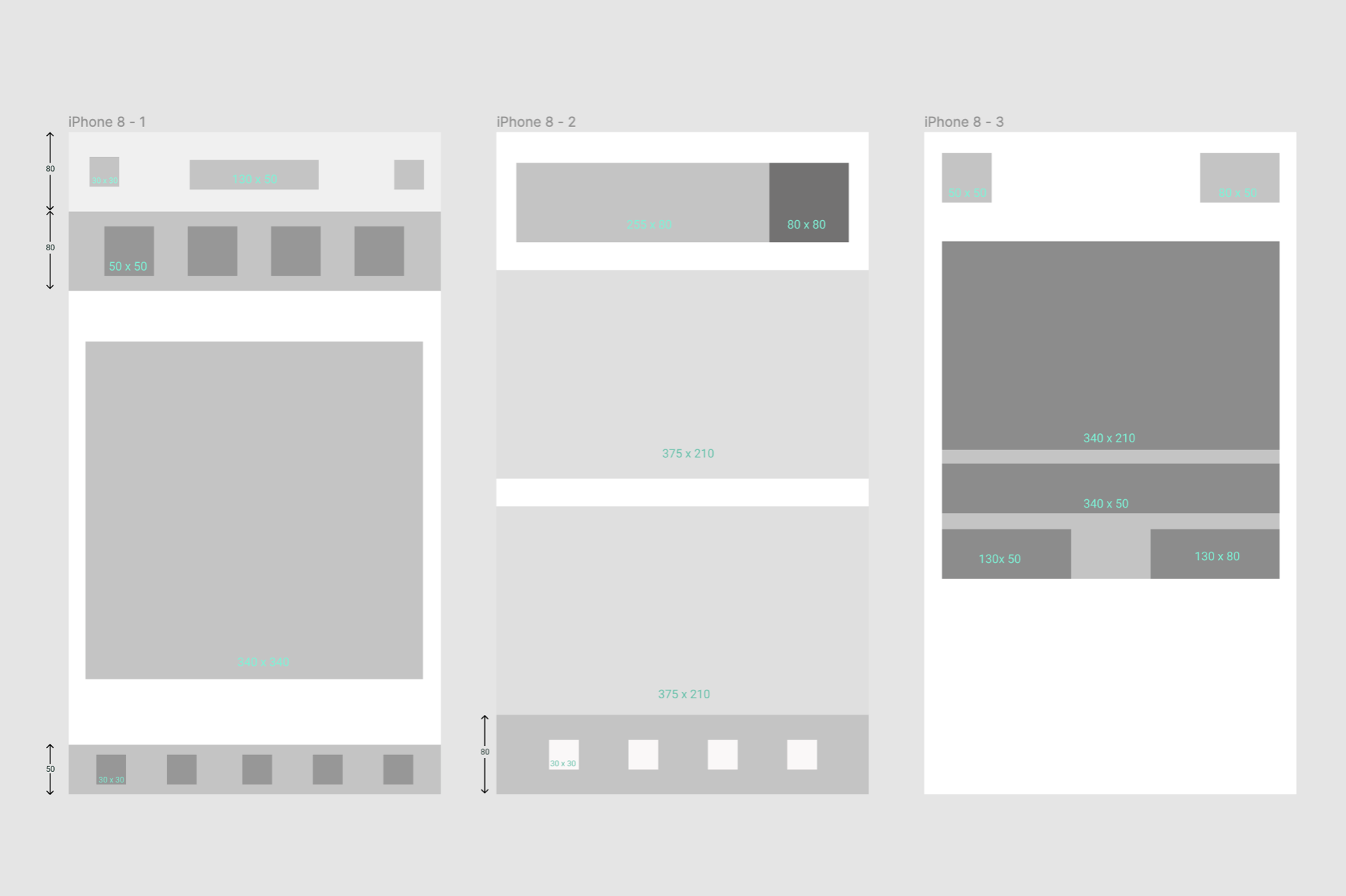
I then used these initial sketches to draw up app wireframes using the Fibonacci sequence (see dimensions used above). I was surprised at how well each of the formats fit the Fibonacci sequence while maintaining the integrity of the original formatting used on the actual apps. I feel that the above outcome proves the usefulness of incorporating tools such as the golden ratio and the Fibonacci sequence in the early stages of design.
Examples of designing with the Golden Ratio
Didn’t quite get out in the wild but found these on Instagram:

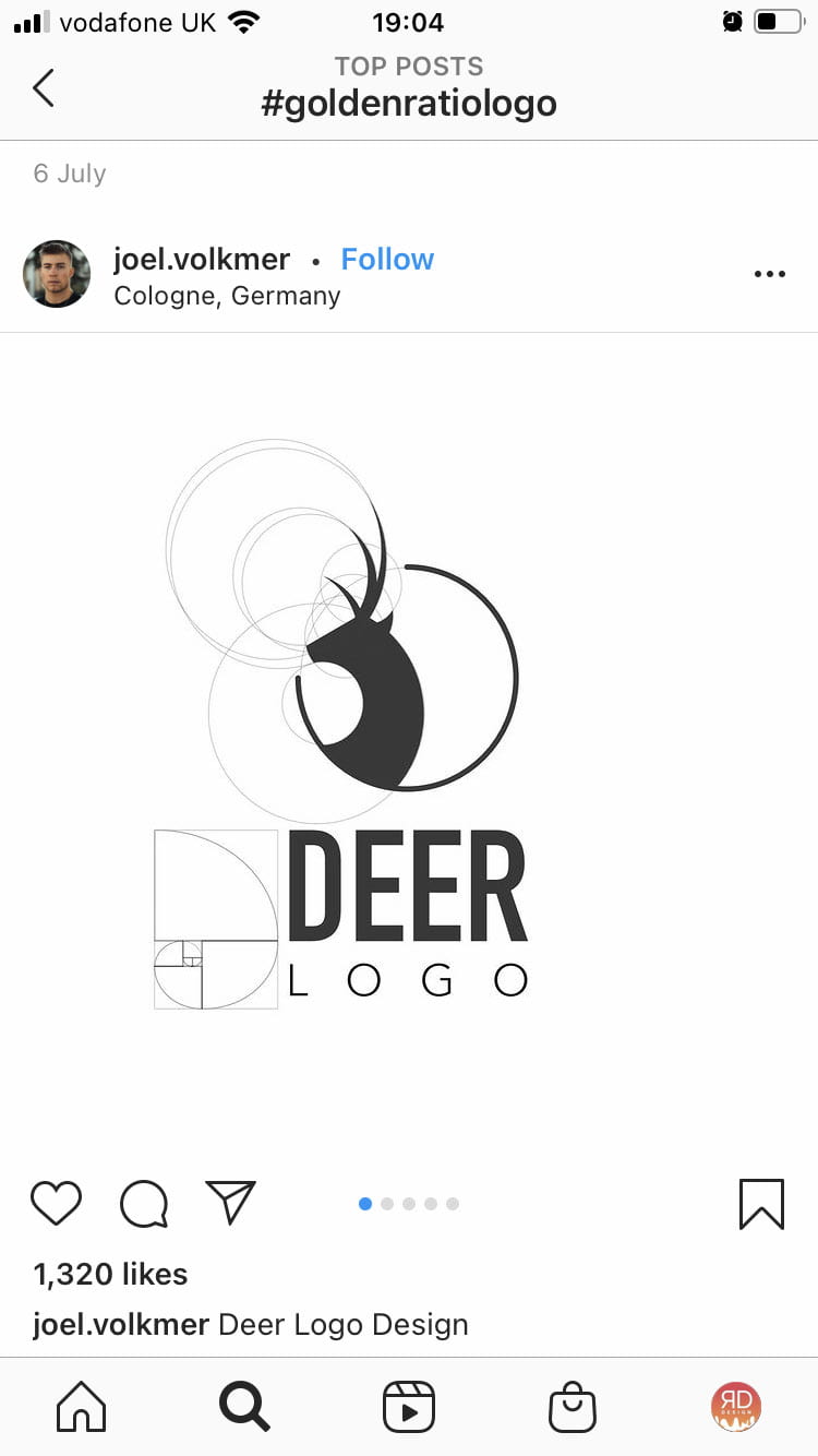
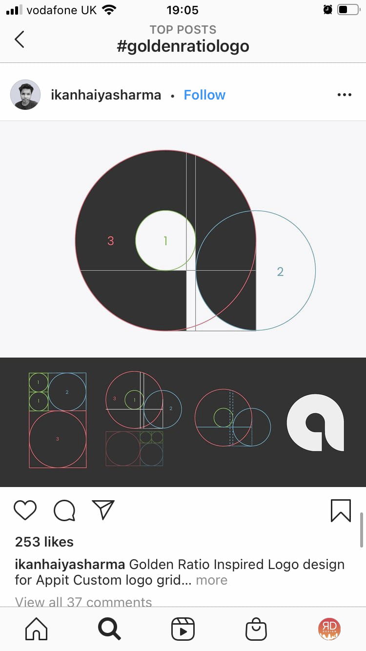
Above are examples of how the golden ratio has been used to format well-proportioned icons for logos and to produce a simplistic letter form as well as acting as a template for type scale. The above outcomes are simple yet really effective and well balanced, demonstrating how the golden ratio can be applied to illustrations, icons and logos.
The Gestalt Principle
Examples of the Gestalt Principle
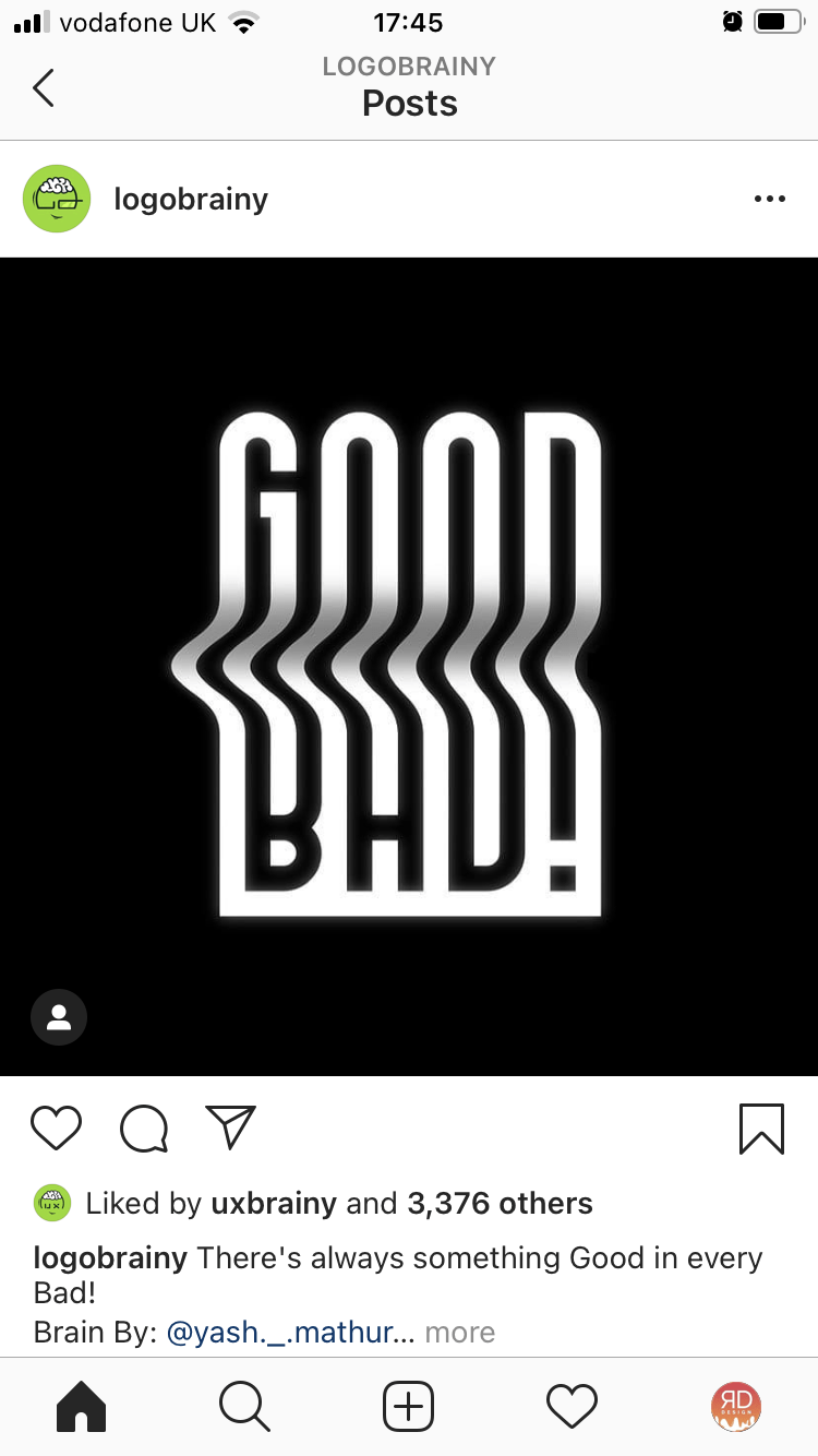
I really love the above designs and find the Gestalt Principle to be a way to produce really clever and engaging design outcomes. I like how the negative space used within the word “GOOD” is used to create the word “BAD!” with additional effects added e.g. the centre crease creating a 3D effect and improving legibility of both words.
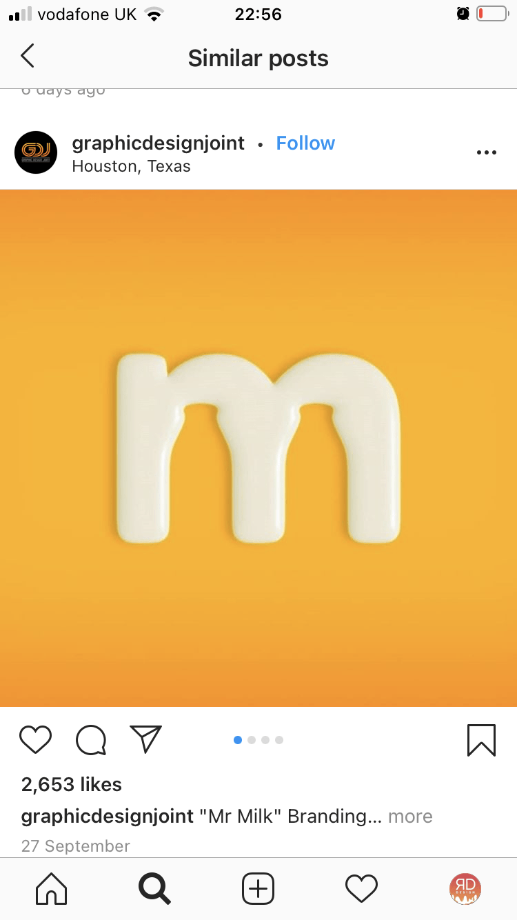
In the centre ‘m’ designed used to promote milk with the negative space within the letter being used to create glass milk bottles there is the added effect of the ‘m’ appearing as though it was made of milk. The combination of the two effects within this piece is really effective and is well couples by the soft organ gradient it is placed against.
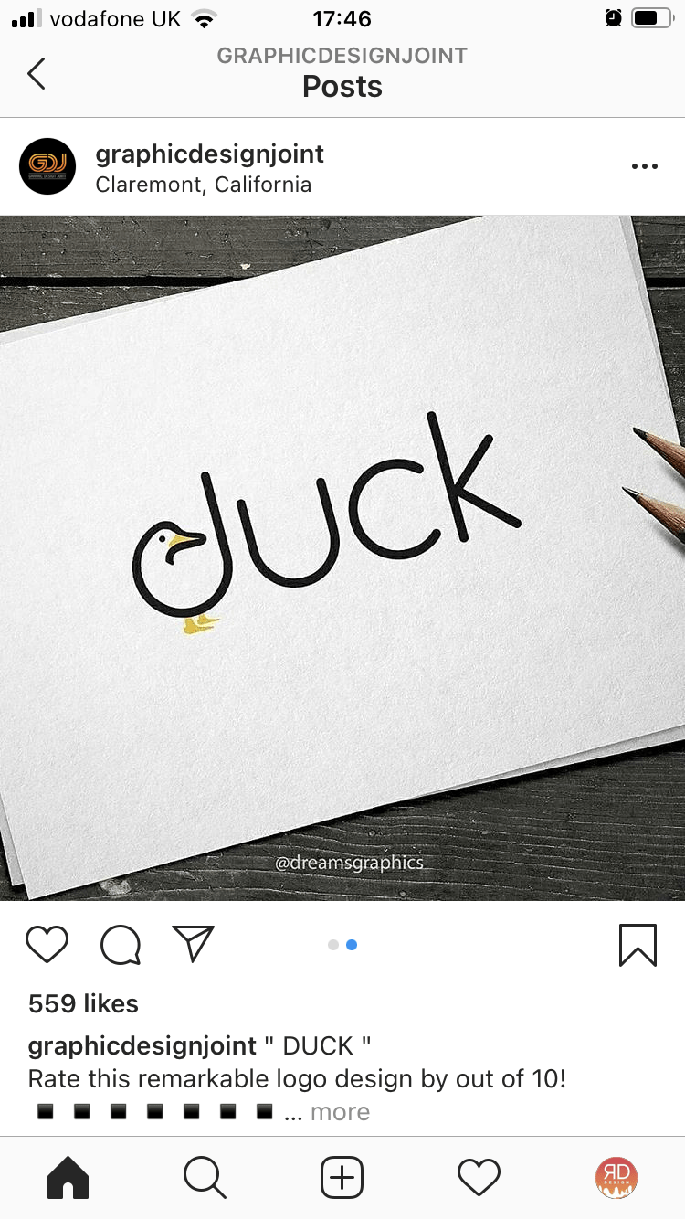
The duck in the third design uses the curve of the ‘d’ to make up the neck and body with added illustrations for the feet, beak and eye. This is effective in producing a clear outline of a duck with added yellow colour making the outcome really pop against the black typography. I really like this outcome and feel it produces a quirky and interesting design.
Type Scale

Above I have experimented with type scale using my manifesto “It’s the process that’s impressive”. This was a really fun exercise that allowed me to play with which words I wanted to emphasise dictating how the viewer processes. I began by choosing the 2 words I wanted to emphasise, ‘process’ and ‘impressive’. Of these words I wanted ‘process’ to stand out the most and as seen in all of the above outcomes I, therefore, made it the largest. I then played with different lay the first using a left alignment for the first two lines and a right alignment, the second a central alignment for the first line and a left alignment for the next to lines and the third I used letterform to dictate placement, entering the first line against the second and slotting the third line in after the the ‘p’. In each layout, I also played with upper and lowercase outcome and weight. Of the above outcomes, the third is my favourite as I feel the size of the text used for the word ‘process’ causes it to stand out while the light-weighting of the typeface reflects how the process can often go unnoticed and underrated. I also like how the uppercase and bold weighting of the word ‘impressive’ causes it to stand out while the small text size stopes it from overpowering the composition.
Over I’m quite pleased with all of the outcomes and really enjoyed this exercise. I also feel that as my manifesto is so short including a playful type arrangement such as the above could add interest to the final outcome and will experiment with this in my actual manifesto.
What have I learnt?
- An improved understanding of what the golden ratio and Fibonacci sequence are.
- How to apply the Fibonacci sequence to point, line, plane (which can be used as rudimentary layouts) and wireframes to produced balanced and ascetically appealing outcomes.
- How to use the golden ratio in illustration, logos and icons
- The gestalt principle can be used in logo and branding to produce interesting, clever outcomes
- How to use type scale to produce interesting outcomes
- How the type scale can be used to emphasise and draw attention to a specific word in specific orders
How I can apply this learning?
- I can use the golden ratio and Fibonacci sequence to help set the correct proportions for layouts when wireframing apps and websites
- I can use the golden ratio and Fibonacci sequence to help me to produce logos, icons and illustrations
- I can use the gestalt principle to produce clever designs in logos and illustrations
- I can use type scale in branding and promotional material as well as hero sections on websites to emphasise specific words and sentences.