Origins
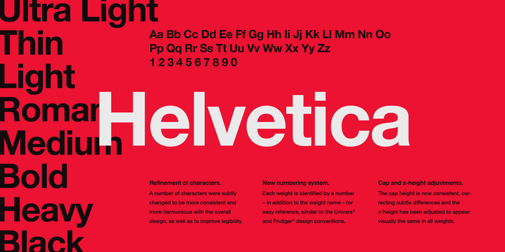
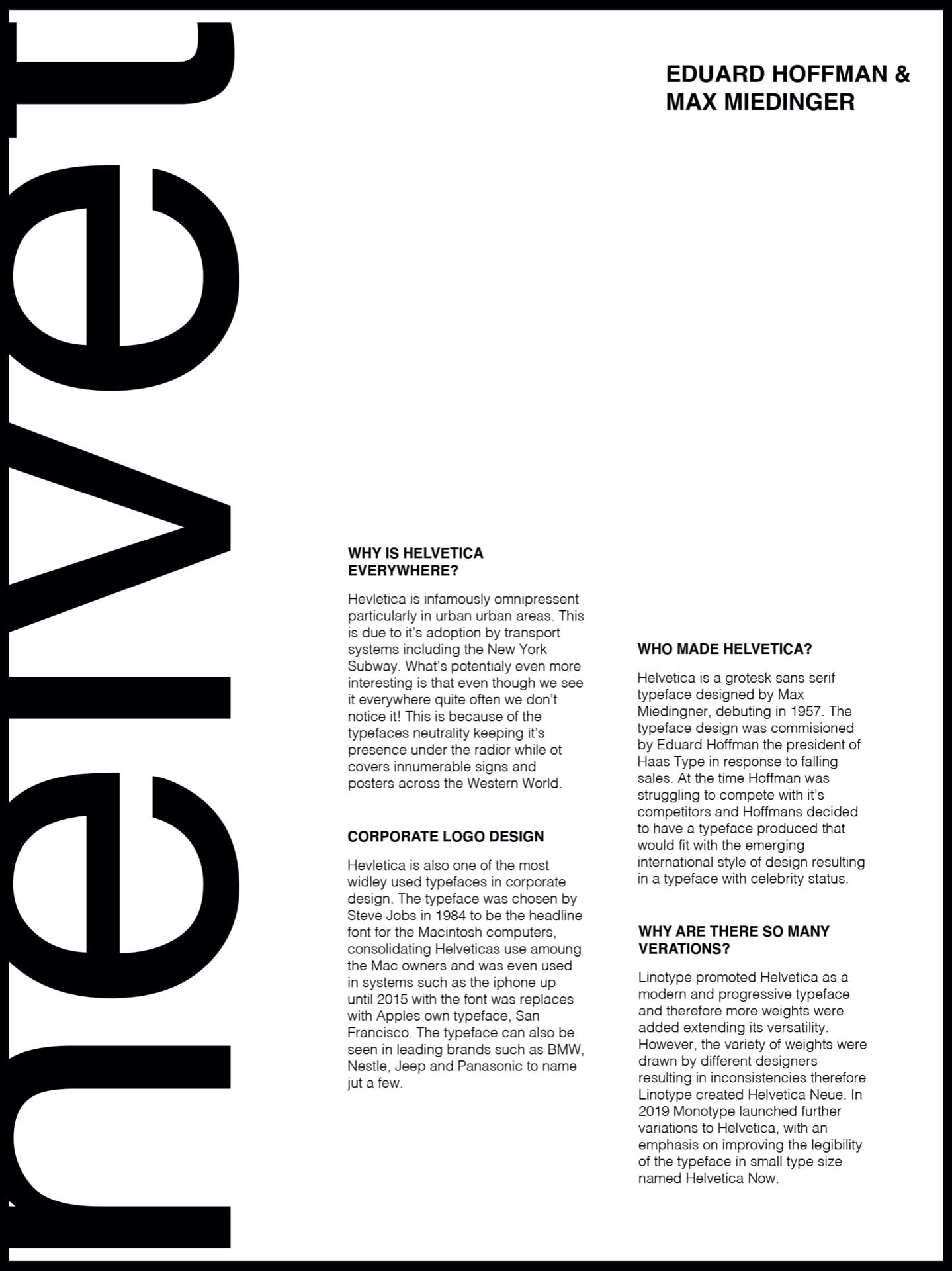
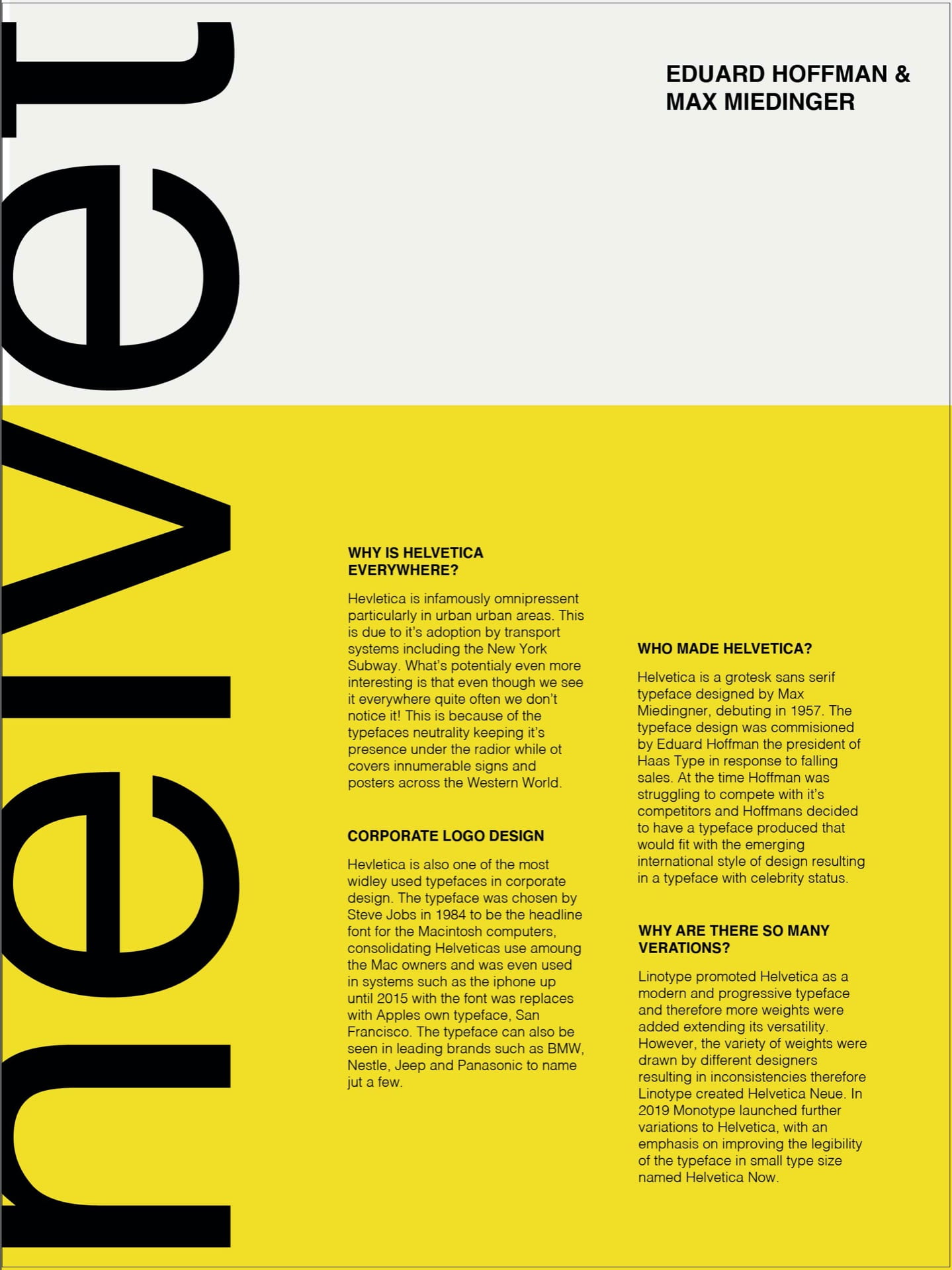
Helvetica originally named Neue Hassocks Grotesk, was created by Swiss typeface designer Max Miedinger in 1957. The typefaces name was changed in 1960 to Helvetica, a Latin word meaning Swiss, in order to lend the typeface more readily to the international market. The typeface is now one of the most popular and commonly used. Miedinger created the sans-serif typeface as a competitive addition to the Swiss Market with the primary aim of creating a neutral typeface that would be clear and usable in a number of ways.
Documentary Film
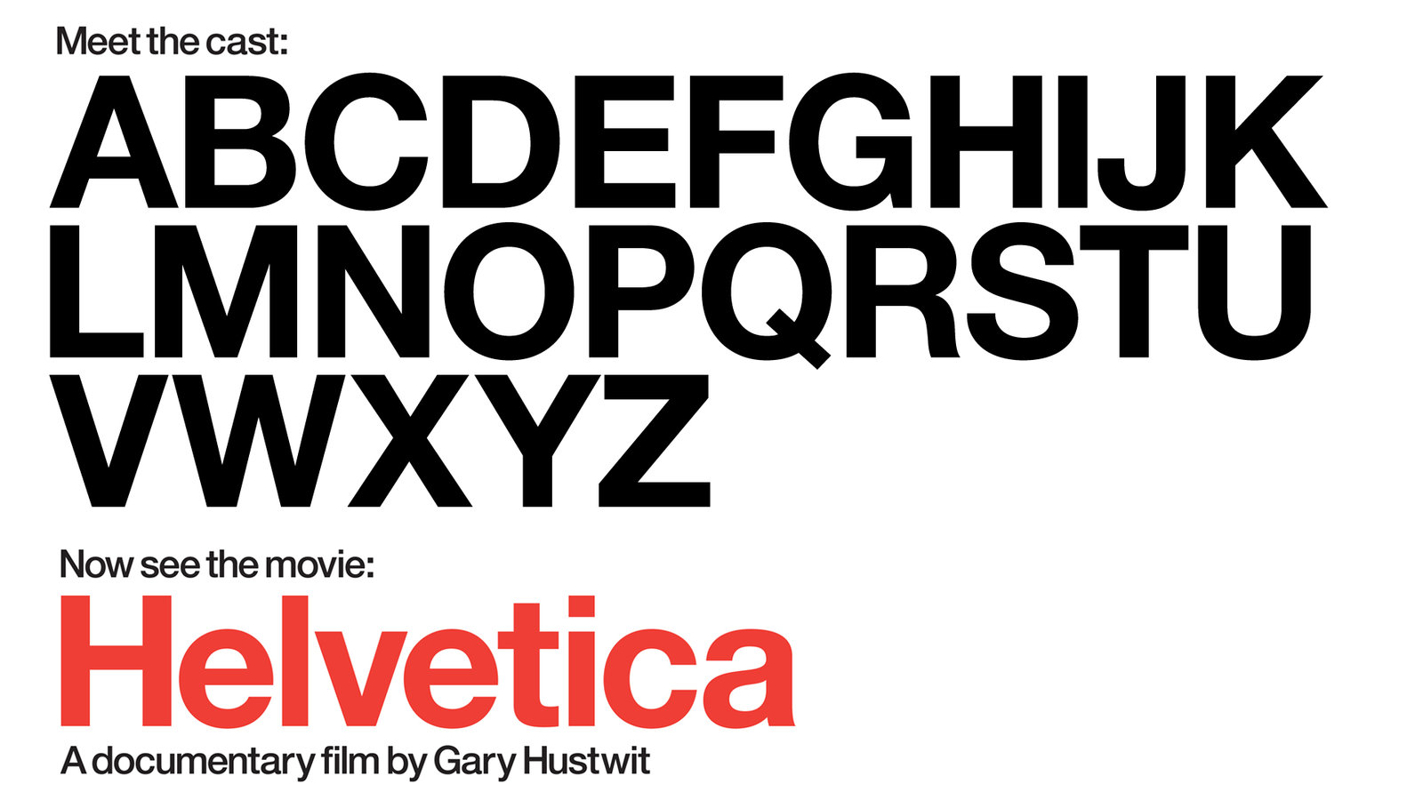
Due to the typeface’s high level of popularity director, Gary Hustwit created a documentary film on Helvetica. The film looked at how the typeface has moulded the culture of typography and design and was nominated for the Truer Than Fiction Award in 2008 at the Independent Spirit award.
Variations
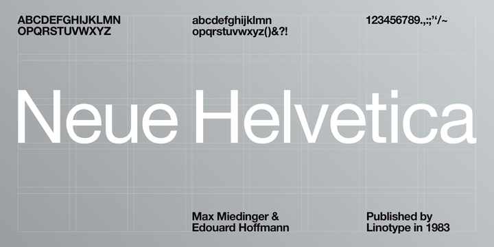
Linotype promoted Helvetica as a modern and progressive typeface and therefore more weights were added extending its versatility. However, the variety of weights were drawn by different designers resulting in inconsistencies across the various weights of the typeface therefore Linotype created Helvetica Neue. In 2019 Monotype launched further variations to Helvetica, redrawing every character with an emphasis on improving the legibility of the typeface in small type size named Helvetica Now, which is produced in Micro, Text and Display optical sizes.
Interesting Uses
Helvetica Beer
Created by art director Sasha Kischenko as a concept for Helvetica Beer packaging. I really like the design work here and how it plays the proportion and refers the typefaces Swiss heritage by the inclusion of the cross symbol similar to that of the Swiss flag- this may be something to consider in my own work.

Helvetica Bike
The Helvetica bike was brought around by the Spanish design studio Borja Garcia. I love this piece of design work and how the colours and minimalistic design of the bicycle fit perfectly with the minimalist style that accompanies Helvetica. I also love how the typeface has been included and the combination of weights. Overall a really fun piece of design work.


Helvetica Chocolate
Created as part of freelance designer, art director and animator, Rosa de Jong’s chocograhpy project. I love this concept and the precision and minimalist outcome of the packaging.

Helvetica Juice Bar
The Helvetica Juice Bar & Cafe is based in Lakewood, Ohio and serves Latin American food along with cool and hot drinks in 100% biodegradable, eco-friendly cups and is said to be the “playground for artists”. I think this concept is both bizarre and brilliant and would love to visit. I love the cutout typeface element exposing the photograph behind seen in the poster below.

Helvetica Swiss Army Knife
Part of a series of Helvetica- inspired artwork by Stephane Massa-Bidal. A brilliant work of typography! I love how the variations of type weights are used to demonstrate the varying knife blades that are found in a pocket knife.

Type Specimen Examples
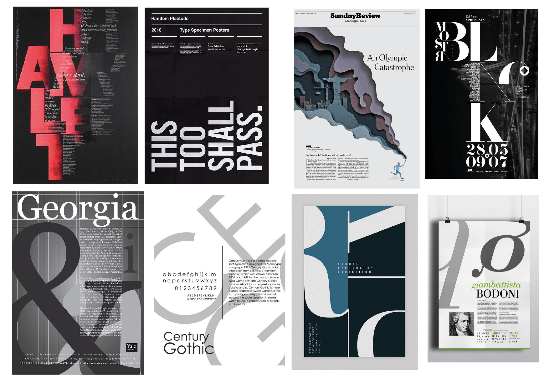
I wanted to begin my type specimen research with a broad range of examples not necessarily focusing on Helvetica and simulate typeface to begin with. In the above outcomes I love how form is created through type and like the included elements of layering along with vertical and diagonal text placement.
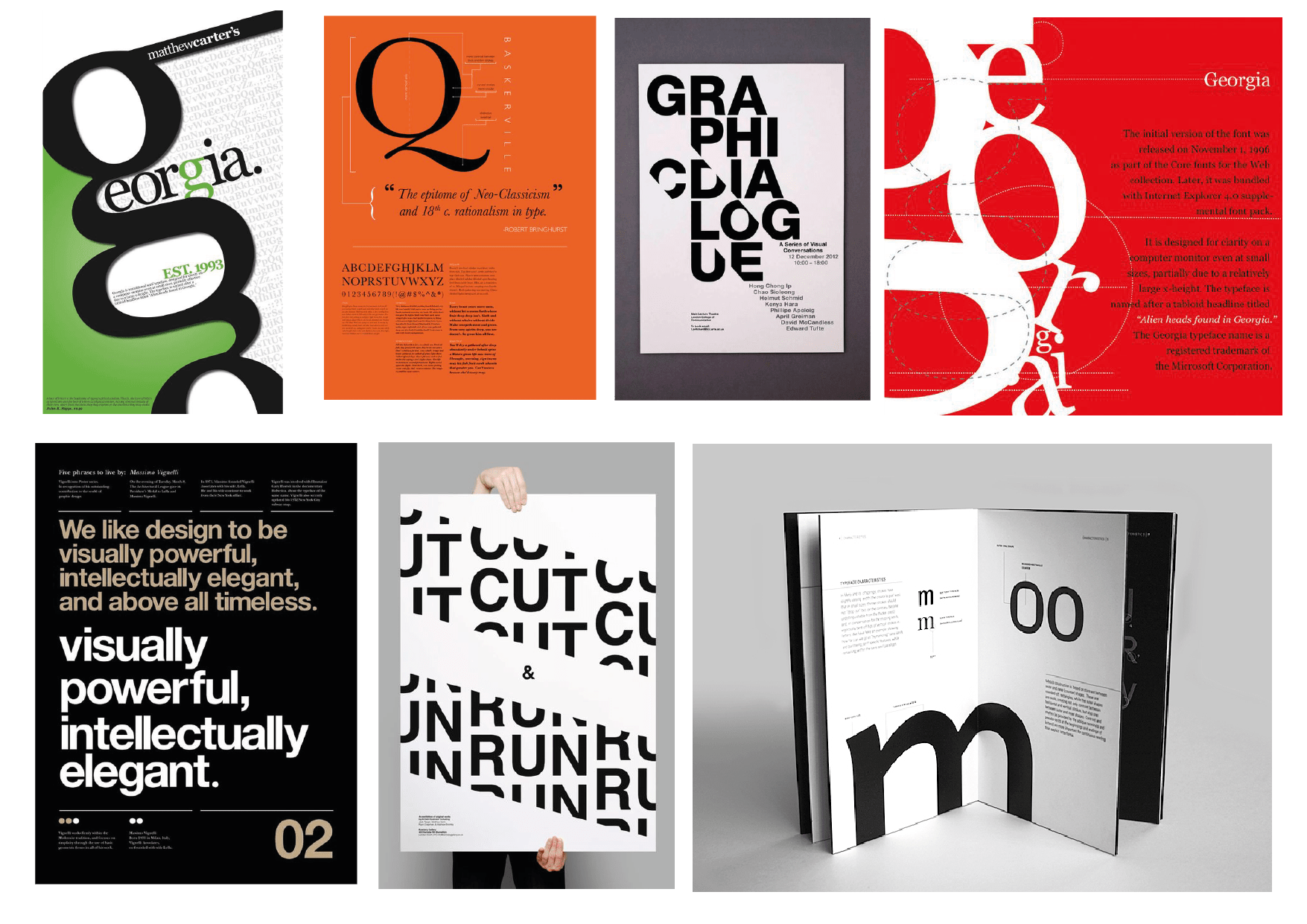
Above I really like the cutout style outcomes and the overall focus of line shape and grouping.
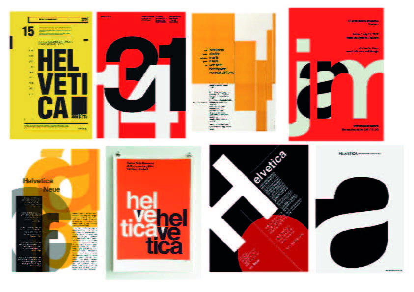
Here I have focused on Helvetica type specimens and similar typefaces. Again I love the use of layering along with vertical and diagonal text placement and the combinations of contrasting text weight and size and well as the use of colour. As Helvetica is a minimalist style font like the above I think I will stick to no more than 3 colours most likely, black, white and one other.
Sketches
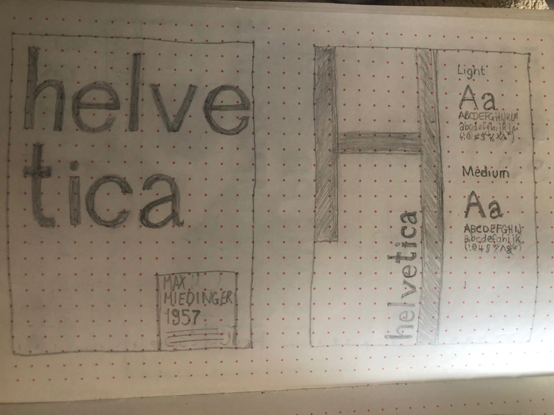
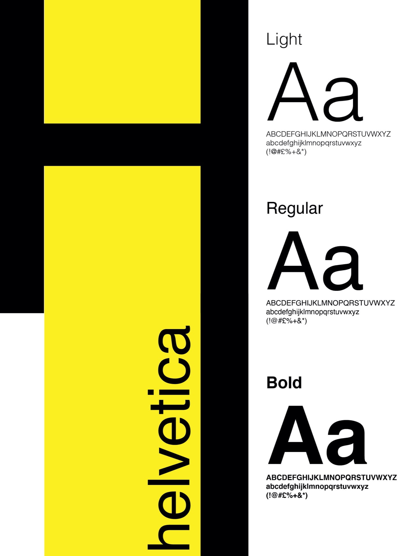
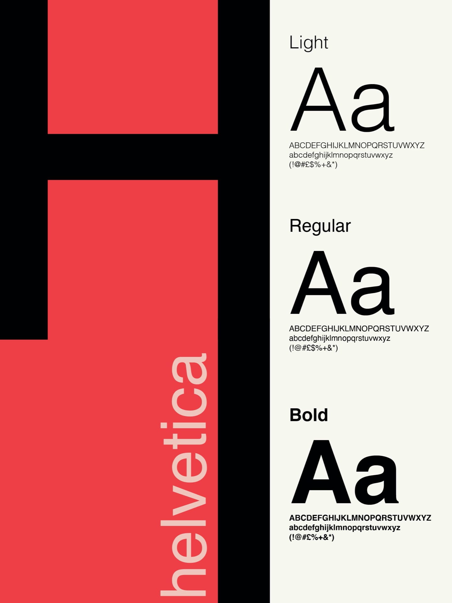
I began by drawing out designs that presented contrasting sizes as well as horizontal and vertical text placement. In the first outcome shown above, I have increased the size of the Helvetica so that the name of the typeface alone covers half of the layout. I have then added a small portion of text in a box at the bottom right-hand corner of the page adding an element of interest in the bottom half of the layout. I have also used contrasting typeface sizes, width sizes and a blend of lower and upper case to distinguish the heading form the body text. Overall I’m very happy with this outcome. The second outcome I have based my layout around the form of the H with the letter extended and Helvetica running vertically alongside it. I have also included the alphabet and a large Aa to showcase the typefaces in thin, regular and bold outcomes.

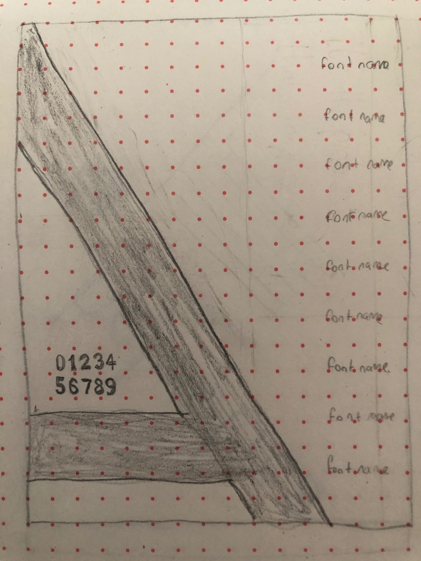
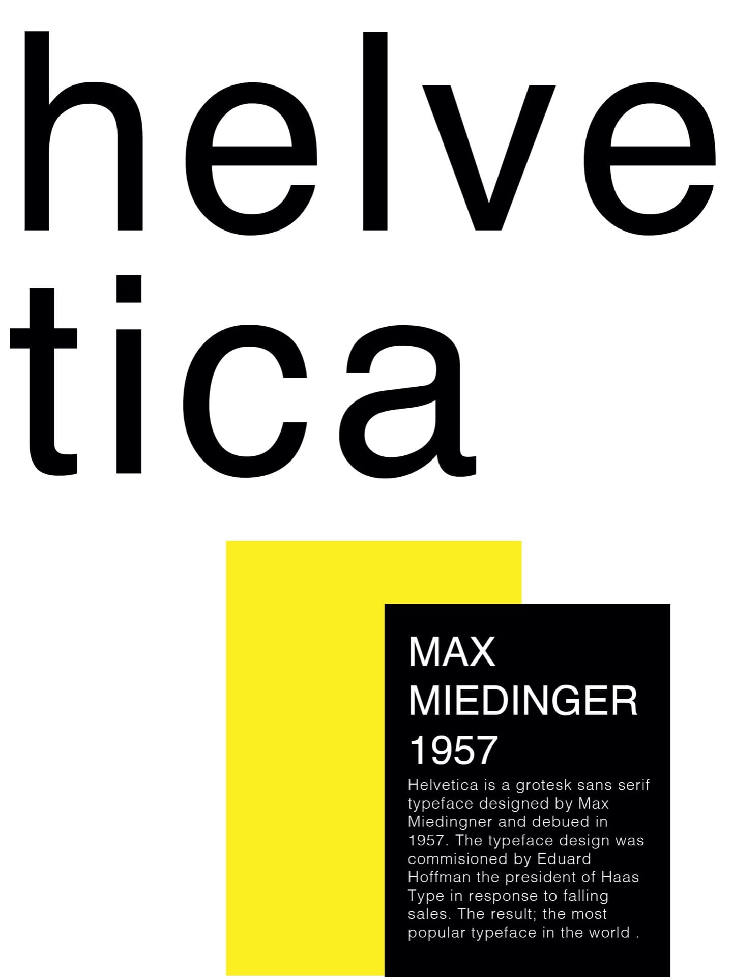
In the above to layouts I have experimented with partially moving the text off the page using horizontal and vertical text placements. In the first outcome, I was given feedback to include the line seen above at the top right-hand side of the layout adding balance to the overall outcome, which I feel has been very effective. In the second outcome, I was not pleased with the overall structure of the outcome and was struggling to achieve the correct composition of the A. On this layout, I was given feedback to increase the size of the A to better fill the layout. I love the outcome chad can’t believe the difference this has made to the overall layout adding balance and a strong sense of line and shape.

Of the outcomes the above our my least favourite however I want to experiment with weighting, and diagonal text placement in more minimalist style and better demonstrate the typefaces Swiss origins.
Digital Outcomes


After having discussed digitising the outcomes I then filled in the layouts with relevant content and produced the above 3 outcomes on illustrator in black and white as per the feedback given. I am quite pleased with the above outcomes and feel the clearly reflect the ordered and minimalistic feel.
Digital experiments


I then began experimenting digitally looking and the white space around the letters as I had seen in some examples (shown above) to see the different outcomes that I could achieve as seen above. I then moved the shapes around to find an interesting outcome. While this was quite a fun exercise the outcome was too abstract and not what I wanted to achieve.
I also accidentally produced the above outcome by adjusting the line spacing on the second half of the word and quite liked the outcome.

From these digital experiments, I created the above two outcomes. I was really pleased with these type specimen layouts and the simplicity of the outcomes. I also love how using the white space around the letter highlights the letter form in a visual representation of how the typeface blends into its background.
Adding Colour
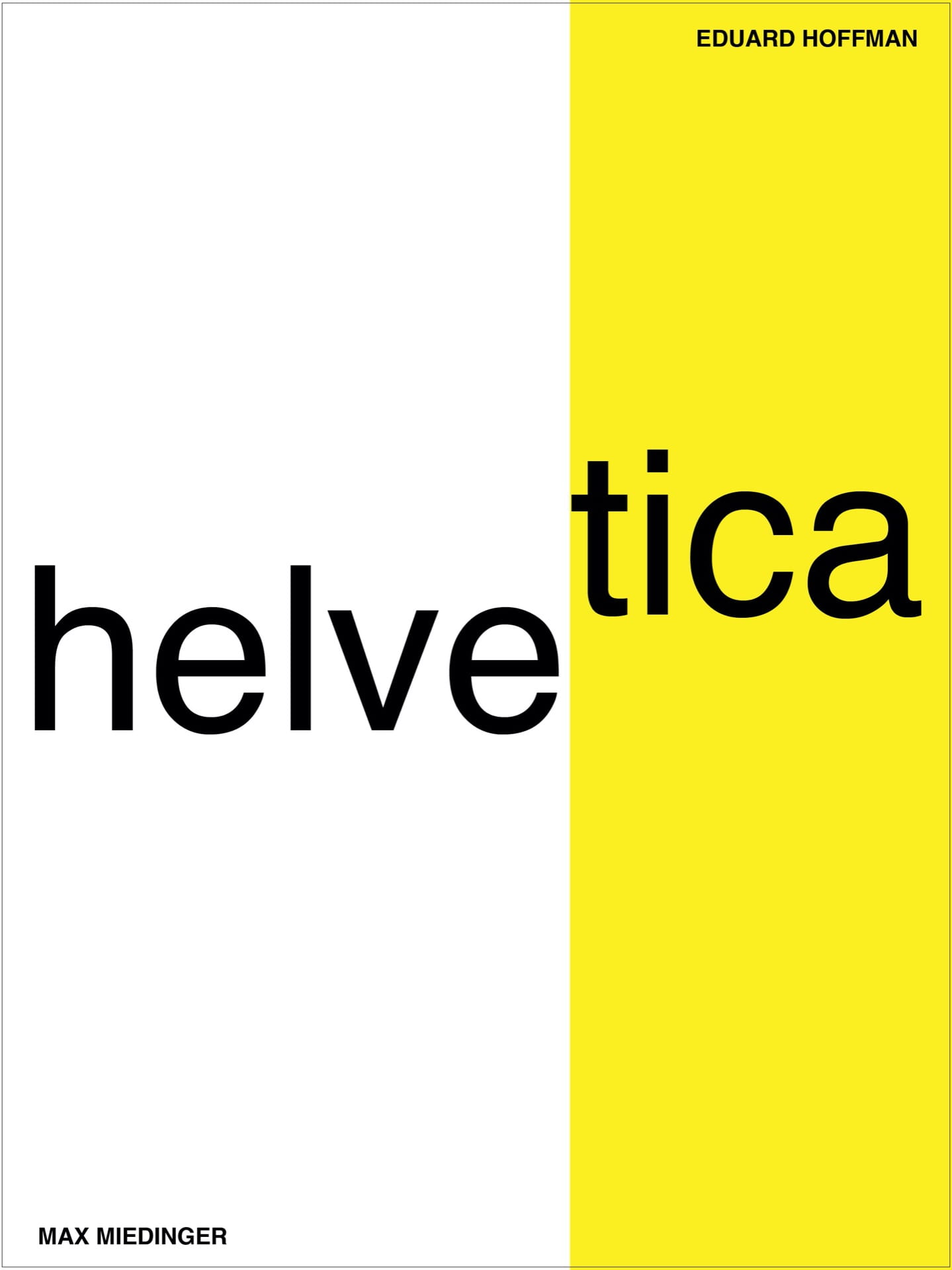
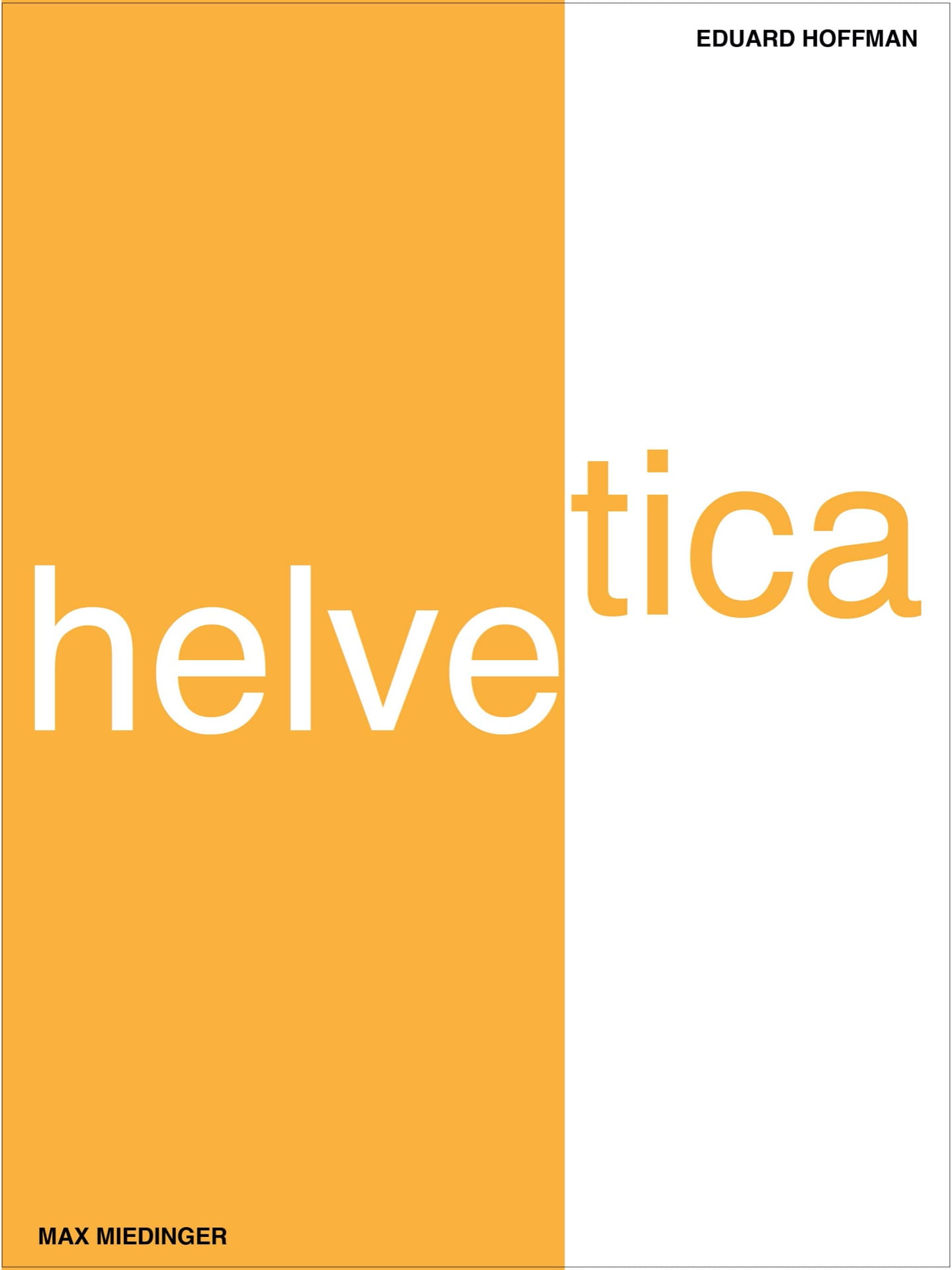
I then started to add colour and experiment with how I could split up the layouts using colour. I am quite please with both of the above outcomes however I prefer the red covering the full of the left-hand side of the layout.
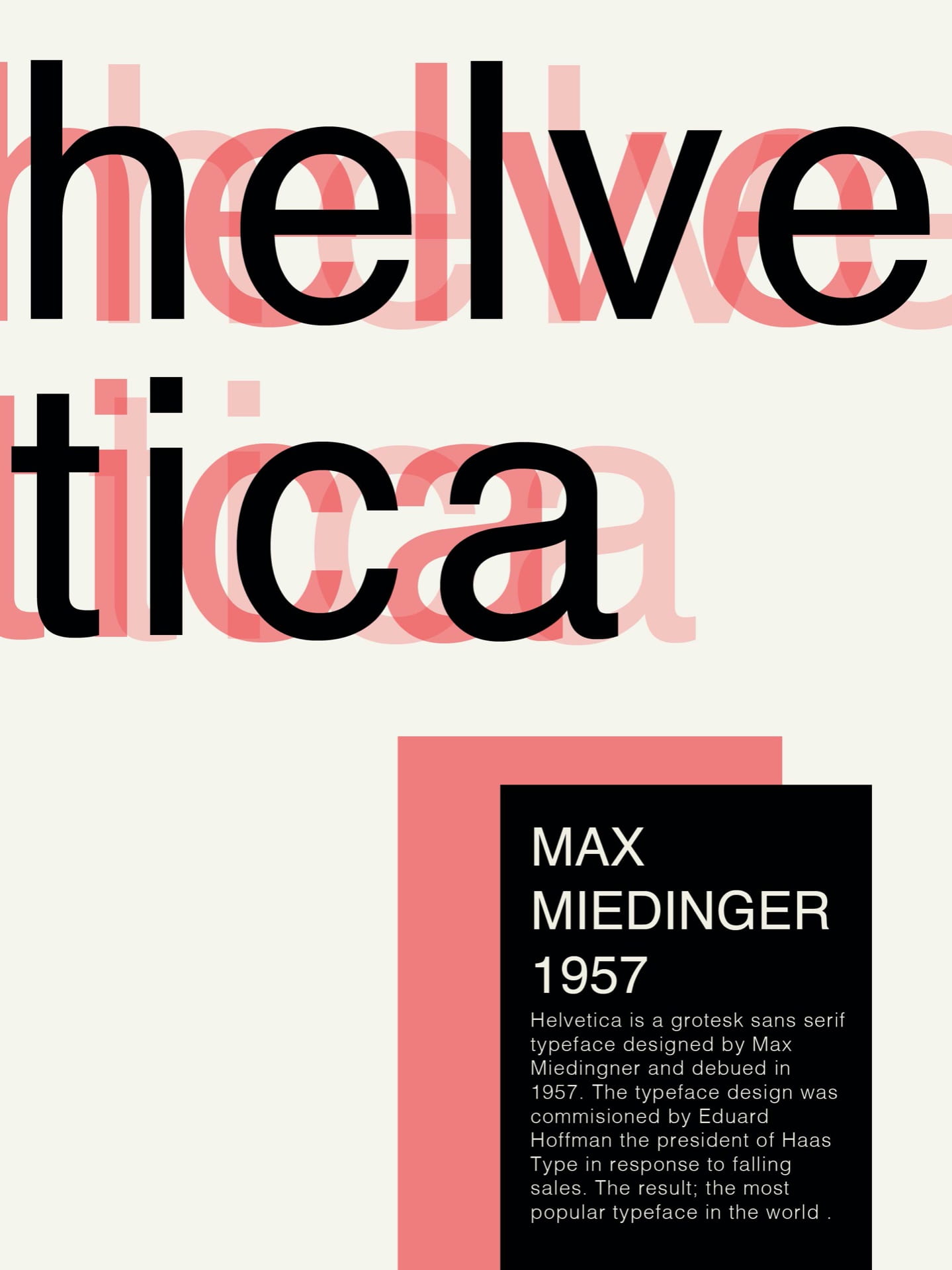
In the above layouts, I experimented with layering, particularly in the left-hand layout, where I have layered 3 copies of the text in red, lowered opacity and black.
I then used a yellow backdrop to split the above layout into 1 and 2 thirds to complete the text layout. In the second variation, I lowered the brightness on the second layout shown above.
In the above layouts, I have employed a similar technique in a vertical format and am please with both outcomes and the minimalist outcome I have achieved

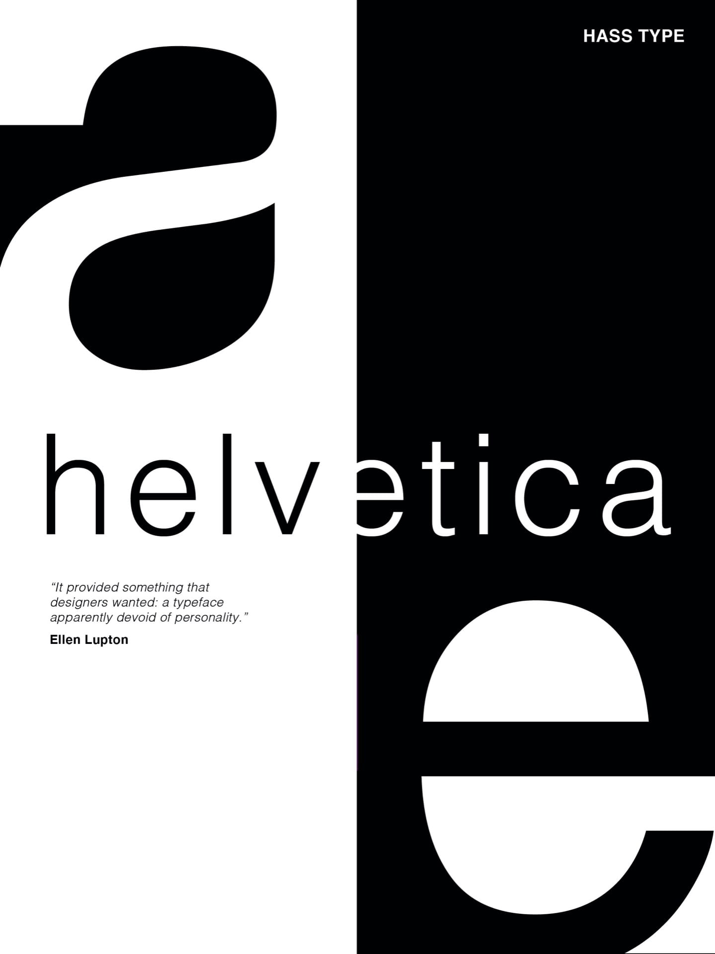
Finally, I experiment by splitting the above layout into in half creating a striking black and white outcome. In the first layout, I have included the first half of the ‘e’ in black however I felt this took away from the simplistic and streamlined feel of the outcome and decided to leave the ‘e’ white on the second layout.
Final Selections

Of the type specimens, I have created the above 3 are my favourite as I feel they have captured the minimalist outcome I had hoped to achieve while still producing a level of interest to capture the viewer’s attention.
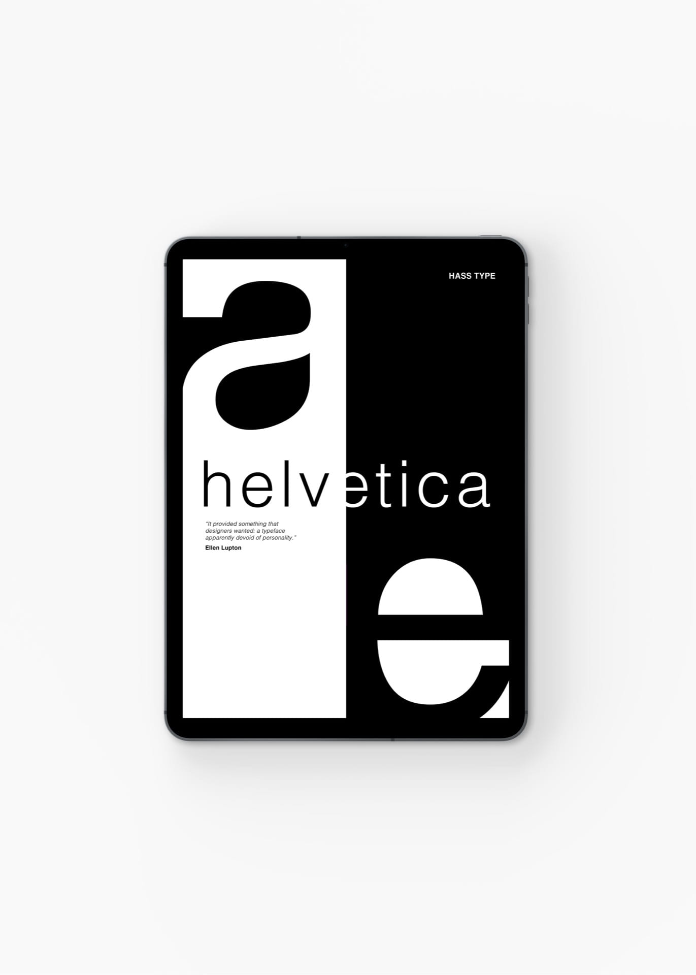
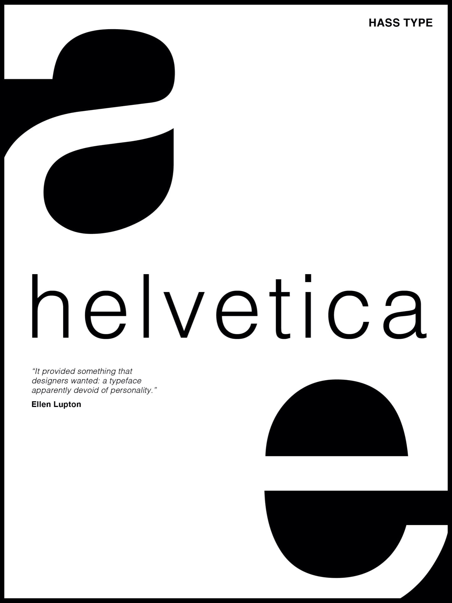
Of my final 3 type specimens I chose the above black and white outcome as I feel it demonstrates an individualistic feel and stands out against my other design outcomes highlighting the simplicity and beauty of the typeface juxtaposing the quote:
“It supplied something that designers wanted: a typeface apparently devoid of personality” Ellen Lupton
Feedback
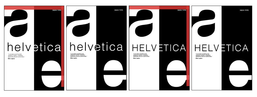
In our group critique, we were each given individual feedback on how to improve our design outcomes. The areas I needed to look at were removing the white corner under the large ‘e’ align the ‘HASS TYPE’ with top of the highlighted negative space within the large ‘a’ and align with the end of the word ‘helvetica’. I made these changes as can be seen in the top right using a red rectangle as a guide on top and bottom. I also adjusted the large ‘e’ so the negative space also lined up. Creating the second outcome shown above and added in the second half of the small ‘e’ in the centre in black with no line. I was very pleased with the outcome however it was also suggested that I experiment with using uppercase on the ‘helvetica’ which I did and followed the same alignment process. There is something about the contrast of the large lowercase ‘a’ and ‘e’ which I felt gave this outcome a bit on an edges ad as the stem of the ‘E’ lined up perfectly with the background it allowed me to have the clean finish I wanted without having to split the ‘e’ into 2 colours.
Final Outcome
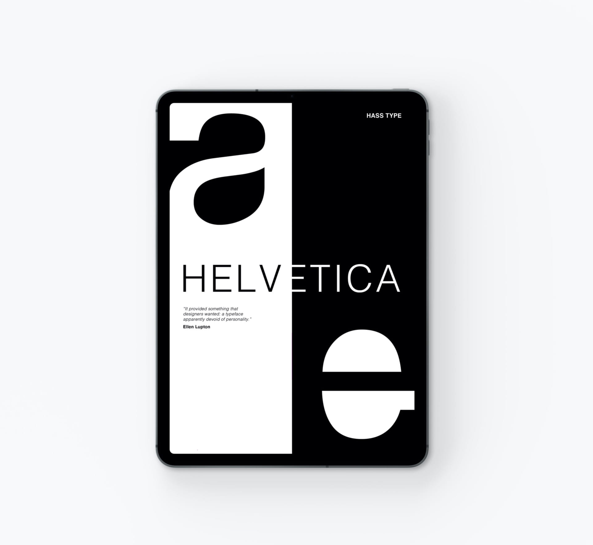
I am very pleased with my final outcome and am happy with the bold contrast of the black and white. I also really enjoyed playing with the negative space within the lettering and found the feedback incredibly helpful in highlighting how important alignment is in every aspect of a composition.
What have I learnt?
- Helvetica was made to be a neutral typeface.
- Helvetica’s popularity is so great that products and cafes have been designed after it.
- Helvetica is closely linked with modernism.
- It’s important to consider the white space around letters.
- It’s important to consider where alignment throughout layouts.
How can I apply this to my work in future?
- When wanting to create modern and neutral design outcomes using the typeface Helvetica will add to the effect.
- In future, I should consider how every element aligns in a page or layout with other elements and use this as a way to create seamless and balanced outcomes.
- Experiment with typography and try variations such as capitalising letters and using different weights as this may lead to stronger and more interesting outcomes.